What Are Pie Charts?


A pie chart is a circle divided into different pieces based on how much each piece makes up of the whole. The key rule when using a pie chart is that all of the pieces together must equal 100% of the whole. Pie charts look great visually and can improve the look of your reports or presentations. However, they are somewhat limited in use because not all data makes sense when organized in a pie chart. Another rule of thumb is not to use a pie chart if you are working with more than a few categories because the more categories that you add, the less meaning the chart will have.
How to Make Your own Pie Chart in Excel

Setting up the Pie Chart Data Table
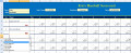
For this example, I will use the above spreadsheet that I created to walk you through how to set up the data table.
- In cell A4, enter “Customers”.
- In cell B4, enter “Sales $”.
- Highlight cells A4:B4 and click on the “U” button on Excel’s “Home” tab.
- In cell A5, enter “Customer A”.
- In cell A6, enter “Customer B”.
- In cell A7, enter “Customer C”.
- In cell A8, enter “Customer D”.
- In cell A9, enter “Customer E”.
- In cell A10, enter “Misc. Customers”.
- In cell, A14, enter “Total”.
- Highlight and format B5:B14 as accounting and zero decimals.
- In cell B5, enter “1200”.
- In cell B6, enter “850”.
- In cell B7, enter “700”.
- In cell B8, enter “500”.
- In cell B9, enter “350”.
- In cell B10, enter “200”.
- In cell B14, enter a sum formula to add up total sales dollars “=sum(B5:B13)”.
- Highlight A4:B14 and pick a color to shade the box. Also, add a bold border around the box. Doing this keeps the table nice and cleaning looking.
Now that we have laid out the data table, now we can look at how to create the different kinds of pie charts that are offered in Excel.
")
Creating a 2-D Pie Chart
A two-dimensional pie chart is the most basic type of pie chart and the most commonly used one as well. It is simply a circle divided into pieces, nothing fancy.
- Highlight A4:B10 and click on Excel’s “Insert” tab and click on the pie chart icon, which asks you to pick the type of pie chart that you want. Select the top left one, which is called “Pie” under the 2-D heading. This will create the chart.
- Click on Excel’s “Layout” tab and click the drop down arrow under the “Data Labels” icon. Select “Best Fit” from the choices that are listed. This will insert the corresponding amount to each slice of the pie chart. You can choose any of the other choices that you want, but usually “best fit” looks the best.
")
Creating a 2-D Exploded Pie Chart
A two-dimensional exploded pie chart is similar to a two-dimensional pie chart, except that the pieces have been pulled apart. One of the unique things that you can do with this chart is that you can move the “exploded” pieces around how you want them. The instructions are the same as above, except that you select the two-dimensional “Exploded Pie” chart instead.
")
Creating a 2-D Pie of a Pie Chart
A pie of a pie chart adds a little more analysis that the last two types of pie charts. It breaks out the bottom two or three lines in the table into a smaller and separate pie chart. It also, puts a place holder in the main chart that is equal to the total of the smaller chart. All of the instructions are the same, except that you select the “Pie of Pie” instead.
")
Creating a 2-D Bar of a Pie Chart
A bar of a pie chart is similar to a pie of a pie chart, except that it uses a bar instead. Personally, I like the pie of a pie better. Follow the same instructions as above and select a “Bar of Pie” instead.
")
Creating a 3-D Pie Chart
A three-dimensional pie chart adds a little flare to your spreadsheet. It is similar the regular two-dimensional pie chart, but it looks a lot more attractive with the extra dimension. Personally, this is my favorite type of pie chart to use. Follow the instructions above, except to select the “Pie in 3-D” instead.
")
Creating a 3-D Exploded Pie Chart
The three-dimensional exploded pie chart is a 3-D pie chart broken into pieces. I would suggest that if you plan to use this, I would try to stay around 3 or 4 categories at the most. When you start getting small slivers, it looks busy. Same instructions as above except, select the “Exploded Pie in 3-D.”
Formatting Options for Your Pie Charts

Formatting the Chart’s Colors
When you create a chart, Excel pre-selects the colors for the chart. You can click twice on any piece of the pie and change its color to whatever you want. You may have to adjust the color of the data labels to make them more readable. To change a pie slice color, click on the slice twice so that it is the only one selected. On Excel’s “Format” tab, click on the “Shape Fill” button and select whatever color you want. To change the color of a data label, click twice on that data label so that it is the only one selected. On Excel’s “Format” tab, click on the “Font Color” button and select the color you want.
Formatting the Chart’s Background
A plain white background on a chart can look boring and dull. One of the things that I like to do is to add some color to the background to make it look more professional. Excel allows you to change the background to a solid color, gradient, picture, or a texture. On all of the charts included in this hub, I did something different with the backgrounds to show some of what Excel is able to do. To change the background of a chart go to Excel’s “Format” tab and click on the “Shape Fill” button and select the color, picture, gradient, or the texture that you want. After selecting a new background, you may have to change the color of the data labels, chart title, legend, and any chart slices that may need to be adjusted.


Formatting the Chart’s Look
Excel’s “Shape Effects” button on the “Format” is a great way to take your charts from good looking to professional looking. Excel offers the ability to modify a chart by giving it a shadow, a glow, a reflection, soft edges, and the bevel. Each of these can turn a boring 2-D or 3-D chart into something special. Look at the thumbnail pictures to the right, each shows a normal pie chart with a corresponding pie chart using some of the “Shape Effect” options.
Pie charts can make your reports look great and are easy to create. Personally, I prefer to use 3-D Pie Charts because they look cleaner and more professional. Remember that in order to use a pie chart, the data has to make sense being analyzed as a part of the whole.