Filmed in Glorious Black & White
When technology ceases to be a standard, it can become an ethos.
In the pre-digital world you rarely encountered anyone going into ecstasies over the texture of film grain or the "materiality" of celluloid, but once endangered and threatened with obsolescence, the analogue film strip acquired a new preciousness, an aura which, even if it had previously existed, there had been scant sense of urgency about appreciating. Along similar lines, no one bothered to think about black-and-white cinematography as an elevated art medium so long as it was the default, but it was only a little while after the Technicolor revolution had well and truly carried the day that the honest and austere monochrome acquired a new cachet.
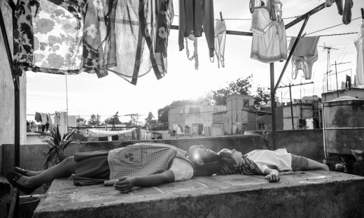
Roma
To shoot on black-and-white today is to step at least a little outside of the run of business-as-usual, and so Alfonso Cuaron's Roma, shot in monochrome on an Alexa 65 digital camera, is both a movie and a statement of belonging to an aesthetic minority - not the only one on the 2018 festival circuit. One might even detect a minor renascence of black-and-white among some of the year's most widely acclaimed touring films, including Roberto Minervini's What You Conna Do When the World's on Fire?, projected in contrasty digital monochrome, and Pawet Pawlikowski's Cold War, his follow up to the likewise black-and-white Ida, shot again in the suddenly-in-vogue 4:3 aspect ratio, aping the look of 35mm with an Alexa XT.
Roma, set in the c.1970 Mexico City of Cuaron's youth, and Cold War, which spans the period from the late 1940s to the early 1960s, both fulfil the typical prerequisite for contemporary movies made in black-and-white - they are period works, and use monochrome, at least in part, to evoke the texture of bygone times as they persist in the popular imagination. "We were considering colour at first," commented cinematographer lukasz Zal, speaking of his work on Pawlikowski's film, "but we couldn't find the right palette and it struck us that we would have been stuck with a look resembling a CDR's Orwo film stock. Unlike America, wonderfully portrayed in Todd Haynes' Carol with its vibrant colours, Poland in that period was drowning in different shades of grey." The logic goes something like this: the past is another country; they did things in black-and-white back then.
The afterlife of black-and-white cinematography
The afterlife of black-and-white cinematography now spans more than half the timeline of cinema's lifespan, and shows no signs of cessation - for unlike, say, the arrival of sound cinema, the assertion of colour photography as the default standard was a gradual process, by no means regarded as an unalloyed good. In the United States, on the vanguard in this matter, the tipping point came in the middle 1950s. Colour film had been around in one form or another since nearly the earliest days of cinema, with Herbert Kalmus' Technicolor introducing its first two-strip subtractive process all the way back in 1915, but the 1952 introduction of the one strip 'monopack* Eastmancolor negative process provided a new, lightweight alternative to the cumbersome Technicolor camera, with the additional benefit of allowing studios to bypass that company's long-standing monopoly on the colour film market. By 1954, for the first time, colour films accounted for more than half of the total produced in the US, as colour, like Cinemascope and 3D, became one of the particularly cinematic inducements being pushed by the studios in hopes of luring American consumers away from their new television sets. Both TV and colour film were slower to saturate other major national markets - outside of the States, German Agfa color offered an alternative to Technicolor - but the work would be largely accomplished in the next decade or so.
Past the threshold of the 1970s
As with any innovation, colour film s creeping domination of the industry created holdouts and discontents. Past the threshold of the 1970s, Orson Welles could be found opining that ’Colour enhances the set, the scenery, the costumes, but mysteriously enough it only detracts from the actors. Today it is impossible to name one outstanding performance by an actor in a colour film' - though he had already hesitantly caved to contractual obligation, abandoning black-and-white to shoot his The Immortal Story (1968). Billy Wilder had filmed on Technicolor as early as 1948 s The Emperor Waltz, but hung onto two-tone until rather late in the game -his 1966 The Fortune Cookie was the last film he made before surrendering permanently to colour, its cinematographer Joseph LaShelle nominated for the Academy Award for Best Black-and-White Cinematography in the last year that the category was awarded separately, a practice that had been in place almost constantly in one form or another since 1936.
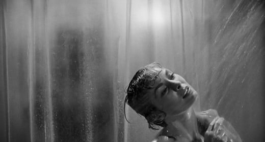
As colour became the standard for Hollywood productions in the waning years of the 1950s, black-and-white tended to denote lower budget productions, but at almost the same time it began to emerge as a marker of prestige, of sober-minded seriousness of purpose, as set apart from bauble-like razzle-dazzle entertainments. To borrow one of the categories coined by Andrew Sarris in his 1968 book The American Cinema’, in the late 1950s and 1960s, black-and-white was the official palette of Strained Seriousness, of those earnest adult dramas appealing to the conscientious, liberal-minded (and literalminded) middle-class middlebrow mass moviegoer. A partial canon of work in this line would include Richard Brooks' Blackboard Jungle (1955) and In Cold Blood (1967), Martin Ritt’s No Down Payment (1957), Hud (1963), and The Spy Who Came in from the Cold (1965), Stanley Kramer's The Defiant Ones (1958) and Judgment at Nuremberg (1961). In the same period, Alfred Hitchcock's Psycho (1960) was something of an outlier - an instance of a director of enormous clout who had worked extensively in colour, opting to shoot in monochrome with his television crew, with the aim of creating a cheap, flimsy look that connotes danger.
Best Black & White Movies
- Sunset Boulevard
- Modern Times
- Psycho
- On The Waterfront
- Casablanca
- It’s A Wonderful Life
- Dr. Strangelove Or How I Learned To Stop Worrying And Love The Bomb
- Some Like It Hot
- Gilda
Sunset Boulevard
Converting to colour
Other international industries lagged behind the Americans in converting to colour, and the fact that the key works of arthouse megaliths like Akira Kurosawa, Federico Fellini and Ingmar Bergman were in black-and-white, as were the opening salvos of the New Wave, can’t but have helped to cement the connection between a monochrome palette and furrow-browed intentness of artistic purpose for a generation of moviegoers in the mid-1960s. Among them was a young Woody Allen, who would return to the format in films including Manhattan (1979), Stardust Memories (1980) and Broadway Danny Rose (1984).
"a means to ape of the texture of a bygone era"
While cinema had its holdouts, in the world of fine art photography the prejudice favoring black-and-white as a serious medium was much more firmly in place - while a pioneer like Fred Herzog was doing extraordinary work on Kodachrome slide film through the 1950s and '60s, colour photography still carried the stigma of the vacation snapshot, and by general consensus only gained institutional legitimacy with the awarding of a Guggenheim Fellowship to Stephen Shore in 1975 and the 1976 exhibition of William Eggleston's dye transfer prints at the Museum of Modern Art. The process of legitimising colour cinema for the highbrows had begun some time earlier, a pivotal moment coming with the release of Michelangelo Antonioni's Red Desert (1964), shot by Carlo Di Palma - stories of Antonioni demanding that grass be dyed in a proper shade of green helped to validate colour film as a potentially "painterly" medium, introducing one more element over which the auteur-author could exercise control. One after another the art filmmakers, like folkies going electric, moved into colour
By the end of the '60s, the black-and-white prestige film was on its way out, with 1966 something of an Indian summer for the form bringing not only The Fortune Cookie but Mike Nichols' Who's Afraid of Virginia Woolf? and John Frankenheimer's Seconds, shot respectively by Young Turk Haskell Wexler and old pro James Wong Howe The appearance of colour television meant that colour film were more readily licensed to TV, eliminating one of the last commercial inducements to cling to black-and-white. Sam Peckinpah's insistence that the Steve McQueen vehicle The Cincinnati Kid (1965) be shot' monochrome, so to preserve the feel of its Depression era setting would be one of the reasons behind his dismissal of the project finally filmed in Metrocolor by the more pliable Norman Jewison
The colour breakthrough
Thereafter, black-and-white films would in the main be divided into two discrete categories. The first, unchanged since the early days of the colour breakthrough, was the film shot monochrome because budgetary limitations: instances can be found in the early number of emerging filmmakers, including George A Romero's Night Of the Living Dead (1968). whose particular effectiveness owes much to the fact that it approximated the look of atrocities broadcast on the local news. The second was the film which opted for monochrome as a means to ape of the texture of a bygone era. Perhaps the most commercially successful maker of the latter sort of movie was Welles' old acolyte. Peter Bogdanovich: in Paper Moon (1973) he succeeded where Peckinpah had not. rendering the Depression in black-and-white, while his The Last Picture Show (1971), shot in the small Texas town of Archer City and set at the beginning of the 1950s, was almost sepulchral in its whiteness, a near-ghost town that gave the impression of having been picked clean near down to the bone.
Martin Scorsese's Raging Bull and David Lynch's The Elephant Man, two prominent films of 1980, established period setting as the principal justification for the employment of black-and-white in high profile American films. This historicising principle is at work in such films as Tim Burton’s Ed Wood, Steven Spielberg's Schindler's List (both 1993), Joel and Ethan Coen’s The Man Who Wasn't There (2001) and George Clooney's Good Night, and Good Luck (2005). In addition to period pieces per se, black-and-white would be used for films aping and burlesquing antique filmmaking practices: Universal horror in Mel Brooks’s Young Frankenstein (1974), film noir in Carl Reiner's Dead Men Don't Wear Plaid (1982) and a number of idiomatic styles in the films of Guy Maddin.
"black-and-white the natural raiment of total desolation"
In the corner-cutting department, from the early 70s to the dawn of the digital era monochrome was the province of international art films and American independents, which led to a distinguished lineage of grotty black-and-white feature debuts by US filmmakers that runs from Joan Micklin Silver’s Hester Street (1975) through David Lynch's Eraserhead (1977), Eagle Pennell’s The Whole Shootin' Match, Charles Burnett's Killer of Sheep (both 1978), Gus Van Sant’s Mala Noche (1985), Spike Lee's She's Gotta Have It (1986), Alexandre Rockwell’s In the Soup (1992), and right down to Kevin Smith’s Clerks (1994). The kinship between the American and European undergrounds at this time is illustrated by one anecdote: shooting his Stranger Than Paradise (1984), Jim Jarmusch used unexposed stock from The State of Things (1982) by Wim Wenders and created buffers between scenes with black leader courtesy of Jean-Marie Straub and Dantele Huillet, who were offering materials unused in their Klassenverh SItnisse (Class Relations, 1984), one of the most ravishing black-and-white films of the decade. In conversation with Jarmusch, the critic Jonathan Rosenbaum referred to the period that produced these works as “the last great era of black-and-white," though into the 21st century, a handful of filmmakers have continued to work purposefully in monochrome: the monastic minimalist Phillippe Carrel Tarr, exploring the medium’s capacity to convey the barren and the baroque; and the Alexei German of Hard to Be a God (2013), who finds in black-and-white the natural raiment of total desolation.
Alongside the work of these one-off outsiders, there remains an expressionistic black-and-white tradition, one that plugs into the fact that, for lack of a better word, it looks “cool." Luc Besson, the godfather of cinema du look, who no one has ever accused of an excess of good taste, can be found working in black-and-white widescreen in Le Dernier Combat (1983) and AngehA (2005), and there are a small body of cult items beloved of Dorito-breath film school undergraduates that draw on the intrinsically eye-popping “Wow" qualities of high-contrast photography: Shinya Tsukamoto's Tetsuo: The Iron Man (1989), Benoit Poelvoorde R6my Belvaux and Andr£ Bonzel's Man Bites Dog (1992), Tony Kaye's American History X (1998), C6la Babluani's 13 Tzametl (2005) and Ana Lily Amirpour's A Girl Walks Home Alone at Night (2014). Francis Ford Coppola's Rumble Fish (1983), a monochrome movie which includes a striking scene in which only koi goldfish are rendered in colour, used rear projection to achieve the effect, though more recent digital technology has allowed for the creation of far more intricate black-and-white/colour hybrids such as like Gary Ross' Pleasantville (1998) and Frank Miller and Robert Rodriguez's Sin City (2005) - incidentally, two of the worst films ever made. The identifiable low point in the tradition of film geek black-and-white arrived in 2017, when a colour desaturated version of James Mangold's last entry in the Wolverine franchise was released into cinemas as Logan Noir.
Productions like Alex Ross Perry’s The Colour Wheel (2011) and James N Kienitz Wilkins' Public Hearing (2012) could seem willfully archaic. Whereas fiscal necessity -the prohibitive expense of colour film stock -once precluded the aesthetic decision to shoot in black-and-white, now the aesthetic is principal. When, say, Hong Sang-soo decides that his digital The Day He Arrives (2011) will be in black-and-white, he isn’t agonizing over cutting corners; he's pushing a button, possibly as late as post-production. (The film's Cannes trailer is in colour.) If anything black-and-white is today a financial liability, considered a drain on potential box-office - “A black-and-white film seems ghettoised into being artsy-fartsy" is how Alexander Payne put it in discussing his greyscale Nebraska of 2013, elsewhere proselytising that black-and-white is “such a beautiful form, and it's really left our cinema because of commercial, not artistic, reasons."
Beautiful Black and White Shots
Celluloid
The same might be said of celluloid. But throwback associations aside, digital monochrome like that which Nebraska represents not a return to classical glamor, but a new, discrete medium; of Roma, Cuarbn said he wanted 'contemporary black-and-white, not to work with long shadows like in the ’40s and ’50s." If there is to be another “great era" for monochrome, like that which Rosenbaum proclaimed in the mid-’80s, it will likely have to come through this - a digital technology that has largely been put to work reimagining our analogue past
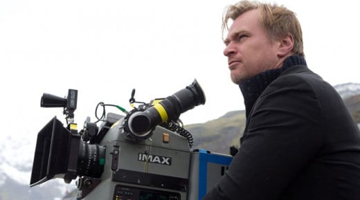
With digital now invariably the go-to for cost-cutting measures, budgetary vicissitudes have been eliminated as a reason to shoot black-and-white - the bland, bleary early films of Andrew Bujalski represent something like the end of an indie era, and only a few years later 16mm black-and-white.


