Breathing for the Eyes: How to Improve Your Writing using White Space


© 2011 by Aurelio Locsin.
Text that is dense and tightly packed suffocates the eyes like an avalanche. It is difficult to browse for quick readers and hard to follow for those wanting a more in-depth experience. If you momentarily look away from the page for some eye relief, it is difficult to return to the exact word or line you left. Adding white space to your layout avoids these problems by allowing the eyes to breathe.
White space refers to the blank lines and empty spaces that surround your text. You can arbitrarily employ this technique by pressing the spacebar to add blank characters or tapping the Enter key to insert blank lines. However, you can also use white space more organically in the following ways.
Break up long paragraphs.
Paragraphs with too many lines look like unbreakable walls of characters rather than comprehensible text. Rather than break through such barriers, readers are more likely to skip over such text and miss any important ideas you’ve buried there. Make your efforts more readable by splitting long paragraphs into lengths of five-to-seven lines each.
Items of equal importance in the following list of bullet shapes:
- Bullets
- Dashes
- Asterisks
List of award medal types showing most to least imporant:
- Gold
- Silver
- Bronze
Use numbered and bulleted lists.
When you present three or more ideas together, break them up into lists at one item per line. This allows readers to quickly calculate the number of items, and to find each item immediately. Use bulleted lists to enumerate items of equal importance and numbered lists to show item importance or steps that must be performed in order. Examples are on the right.
Show how items are related through tables.
Tables are a graphical way to show relationships in rows and columns that may disappear if explained through text. You can make it easy to distinguish the information in tables by differentiating labels from information, perhaps by using bold characters. For example, consider how much text would be needed to explain the information shown by this table and the bold text designates the titles of rows and columns.
China
| India
| U.S.A.
| |
|---|---|---|---|
Population
| 1.3 billion
| 1.2 billion
| 312 thousand
|
Area in square miles
| 9.6 million
| 3.2 million
| 3.7 million
|
Gross Domestic Product in U.S. dollars
| 6.9 trillion
| 1.8 trillion
| 15 trillion
|

Add graphic elements.
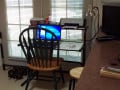
Graphic elements such as photos, video and diagrams count as white space because they give the eyes a break from words and characters. They also use a discrete and compact area to communicate ideas that may require several paragraphs of text. If necessary, you can clarify the graphic element with a short caption. Note, for example, the picture on the right.
- What description does it evoke in your head?
- How much text would it require to explain that instant evocation of ideas?
- Does the caption improve or hinder your understanding of the picture?
You can find copyright-free pictures through the Advanced Search feature of Flickr.com under the Creative Commons section. As for videos, nearly all those at YouTube allow re-posting at any online site, unless explicitly stated otherwise.
Request
If you have any additional ideas for using white space to improve readability, please put them in the Comment field below. Thanks.