Children's Book Character Design

Building your main character is the most important aspect of your book, specially when it comes to picture books for kids, as the story line is not only depended on the text, but also on how your character is presented in each illustration.
But how to build a character from start to finish? There are two ways I do this process:
- I have an idea for a character and build the story line around that idea. More commonly used for people writing and illustrations their own books.
- Or I have the story line, and build the character to match that story. This is what you will do if working as an illustrator for an author or agency.
In this post, I will be sharing my creative process from sketching to the final published book for the second process, where I created the illustrations based on the existing story line.
Doodles
The first step is to read the story and let your imagination run free. Become very familiar with the story line so you can picture it in your head. Then as the first ideas pop in your head, start with the first sketches. At this stage, a stick man will do, no need to get fancy. You just trowing ideas together, but this process will start giving shape to your final product.
Also at this stage, do not use your expensive paper. It is a waste of money. The back of an envelope will do, or whatever paper you can grab when the inspiration hits you.
These first images are usually very private for most artists. Even when you may see people sharing sketchbooks online that looks amazing, you just do not know how many sketches were done behind the scene in order to get to there point.
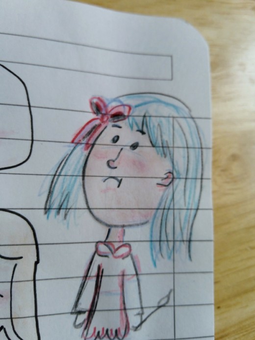
In my example above, this character is named Stick. In the first illustration, she looks up in fear. So for the first drawings I created I was considering what type of eyes to use in order to show the action of looking up. Many artist would have chosen big eyes as it is easy to show expression and indicate the direction the character is looking. However I choose to use dotted eyes simply because I like the simple look when designing for children.
A lot of times, it all comes down to the artist's creative decision being simply based on personal preferences.
After deciding the shape of eyes and other facial features as shown on the image above, I started considering other aspects of the character design, including hair and clothing.
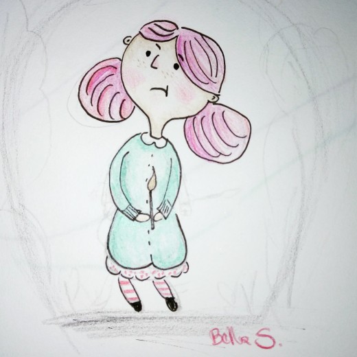
So from the first image, with blue hair and pink dress, I changed the design to pink/red hair and a blue dress. Again these are based on my personal preference, but creating details like the red and white stripes on her leggings, all help in building the identity of the main character.
Another significant decision I made at this stage was the shape of the character's hair. This design became the focus of my illustrations, as shown below.
Storyboard
Once the initial character was created, it was time to storyboard.
This aspect is the most important in creating a picture book. It is of course, subject to a lot of changes, but it will guide you thoroughout the process.
Again, no need to get fancy during this stage. Simple stick-man drawings will do with the text next to it.
What you want here is to figure out:
- how many illustrations you want to create;
- how to spread the text for each page;
- and whether create double spread illustrations or single images.
For this particular book I have decided on 12 illustrations, mainly single pages illustrations, with one double spread illustration across two pages. The cover for the book is also a double spread illustration.
This process will depend highly on the story line, so it will vary a lot from artist to artist. It is a good idea to have a look at different designs in picture books and gain an idea of how you want your final product to look like.
Traditional or Digital Media
Once the idea for the character was born in my mind, and the first sketches created, and the storyboard decided, it was time to choose the right media for the illustrations.
Now, some artist have one preferred media of choice, be it more traditional painting techniques like acrylics or watercolor, or new methods like digital media. But for an illustrator like myself, we consider all types of media to create our images. And it is OK to mix and match, and use more than one media for your work.
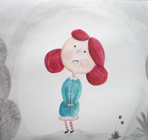
My first concept for this book was to used traditional watercolor illustrations, which is very common and more traditional for children's picture books.
I was happy with the first image I illustrated (above) using watercolor, but eventually as I created more pages, I decided that the colors were not right and the character was missing something.
So back to the sketch book for new ideas. I made changes to the design and played a bit of the clothing and accessories until I was happy with the character.
Budget
And so, I made the decision to use digital media for this project. Not only in order to get the colors I wanted, but also to make it easy for self-publishing and promotion.
The other driving factor on this decision was based on the budget for this project.
Using traditional methods means you even possess or need to buy the art supplies for each project. Using digital media can also be an expense depending on the software you buy.
However, my project was funded via Patreon donations, and therefore my budget was very limited. In order to create this work, I used an open source software to design my illustrations. There are many good free programs online for those wanting to design for free, it again will depend on your own personal preference and knowledge.
I used Inkscape to create all my images for this book. It is free, and very easy to use for those already familiar with vector drawing.
Having digital images also means it is much easier to change your mind. For this design, I played along with different dresses and colors until I found something that felt right for the character.
When using vector images, it is also an advance to change the sizes of images without losing details. These features alone are very favorable when choosing your media, budget and promotions tools for your book.
Publishing
After creating all the illustrations using Inkscape, I had to consider what kind of files I needed for publishing the book. Again having digital art comes handing during this process, because you can choose different sizes and formats for your images.
You also need to consider the text for each page.
If working with an agency or author, you will probably be told what size and format to send your images. As my project was self-published, I made those decisions for myself.
A good size for children's books is 8.5 by 8.5 inches. This format is also supported by CreateSpace, where I self-published my book.
For some of my illustrations, the image and the text where part of the same page, so I had to consider this when getting my files ready.
Using the CreateSpace platform was very easy, and they even provide a word template that you can use. I saved all my images as 'png' files including the text with my desired font size, and imported those into the word template provided by CreateSpace.
Then you have the option to preview online or order a proof copy of your work. At this point, make sure to review, review and review again each detail of your work.
And then, you are ready to publish.
© 2018 Bella Shaikh
")


