- HubPages»
- Home and Garden»
- Home Decorating»
- Interior Design & Decor
Ten Top Visual Tricks With Colour

interior design and colour

example of a colour wheel
- Color center. Complete interior color idea and resource center at artSparx.com
Art and design education and resource site. Step by step home improvement tutorials, and art and design encyclopedia. - xlphotoart Home - xlphotoart
We offer exquisite photos printed on canvas mounted on 38mm gallery frame. Our prints are only ever produced as limited edition runs, which allows you to own a very distinct and high quality piece of art. - Tektura - Home Page
Tektura - Tektura manufacture and distribute contract wallcoverings for use in public buildings or residential interiors - Niche Interiors
my fave Interior shop for quirky pieces.
Interior Design Ideas and Tips
Ten Top Visual tricks With Colour
Interior Design Ideas and Tips
Colour is a massive topic. This hub is dedicated to highlighting some tricks with colour. How colour can be used to hide or emphasise aspects, add space or warmth serenity or vibrancy.
Working with colour takes a lot of practice. Colours can look very different in different parts of your home as the type of light in a space can affect the colour dramatically. Don't be too hard on yourself if you make some mistakes, most of us have at some time looked at a wall colour and thought "did I choose that!" So before we start looking at tricks with colour.....remember....
2 big rules for finding the right colour for walls are
(1)Test Test Test. Look at the tested areas during the day and night as light affects colour enormously
(2) NEVER choose a colour in isolation....i.e. Think about how the colour fits in with existing furnishings and artefacts, how the colour will change the room's look and feel, how the colour looks when viewing from another room and how it will flow into another room.
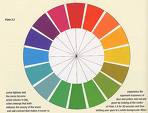
Familiarise yourself with the colour wheel. Example below right.
Cool and receding colours are located on the left e.g. blue green and purple
warm or advancing colours are on the right such as red orange and yellow.
Tip 1
Using Colour to....
Make a very high ceiling lower
Why...to make a room cosier... this tip is often used in restaurants for this reason.
How
Paint the ceiling an advancing colour. This makes the ceiling seem to be nearer. Paint the walls with a cool contrast colour.
Continue the ceiling colour down the walls to picture rail height.
If you prefer a white ceiling use darker walls. This will work in a large room but please note it may make a narrow room with a high ceiling look narrower and taller.
Use wallpaper with a horizontal pattern.
Paint coving or cornices to contrast with the ceiling.
A more adventurous approach is to tent the ceiling with coloured fabric
Tip 2
Using Colour to....
Add Height to a room
(Ceiling too low)
How
Paint the ceiling a receding colour. This makes the ceiling seem to be further away. White is the obvious choice but not the only one.
Use light colours on the floor and ceiling.
Use a reflective finish on ceiling such as a silk or gloss paint.
Disguise or remove horizontal effects on the walls such as picture rails. Avoid horizontal patterns on the walls.
Emphasize all verticals, Use striped wall paper or vertical paint effects.
adding height

Tip 3
Using Colour to....
Make a small room seem larger.
Use light receding colours on walls.
What are Receding Colours.
Also called cool colours, receding colours are said to make walls appear to recede. Warm colours are said to make walls advance.
When using patterns use small patterns to create the illusion of space.
Avoid too much contrast in colour, choose a harmonious neutral instead. Alternatively use a monochromatic scheme.
Neutrals can also be termed ‘non colours'. They are very easy to work with and can be a great choice for a beginner who is unsure of colour. Another advantage of Neutral colours is that they all go together and can be layered, mixed and matched as no neutral colour will try to dominate over another.
Neutrals don't appear on the colour wheel and include Black, Grey, White and sometimes Brown and Beige.
Using Tone on tone colours for furnishings is another great way to add to the illusion of space, i.e a cream (neutral) sofa against a dark cream wall, the sofa will blend in and recede. In other words select furnishings that blend in with the background colours of the room. Big dramatic red or purple sofas are best used in large room where they can't swamp the room.
Tip 4
Using Colour to....
Make a large room cosier
Use Warm advancing colours on the walls.
Warm advancing colours and contrasting textures will bring instant warmth to a room.
What are warm colours.
Colours such as orange and red and purple are said to be warm or advancing colours.
Fabric and textured wall coverings are coming back in vogue (OK maybe not woodchip!). Consider adding texture in this way.
Use complementary colours on curtains that contrast with walls, or furniture that contrasts with the floor will also help to draw the room in.
Use several table lamps, singularly or in clusters to create little pools of warm coloured light.
Tip 5
Using Colour to....
Camouflage unwanted features
Disguise storage by using the same treatment as on the walls i.e. painting it the same colour, or even wallpapering it. You can also continue any architectural details such as coving, skirting etc. across the area.
Paint or colour unsightly features such as ugly radiators the same colour as the background to help them melt away.
Where you can use a receding colour on the piece and on the background to help them ‘melt away'
Tip 6
Using Colour to....
Enhance attractive features
Paint or paper attractive features such as a chimney breast to contrast nicely with a background. For example in a smaller room you can use neutral colours against a white background. Or in a larger room you can try an advancing colour against a receding one.
Light your favourite feature or your dramatically.
Consider using your own treasures as points of focus and drama.
Invest in a display unit or Curio Cabinet. Rather than hiding all your childhood memento's, holiday or travel souvenirs vintage finds in drawers, display them.
Light it artfully to pull focus onto the pieces and away from aspects of the room that are less attractive.
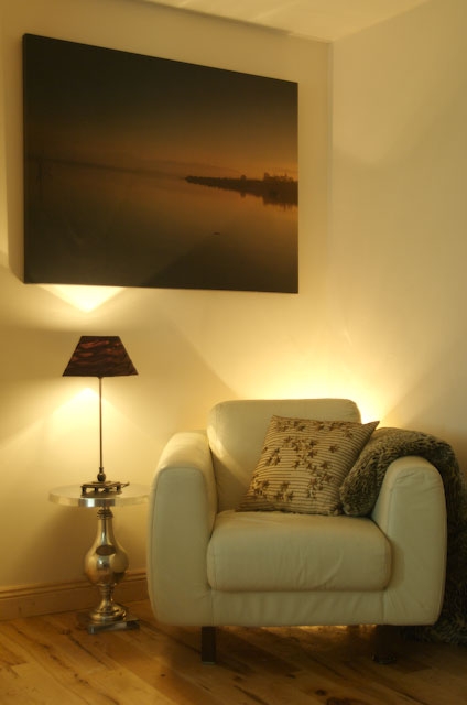
enhancing features using colour

Tip 7
Using Colour to....
Add width
Making a narrow room seem wider.
How to do this will really depend on the function of the area. Try painting narrow end walls in an advancing colour and the other walls in a receding colour. This trick is typically used in long corridors in hotels. You will often see patterned walls in advancing colours at the end of long corridors and cool receding colours on the corridor walls. alternatively place items of interest, a piece of furniture or art at the end of the corridor to attract the eye.
If you don't wish to use warm colours or patterns on the end walls you can use an eyecatching piece of art or a cluster of pictures and light them well.
Paint the skirting board to match the floor.
Use width way stripes on the floor or a chequerboard effect to add width.
Tip 8
Using Colour to....
Make a box room less square.
Consider colouring one wall in a bold contrast to the other walls. If the room is small be careful to choose receding colours.
Create a focal point in one area such as a fireplace...see tip 6 above how to use colour to enhance a feature. Alternatively use bold drapes or window treatments as a focal point.
Use a bold colour on one wall and display your treasures here, beautifully lit of course.
Choose a large dramatic piece of art on one wall. It doesn't have to be dramatic in colour but a large piece of canvas art in receding colours or neutrals can be eye catching and restful.
Tip 9
Using Colour to....
Add drama to a small space.
Don't be afraid to use colour in a small room .
Avoid using advancing colours on walls or large pieces of furniture as they will make the room appear to close. But do choose accessorize in your favourite dramatic colours. A piece of art, cushions , lamps, and of course your own favourite treasures such as a beautiful hat can be used to add colour and drama. In this way you can stay on trend without being hopelessly off trend in 6 months or so.
Sort through all your old things you will be amazed what you have you could end up designing a room around an old favourite piece of fabric!
Tip 10
Using Colour to....
Create rooms within rooms
In a very large open plan room colour can be used to create zones for different activities. Each Zone is defined by its colour scheme, furniture and lighting.
For example a study area in greens as it is thought to be calming and improve vision. A dining are in warmer tones such as orange which is thought to be friendly and considered to stimulate the appetite and another area for evening entertaining in warm tones.
Remember to have balance include texture as well as colour
Rooms within rooms


