Point and Figure Chart Basics

What is Point and Figure
There are several charts styles that are available to stock traders. Probably the most popular style chart in the United States is the Japanese Candlestick Chart. However, there is great value in the Point and Figure Chart (P&F), if you understand how to read them. Many shy away from this type of chart because it is, initially, visually confusing. However, if you read this simple HUB this chart will become very easy for you to read, but more importantly than that it will become very valuable to you as a trader.
According to Investopedia a P&F Chart is, "A chart that plots day-to-day price movements without taking into consideration the passage of time. Point and figure charts are composed of a number of columns that either consist of a series of stacked Xs or Os. A column of Xs is used to illustrate a rising price, while Os represent a falling price."
The most important part of the statement above is the statement that P&F charts do not account for the passage of time. It is also one of the things that can make the chart confusing if you don't understand it. The value in not having the passage of time plotted is that a lot of the unnecessary noise is eliminated from the chart. You'll see why that is actually a benefit as you read through this article.
Construction of the Chart
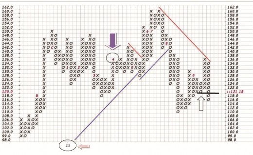
Let me first of all talk about how the chart is laid out. On the left and right of the chart are a column of numbers. These numbers are price ranges. If you start at the top you will see the number 162 and then right below it the number 160. Each box represents two points. At the bottom of the chart I circled and then pointed an arrow at the number 11. This number represents the year 2011. Therefore, at this point in the chart the chart moved from December to January. If you look straight up the column you will find the number 1. This one represents January. Just as the down arrow pointing to the number 4 represents April (the fourth month of the year).
Here is a little test, find the number 6 in the chart above and the number 7 in the body. The information between these two numbers represents all the activity during June and July. Notice how this is very different then how other charts are formated.
Columns of X's and O's
When you look at this chart you will obviously notice a bunch of columns of X's and O's. Notice that there are no O's in the X column and there are no X's in the O column. This is because X's represent a rising price and O's represent a falling price.
What this means is that P&F charts are either on a buy signal or on a sell signal at all times. There is no in between. This actually makes the chart very easy to read because it takes a significant move in the opposite direction to change from one type of column to the other.
The most current column is the column to the far right. In this particular chart we can see that the price is falling because we are in a column of O's. But the buy and sell signal is determined a little bit differently.
Notice the horizontal black line that I drew with the up arrow pointing to it. Notice that the current column of O's broke below the previous column of O's when it crossed the line that I drew. This is actually when a sell signal was generated.
A sell signal is generated when the chart is on a buy signal and the current column of O's breaks below the previous column of O's. A buy signal is generated when the chart is on a sell signal and the current column of X's exceeds the high of the previous column of X's.
Can you determine when this chart went on a buy signal prior to the current sell signal? The answer is found if you count six columns to your left. First of all notice the long column of O's that is the 13th column to the left. This generated a sell signal because it broke below the prior column of O's. It stayed on a sell signal until the column of X's that are the 6th column to the left. It then stayed on a buy signal until the current sell signal.
When you get used to what you are looking at you can easily see where the power of the chart is. Right now this chart has prices falling and is a downtrend.
How This Chart Can Help You
How does a P&F chart benefit you. You may not want to give up your candlestick chart or whatever type of chart is your favorite, but adding P&F charts to your toolbox can be very beneficial.
Let's just say that we felt this particular chart was experiencing a buying dip and we were looking at a place to get in. We've plotted our trend line on our candlestick chart and we are trying to time our entry for the best possible price.
We can then click over to a P&F chart and we see that it is in a downtrend and just went on a sell signal. This may tell us that there is more downside before we see the bounce. At this point we may want to wait until the chart switches to a column of X's or possible wait until it went on an actual buy signal. Once we buy into a stock and we are trying to calculate how long to stay in it before we take profits, the P&F chart can show us when the strength of the trend is changing. This can be very profitable information.
I can only speak for myself, but when I added P&F charting to my toolbox I increased my win percentage.

 Christmas Songs of the Seventies")


