10 CSS Tips For Blogger

CSS
CSS stands for Cascading Style Sheets.
CSS is used to personalize the appearance of a website, aiding the use of the site and making a more pleasing front.
While HTML still holds the information for the site (the basic text and actual content) CSS can give it a whole new look.
CSS Basics
Below is an example of some CSS code:
p{
font-family: georgia, "Times New Roman";
color: black;
text-decoration: underline;
}

.content quote{
background: rgb(200,200,200);
border-radius: 10px;
}
As you can see from the example, there are two simple parts to a CSS rule:
- The Selector
- The Declaration Block
The selector ('p' and '.content quote' in the example) tells the browser what portion of HTML to apply these effects to.
The other section, the declaration block, is where the actual work is done, setting values to properties, thus giving the website a different appearance.
While a detailed discussion of CSS would take up too much space in this article, you can learn more about it at:

How To Add CSS in Blogger
Adding CSS in Blogger is easier than you'd expect.
- On management screen for your blog, click the 'Template' option.
- Next, choose the orange button: 'Customize'.
- In the resulting screen, choose the option 'Advanced'.
- Now, at the bottom of the list, choose 'Add CSS'.


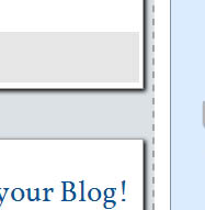
1: Rounded Corners
Sometimes, a squared corner looks harsh or out of place on a website. In this case, use border-radius. This will curve the corners of the selected element, making them appear rounded.
Note: While this property will affect the appearance of the borders of an element, you don't need borders to use this property, it will work just as well without them.
Border-radius needs a value to function, and can accept a px/em/in/etc. measurement, or a percentage.
Below is an example of how it would look in the stylesheet.
border-radius: 10px;
This example would make all four corners nicely rounded.
Note: As with most shorthand properties, you can define more than one value for border-radius to specify what to do for each corner. They are, in order, top-left, top-right, bottom-right, bottom-left. If bottom-left is omitted it is the same as top-right. If bottom-right is omitted it is the same as top-left. If top-right is omitted it is the same as top-left.
2: Transparency
Another change you can make, subtly or dramticlly, is transparency. This works especially well if you have an image behind the transparent element.
The basic transparency control is:
opacity: value; /* replace 'value' with a number between 0 and 1. */
But opacity controls the transparency of the entire element. If you want to change the opacity of just the background or just the text, you'll need rgba(). Here's how it works:
background-color: rgba(0,0,0,0.5);  /* This will make the background a half-transparent black. */

color: rgba(0,0,255,0.5);  /* This will make the text a half-transparent blue. */


3: Shadows
You can give a little depth and interest to your design by adding a shadow. There are two shadow propeties:
- box-shadow, which creates a shadow from the shape of the element.
- text-shadow, which creates a shadow of the text.
Both of these take the following values:
- x offset: The distance to offset the shadow from the element horizontally.
- y offset: The distance to offset the shadow from the element vertically.
- Blur: This value is optional, but provides the degree of blurring.
- Color: You can use rgb() to get a specific color, or rgba() to make a gentler shadow.
4: Links
Links are a very important part of any site. Done well, they pop, and allow the reader to know that they'll take him/her somewhere. Done poorly, they might go unnoticed, or distract from the content.
To select the links in your CSS, you need some special selectors.
- :link will select all unvisited links.
- :visited will select all visited links.
- :hover will select the link the user is hovering over.
- :active will select a link that's being clicked.
Note: The properties must be set in the order they appear here.
To use any of these selectors, mimic the following code:
p:hover{
color: red;
}

.content .sidebar h2:active{
color: blue;
}
5: Fonts
You can add some extra personality to your blog with unique fonts. The main property for changing a font is 'font-family'
To use it, you simply name the font you'd like to be used after it:
font-family: georgia; /* Voilà */
It's recommended that you give the server multiple options for the font, in case it can't use the one you selected. To do this, simply continue listing fonts, separating each one with a comma.
font-family: georgia, tahoma, "Times New Roman";
/* Multi-word fonts need surrounded by quotes */
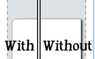
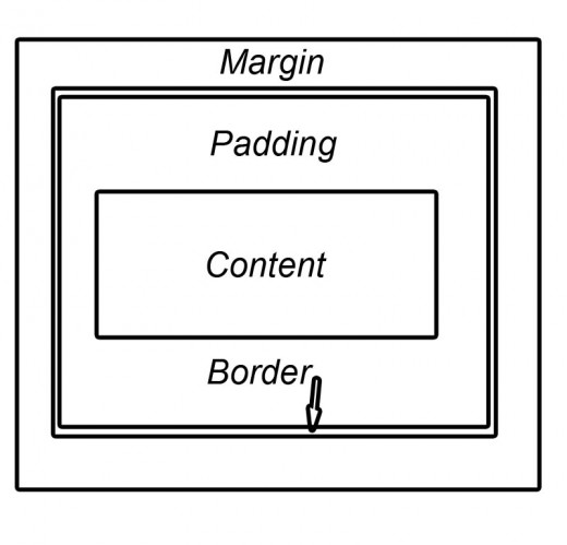
6: Padding and Margin
If you find that the spacing on an element isn't to your liking (which often happens when changing fonts or adding borders) you can use 'padding' and 'margin' to correct these problems.
Padding determines the distance between the content and the edge of the border.
Margin determines the distance between the border and other elements of the same hierarchy.
See the diagram below:
7: Outline Text
The text-shadow property can also be used to make outlined text. Use the following code:
text-shadow: 0px 0px 1px black;
This will create a thin black outline all around your text. As with the previous discussion of text-shadow, you can change the color of the shadow using words (white, black or brown), hexadecimal(#ffffff), rgb(20, 40, 40), or rgba(200,200,255,0.4).
8: ':first-letter'
This handy pseudo-selector, allows you to apply an effect to the first letter alone, and not the rest. This can be used for drop caps, or just fancy-ness.
My favorite effect here is:
p:first-letter{
font-size: 120%;
}
It just adds a little more pop to the paragraph opening.
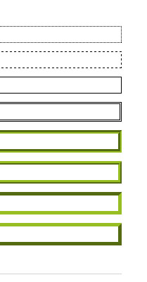
9: Borders
Give a little more attention to an area of your blog, or divide it from another, by adding a border.
Borders need three values:
- width
- style
- color
Your options for the style are:
- dotted
- dashed
- solid
- double
- groove
- ridge
- inset
- outset
border: 2px solid black;
border: 4px dashed rgb(40,50,10);
Stylize Your Text
Beyond picking a font, there are three other ways to customize the text:
- font-size
- font-weight
- font-variant
- font-style
- text-decoration
- text-transform
Font-size simply accepts a value to determine the size. This value can be absolute (50px, 2em) or relative (200%, 50%).
font-weight can accept 5 values:
- normal (this resets this value after a change)
- bold
- bolder
- lighter
- any hundred (100 - 900). Along this scale, 400 = normal, 700 = bold
font-variant adds some zing by making the text have small caps instead of lowercase letters. It's as simple as
font-variant: small-caps;
/* Replace 'small-caps' with normal to
   revert to regular text          */
font-style can make text italic or oblique. Another simple property to use, just write
font-style: italic;
/* or */
font-style: oblique
text-decoration can underline, over-line, or strikethrough your text. Just give it one of the following values:
- underline
- overline
- line-through
text-transform controls the capitalization of the text based on the value you give it:
- capitalize makes the first letter of every word uppercase.
- uppercase makes every letter uppercase.
- lowercase makes ever letter lowercase.
For More CSS Help...
- CSS-Tricks
Learn how to use CSS from articles, tutorials, examples, and a community of programmers. - CSS Reference
Free HTML CSS JavaScript DOM jQuery XML AJAX RSS ASP .NET PHP SQL tutorials, references, examples for web building. - CSS Reference
Free HTML CSS JavaScript DOM jQuery XML AJAX RSS ASP .NET PHP SQL tutorials, references, examples for web building.