Create Your Own Mobile Website!

Mobile Website Designing
Why Mobile Website is Important Today?
We might argue that we already have a website which users can access on their talking devices. Its true, but websites have been made with the desktop view in mind. They are large, have built in javascripts, flash components, tabs which might not function on the mobile devices. Even if they did work, the display would not be perfect or the website components would look so small that users wouldn't know where they have landed.
Even if they knew where they did land up, their tiny finger tips wouldn't be able to access or tap the right links, tabs, images as they would be quite small on these devices.
Most importantly, in the growing market of Android mobiles and mobile iphones, it is important that the websites we create functions properly on these devices.
Know What Your Target Audience Uses....
We have had websites for far too long. We have stayed over 2 decades on the desktop. We have lived with laptops and palmtops. We have lived our lives with people who are now getting technologically outdated. Technology has changed really fast in the last 5 years and now all the web is there on your finger tips and on a single tap. The world has now started using smart phones, tablets, notepads to access the world wide web.
The first step to making a successful mobile website is understanding who will be viewing your site. Mobile website users are usually busy doing something else like waiting in line, walking through town, or spending time out with friends. Their main focus is not necessarily your website so information needs to be quick and easy to access.
The main difference between mobile and desktop users is that mobile users browse the internet in "on-the-go" situations, where desktop users are in stationary and predictable environments.
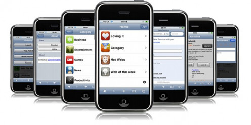
Web view difference!

Difference Between Mobile Websites and Mobile Apps:
Apps are great for more focused and personal experiences. They are miniature softwares residing on your mobile devices and connecting with the online environment where required. If the majority of your users arrive via direct traffic this could indicate that they bookmark your URL and that an app icon on the home screen would be of value. If most of your traffic comes via shared links an app alone won’t cut it as people need to be able to get to your content even if they haven’t installed your app. Apps would be able to utilise mobile features, whereas mobile websites would be able to do only that which is done on desktop websites.
Thus both need to treated differently.
DIY Steps to Mobile Site Building!
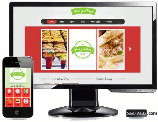
Thus the first step is to create a similar platform of the desktop environment into a mobile device environment.
We must get out of the transition or strict html bandwagon and get ready with the latest HTML5 and CSS3 bandwagon as this is mobile friendly and is required to start off with the mobile device recognition properties.
Major pointers to be kept in mind.
a) All HTML codes must be validated in html5 and CSS3 formats.
b) Fluid layouts - There are various kinds of mobile phones in the market and each one with a different dimension and resolution. One way to address this problem is the use fluid layouts that will automatically adjust to the screen size.
To accomplish this avoid setting widths in pixels and use percentages or ems instead. For instance, instead of width: 400px; use width: 100% or width: 1.0ems. There are conversion tables for px to ems which may be used to define your values.
c) Responsive designs: There is a spectrum of screen sizes and resolutions which is widening every day, and creating a different version of a website that targets each individual device which is not a practical way forward. It is the problem that responsive web design addresses head on and this is achieved by using a fluid grid as well as Media Queries.There are lots of articles on the internet explaining those concepts so we will not go deeper into it here.
d) Specific Stylesheets:
You can always target various mobile devices for better user-experience. For example, for targeting users browsing your site using Handheld devices you can use this in your website’s <head>.
You can find more on media types at this link: http://www.w3.org/TR/CSS2/media.html
Always design for the fingers and not for mouse. Click targets should be a minimum of 30-40px in size and use whitespace in between elements to ease clickability.
Its a must to keep download time in mind. Combine smaller images, like icons, into one file and use css to position them on the page. Avoid background images as they can reduce readability in certain lighting conditions.This reduces the number of http requests your device has to make. Lastly,reduce size of images and minify javascript.
Forms can be difficult to use on a mobile device. Since text is time consuming to enter, you would want to offer your user the convenience of radio buttons and lists, which they can choose from depending on what they need. Form labels should be top aligned rather than left aligned to save space. Forms should require the minimum amount of data input and should remember the data for the next time a user visits the site. Most browsers don't support plugins or extensions.
Targeting advertisements for different mobile devices!
If you are targeting websites to different geographies and to different devices, then can use a particular softwares like 24x7 or any other which can be used for proper targeting of advertisements for different devices. Of course, it is important to define the advertising space as per IAB standards. Do not clutter your advertisements as it will hide your web components.
You can get your guidelines here: http://www.iab.net/mobilewebmeasurementguidelines
Some Important Mobile Website Components:
A few tags are needed in the <head> section of the webpage to let the browser know that the page is ready to be viewed in a mobile browser like HandheldFriendly, MobileOptimized, viewport.
The Viewport META tag controls the logical dimensions and scaling of the browser viewport window in many smartphone browsers.
These could be Safari Mobile for the iPhone, Android browser, webOS browser in Palm Pre and Pixi devices, Opera Mini, Opera Mobile and BlackBerry browsers. The Viewport META tag indicates that the markup document is optimized for mobile devices.
AUTOMATIC MOBILE BROWSER DETECTION
Include an automatic “Mobile Browser Detection & Redirection” server-side script.
You may also use this as User Agent detection, where a server makes a decision on what to serve based on how an incoming browser describes its capabilities.
Other implementations feature real-time JavaScript requests to databases that also supply information on what a device can do.
For a really high user-base, make a dedicated application targeting various mobile interfaces. Facebook, Gmail, Twitter, Yahoo and many other big-companies have done this to be so successful. If you make an application for specific handsets then you no longer have to care about all the Fancy scripts etc. because you can then enhance the application your own way.
That's the Difference!
Testing your mobile website!
Testing is normally preferred by way of real devices as different devices will produce different results. However, the base can be checked via different sites and emulators available.
The first is to get your mobile website validated w3c:
http://validator.w3.org/mobile/
Then test in different online sites such as:
http://www.howtogomo.com/en/d/test-your-site/#gomo-meter
http://quirktools.com/screenfly/
http://www.mobilephoneemulator.com/
http://webdesign.about.com/od/testing/a/test-mobile-web-pages.htm
http://html.adobe.com/edge/inspect/
http://www.howtogomo.com/en/d/
If everything is alright here, then real devices should be used to do the final testing before putting it online. There is no substitute to real device testing.
Easy and quick mobile website creation!
Creating a website itself can be cumbersome, but you could also rely on ready to serve mobile webiste builders online. What they do is identify the critical components of your desktop website and convert them into mobile device website components. This is quick way to convert your current website into a mobile website, but what you won't get alongwith it is the correct version of website which you will like to have nor will you have the desired mobile website name. So altough these are good for smaller sites, I would recommend that you create or get created a mobile website to your style, if yours is a website catering to a large enough audience.
Some of the Mobile site builders include:
www.zoho.com/sites/mobile-website.html
www.dudamobile.com
www.mobstac.com
https://www.langoor.mobi/
www.ekomobi.com/
www.mofuse.com/
www.bmobilized.com/
There could be many more...
Be totally Web Compliant!


 for Website Building")
