- HubPages»
- Technology»
- Computers & Software»
- Computer Software»
- Office Software Suites»
- Microsoft Office
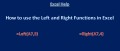
Creating Graphs in Microsoft Excel: Pie Charts, Bar Charts, and Histograms

Graphs in Microsoft Excel: An Introduction
Graphs are a particularly useful way to present data. To create graphs in Microsoft Excel, it is helpful to have already created a frequency distribution (since the format of your data in your frequency distribution is very similar to the format required to create a graph). For more on creating frequency distributions, check out this hub.
Although there are numerous graphs that can be created in Excel, I will cover three common types here: pie charts, bar charts, and histograms.
This guide will walk you through the step-by-step process of creating these basic graphs in Microsoft Excel. To illustrate how each graph is made, I will be using survey data extracted from the 2008 General Social Survey.

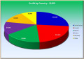
Pie Charts: A Good Way to Display Nominal-Level Data
Pie charts are typically used to display nominal-level data (although pie charts can be used to display ordinal-level data—it is more appropriate to display ordinal-level data in a bar chart). Pie charts are used only for qualitative variables, in other words, variables that are named. For more on levels of measurement, check out this hub.
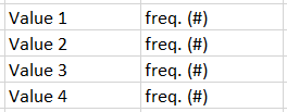
To create a Pie Chart for a particular variable, list all values in a column in Microsoft Excel. In the column directly to the right of the list of values, enter corresponding frequencies. Information for a pie chart must be presented in the format presented on the right (although the number of values and corresponding frequencies will vary):
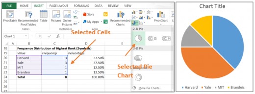
- Ex. To create a pie chart for Highest Ranking (Symbols), we can re-use the information included in our frequency distribution (we have already done the work!). Select only the values and the frequencies (not the percentages, column headings, total, etc.). To select, click on cell C20, hold down your mouse, and drag over the adjacent data. Click on the “insert” tab in Microsoft Excel. Locate the button for “insert pie or doughnut chart” and select the particular type of chart you would like to use from the drop-down menu (I would recommend using the simple 2-D Pie). Once you make your selection, a pie chart with default settings will appear in your spreadsheet.
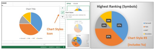
If you hover above the chart, three icons will appear to the right of it. These will allow you to modify your chart. The middle icon that looks like a paintbrush allows you to alter the “chart style.” For example, if we go to “chart styles” and select the third option down that appears, we can modify our Pie Chart to include percentages (results slightly differ from our frequency distribution due to Excel’s default rounding process). To edit the chart title double click on “Chart Title.” Charts can also be resized and moved within the spreadsheet.

Bar Charts: A Good Way to Display Ordinal-Level Data
Bar charts are used to display information on qualitative (nominal or ordinal-level) variables. In other words, they are useful for variables that are named, particularly those that are both named and ranked. To create a bar chart, data must be presented in the format depicted on the right (although the number of values and corresponding percentages) will vary.
If we have already created a histogram for the variable we are analyzing, we simply need to rearrange the information included in our frequency distribution so that the names of the values and the percentages are directly next to one another. It is best to manually re-enter information on percentages into a new block of cells (enter them in decimal form). Values may also be manually re-entered, but they may also be copied and pasted.
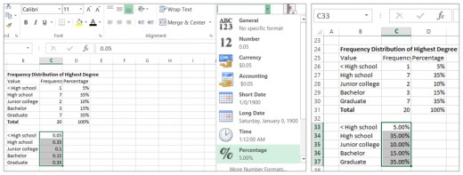
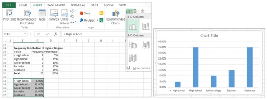
- Ex. Let’s create a bar chart of “Highest degree completed” using the subsample of the GSS 2008 data. Using the existing frequency distribution for this data, re-enter information on values and their corresponding percentages in a new block of cells on the spreadsheet in the correct format. The original frequency distribution and the re-typed information for the bar chart directly below it are presented in the image below (on the left). Before proceeding to create a bar chart, highlight the percentages (in decimal form), and select the arrow next to the drop-down menu in the top center of the home tab (also depicted in the image below on the left). Once you have selected “percentages,” your data will display as a percentage (presented below in the image on the right). This must be done correctly in order to create a bar chart.
We can now create a bar chart. Click and hold down your mouse in cell B33 to select select the values and percentages in the reformatted table. Click on the “insert” tab and click on the button corresonding to “column chart.” I recommend selecting a basic 2-D column chart. Once you have made your selection, your default bar chart will appear in your spreadsheet. As with pie charts, the style of your bar chart can be modified and the title can be edited by double-clicking on it.
Histograms: A Good Way to Display Interval-Ratio Level Data
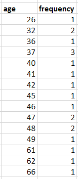
Histograms are used to display the distribution of quantitative variables graphically. Quantitative variables are often referred to as variables at the interval-ratio level of measurement, meaning they are characterized by numbers (rather than words). Histograms require data to be presented in the same format as for a pie chart (format displayed on the top right).
For example, to create a histogram for the variable age using the GSS 2008 subsample, it is first necessary to list all occurring values for age and their corresponding frequencies (as displayed on the bottom right).
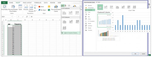
To create the graph, highlight all values for age and their corresponding frequencies. In the “insert” tab, select the button denoting “column chart”. From the drop-down menu select “more column charts.” From the provided selections that open in a new window, choose the option for a “column chart” that presents frequencies as single bars. Once selected, this histogram will appear in the spreadsheet. As always, the style of the chart can be altered (ex. to make bars adjacent) and the title can be edited by double clicking on it.

 Christmas Songs of the Seventies")
 and Bosu")