- HubPages»
- Technology»
- Computers & Software»
- Computer Software
Creating charts and graphs in Excel 2007

Using Excel 2007 to create graphs to display and summarise your data in a pictorial format is a popular and integral part of Excel. Excel 2007 changed the way graphs are created when compared to previous versions of Excel. The whole interface in Excel 2007 changed significantly from the menus seen in Excel 2003 and previous versions with the introduction of the ribbon. This hub was created as part of my learning process in adjusting from Excel 2003 to Excel 2007 and is a guide on the creation of graphs using Excel 2007.
Configuring your data before creating a chart or graph
Excel 2007 is far more precise when it comes to how it wants the data to be formatted before the graph it creates from your data will look as you would expect it to look. By way of example, I am trying to create a pie chart showing how may farm animals my farm has. I have reversed the columns to illustrate the difference in the graphs created by Excel. Of course, I can adjust the graph so that it displays correctly, but creating the data in a format Excel likes is much more straightforward.
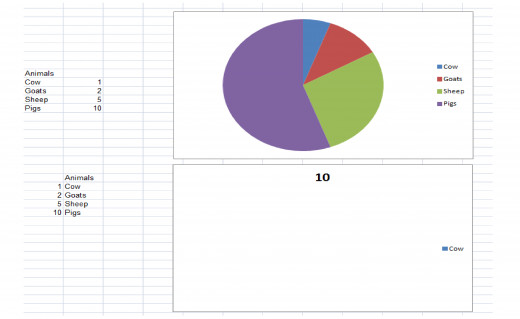
As you can see from my example, the top chart looks some way towards what you would expect and the bottom chart is a disaster. Excel clearly prefers the labels on the left and the data on the right!
Creating a chart or graph
To create a graph or chart once you have your data formatted correctly is very simple. Select your data and then click on the Insert tab and select the type of graph you wish to use. You will immediately notice that the chart wizard from Excel 2003 was a casualty of the upgrade to 2007 which is a great pity. Excel 2007 has the common graph types as buttons on this tab. Column, Line, Pie, Bar, Area, Scatter and Other charts all have their own buttons. Selecting the Column button for example gives you all the sub-categories of column graphs and at the very bottom, you can select from all chart types.
Configuring your graph
Once you have selected and chosen your chart or graph type (I chose a pie chart) Excel will create your chart and also create three new tabs just for charts Design, Layout and Format.
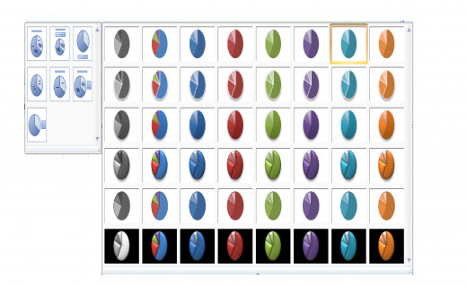
Design tab
On the Design tab, you are able to select from a large number of Chart Styles and Chart Layouts to further customise the look of your graph.
To change the data displayed in your chart of graph, select the Select Data button on the Design tab. You can also change the chart type, save the chart or graph as a template and move the graph all on the Design tab.
Layout tab
The layout tab has a number of very useful functions available to further polish your chart and also add many elements that may be missing such as a title or other labels depending on the style and layout you have chosen while in the design phase of graph or chart creation
Excel has a very useful tool on the left hand end of the Layout tab. You will see from my example below that mine is currently set to Legend. If I were to use the drop down and select Series 1 Data Labels then I would be able to edit or move those labels so that they were positioned exactly where I wanted them and in the font and size I desire as well.
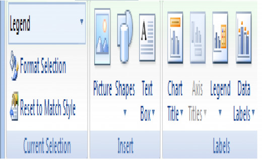
As you can see from the Layout tab, you can add, move and also configure text boxes, titles, legends as well as configuring the axes, adding removing gridlines. As mine is a pie chart, many of those options are not available, but should I decide to change it to a bar chart for example (via the option on the Design tab), some of those greyed out options become selectable.
Format tab
The format tab allows you to format the text in a number of funky ways adding glow effects, shadows or even reflections to the text used in your graph. You can also precisely resize your graph using inches, should you need to have your graphs sized exactly (particularly useful if you require a number of graphs that look identical in their formatting.
Changing data for your graph
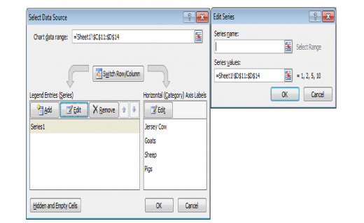
As I mentioned above, Excel is very particular about the data being correctly formatted in order for it to be able to create meaningful graphs. If your data is not formatted exactly as Excel wants it and you have too much data to reformat (or you simply don’t want to for whatever reason) never fear. Simply create the graph and then click on the Design tab and choose the Select Data button. It is important to understand exactly what Excel is looking for as often what is in there to begin with will cause Excel to error or produce an even stranger graph.
For my example, the data goes on the Left (Legend Series) and the Horizontal (Category) Axis Labels go on the right. You can see that my range is
=Sheet1!$D$11:$D$14. Excel will accept this as a range and my graph will now look as I want it to.
Conclusion
Creating graphs or charts in Excel 2007 despite the lack of the wizard is still relatively straightforward with a wide range of styles and layouts only a click away. It is very easy to create some striking and even funky graphs using the text formatting and 3D graph styles available now in Excel 2007. The only thing to watch is your data formatting which can sometimes make graphs tricky to create. Once you are aware of this, creating graphs is as easy as it was in previous versions of Excel. I do hope that you have enjoyed reading this hub and have found it useful. Please feel free to leave any comments or suggestions you may have below. Thanks for reading!
I also have a number of other hubs on aspects of Excel 2007, covering everything from Conditional Formatting to creating charts and graphs. I have an Index hub which also covers how I successfully transitioned from Excel 2003 to 2007 as well as outlining my other Excel 2007 hubs which can be found here
Related

How to use, create and configure ActiveX Controls List Boxes in Excel 2007 and Excel 2010

Detailed Introduction to Microsoft Office Excel 2007

Creating an Amortization loan or mortgage schedule using Excel 2007 and Excel 2010

User Interface design using a UserForm in Excel 2007 and Excel 2010

How to write Visual Basic code to configure a User Interface created using a UserForm in Excel 2007 and Excel 2010


