How to Choose a Responsive Design Template for Your Website
With mobile traffic on the rise, it’s now more important than ever to have your website optimized for smartphones and tablet PCs. According to various reports, there has been a significant increase in mobile traffic since 20131. Around 40 percent of traffic comes from mobile devices2. And now Google wants your website to be mobile-friendly to ensure that users are satisfied with the overall navigation, design and content on mobile.
The best way to make your site optimized for a smartphone is to have a mobile-friendly design. This way you won’t be losing a chunk of mobile traffic to your competitor. Thankfully, there are several pre-made responsive design templates available for Blogger or WordPress-powered websites. This step-by-step guide will help you choose the right theme for your site:
Find a Suitable Template for Your Website
Does your website provide news on politics or technology? Is it an ecommerce or a recipe site? No matter what your website niche is, you will need to find a suitable theme for it. There are plenty of responsive design templates that will make your site look more attractive and polished. Designers know what a webmaster needs and so creates a theme that suits his website niche. Nowadays, several sites provide free and premium templates:
For Blogger
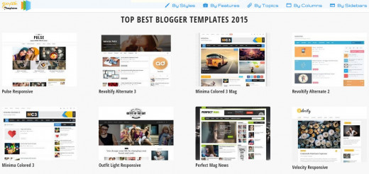
- Gooyaabi: A blogger theme aggregator, this website provides the newest blogger templates. It categorizes each theme into SEO-Ready, Ads-Ready and other sections. Make sure you go to the “Responsive” section to check out the latest themes. You can also search for a template for your site niche in the “Topics” section. But make sure it is mobile-friendly.
- New Blogger Themes: NBT is another great site that offers a collection of amazing templates. You can filter your search results by column or color.
- Sora Templates: One of the best sites that offer themes for blogger hosted sites. You will find some of the coolest magazine templates for your news blog.
For WordPress
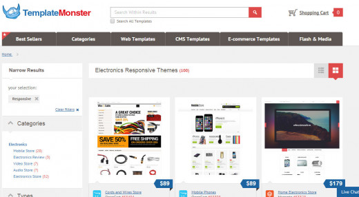
You will find more WP themes than blogger themes as most people use WordPress nowadays. The official site has a nice collection of themes for your WP-powered website, but you might want to look elsewhere, especially if you need the one that fits your niche website. Check out these sites that offer the best responsive themes:
- ThemeForest: Probably the most popular one-stop theme shop for your website needs, ThemeForest has a huge collection of premium themes. Each template is crafted to suit your needs. While most of them are a bit pricey, they are easy to install, customizable and compatible with all browsers.
- TemplateMonster: This site may have that perfect mobile-friendly theme for your website. All themes are divided into different topics such as business, car repair, gaming, travel guide etc.
- Elegant Themes: Has an excellent collection of WP templates categorized into different types of niches. There’s a special section for responsive themes. Make sure you visit that section first before searching elsewhere.
Besides these sites, check out sites like HongKiat, DesignCrazed and Colorlib to get a list of some of templates. Bookmark them as they get updated with new themes regularly.
Check Whether the Template Is Mobile-Friendly or Not
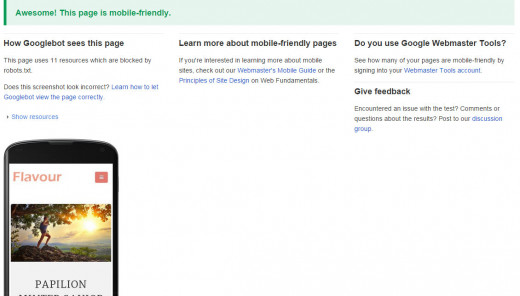
Most sites mentioned above will claim their themes as responsive, but you should still check whether the template you have chosen is optimized for smartphones or not before uploading it to your site. Use Google’s Mobile-friendly testing tool to find out whether your template is ready. Most sites now provide a demo of their templates. You just need to copy the demo site’s URL and paste it into the tool. Now hit the analyze button to see whether it passes the test.
Is Your Website Optimized For Mobile Devices?
Another way to test a theme’s responsiveness is to upload it to your website (make sure you have backed up your old template first) and then find out whether the site has a grey “mobile-friendly” label just beside it on Google’s mobile search engine results pages. To find this out, you will need to search your website on your smartphone. Type your site’s name on the search box and look for that elusive grey label.

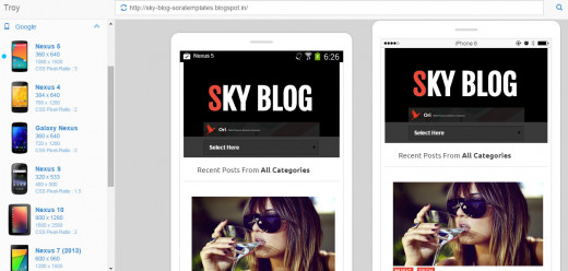
Don’t want to upload your new template? Just use a mobile phone emulator to test its responsiveness. Mobiletest.me offers some great mobile emulation choices, including an Apple iPhone 5, HTC One and Nokia Lumia 920. If you want more emulation choices, just visit troy.labs.daum.net. You will find a host of mobile phones categorized into size and company. It offers various screen sizes ranging from 360x640 to 800x1280. Copy and paste the demo URL into these sites to test whether they are mobile-friendly or not.
Things to Remember Before Uploading the New Responsive Template:
Now that have selected a theme, it’s time you check out these tips before you upload it to your website:
- Make sure that the template supports all resolutions. Always test it by choosing the lowest resolution to the highest and check whether the navigation bar and gadgets resize according to the mobile’s screen. Check every resolution and make sure there aren’t any flaws in its responsiveness.
- Check whether the navigation bar gets sized down for the mobile screen. Most responsive templates switch to a drop-down menu, which looks pretty good on mobile devices.
- Does the template offer responsive ads? It’s not necessary as Adsense offers ad units that are optimized for multiple devices. However, if you are using a third-party ad network, make sure they provide responsive ads. And if they don’t, then you must choose a theme with optimized ads, especially if you want your site to show the header ad on every device.
- There should not be too much space between the navigation bar and title or header and navbar. More space would push down the content below and too much white space may be a big turn-off and won’t look good on a mobile device.
- Does the theme have social sharing buttons? Most templates will have social sharing buttons, but you should choose the ones that have buttons placed after the post body. Social sharing buttons placed just below the post title will push the content lower. Of course all social sharing buttons load asynchronously, so there won’t be any problem with the site load speed. However, I would still prefer those themes that have buttons placed at the end of the post than the ones with buttons placed below post title.
Those were some key things to remember before uploading a responsive design template to your website. You should also visit Google Webmaster Tools to review mobile usability errors. Just go to Search Traffic > Mobile Usability and see whether it has any errors or not.
References:
1 http://blog.woorank.com/2015/02/reasons-to-have-mobile-friendly-website/
2 http://www.clickz.com/clickz/column/2388915/why-mobile-web-still-matters-in-2015


