How to Create a Responsive Web Page Using Bootstrap
Bootstrap is an open source library for designing responsive websites. It provides ready to use CSS classes and JavaScript extensions. Websites that have responsive layout adjust themselves to look good on various devices with different screen sizes such as desktop, smartphone, etc.
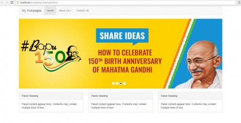
Following is the layout of a webpage we want to create.
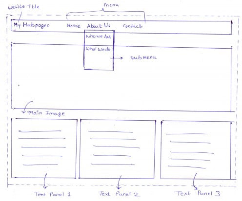
The layout of a web page given in above figure is very familiar to us. It has a menu bar, a banner image and three panels to display text. In this article, we design this layout by keeping in mind that it should be responsive. The following steps describe achieving such task.
Viewport
Viewport can be defined using <meta> tag. Viewport enables a webpage to render properly on all devices.
<meta name="viewport" content="width=device-width, initial-scale=1">
Bootstrap Library
To use bootstrap classes its library has to be included. It can be included using one of the following ways.
1. Include from a local copy
2. Include from Content Delivery Network (CDN)
I am using the second method in this example.
<link rel="stylesheet" href="https://maxcdn.bootstrapcdn.com/bootstrap/3.3.7/css/bootstrap.min.css">
<script src="https://ajax.googleapis.com/ajax/libs/jquery/3.2.0/jquery.min.js"></script>
<script src="https://maxcdn.bootstrapcdn.com/bootstrap/3.3.7/js/bootstrap.min.js"></script>
Point to Remember
Both the CSS and Javascript of Bootstrap must be included!
Bootstrap Container
A bootstrap container is used to define a grid system to hold all elements of a webpage. A container contains row elements and row elements contain column elements to make a grid system.
The bootstrap library provides 'container' class to define a container. A container can be defined as follows:
<div class="container">

<!-- Place your code here -->

</div>
Menu Bar
Our layout contains a menubar. Menubar display title of website and menu items, i.e., 'home', 'about us', 'contact us'. Also, note that 'about us' menu has two more sub-menu items i.e. 'who we are?' and 'what we do?'. The following code creates a menu bar.
<nav class="navbar navbar-default">
        <div class="container-fluid">
          <div class="navbar-header">
            <button type="button" class="navbar-toggle collapsed" data-toggle="collapse" data-target="#navbar" aria-expanded="false" aria-controls="navbar">
              <span class="sr-only">Toggle navigation</span>
              <span class="icon-bar"></span>
              <span class="icon-bar"></span>
              <span class="icon-bar"></span>
            </button>
            <a class="navbar-brand" href="#">My Hubpages</a>
          </div>
          <div id="navbar" class="navbar-collapse collapse">
            <ul class="nav navbar-nav">
              <li class="active"><a href="#">Home</a></li>
             <li class="dropdown">
                <a href="#" class="dropdown-toggle" data-toggle="dropdown" role="button" aria-haspopup="true" aria-expanded="false">About Us<span class="caret"></span></a>
                <ul class="dropdown-menu">
                  <li><a href="#">Who We Are?</a></li>
                  <li><a href="#">What We Do?</a></li>
                </ul>
              </li>
			  <li><a href="#">Contact Us</a></li>
            </ul>

      </div>
     </div>
</nav>
Banner Image
Banner image is defined using <img> tag. Further, the bootstrap class, ‘img-responsive’, is applied to <img> tag to make it responsive. The <img> tag is contained inside another bootstrap class ‘col-md-12’. This class fills the element horizontally in the container.
<div class="row">
	<div class="col-md-12">
	  	<img src="slide.jpg" class="img-responsive" alt="main image"/>
	</div>
</div>
Panels
Bootstrap panels are used to display text and images. A panel may also contain header or footer or both. To create a panel, ‘panel’ class is provided in the library. In this example, a contextual class called ‘panel-default’ is also used which creates a default panel.
In this example, all three panels are nested within columns each defined with ‘col-md-4’ class. Unlike ‘col-md-12’ which fill whole space in the container, ‘col-md-4’ only takes around 33% of the width. This is how we get all three panels fit in one row. Following code illustrate this.
Point to Remember
'container', 'col-md-12', 'col-md-4', and 'row' classes used in this examples are always applied to 'div' element.
<div class="row">
	   <div class="col-md-4">
		<div class="panel panel-default">
			  <div class="panel-heading">Panel Heading</div>
			  <div class="panel-body">Panel content appear here. Contents may contain multiple lines of text.</div>
		</div>
		</div>

		<div class="col-md-4">
		<div class="panel panel-default">
			  <div class="panel-heading">Panel Heading</div>
			  <div class="panel-body">Panel content appear here. Contents may contain multiple lines of text.</div>
		</div>
		</div>

		<div class="col-md-4">
		<div class="panel panel-default">
			  <div class="panel-heading">Panel Heading</div>
			  <div class="panel-body">Panel content appear here. Contents may contain multiple lines of text.</div>
		</div>
	</div>
</div>
Output
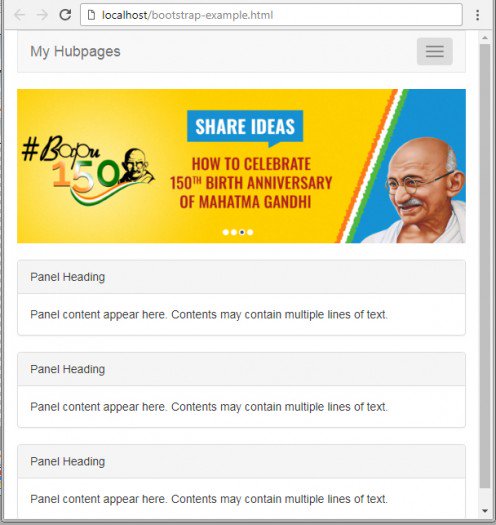
The final step is to run your code and see the magic of bootstrap!
