How to design perfect webpage layouts in HTML

Designing a Layout for your Website project is neither a big task, nor a problem but designing a perfect webpage or website layout, which will be displayed perfectly on every screen, resolution is little bit Daunting task. Presently, the lowest screen resolution on laptops or computers used by big ratio of internet users is 800*600, Then comes 1024*768, 1280*800 and so on. As per My Knowledge, Most designers including me prefer to design layouts while keeping 1024*768 screen resolutions as target one's or make it so dynamic that layout automatically changes it's size according to screen resolutions of visitors computer.
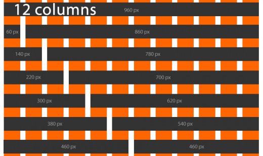
Presently, Most of the web designers around the world design new layouts based on 960 grid systems as It is assumed to be an Industry standard and most browsers render it without any problems on any screen resolutions. Do not confuse with term 'Grid Systems', It is just a name given to all the layouts whose maximum width is 960px. Well, Some design rules need to be followed while designing such layouts in order to catch visitors attention and no one is going to tell you because it varies from designer to designer (A little bit).
960 Grid System
CSS rules that needs focus while designing a perfect layout
- Width - 960px maximum is recommended,
- Margins,
- Padding's,
- Borders,
- Float,
- Position.
A most basic layout which is popular among designers today includes header, footer, right-sidebar. In the last Para, I used the term 'Dynamic Layout', It is not so problematic/confusing, I was just referencing to layouts whose width and height changes automatically according to 'user's computer screen resolution' and renders accordingly. To create Such layout, you'd need to define width and height of various page elements in %'s (percents) like 20%, 100%, 80% etc. So that page blocks will adjust their size accordingly and instead of using pixels or inch to define size.
A 100% size will cover all the space of browser but look and feels will either become better or worst on different resolution. So, such layouts were mostly avoided by most designers but these layouts also have positive benefits (Which you should think as according to your project requirements).
Last and Most interesting point: Designing a perfect layout is just only in your hands as because you only knows what you need and no one is good enough to teach you (If someone tried, You're good enough to modify it).
After designing a layout, you can change looks and feels of it by using related images. Believe, Images have so much powers that your simple layout would look like a brand in himself.
For Xample

Thank you for reading and visiting,
A Advanced programmer and web-designer by full Interests (But not a good Teacher).


 With Cloudflare")