Quick Tips For Using Free Google Web Fonts In Standalone Webpage
Let me write a brief but helpful article on the use of web fonts in your webpage, and also how you can use Google’s free web fonts in standalone web pages.
If you are a web designer you will know that typography is the foundation of any web design. If you aren’t a web designer, you’d still have noticed how some websites use stunning typefaces that give edge to their look and enhance the readability.
Users have a wide choice of fonts available to them. And many, like the Google web fonts, are free to use. What’s more, it is easy too to use them as you’ll shortly see in this article.
A word of caution though!
Being free doesn’t mean you would use any web font for your website. That’s not a wise thing to do. There always has to be some balance to decide which fonts to use and for what purpose.
Pros & Cons of ‘Difficult’ Fonts
In the report, If it is hard to read, it is hard to do, the researchers have found that people who read a set of instructions in a simple font (Arial) take nearly half the time (8.2 minutes) to follow them than when (15.1 minutes) they are written in a hard-to-read font (Brush).
Again the same researchers also made a surprising discovery.
They found that there are situations when where fancy, hard-to-read fonts can actually work better than simple ones.
For example in restaurant menu, people considered hard-to-read items-list as an indication of more skills of the chef. This is revealing indeed!
Next time you start a restaurant, keep this in mind!
Things To Know
Coming back to web fonts, what are the basic parameters to consider? Here are they irrespective of which font you use:
- Point size
- Line length
- Leading or the line spacing
- Tracking or the spaces between groups of letters, and
- Kerning or the space between pairs of letters
Okay, those are important measurements responsible for a font’s appearance, but there are some other external design factors as well that contribute heavily to the appearance of the font.
- Color of the font to contrast with the color of the background
- Don’t go overboard with more than 3-4 fonts in a webpage
- Size of the fonts in headings and main body should clearly contrast, but not too much
- Overall readability should be pleasing vis-à-vis other elements in the page
Using Google’s Free Fonts
Let me now show you how to use the free Google web fonts in standalone pages in your website. It’s simple really.
Here are the codes to use the fonts Open Sans Condensed, PT Sans, and Droid Sans in your website.
USING STANDARD CODE

<html>
<head>
<link rel="stylesheet" type="text/css" href="http://fonts.googleapis.com/css?family=Open+Sans+Condensed:300|PT+Sans|Droid+Sans">
<style>
body { font-family: 'Open Sans Condensed'; font-weight: 300; font-size: 48px; }
p { font-family: 'Droid Sans'; font-size: 28px; color: #C90;}
</style>
</head>
<body>
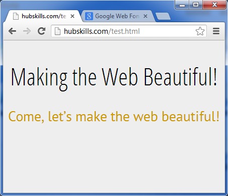
<div>Making the Web Beautiful!</div>
<p> Come, letâs make the web beautiful!</p>
</body>
</html>
USING @import CODE

<html>
<head>
<style type='text/css'>
@import url(http://fonts.googleapis.com/css?family=Open+Sans+Condensed:300|PT+Sans|Droid+Sans);
body { font-family: 'Open Sans Condensed'; font-weight: 300; font-size: 48px; }
p { font-family: 'Droid Sans'; font-size: 28px; color: #C90;}
</style>
</head>
<body>
<div>Making the Web Beautiful!</div>
<p> Come, let's make the web beautiful!</p>
</body>
</html>
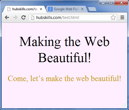
The following 2 images show the difference between without and with the use of the fonts above.
Finally…
Remember there are free plugins that enable you to use Google web fonts in your WordPress blog. This I’ll show in a future article.
Meanwhile, don’t hesitate to check out my detail blog article, Complete Guide To Use Free Exciting Google Web Fonts In Your Website, for more on the subject.
Lastly, watch my video below that encapsulates all that I’ve spoken above.
Comments and suggestions are most welcome.

