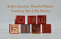
The Evolution of a Strange Website


Eleven years ago before my first novel hit bookstores, I created an author’s website. Because I am a thrifty Scotsman, I didn’t want to pay anyone to help me design or maintain it. Thus, with no prior knowledge or skill, I threw myself into cyberspace. I thought I knew what I was doing.
I didn’t. I still don’t.
Recently I went to web.archive.org and used the Internet Archive Wayback Machine to see what a mess I had made of my website over the years, and I discovered that they still had screen shots of my weak attempts at home pages from 2001 to 2011. I had hoped that these pages had died horrible deaths somewhere in cyberspace, but there they were—and still are—for anyone with an Internet connection to see.
If you are planning to create and maintain your own website, look (and laugh) at my feeble attempts but take heed of the many mistakes I have made. Each of my 20 different home pages is pictured and described below for your reading and viewing amusement. Don’t be surprised if you find yourself wincing and scratching your head as you chuckle.
I still do.
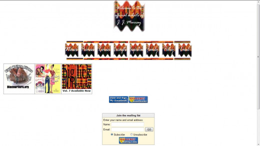
February 2001
Look at the title graphic from February 2001 above. That is the home page of the first website I published, and in a word: yuck.
I chose Tripod.com (along with 6 million other users) because it was free. I didn’t think viewers would mind being blasted with advertising. I was, of course, wrong. I only had one title available (Renee and Jay) to “hype” at the time, and I thought the Papyrus font was the best way to hype it. I was, of course, wrong again.
I packed everything into the website that I thought authors should include. I gave a preview of the novel, reviews of the novel, and an excerpt from the novel. I included a page of selected poetry, an “Email the author” button, an “About the Author” page, a guestbook, a visitor counter, and lots of Kente cloth bars and buttons, which are now empty boxes on the screen above. I even included a “Summer 2001 Tour” page, which consisted of one local book signing, a book signing in Philadelphia, and a reading at a local bar. I chose black and yellow for the background because I am a Pittsburgh Steelers fan. I was, of course, extremely wrong about that choice, too.
You can view what’s left of this pitiful, original site by looking at the graphic at the top of this article. You will, however, find that it is much more hilarious (and somewhat nauseating) to navigate around the original archived site by clicking here.
May 2001
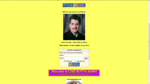
I dropped the black “stripe” and added a logo, a welcome message, a mailing list, and a few banners. I thought banners were cool, especially hot pink ones. Again, I was wrong. I also added a picture of myself and urged my viewers to “click on that ‘third elbow’ in the middle of my face” to continue. What was I thinking? I wonder how often viewers lined up the cursor to click on my nose. They really couldn't miss it.
June 2001
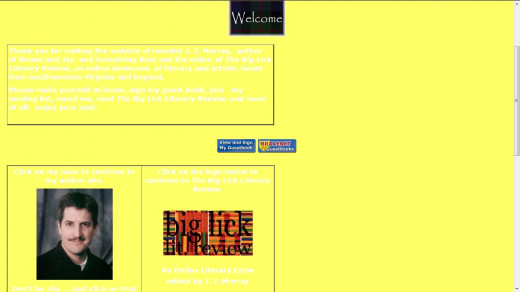
I must have discovered tables by this time, though I obviously didn’t know how to center them. I used white lettering on a yellow background in an extremely lame attempt to maintain a color scheme. I know you can barely see the words. I must have had better eyesight then.
I also added my literary e-zine, The Big Lick Literary Review, which would last for only two years. All 18 issues of this e-zine are still available through web.archive.org, and they all look better than my early home pages. I have no idea why. I also have no idea why I inexplicably mixed Kente cloth dividers with tartan plaid buttons. See this unholy mess here. (Note: If you click on my nose when you get there, you’ll also see how crummy my scanner was at the time. The cover looks extremely tepid. You’ll also see a campy book signing picture).
December 2001
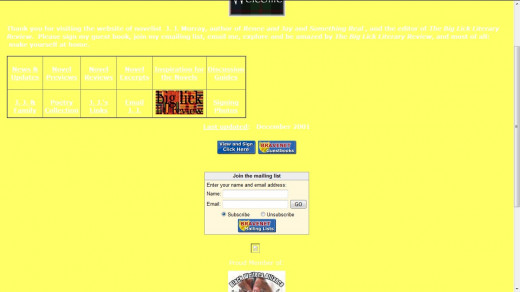
I obviously enjoyed tables immensely because I created a long, skinny one here. Once I like something, I tend to overdo it. I added “News and Updates,” “Inspiration for the Novels,” “Discussion Guides,” family and signing photos, and something called “J. J.’s Links.” I have no idea what those links were, and I suspect they didn’t work very well anyway. I was always forgetting important components like "www" and "http."
May 2002
No more yellow background (good), but what's up with the buttons? This was a major overhaul that took many hours to create. I know I shouldn't have wasted my time, but I was on a Kente cloth high. I created a series of buttons that were almost impossible to read because of a skinny script font. I also displayed covers for the first time in a collage (Why a collage?), a copyright notice (as if anyone would ever borrow anything of value from my website), and a pitch for Booksense.com, a website for independent booksellers. I thought it almost looked slightly professional. I know, I know. It was still a mess.
March 2003
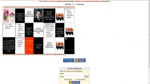
I have no idea what I was thinking here—or if I was thinking at all. I tried to fit links to every page on my website on the home page, so I created a table with 21 boxes--and colors from the Halloween palette. I plead temporary insanity. I might have been trying to recreate a checkerboard, but what a collision of colors! Walt Disney would have surely rejected me. Notice how few of the boxes in the table are the same size. I was definitely pixel-challenged.
August 2003
To further complicate my page, I added another table for author friends of mine and a banner button for a group of students I taught at the bottom. What a mélange of ideas! It all seemed so purposeless. It was fast becoming a growing menace to the Internet. I wonder why no one shut me down ...
December 2003
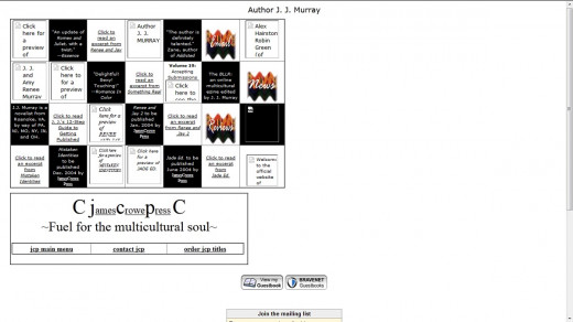
Yes, the table now has 28 boxes. My insanity wasn't necessarily temporary, I guess. This version also brings back some stressful memories. I included information for my first “publishing company” and my first self-published title. Somehow I figured out how to take orders online and was able to sell 500+ copies in two months through this goofy home page. I applaud any customer who was able to figure out where to click. Notice another quasi-checkerboard taking shape.
March 2004
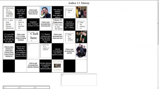
And now I had outdone myself. I somehow put 35 boxes in a table on the home page of one website, perhaps the most boxes ever put on a home page in cyberspace history. I must have been trying to set a world record. I wonder often if I actually did.
It also seems that I wised up and included an Amazon.com link to my self-published titles to simplify my work. Please feel free to laugh heartily at my checkerboard. You may need to sip some water now--or something stronger. Oh, and don't try to play checkers on your screen. I royally screwed up the pattern.
June 2004
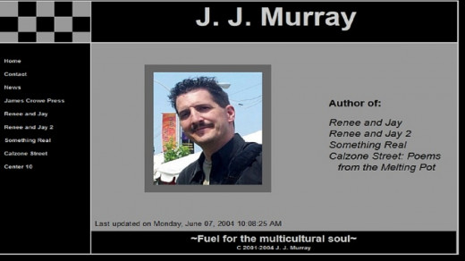
It was a miracle! I had finally broken down and found a web host (at a thrifty $19.95/month) to make my website more professional looking, mainly because I was finally making money from my books. Those were literally the salad days, the days and nights of traveling to author’s conferences, staying in two-star hotels, and eating rubbery chicken and wilting salad.
I chose a checkerboard template (of course), thought up a catchy slogan (“fuel for the multicultural soul”), and ultimately simplified my life. There would be no more boxes, tables, homemade buttons, tartan plaids, or Kente cloth for me. There would be only an author picture (yes, that's hair gel) and dull colors for my website from now on. The common “wisdom” back then was to create simple, one-screen home pages for viewers to see in a click, and I tried to oblige them. I was, of course, wrong again.
August 2005
After over a year of just my mug shot and hair gel on the home page, I finally included a cover, which really brightened up the page considerably--until I dulled all that nice color with a dark gray frame. I also obviously discovered Firefox, which I still use exclusively. I am such a renegade. Why, though, would I hype an Internet browser on my home page?
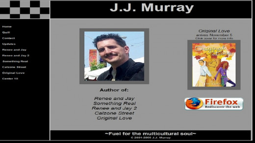
November 2005
Notice how I swapped myself for a cover and shrunk myself in the process. I dumped the Firefox logo and added a few reviews and a list of titles with publication dates in parentheses, as if somehow listing those dates was important. I probably included the dates so that I could keep my books straight.
April 2006
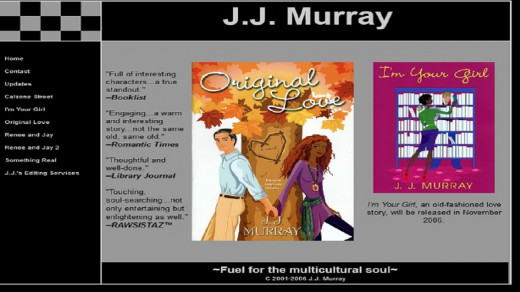
I removed my face from the home page (never to return), and my sales increased dramatically. Just kidding—a little. I highlighted not one but two covers for the first time and included a button for “J. J.’s Editing Services” to signal the beginning of my freelance editing days. Those days would end several years later in a cloud of unpaid bills from some of my clients. I must have been colorblind when I revised this home page, though. Black and gray do not go with fall colors and purple.
December 2006
Go ahead and say it. I said, "Oh no," but the screen didn't change. As soon as my website started to look somewhat professional, I bollixed it up with buttons “ripped” from book covers. I wasted hours fashioning those buttons using the vague justification that "no other author has buttons like these." I didn't know at the time that there was a good reason for that--they look tacky.
I increased the size of my current cover (good) and curiously framed it in white (bad). Don't ask me why. I also squeezed in a long list of reviews in 10-point type and butted them up against the edge of the cover. Again, please don't ask me why.
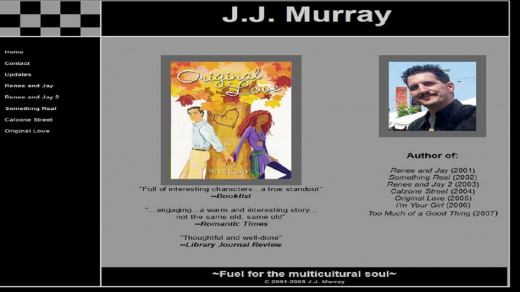
May 2007
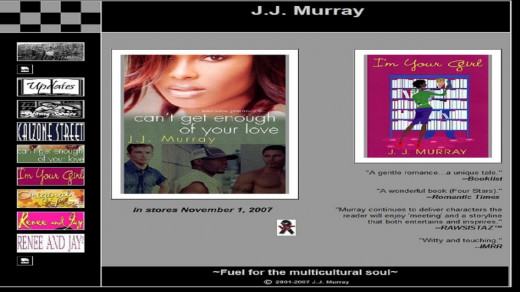
I included a new book to sell, the same clutter of buttons (although they’ve been rearranged), and a Virginia Tech memorial ribbon. I still have no clues why I used white frames for my covers, but I was compelled to frame them since my new scanner botched up the edges often. Oh, those buttons have got to go.
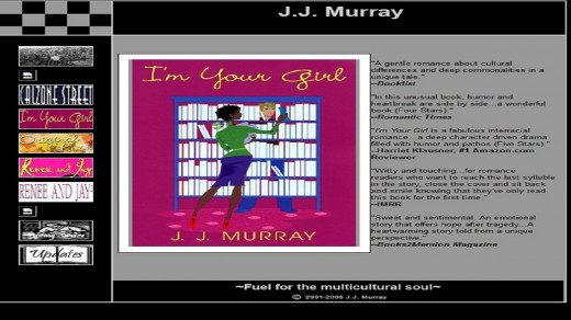
April 2008
Thus began my nihilist phase. I decided to simplify to the point of starkness. I would showcase dull simplicity in all its glory. Every page of my website became exclusively black and white overnight. This home page became somewhat (dare I say it) "normal" again. I used normal navigation instead of those strange cover buttons, scaled back to one book cover, and used 8-point type. I reasoned that viewers could magnify the page if they couldn't see it. I retired the checkerboard and editing service and added a page entitled, "Twelve Steps to Publication," mainly to thwart would-be authors' emails asking me, "How do I get published?"
December 2008
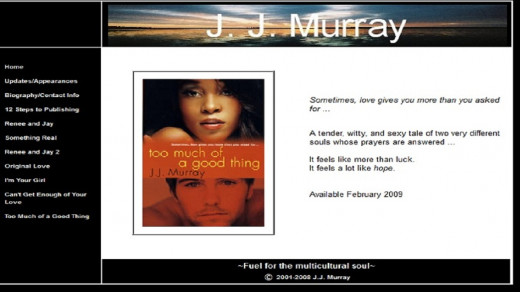
My nihilist phase ended when my name made a bold return. I emblazoned it on a logo made from a Canadian lake scene. For some reason I only hyped my next book, not my current book. That wasn’t very wise. And I still had a silly frame around my cover. At least the frame blended into the background.
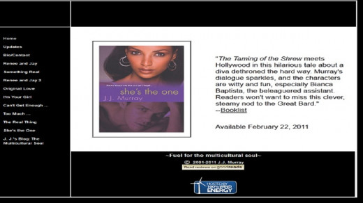
May 2010
For the next 18 months, I made few changes. I added a blog since other authors had them, but I only used it once. I employed larger type thanks to numerous complaints (mainly from relatives, who were the only ones who could stomach my website), and I touted my membership at Goodreads.com. The yellow cover did look kind of nice, though. It reminded me of my Pittsburgh Steelers home page from 2001.
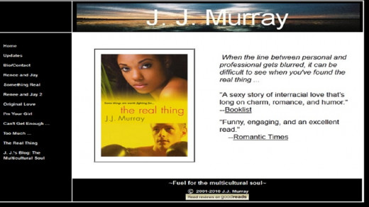
February 2011
In a fit of sanity, I removed my name again. I really wish I could tell you why. But look at the bottom of the page. My website was hosted by wind energy. I suppose it’s a fair trade to lose your name and become kind to the environment. My website had become namelessly quiet, energy-efficient, ... and boring as watching C-Span. I needed to make some changes ...
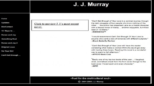
Currently
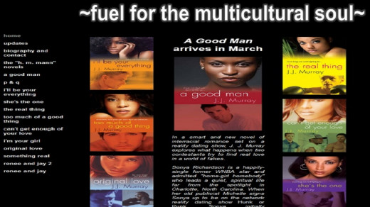
... and I made a bunch of them. I gave my website a complete overhaul earlier this year (2012), and I don’t know why I didn’t do it earlier. Color! That’s what’s been missing! My publisher has been “branding” me with colorful covers for years, and it’s about time I took advantage of them. I have even left “spaces” for two upcoming Kensington titles. Oh sure, I still have the black and white thing going, but that's what I write about--so there.
I know my website isn’t going to win any awards (I am open to any and all suggestions for improvement as long as they're free), but for now I am content. The blog is gone (replaced by articles on HubPages.com), I have monetized the Kindle titles I offer on the site, and though viewers have to do a fair amount of scrolling to see the entire home page, it’s all here and it’s still all mine--warts and quirks and color schemes and all.
And I'm sure that in, oh, a few months, I'll overhaul it again. I may even bring back tables and boxes ...

10 things I have learned the hard way
- Never use your favorite football team’s colors for your home page’s background because everyone does not like your team.
- Only use white letters if the background is dark, and never use the Papyrus font for anything you want your viewers to read and understand easily.
- Checkerboards are necessary for the playing of checkers and chess; they are not necessary for “trademarking” a website.
- An author’s face, if it resembles mine, will not sell many books.
- Book covers, especially colorful ones, sell books in abundance--use them in abundance.
- Tables are useful to eat upon, not to cover a huge chunk of a home page.
- Some bells and whistles (visitor counters, e-mailing lists, guest books, and banners) are more useless than useful.
- Kente cloth and tartan plaid clash--badly.
- Homemade buttons generally look homemade and amateurish--use normal buttons for website navigation.
- Maintaining your own site, despite years of apparent colorblindness and spatial foolishness, is actually kind of ... fun.