Under Targeted Internet Users

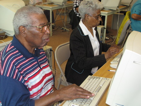
Internet users are a very diverse group of people. While most people would assume that the audience they are targeting primarily consists of younger users, people fail to recognize that there are a large number of mature users on the web also. It is a little known or recognized fact that 22% of people 65-years and older use the internet. Few web programmers recognize this fact or develop websites that are user friendly to the senior population. There is a lot of effort that goes into creating a website that is geared towards children, or young users, why does this same effort not go towards targeting senior users? There is a huge profit to be had, here. In this article I will outline some tips and techniques that people creating websites should try to follow, to create a website that is more user friendly to the senior population. First we need to recognize the differences between younger and more mature internet users; such as they need larger and more legible fonts. However, there are a lot of similarities that, if you follow these suggestions, will give you a more user friendly website for all users.
Because seniors often times may have motor skills that are beginning to decline, they can encounter more issues and errors when dealing with multiple windows. Also, as I previously mentioned seniors may need a larger font than the general public. Placing a link that allows users to increase and decrease the display font size is an easy way to remedy this problem, and it allows users to tailor the font size to their specific desire, therefore meeting everyone’s needs. It is also always a good idea t stay away from light colored or hard to read fonts, so that the user can easily read the data that you are displaying.
As long as we are discussing mature Internet users, this may be a good time to also discuss Internet users with disabilities. There is a lot of attention to creating a physical world that accommodates people with disabilities, but there is little visibility to creating a virtual world that is just as accommodating for users with disabilities. There are actually guidelines for government websites about creating a site that is especially accommodating to users with disabilities which were put into place back in the late 90’s. While these guidelines may not be required of company or private web sites yet, it is a good practice to follow, and I am sure that these guidelines will go public in the near future.
When wanting to create a website that is easily displayed to disabled users, it is always a good practice to have a way that your website can be displayed in black and white text only. An easy practice to follow is to always create textual comments that can replace any non-textual content on your site. This will allow users that cannot see your site to utilize a page reader, and still be able to get a full picture of your site. Section 508 of the Rehabilitation Act that went into effect in 2001 lays out specific guidelines for government websites, but you can view the Web Content Accessibility Guidelines for Users with Disabilities yourself at the link provided below.
Guidelines for Making Your Website Easy to Use by Mature Users
Try to follow these guidelines when creating a site that is easier for the mature user to navigate (from http://www.nlm.nih.gov/pubs/checklist.pdf)
Style
Present information in a clear and familiar way to reduce the number of inferences that must be made. Use positive statements.
Simplicity
Write the text in simple language. Provide an online glossary of technical terms.
Phrasing
Use the active voice.
Organization
Organize the content in a standard format. Break lengthy documents into short sections.
Incorporating Other Media Illustrations and Photographs
Use text-relevant images only.
Animation, Video and Audio
Use short segments to reduce download time on older computers.
Text Alternatives
Provide text alternatives such as open-captioning or access to a static version of the text for all animation, video, and audio.
Navigation
The organization of the web site should be simple and straightforward. Use explicit step-by-step navigation procedures whenever possible to ensure that people understand what follows next. Carefully label links.
The Mouse
Use single mouse clicks to access information.
Consistent Layout
Use a standard page design and the same symbols and icons throughout. Use the same set of navigation buttons in the same place on each page to move from one web page or section of the web site to another. Label each page in the same location with the name of the web site.
Style and Size of Icons and Buttons
Incorporate text with the icon if possible, and use large buttons that do not require precise mouse movements for activation.
Menus
Use pull down menus sparingly.
Scrolling
Avoid automatically scrolling text. If manual scrolling is required, incorporate specific scrolling icons on each page.
Backward / Forward Navigation
Incorporate buttons such as Previous Page and Next Page to allow the reader to review or move forward.
Site Maps
Provide a site map to show how the site is organized.
Hyperlinks
Use icons with text as hyperlinks.
Help and Information
Offer a telephone number for those who would prefer to talk to a person or provide an e-mail address for questions or comments.
A Final Check of the Web Site
Solicit unbiased comments from older adults through focus groups, usability testing or other means, to evaluate the accessibility and friendliness of the web site.
- Checklist of Checkpoints for Web Content Accessibility Guidelines 1.0
A list of all checkpoints from the Web Content Accessibility Guidelines 1.0, organized by concept, as a cecklist for Web content developers. - http://www.nlm.nih.gov/pubs/checklist.pdf
The goal of this Checklist is to provide research-based guidelines for web site design that, when implemented, will make websites more accessible to all adults.


