Web Page Layout

Planning a web page
When you decide you want to build a web page, there are a few things you need to consider. I have shown some ideas for planning a web page layout and starting the web page below.
Selecting the Niche for your web page
Decide the topic of your web page. It is best to select some niche that you know a lot about or for which you have a great passion. As an example, some people have a passion for animals, sports, cooking, internet marketing, etc.
If you are planning to monetize your web page, consider if your proposed niche is suitable.
When you are considering niches for your web page, it is always a good idea to use Google's Keyword Tool to analyze the type of competition you may have in that niche and to look at various keywords to see what terms people are searching for monthly. This can help you in creating a web page which will get visitors through the Search Engines.
Decide the Theme for the web page
Select a theme of a 2 - 3 column page layout which will showcase your content and your images in style. More information on web page layout is presented later in this Hub.
Think about the type of Header you want for your web page which will brand your niche.
Decide if you want the navigation links across the top of the page or in a column on the left or right.
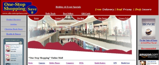
Sample Layout with Header and 3 Columns, Navigation Across Top
Think about having a footer on your web page, which is always optional. Footers are normally not used to catch a viewers attention and are often ignored. Footers are used to show Privacy links, Contact details, Copyright notices and site information, etc. But that doesn't mean that you can make it more appealing. You can also use the footer to express something artistic and very personal to make the footer more appealing.

Page Layout -- Position, Text, Background & Graphics
When we first look at a web page, we unconsciously decide how interesting we think the page will be. This decision is normally based on what the eye initially sees. Below are some major elements to consider when you start a web page:
Position of Key Elements - it is imperative to understand how web users view web pages. Think about how visitors would see the web page. Since we read from the left and from top down, the top left corner of the web page is usually what catches the eye first. It is important to have key elements of your web site in this quadrant to entice your visitors to “take a look.” Something to keep in mind is that users want to see content right away, rather than scrolling down the page past a slew of ads, .
Another key factor for not overloading your page above-the-fold with ads is that Google now penalizes a web page where only a small amount of visible content is above-the-fold.
A webpage "above-the-fold" refers to the visible screen upon the initial loading, without scrolling.

Web page above-the-fold compares to a newspaper-fold

Graphical information on a page – photos, illustrations, charts etc. Your eyes may be drawn first of all to the graphics on a page. If a page is all text, your visitors might consider the page to be too much like hard work to view.
-
Although graphics are very important on a web page as they add interest, they also increase the download time for your site. Slow download times have been shown to be a major cause of people leaving a web site.Choose the right file type and size for your graphics. Graphic images that you plan to use on your web site should be saved in JPEG or PNG format, whereas other pictures, such as buttons and logos, can be saved in GIF format.
-
To include a large graphic, you can present it as a small thumbnail with a link to the larger version of the graphic and the initial load time will be quicker.
-
To help web browsers lay out your page faster, use your HTML Editor to add the width and height attributes to images, so that the browser knows how much space to reserve on the page for the downloading image. This will speed up the download time.
White space – this is the empty space on a page – margins, breaks between paragraphs and space around graphics. White space is the second most popular thing on a page as it gives your eyes a rest from reading.
Text – the text on a page may be the least interested element to look at. Use a good font size and my recommendation is NOT to use more than 3 font types on a page. Titles, sub-titles, headers should be the same font type and the body text should be a different font type. Don't pick a background color which makes your text difficult to read. Use color text for emphasis, but don't use it excessively.
You should arrange your web pages to balance your graphics with white and text space to make sure your visitors will be enticed to read your text and stay on your page.
Start your web page
Now that you have completed the preliminary decisions for your web page, start creating the web page with a good web page Editor.
If you are looking for a Free Web Page Editor, I recommend Kompozer, a what-you-see-is what-you-get Editor. You see immediately as to how your page will look. Google "Kompozer" to find the Kompozer web site for download.
To build and test your web page, you don't have to be online or have a web hosting company. This can come later.
You can create your web page with the Editor, save the page on your hard disk and then load it into a browser to test. You will have to go online to finalize the testing of your links.
Upload your webpage to your domain
When you have your web page finalized for upload, you will need File Transfer Protocol (FTP) software to upload the web page to your domain server. Most FTP software is intuitive and easy to use.
![ClassicFTP FTP Client Software [Download]](https://m.media-amazon.com/images/I/41IIgBgotAL._SL160_.jpg)