- HubPages»
- Technology»
- Computers & Software»
- Computer Software»
- Office Software Suites»
- Microsoft Office
How to Make Bar Charts and Graphs in Excel
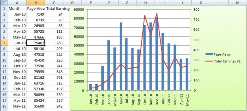
Page Views & Earnings graph.
What is a bar graph?
A bar graph is used to display a comparison of the amounts of something compared to a certain characteristic of the data. What? The standard description sounds very complicated – it is actually easier to explain by given examples. Imagine you grow apples and you want to find out the frequency of production of apples per month – you would create a simple bar graph that records the total production of apples per month – you’d then create a bar for each month that represents the number of apples.
Before the advent of computers the bar graph was always hand drawn and very time consuming, especially if you made in error with the graph. However, as technology has infiltrated our lives, it’s becoming easier to present data graphically, and also be able to instantly change the data – today, you can create a bar graph using excel or any other spreadsheet program quickly and easily – the graphs are versatile and customizable and can really spice up a presentation.

Why create a bar graph using Excel?
Graphing with excel is very easy; Microsoft Excel has excellent tools to help you produce decent graphs very quickly; there are dozens of types of graphs, and each graph type is fully customizable allowing you to create a graph that not only presents the data you want, but also allows you to format the graph is hundreds of different ways.
How to make a bar graph using Excel
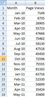
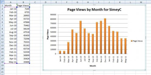
Before you make a bar graph in excel you have to decide what data you are going to present in bar graph format. For the purposes of this example I am going to create a bar graph that shows my page views on all my articles over time. I’ve collected the data from different sources – the table below gives you the raw data:
Month
| Page Views
|
|---|---|
Jan-10
| 7149
|
Feb-10
| 6735
|
Mar-10
| 26905
|
Apr-10
| 55723
|
May-10
| 47666
|
Jun-10
| 75462
|
Jul-10
| 58130
|
Aug-10
| 47518
|
Sep-10
| 45450
|
Oct-10
| 72596
|
Nov-10
| 75555
|
Dec-10
| 81162
|
Jan-11
| 63716
|
Feb-11
| 52330
|
Mar-11
| 50899
|
Apr-11
| 35424
|
May-11
| 35600
|
STEP 1 – setting up the data table
I have the raw table already and it’s simply a case of transferring this data into a worksheet on Microsoft Excel.
- I transferred the data directly into an empty worksheet on Excel.
- I added headings that were relevant (Month, Page Views).
- I formatted the Month column so that it is viewed as MMM-YY – to do this, highlight the entire range where the dates are going to be by clicking in the top cell, holding the left mouse button and dragging the outline down. Right click on this range and select format cells – on the Number tab, click on Date in the Category and move down the Type until you find Mar-01 – highlight this and select OK
- In each cell under Month I entered the first day of the month – for example I entered 1/1/10 for January 10; in each cell under Page Views I entered the actual page views I received for that month.
STEP 2 – creating a graph
Now that I have the data table setup I can create the graph; creating a graph in excel is very easy as long as you have the data table setup correctly:
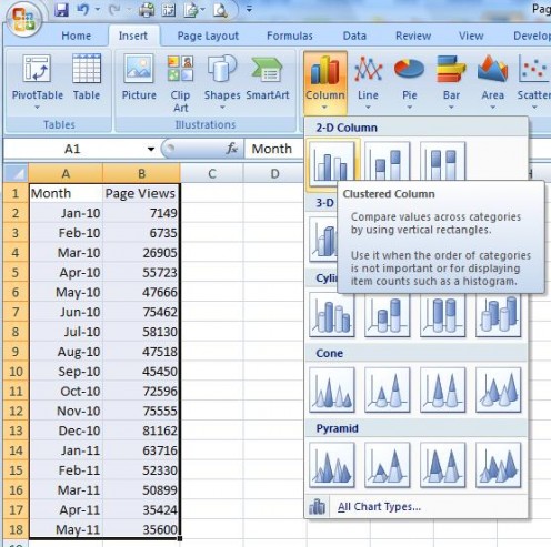
- Highlight the data table – click on the top left cell, click and hold the left mouse button and drag the box to the last cell in the data table.
- Using the menus – click on Insert
- You now see some submenus – as we are creating a Bar chart, click on the small down arrow underneath Bar – this presents you with various options relating to bar charts – hovering over each chart will give you a brief explanation of the chart. I wanted a vertical bar chart so I selected the Column rather than Bar graph and chose cluster column chart. Clicking on the cluster column chart Excel creates a bar chart based on your data.
STEP 3 - customizing the bar chart
The method above gives you a pretty decent chart already, but I want to format the chart by changing colors etc:
- When I inserted the chart, I note that there is a border around the chart with some dots on the edge and corner – I can click on these (and hold the left mouse button down) to change the shape and size of the graph. (If you lose this border, simply click on the edge of the chart again).
- When you select the chart, you are given additional menu items; design – this allows you to amend the style of the chart; layout – this allows you to amend the detail of the chart such as headings, legends, labels etc; format – this allows you to amend the text and other formatting within the graph
I’ll start by amending the design.
- In the Chart Layouts section under the Design menu – this gives you several predefined layouts to choose from – I chose Layout 9.
- In the Chart Styles section under the Design menu – this allows you to change the color and format of the bars – I chose style 31;
- Having amended the design I noticed that there was additional ‘default’ text on the graph – I simply clicked on each text item and amended accordingly
Next I’ll amend the Layout
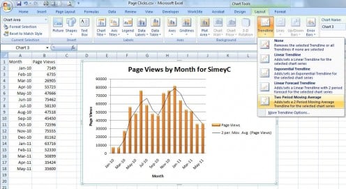
I’m not going to cover too much in this section as there are a lot of things you can change – suffice to say the best thing you can do is to mess around with each item and see what happens. I’ve decided to add a trend line:
- In the Analysis section of the Layout menu – this allows you to add different graphical analytical tools – I clicked the down arrow under Trendline and chose Two Period Moving Average
Finally I’ll amend the Format
This is where you can have most fun and really customize the look of your chart.
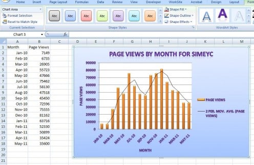
- In the shape styles section of the format menu – this allows you to change the background settings of the graph – I chose subtle effect accent 1. You can use the Shape Fill, Shape Outline and Shape Effects tool to further customize the look.
- In the WordArt Styles section of the format menu – this allows you to change the font of the text in the graph – I choose Gradient fill, accent 4, reflection; again there are other tools in this section that allow you to fully customize the text.
STEP 4 – changing the concept
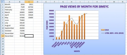
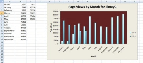
I decided that I wanted to directly compare 2010 figures against 2011 figures. So I amended the data table – as I did this the graph automatically updated for my changes. What it now shows is the data for 2010 only. I need to add the 2011 data:
- If you look at the data table when the graph is selected there are several colored boxes around the data – these represent certain areas such as data, column headings an row headings; by manipulating these boxes you can automatically amend the graph.
- To extend the graph to include the 2011 data – hover over the corner of the data (blue box) until the cursor turns into a double arrow-left click the corner and extend the box over the 2011 data – I note I also moved the box so that it no longer covered the blank area below the data.
- The graph automatically adds the new data – the trend line now only represents a trend for 2010 so I clicked on this line and pressed the delete key to remove it;
And there you are – you’ve amended your graph to compare 2010 data v 2011 data.
Conclusion
This is a very simple demonstration of using a bar graph in Microsoft Excel. The graphing tool within Excel is very powerful and can let you compare different data – for example you could plot your page views and earnings

