How to Photograph Color in Ordinary Things


"Color photography is photography that uses media capable of representing colors, which are traditionally produced chemically during the photographic processing phase. By contrast, black-and-white (monochrome) photography records only a single channel of luminance (brightness) and uses media capable only of showing shades of gray.
In color photography, light-sensitive chemicals or electronic sensors record color information at the time of exposure. This is usually done by analyzing the spectrum of colors into three channels of information, one dominated by red, another by green and the third by blue, in imitation of the way the normal human eye senses color."Wikipedia
Color is one of the mainstays of photography and photographing color in ordinary things that you probably see everyday is yet another easy at home photo adventure. Although early black and whites did a great job of showing the general masses how things were and offered a glimpse of life, they always lacked the true nature of things.
The world is made up of different shades of many colors and to view something as it really is it must be seen in color.
This is not to say that some images are better rendered in a monochrome and this is usually done to create a sense or awaken a feeling which is usually one of nostalgia.
Color photography will probably always be the medium of choice if one wants to capture an image that shows things as they really are.
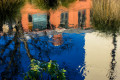
With that said, not all color photography has to be of exceptional and awe inspiring subjects.Color has the ability of catching the eye and keeping it focused on the subject simply because of the colors that are present.
A photographer can always take an image of a simple, plain and everyday object and use its colors to make the photograph great.


The range of subjects is as varied as there are things or subjects. By simply taking a look at your surroundings; house, patio, neighborhood, you should be able to find quite a number of suitable subjects.
For this project it is better to look at possible subjects with color in mind and not necessarily with the subject as the main point of focus.
Anything that presents itself, if it has a rich color palette, becomes a suitable subject to be photographed.
Keep in mind that this is not bokeh, but many of the photographs will be very similar to a bokeh style of photography. Just remember that It really does not matter if your images end up being bokeh or not.
Your emphasis should be on capturing the color first and worrying about whether or not it is one theme or the other.
Do you think that color must always be shown?
The set up does not have to be overly scenic or complicated. Just look for things and once you have found them compose the shot with your lens. A medium zoom should be enough to crop the scene to your liking.
Any subject whether is found or you set it up in a studio will do the job so long as it is rich in color. However for studio shots it works best if the setup is done against a totally black backdrop as this isolates and showcases the color better.
Pay attention to the subject's background. Since you are mainly using color for effect a good subject can become lost if the background has too many distracting elements or lacks color that proves to be too much for the sake of the main theme.
If you do end up locating a subject or scene that features what you are looking for but somehow you can not crop on the go to your satisfaction like outside elements which will distract, then at least take the shot and digitally work the image later.
One example would be a colorful piece of birthday cake sitting on a white plate which sits upon a white tablecloth. Take the shot then make the whites into blacks with Photoshop or any other digital editing program. Make a copy of the photo before you begin to edit and compare the results later. You will be surprised by the before and after results.
Stay away from doing macros since you will then cross over into this technique and veer away from the main one.
Wide angle and regular lenses can be used but they should be very limited in how and when you use them.
A regular flash unit and a tripod should also be available just in case and depending on the scene itself.

Compose the scene with caution. Look for interesting details and add or eliminate elements as you see fit if this adds to the scene.
It is often better to crop more than you are used to if cropping aids the scene rather than including every single piece of photographic information just to capture everything.
Your audience will not be so interested in what is around the subject , where it is found, or how it got there.
Their gaze should be directed towards the color scheme and this is what you should ask yourself as you compose the shots.
Another thing to remember is to photograph colors that complement each other. Competing colors, soft ones, strong ones all have a place in photography. But you should allow for a mixture only if the final image has a pleasant array and harmony about it.
If the colors seem to clash then your audience will notice this and may even find the composition to be distancing rather than appealing.
Examining and becoming familiar with the color wheel and how colors work with each other would be a good place to start.
- PHOTOGRAPHIC RESOURCE CENTER at boston university
TIMELINE OF COLOR PHOTOGRAPHY related to the Leopold Godowsky Jr. Color Photography Awards Please see below for a complete list of consulted sources. (This page was created on the occasion of the 2005 Awards) 1758 Johann Rudolf Geigy-Gemuseu

The majority of these photographs can be suitable for many photography related publications, for posters, for home or office decorations and used in a book project.
Use the images for your own sake if you have to . There is no right or wrong motive to photograph so long as you love what you are doing nothing else matters much.
However if it wise to keep in mind that you are using subjects which people have seen countless times so your job is to make then realize that they had never looked at these same mundane objects quite the same way.
The images must stand out and if you accomplish this then you have done a good job of following the theme.

© 2013 Luis E Gonzalez