- HubPages»
- Technology»
- Internet & the Web»
- Web Page & Web Site Development
A Joomla template on a mobile device

A large number of people access the Internet using mobile devices such as the BlackBerry and the Apple iPhone. This number is steadily growing. These people are normally tech savvy and more than willing to purchase products and services that interests them.via the Internet.
I wonder if you've thought about whether your website is capable of servicing the visitors that come to it using mobile devices. If your website is driven by Joomla! CMS, and uses standard templates, it's very likely that your website would look terrible on a mobile device turning off potential customers.
Today, there is no need to lose this section of your site visitors.
There are multiple ways via which your Joomla driven website can respond to a visitor who's visiting using a mobile device.
There are Joomla! core extensions available for free download and use, that sense whether a browser or mobile device is requesting for information and will deliver content to a Browser or a Mobile device appropriately. Hence, visitors using mobile devices are not turned off but have a delightful experience when browsing though your Joomla driven website.
In today’s competitive world it’s pretty important to be able to tap into the buying potential of all your customers. There is a lot of noise happening that shortly mobile devices may become as powerful and useful as laptop or desktop computers. There are several mobile devices delivered by Nokia, Motorola, Sony, Apple and others as the as well as netbooks with 10 inch screens that make me believe that this notion is true.
However all mobile devices present specific challenges associated with bandwidth and browser size and browser functionality when compared to a desktop to full-fledged laptop accessing the Internet via a broadband connection.
One option is to build a dedicated version of the website that responds requests for information from mobile devices. This is possibly the best solution because you would control and thus be confident about what you are delivering to the Mobile and other devices (such as netbooks).
Regretfully, this solution throws up other problems, such as:
- Maintaining two different copies of content, one for the mobile site one for the normal one
- Keeping careful track of what content was updated and where
- Ensuring that if the content on one website changed the same change was reflected in the other
And so on.
While this approach is perhaps the best fit for this type of visitor scenario, there are perhaps alternative solutions for crafting mobile-friendly Joomla sites.
Use Mobile-friendly Joomla templates
Recognizing this need, some Joomla templates are being specially coded so they work well for both desktop / laptop Browsers as well as mobile / netbook devices.
Here are a few useful URLs where you can find some:
CloudBase template by CloudAccess.
URL: http://www.cloudaccess.net/cloud-base-joomla-template.html
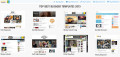
The CloudBase template is very flexible with a wide range of module positions and parameters. The mobile template is displayed automatically whenever someone visits the site using a mobile device, but if the site visitor preferred, they could switch over to the normal layout. Take a look at diagram 1.
Best Of Joomla:
URL: http://joomlatp.com/joomla-1.5-templates/joomla-templates-for-cell-phone-and-mobile-device-website.html
Joomla Mobile Dark Theme from Themeforest:
URL: http://themeforest.net/item/joomla-mobile-dark-theme/16040
Mobile Extensions For Joomla CMS
There are a few Joomla extensions available today that help create mobile compatible version of a Joomla CMS driven website. Here are one or two interesting ones.

Mobilebot: Type - Non Commercial
URL: http://extensions.joomla.org/extensions/mobile/mobile-display/9804
Mobilebot 1.0 for Joomla 1.5x can detect visitors using mobile devices and change the Joomla! template automatically.
It can detect iPhone, Blackberry, Android and Opera Mini separately and load a particular template for each of them. It has two extra spaces so you can add your own custom mobile devices.
Mobile Joomla: Type – Non Commercial
URL: http://extensions.joomla.org/extensions/mobile/mobile-display/11722
Mobile Joomla! is the best and easiest way to turn your Joomla! site into a mobile web site for iPhone, Android, Blackberry, Nokia, WAP and iMode phones.
Feature Highlights:
- Advanced User Agent detection (Tera-Wurfl, WURFL, Compact WURFL, fixed..)
- Multi site support
- Advanced image adaptation
- Flexible layout settings
- Sub-domain redirection
- Custom templates per device category
- Menu exclusion per device category
- Fully customizable with different modules and templates
- Compatibility with 3rd party extensions, modules and components
Ivan Bayross
Open source tutorials