Give Your Visitors a Superior Browsing Experience with the Help of Responsive Website Design

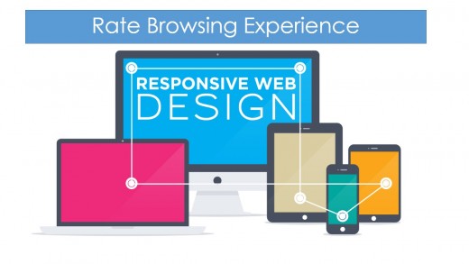
Analyze Your Website’s Browsing Experience
Have you ever tried to view a website on a device other than your desktop or laptop, for example, your smartphone or tablet? Have you found it too difficult to read and navigate because of the extensive re-sizing and scrolling? Well, this might be attributed to the lack of responsive web design.
Does your website or blog have responsive web design? If it does not, it is highly recommended to take the necessary steps provide a more indulging browsing experience to your visitors.
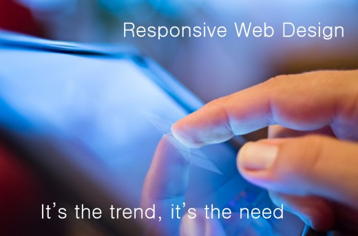

Responsive Website Design and its Importance
Let us start by getting a basic idea about responsive web design. Responsive website design allows your website to be viewed perfectly on any device connected to the internet such as desktop monitors, smartphones, tablets, etc. Thus, responsive design makes it easier for your readers to read and navigate the site. Hence, it increases the reach of your website.
Today, a large number of people access the internet on a wide range of devices. It is observed that web browsing on smartphones and tablets accounts for a sizable percentage of web traffic and it is expected to rise to even higher levels in the future. In fact, as much as half of the traffic of popular sites like artik-design.ca comes from such ‘non-desktop’ devices such as tablets and smartphones.
Now, responsive web design is often recommended for websites because of the following reasons:
- Getting More Traffic: If you website has responsive design, it won’t lose visitors who use the internet through their smartphones and tablets as it would be easier for them to read and navigate ·
- Better Search Engine Optimization: Popular Search Engines favour websites with responsive design. They tend to give a higher rank to such websites on their Search Engine Result Page (SERP) when relevant keywords are searched.
- Do not Lose Out on Competition: If your site were too difficult to navigate for smartphone and tablet users then they would soon lose interest and would go to the sites of your competitors. In order to prevent this you have to have a responsive website, which would appeal to such audience.
- Increase Your Credibility: If you have an appealing site, users are likely to spend more time on your website and hence your website will achieve the desired results.
How will you do it?
You need to give it a ‘step-by-step’ approach when it comes to responsive web design. To start things off, you might want to determine if you can do this job by yourself or not. If do find yourself a little bit low on confidence then it might be good for you to outsource the job to a professional web designer or a web design company.
If you have a blog, hosted on popular blogging sites such as WordPress, you can easily select a WordPress Theme that is pre designed to be responsive. You could check the ‘help’ section of your blogging website if you need some help with doing it.
In case you have an HTML or a static website, you can make changes to the design by just adding media queries to your site code. If coding is not something that you are an expert in, then you can outsource the work to an expert web designer. Always use caution before hiring a particular web designer or a web design company.
Learn the better way
Use Caution
Before you hire a programmer for coding a responsive design site, try to keep the following things in mind-
- Ensure that the person or business you have hired for the job has a solid reputation.
- If you are thinking about posting an ad on a freelance project website, you should be highly cautious. If the reply to your ad seems pre-scripted, then you might want to avoid them as they are often not what you call ’professional’ services.
- Make sure that the person you hire is a professional in their work and both of you are able to communicate with each other easily so to get the desired results.
- Ask for their portfolio, which would contain examples of their work.
You should also note that the price would depend on the depth of work required- whether your site could be edited by simply adding media queries or it needs to be completely re-coded.
Some points to remember
Doesn't matter you do-it-yourself or you hire a professional for the job, It would be of great help if you consider the following things before beginning the work on the project
- Design- There are a few mobile friendly websites on the web today. Try to find a few of them and take some references for designing your websites. This would help you decide on which type of design will work best to attract visitors to your site.
- Content- Often you cannot fit all the content of your regular website into your mobile site. Be specific and list the things, which can be included in the mobile site and what could be left out.
Nowadays the phones are getting smarter, tablets are cheaper, and everybody wants to stay connected while on the move. So take the wise decision of making your website responsive and thereby improving user experience on your site and witness the impact it has on your bottom line!