Photography Composition 101

What do the number “three” (3), tic-tac-toe, and bright spots have to do with composing a photograph? If you don’t know, then like me, you’ll be in for a pleasant surprise! Before I learned the basic elements of composition, I always tried to get my primary subject centered in the frame. Later, working with post-production software (I don’t use Photoshop.) I would make adjustments when cropping the image especially if the subject was a bird. It would be cropped so the bird was off center enough that it would have some room to fly in the frame. Most of the time, I left the subject centered--a real no-no. Man, was I in for some news!
By the time I had enrolled in the weekend seminar from the Rocky Mountain School of Photography, I had taken over ten thousand photos with my digital SLR and really gotten familiar with the equipment. I’ve adapted the philosophy of Scott Kelby and feel strongly that the photographer should do as much as possible to get the image as “right” as possible inside the camera. No amout of editing and manipulation later will fix a lousy image -- and it’s easy to see if an image has been “Photoshopped to death”. The sessions on composition and lighting have had the most significant and lasting impact on the quality of my work ever since.
Arranging the subjects and objects in a photograph and establishing their respective places in the scene is known as "composition". Much composing is done, and can only be done, through the viewfinder prior to releasing the shutter. Being in touch with your equipment and subject can often be described as a "zen" moment. Some alterations and improvements can be done with digital editing after the image is out of the camera and into the computer. Some image editing software actually superimposes a composing grid on the image to help. Some cameras have the grid visible in the viewfinder.
"Composition 101" by FCEtier

I had been familiar with the “rule of thirds” for a long time and for some reason always applied it horizontally. At the seminar, they pointed out that if you apply the same rule vertically; the two groups of lines form a “tic-tac-toe” grid with a square centered in the frame.The four corners of this square are the “power points,” the four areas of the photo where the eye naturally tends to look in a scene.
The upper left hand power point is the most significant. Regardless of culture and reading path (up, down, left to right, or right to left) the human brain goes to that spot first. (There is actually scientific evidence to support this comment although I do not have the reference to link.) The eye is naturally attracted to the brightest, most clearly focused feature of a scene.Triangles are the most powerful of geometric shapes in a composition because they help to keep the viewer’s eye in the frame and they help focus attention on a particular point in the frame.Three is the preferred frequency for number of items in a scene, i.e., three flowers arranged in a triangle. Notice in this first illustration the grid lines as well as the two triangles. Also, note the gradual change in brightness of the triangle's three sides, ending with a smaller solid white triangle in the upper left power point. Or rather, try NOT to notice them. See how powerful these elements are to the composition?

Composing a portrait
These rules work for any subject matter whether it’s a landscape or a portrait.
For a portrait, we try to get the eyes on the upper third line, hopefully near the two upper power points. In this image, Chelsea's eyes are right on the upper line and almost perfectly align with the power points.
Another old photography rule is illustrated here by having the subject fill the entire frame. There are no distractions in this image.
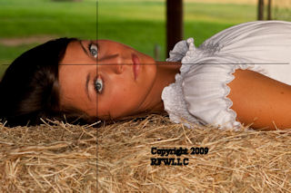
Reclining
The original image here was a longer shot with more of the model in the scene. I cropped it in post-production and aligned the compositional grid so that the upper left power point was right between the eyes. Doing so also eliminated some unnecessary clutter in the background.
Triangles, triangles, triangles!

An irresistible composing tool.
Even without the display of the composing grid and the triangles in the image to the right, it would be very difficult to take your eyes away from Chelsea's face. All the elements of a strong composition are here and working together. In this image, a clearly focused background does not distract as it is simple and not cluttered. This image could have been cropped to make more of a closeup, but the power points would have moved and in this version, the subject fills the frame and the triangles support the crop.
You can do it!
Remember these simple but powerful rules the next time you raise your camera to shoot, or the next time you edit images, and you can get better photos every time!
Watch for more articles on photography as I share my experiences and lessons learned over the years.
Happy shooting!
See more of my work here:
- Etier Photography -- Zenfolio -- Several galleries
Biography/Education: Born in Louisiana, FC Etier spent most of his adult life in Baton Rouge, eventually splitting his time between Baton Rouge and. 1158 Max Thompson Road, Canton, North Carolina, 28716, United States - Royal Flamingo Works, LLC -- some of my earlier work.
Photography sales and custom framing.


