Tangerine Tango is the Color for 2012

What would life be like without color? Can you imagine living in a black and white world with just shades of gray to mix things up?
Color adds all sorts of emotion to our lives, from excitement to serenity. Just picture two women walking into a party. One is wearing a red sparkly dress. The other the “little black dress” that every woman should own. Who do you think will have the most eyes on her, regardless of her beauty or lack thereof? Her dress will capture our attention.
Color of the Year
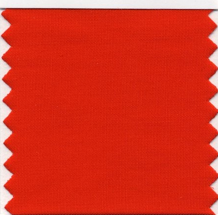
Every year the Pantone Color Institute names the hot new color trend of the year. In 2012, that color is Tangerine Tango 17-1463.
Don’t expect to see a bright orange. Tangerine Tango is a “spirited reddish-orange.” It has energy and boldness. Last year’s hot pink Honeysuckle “encouraged us to face everyday troubles with verve and vigor,” according to the Institute’s press release. This year, Tangerine Tango gives an energy boost to keep us moving forward. It’s a renewed promise of a brighter day after winter’s gloom.


Tango all around us
Watch for Tangerine Tango to show up in all sorts of products for home and fashion – even our gardens! It isn’t likely you’ll want to be outfitted all in Tangerine Tango, but adding it as accents can really make this color pop.
Tangerine Tango can add energy to your home in a number of ways. Toss a pillow on your couch or bed for a burst of color. Go even further with a bedspread. Adding tabletop accessories can add pizzazz to your dinner without reaching for your spice cabinet!
Paint is one of the least expensive ways to change a home’s look. You don’t have to have a whole room of orange to get this color’s effect but why not paint one wall? It can liven up your living room.
Look for Tangerine Tango to start showing up at the makeup counter. A bit of eye shadow in this shade will complement blue or green eyes. It’s a fun way to add a bit of fashionable color without going all out.

How colors affect each other
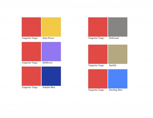
Fashion designers will pair Tangerine Tango with complementary colors such as Sodalite Blue PANTONE 19-3953 (think navy) or Starfish PANTONE 16-1120 (brown). The same color often looks different -- brighter or muted -- depending on what is near it. In a color wheel, red-orange – the shade of Tangerine Tango – is a tertiary color. These are the colors formed by mixing a primary and a secondary color.
Complementary colors are any two colors that are directly opposite each other, such as red and green and red-purple and yellow-green. In the color squares here, Tangerine Tango and Sodalite Blue are complementary colors. These opposing colors create maximum contrast.
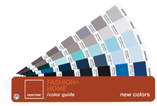
What is the Pantone Color Institute?
The Pantone Color Institute creates the color standards for the fashion, home and beauty industries and is influenced by what is shown on runways, pop culture, new fabrics and even news events.
Pantone was founded by Lawrence Herbert in 1963. He created the Pantone color charts when he realized that each individual sees and interprets the color spectrum differently. He devised the PANTONE® MATCHING SYSTEM®, a book of standardized color in fan format and eliminated inaccuracies among designers in the graphic arts community.
The next time you hear of the hot new color trend, you'll have the Pantone Color Institute to thank. Meanwhile, bring some Tangerine Tango into your home.


