Web Design Trends To Follow In 2015


2014 is about to end soon, now is probably the right time to evaluate the trends this year had, and maybe predict what trends we can expect to see in 2015. We will also see how these trends are going to effect the WordPress community in general. At least this is the original plan for this post. Let’s find what they are:

1. Responsive Web Design
I doubt that someone who has some interest in web design is not familiar with Responsive Design, this is highly unlikely. Even if you have a very good reason against the use of responsive design, still responsive web design will be here to stay in 2015, no matter what happens. In the last few years, you must have seen the advancement and excessive use of responsive design, mainly due to ever growing use of smarter devices such as mobile phones and tablets. Now more and more companies are opting for responsive web design in order to improve their uses’ experience over the internet. We are sure to see this trend continue in 2015.

2. Ghost Buttons
Other prominent design feature that we can expect to see in 2015 are Ghost buttons feature by Divi. Why we expect to see them? Well, the answer is obvious, they are more stylish, simple to implement, and of course their hover animation is really cool. With larger background images and videos their pairing is almost perfect for any web design.

3. Bigger Emphasis on Typography
It has been seen over the past few years that the traditional web type-kits have been too expensive to use on websites, even though they featured some beautiful fonts and typefaces. For the companies that had bigger budgets, these heavy on typographic design sites worked best but it was no fun using for the rest.
However, that is slowly changing, as Type kits are getting much more affordable now. You can also get them from the likes of Google Fonts, who are offering them absolutely free. This is providing more freedom for the web designers to incorporate their typography skills in web designs, having much smaller budgets. Especially for WordPress theme designers, it brings more flexibility in their work, and they are able to develop stylish type-centric designs with minimum of effort.

4. Large, Beautiful Background Images & Videos
Another design feature that we are certain to see are the large and attractive background videos and images. Having too much information on a page is a turn off that is why designers are using much simpler designs so the site may stand out from the rest. This latest trend in web design looks powerful and elegent.

5. Scrolling Over Clicking
As web designers are constantly looking to improve on the mobile user experience, having said so, one thing that will keep on dominating clicking is scrolling. It has many benefits like cutting down on load times, easier to do, intuitive, and provides much more interaction between user and website.

6. Card Design Will Continue
Card design is a great tool for web designers who want to work on responsive web designs. They have many benefits and advantages such as keeping things modular, arranging or rearranging columns so that things don’t get disorganized or sloppy, and browsing huge amounts of general data etc.
In short, card design provides what the web wants along with cleanliness, simplicity and a lot of versatility. These are the reasons why I believe it will continue to prosper in 2015.

7. Flat Design is Growing Up
We have already seen so much from flat designs in the last couple of years to suggest this trend will continue to grow into 2015. Flat design is also growing and perhaps we will see it transform into material design. If you are wondering about material design, it is something that Google unveiled in 2013, as new direction for mobile design in general.
Although the designers at Goggle believe Material design is mostly flat with subtle gradients, animation, and layering but still it achieves all the benefits of a flat design. This is something that could be left for a debate but for future I definitely see more and more companies adopting flat designs.

8. Microinteractions
After material design, Microinteractions is a good and upcoming trend. It is a contained moment or experience within a product that is all about a single use case. A small example of this could be an email signup box that you sometimes see pop up on a website. This wiggles on the screen, in doing so it gives the website playful personality to a static graphic.
The microinteraction offers added user engagement by offering more email signups in this particular case. In 2015, I would expect to see more plugins like these added to Wordpress site that not only add new features but also offer new experience.

9. Interactive Storytelling
When you add all these up, it gives you the feeling of interactive storytelling and narratives. This doesn’t mean that every website should be about fiction or fairy tale, this is certainly not the objective. What this means is that when you use the series of values or concepts (like simplicity, creativity, elegance etc.) in such a way that everything from your page (such as layout, font, web copy, and microinteractive elements etc.) are narrative tools, tell stories in their own way
10. Personalized UX
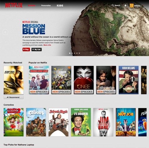
Cookies have been in use for some years now. They are used to keep track on user activities in order to display relevant content for the user. However, in recent times due to better design and practices, use of cookies has also increased. Sites like Netflix and Youtube are using it to remember what you have been watching lately, that way it will suggest what you should watch next. This facility provides both the designer and the user lot of options to play with. I believe in the coming months we will see a lot more improvement of this technique.
A Few Fantastic Examples
When you know about all these design concepts, it makes it harder to incorporate all of them together flawlessly. To make things easier to understand I have put together three examples that have tried to use all of these trends effectively. The intension is to learn from these web designs.

1. Apple
Even if you are not a fan of Apple that will not keep away from appreciating their good web design. Apple has always been famous for offering remarkably designed products that had trademark simplicity all over it. Similarly, their website mimics the same ideology. Your objective should be not to copy or create a website looking exactly like theirs but rather understand what techniques they have implemented.

2. Tesla
The reason why I have chosen Tesla’s website is because it combines all the future trends with fluid experience. Their use of large image, embedded infographics, long scrolling, and interactive storytelling is just amazing. The design is not only brilliant but complete with microinteractions that can turn boring sites into jaw-dropping masterpieces.

3. Divi
This last example is considered by many experts as the best WordPress website. Its theme will come across to you as one of the best themes that you have ever seen. Its drag and drop page builder has taken advantage of modules that are not only interactive but also helps user create effective and beautiful pages. Also you can view this site on any device, thanks to its responsive web design.
In Conclusion
It looks certain that these trends will carry on into 2015. While there will be few that you can expect to even mature further, possibly in the case of microinteractions and material design.
As far as WordPress Community is concerned, you can expect to see a lot more themes following the footsteps of Divi, and taking advantage of various design trends that they have implemented in their website.
Most importantly, you can only expect to see these trends continue to grow if people push them to their limits. There will be limitation at times but I am excited and looking forward to see them unfold. If you have any idea or something to share about the future design trends in 2015, feel free to leave a comment.