How-To Photoshop Tutorial: Glossy Buttons

How to Make a Web 2.0 Glossy Button
Do you want to make your own glossy web 2.0 buttons? Here's a free Photoshop tutorial to get you started. It teaches you to make buttons of any shape or color with text and/or an icon on them.
Once you've learned this basic technique, you'll be able to change and adapt it to make other glossy buttons!
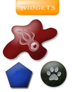
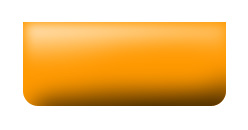
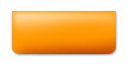
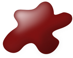
In fact there are three tutorials on this page. The first is my new Glossy Button tutorial which makes all the shapes at left. Click the orange Tutorial button to start:

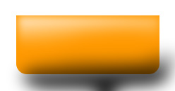
Plastic Glossy Button
My older tutorial tended to produce fuzzier buttons that looked like dull metal. I don't like the effect quite as much, but it used only vector graphics, which may be useful at times. See below for some other styles of buttons and how to make them.
Step One: Make the Button's Shape
CREDIT WHERE DUE: I learned this technique from the Absolute Cross Glossy Button Tutorial, although I have changed it and do it differently now.
Use the rectangle/ellipse/custom shape tool or pen tool to draw a shape. Fill it with a color. I'll use #ff9900, Squidoo Orange.

Tip: to make a tab, draw a Rounded Rectangle, use the Pen Tool set on "Delete Anchor Point" to delete the top two points, then use the Pen Tool set on "Convert Anchor Point " to convert the remaining two top points to sharp corners instead of rounded.
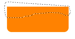
Step Two: Make a Highlight
1. In the Layers Palette (Choose "Layers" under the "Window" menu, click the small notepad icon on the bottom right to make a new layer.
2. Use the Lasso to make a selection across the top of the button. You may want to choose "Select > Modify > Smooth..." to smooth the edge of your selection 5-10 pixels.
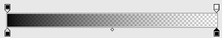
3. Choose the Gradient Tool (Click on Paint Bucket and hold to get it). Choose Linear Gradient from the options in the control strip on the upper lefthand controls.
4. On the upper lefthand controls, double-click on the gradient swatch to edit the gradient. Change the bottom left color stop to white, so that the gradient is from opaque white to transparent white.
5. Fill the selection with the gradient, dragging from top to bottom.
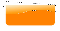
6. Filter Menu > Blur... > Gaussian Blur.. My canvas is 250x130pixels, and I found a Gaussian Blur radius of about 10pixels worked.

This already looks pretty good, but let's add a bit more of a 3-D edge to the highlight. Save the document in .psd format before continuing, as the following sometimes takes a little fine-tuning to get perfect.
7. In the Layers Palette, click on Shape 1 (the orange button).
8. Choose the Path Selection Tool (arrow midway down Tools Palette on left).
9. Right-click (Ctrl-Click on Mac) on the button to get a popup menu and choose Make Selection. Pick New Selection. (No feathering)
10. In the Layers Palette, click on the highlight's layer.
11. Choose the lasso or marquee selection tool.
12. Use the arrow keys to move the selection 2-3 pixels down and to the right.
13. In the Select menu, choose Inverse.
13. In the Select menu, choose Feather... about 5 pixels.
14. Delete.

Remember you can use Step Backward under the Edit menu if you're not quite satisfied with the result and want to try again. Or Revert under the file menu.
Step Three: Add Shading
1. In the Layers Palette, click the small notepad icon to make a new layer.
2. Using the lasso, select the bottom area... maybe a bit more to the right than left.
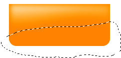
3. Choose the Gradient Tool and click on the Gradient swatch to edit. Change the bottom stops to black.
4. Fill the selection with the black-to-transparent gradient, dragging from below the selection up to the edge of it. Don't worry, we haven't ruined it!
5. Deselect and Gaussian Blur again.
6. In the Layers palette, click on Shape 1's layer.
7. Choose the Path Selection Tool. Right-click (Ctrl-Click) the shape to get that popup menu and choose Make Selection.
8. In the Select menu, Select Inverse. This time, NO feathering.
9. In the Layers Palette, click on the shadow's layer.
10. Delete.
11. In the Layers palette, reduce the opacity to about 20%.
12. In the Layers palette, click the arrow button at upper tight to "Duplicate" the layer.
13. For the new layer, change "Normal" blending mode to "Overlay" and set opacity to around 80%. You may want to fiddle with the opacity of the "Normal" and "Overlay" shadow layers.
13. In the Layers palette, click on Shape 1.
14. Under the Layer menu, choose Layer Style > Drop Shadow...
15. Set the distance to about 2 and the opacity to about 50%. Click OK.
Step Four: Add Text or Icon
Time to add a white icon and/or text to the button. You can use a dingbat font, the Custom Shape tool, or a drawing, but if you're not using text, the shape needs to be a silhouette filled with flat white.
I'm going to use text for this demo. Arial Black is a good font because it's big and blocky.
1. Text tool, Arial Black, 40pt, WHITE color:
2. Choose Layer Style > Inner Shadow... from the Layer menu.
3. Double click on the (black) color swatch. Pick up the dark color from the darker parts of the shadow.
4. Reduce the distance and size by a few pixels until the letters/shape are crisp. Here's Distance: 4pixels, Size: 3pixels.

5. Click Blending Options and set the Fill opacity to about 50%.
6. Pick Inner Glow. Double-click the color swatch to make it white.

All done! Phew!
Finishing Touches
This tutorial works on almost any shape. Sometimes a Radial Gradient may work better.
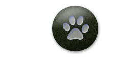
Also, try using the Layer Style > Pattern Overlay on the colored Shape that makes the button. A subtly textured pattern can look snazzy! (See the round button for an example.)
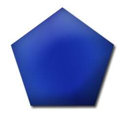
For the pentagon, I noticed the 3-D effect wasn't that strong in the "raw" version (left) and enhanced the Layer Styles as follows (right):
Inner Shadow
- Double-clicked color swatch, selected a color from the shaded area and darkened it slightly.
- Unchecked "Use Global light."
- Set the angle to 20 degrees (found by experimenting).
- Distance: 7px
- Size: 46px.
Inner Glow
- Color: white.
- Blend Mode: Lighten.
- Opacity: 6%
- Size: 24px
Satin
- Color: default black.
- Blend Mode: Overlay.
- Angle: 20 degrees
- Distance: 36px
- Size: 95px
The whole doument is about 250x230, so adjust sizes accordingly.
Credit and Thanks
This tutorial is partly based on the Glossy Button Tutorial by Robouk@Absolute Cross, where there are several excellent Photoshop Tutorials. However, I've simplified, added to, and changed the way I do it, including adding an Overlay layer and making a completely different style of text.

Old Glossy Button Tutorial
(Another Way of Making Glossy Buttons)
Below is my original glossy button tutorial. I'm not entirely satisfied with how fuzzy these are, but you can get several different effects this way. Also, the buttons are entirely vector graphics, so they're easier to scale. Here's two examples of what this tutorial makes:
")

Step One: Make the Shape
1. Pick a color.
2. Pick the Shape Tool and choose Ellipse.
3. Holding down the shift key, drag and draw a circle.
4. Open the Layers Palette under the "Window" menu and name it Circle.
Step 2: Add Some Gloss
1. Choose "Layer Style > Gradient Overlay" from the "Layers" menu.
2. Double-click on the gradiant swatch. We're going to make a new gradient.
3. a) Click the upper left black box on the gradient and set the opacity to 75%. b) Click on the upper right black box and set the opacity to 0%.
4. Click the lower left box and set the color to white.
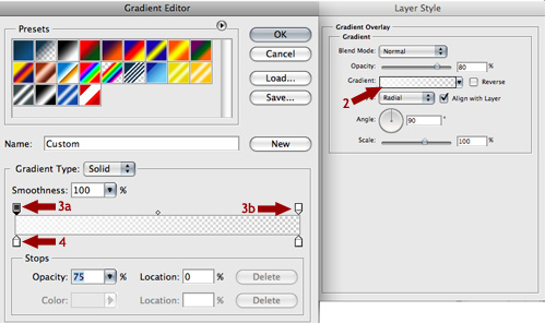
5. Click OK.
6. Set the Style to Radial. Set the opacity to 80%.
7. Click on the circle in the main window, and drag the highlight down so the brightest part is at the edge of the circle.
Step Three: Add an Edge
1. Still in the Layer Style Palette, click "Inner Glow."
2. Click on the color swatch to get the eyedropper. Pick a light color from the circle in the area with the highlight.
3. Set the size to 25 or so. (This is assuming you've made the circle large as I have.)
4. OPTIONAL: Click "Bevel and Emboss."
5. Set the size to 15. Add a bit of softening.
6. Click the shadow color swatch. Click on your circle to pick up its default color. Then pick a darker version of that color.
7. Click OK to set the color, then OK to close the palette.
Step Four: Add a Highlight
1. Click the Move Tool (arrow, upper right part of palette).
2. While pressing option (Alt), click and drag the move tool upwards on the circle to create a new copy. Use the shift key to move a circle straight up, until only its lower half is covering the circle below.
3. Choose "Layer Style > Inner Glow..." from the "Layers" Menu.
4. Turn OFF Inner Glow. Turn OFF Bevel and Emboss.
5. Under "Blending Options: Default", set the Fill Opacity to 0%.
6. Click on Gradient Overlay. Place your cursor on the circle in the main window and drag the highlight up until it's centered within the top circle (brightest highlight will be on the edge of the original circle).
7. Double-click the gradient swatch to get the Gradient editor.
8. a) Click on the upper left black square (opacity stop). b) A small diamond will appear between the left and right opacity stops. Drag it to a location of about 60.
9. Click OK.
10. Set the overall opacity of the Gradient to about 60%.
11. Click OK.
12. On the Layers Palette, name this layer Highlight.
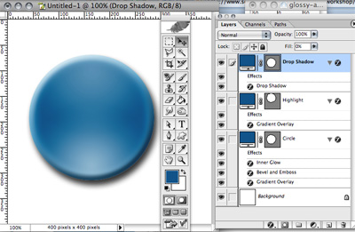
Add a Drop Shadow
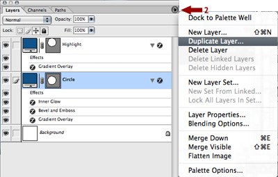
1. Click on the "Circle" layer on the Layers Palette.
2. Click on the small triangle button at upper right on the Layers Palette and choose "Duplicate Layer".
3. Select "Layer Style > Bevel and Emboss..." from the Layers Menu.
4. Turn OFF Bevel and Emboss, Inner Glow, and Overlay.
5. Turn ON Drop Shadow. Try a Distance of 10px and a Size of 13px.
6. In Blending Options, set the Fill Opacity to 0%.
7. Click OK.
8. In the Layers Palette, click and drag the Highlight Layer so it's under the Drop Shadow Layer, above the Circle Layer. That keeps the highlight on the button but avoids lightening the Drop Shadow.
Step 6: Add a Shape
Now you need a shape, words, or graphic to stamp onto the button.
Try the Custom Shapes tool and click the Custom Shapes palette at top to select a shape. Or try a Dingbat font and use a dingbat. (You can also Google for "free Dingbat fonts". If you need to use an existing logo or picture that's a JPG, you'll have to use the magic wand, lasso tools, or eraser to cut it away so it's a silhouette.
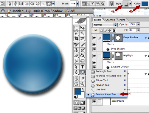
For this example, I'm going to use the fat arrow in the Custom Shapes palette.
1. Pick a shape.
2. Click on the "Circle" layer in the Layers Pallete.
3. Draw the shape over the button.
4. a) On the ribbon up top, click the "Style" icon and click the "no style" (square with red slash through it) to remove the bevel, highlight, etc. b) Click the Color swatch up there to set the color to white.
5. Choose "Layer Style > Blending Options..." from the "Layer" menu. Set the General Blending opacity to 75%.
6. Turn on "Inner Shadow."
7. In "Inner Shadow," click on the black color swatch. Use the eyedropper to pick up the default color of your circle (someplace with no highlight or shadow). Adjust on the color picker until you've got a darker version of that color.
8. Click Okay, Okay again.
Step 7: Finishing Touches
9. Use the Crop tool to crop the document down to just the button and drop shadow.
10. Save the document in .psd format and keep it as your template.
11. To resize, chose "Image Size..." under the "Image" menu. You may have to adjust sizes of drop shadows and bevels after shrinking.
You're done! Fiddle with bevels, shadows, and other Layer Styles to see what other magic you can work on it.


