Branding: Logo and Color Tips to Save Your Brand and Your Budget
"Here are our branding guidelines," says an association client while handing me a several page booklet of logo use rules.
What was up with that?
Being in the promotional products arena, I totally understood why my client even had such a document. It wasn't just directed at work they were doing with me; I had received similar documents from other clients before. Since this group was an association, they wanted their members to properly use their brand name, logos and other branding elements to present a unified and consistent image to the world.
Here's a summary of some rules that were included in the booklet:
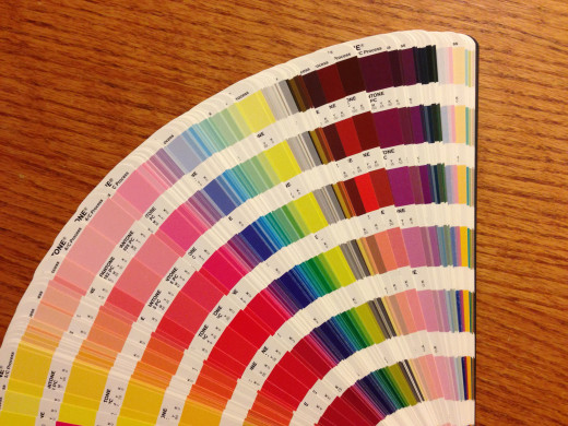
- Use the proper PMS (Pantone® Matching System) colors.
- If PMS colors are not available, use solid black or white.
- No stretching or distortion of the logo.
- Do not use the graphics separate from the text that goes with it.
Being in the market the association was serving, I had seen many examples of violations of these types of rules. For these folks, if it even kind of looked like the original logo, it was just fine. Color? A pink version of a standard blue logo would be okay in their estimation. One company even purposely painted each of their trucks a different color because they thought people would remember the multiple colors! (Hint: They don't.)
The association wanted to avoid having to spend on providing compliant promotional products and other marketing materials for their members. It would have been a huge expense and management hassle, even if they charged for them! So setting simple to understand rules, with "don't do this" pictures, was an inexpensive solution.
"But I'm a small business. Why should I care about consistent branding?"
Even small business owners and entrepreneurs need to be concerned about consistent branding. Why?
- Repetition Builds Reputation and Recognition. Repetition breeds familiarity which breeds top of mind awareness for when a need arises. (Translation: Sales!) Keeping logos and branding colors consistent helps build that repetition and, subsequently, recognition and reputation. In contrast to the company mentioned earlier that painted each truck a different color, another much more marketing savvy group, painted ALL of their vehicles the same bright color and stated so in their marketing so that people would recognize them on the road. Smart!
- Limiting Choices Saves Times and Effort. When given too many choices, people can become overwhelmed and have a difficult time making a decision. Having only a few choices for color or other branding elements makes it easier to make choices on promotional products and printed items such as business cards and brochures.
So regardless of whether the business is large or small, setting logo and branding element standards is important.
Logo Design Tips
When developing a company logo, making some decisions about how the logo can be used in a variety of situations can provide flexibility should the project or budget require it. Here are examples of what this means and how it can affect logo design:
Graphic Only or Graphic Plus Company Name? Many logos feature a graphic shape or element, as well as the spelled out company or brand name. If the two are separated, would the logo look appropriate? If the logo is entirely made up of text—what's called a text treatment—this isn't an issue and all the text is always used. However, this can become problematic if the company name is very long. Some imprint areas are extremely small. So developing a standard way to handle those situations can help keep the brand consistent everywhere. Examples:
- Apple's apple logo is used alone in many (if not most!) situations and people recognize it even without the Apple Computer name below it.
- One logo I saw had nine words—yes, that was 9 words with maybe 60 to 70 characters—that needed to be used in addition to the graphic elements. Wow! That fits on almost nothing. This group definitely needs to set a standard for use of the graphic element minus the organization name.
The Incredible Shrinking Logo. What does a logo look like when shrunk down to less than 1 inch... even 1/2 inch? Legible? If not, come up with a way to handle mini logo placements such as on logo golf balls and pens.
Going through this thought process while developing a logo can avoid the time and design costs to reinvent the logo for every single project.
Logo Colors
One of the advantages of selecting a Pantone® Matching System (PMS) color for a logo is that the color will be consistent in almost every scenario. The only problem with that is that requesting PMS inks may incur additional fees and costs. So factor that in when choosing logo colors.
But there are some ways to get around the cost of PMS colors:
Request PMS Match for Full Color Printing Jobs. If the job is a full
Use Black and White Renditions of the Logo. When developing a logo design, ALWAYS request that a solid black and white version of it be created. In fact, ask the graphic designer to create the black and white version FIRST. If it doesn't look good without color, request a new design.
Use Black, White or No Color Version of the Logo on a Color Background. To achieve a color effect, without having to pay for special PMS color, choose a promotional product that is close to the logo color and imprint it with a black or white version of the logo. Black and white inks are usually standard, no extra cost choices in the promotional product world. Some promotional items—such as leather, glass or metals—may also offer laser engraving or debossing (impressed into the surface) imprinting options which offer a classy, no-color rendition of a logo. For paper products, consider using black ink on a colored paper stock that matches the regular logo color. However, weigh the costs of PMS custom color inks versus color product or paper.
Close Enough Options. Depending on how strict the branding guidelines are, some organizations may choose to allow ink colors that are close enough to the exact PMS color. For example, if an organization's standard dark blue color is PMS 293, but a standard, no additional charge ink color offered is PMS 286 (which is relatively close) is offered for promotional product imprinting, the organization may decide that this is close enough to use to save some dollars. IMPORTANT! If the logo in question is not the organization's own, such as one to designate membership status (as in the association example noted earlier), ALWAYS obtain approval PRIOR to printing close enough color options. This is especially important if proper logo usage is required to receive co-op advertising expense reimbursement.
See Examples of Debossed Leather for a No Color Logo Imprint
This article is accurate and true to the best of the author’s knowledge. Content is for informational or entertainment purposes only and does not substitute for personal counsel or professional advice in business, financial, legal, or technical matters.
© 2014 Heidi Thorne

