Design a Cartoon Character

Learn How To Draw A Full Size Character With Adobe Illustrator
Drawing your own cartoon character is a fun and exciting experience, and you only get better with each successive drawing. There are tons of ways to design a character and these are the best guidelines that have worked for me.
Remember that you can draw however you want, but I hope some of these tips will make it easier for you to begin your design or take it to the next level. Remember not to get too detailed. After all, we are trying to create a cartoon, which is meant to be a little less than real. Simple shapes work the best and can be easily tweaked to look more natural. Curved lines make for the nicest looking cartoons, though softened edges work just as well.
The best thing you can do before you begin is to study your favorite cartoon characters. Take a close look at what basic shapes are used, where lines connect to one another, where they break apart, and what color combinations are used. Look at photos of people as well to get a solid idea of what real life looks like in relation to clothing texture, skintone, and the basic shapes of the human form. Just remember that we won't be getting too detailed, as we are designing cartoons, not realistic drawings. The key will be using simple shapes and the pen tool and tweaking these shapes until they look more natural, not perfect.
**NOTE: These tips are meant for drawing a cartoon character in Adobe Illustrator CS5. Some tools and terminology may not match up, depending on the program you are using. The tips here also assume that you have some level of experience with the pen tool, the color mixer, layers, the selection tools and other basic elements of Illustrator.
Drawing The Head
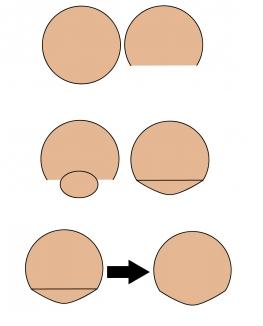
Cartoon heads come in many different shapes and sizes, but most are formed from a basic circle or square. Starting with these will make it easy to read the shape as a person's head and will not be too distracting to the viewer. I prefer to use a circle or square for the top 2/3 of the head, adding an anchor point on either side of the shape 2/3 of the way down, then deleting the bottom segment.
Finishing the face with an oval or triangle for the chin will give a more realistic feel without being too detailed. An oval or circle will add a rounded feel (obviously), and will also allow for a character to have some form of a chin. A slightly sharpened oval or a smooth triangle will give an even better effect.
To connect the main head shape and the chin, just select both and go to window-->pathfinder-->unite. Both shapes will become one, and some adjusting may be needed at the connection points. The key is to not get too detailed, as we want our character to be "cartoony" in the end.
Drawing the Head - Visual
Eyes
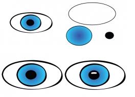
The eyes are always fun to make, containing many different parts and
many different options. I commonly use a sideways oval, but many use
perfect circles for the outer eye. The pupil works best when it's a
perfect circle, but some artists prefer sideways ovals. Finally, a black
circle for the pupil is a standard.
When filing the shapes, regular white (#FFFFFF) is a good way to go. For
the iris, most artists use a solid fill, but I like to use a radial
gradient with the pupil at the center. With blue eyes, for example, I
will blend RGB blue (#0000FF) with an offset lighter blue (#00B7FF) and
set the gradient to radial. This gives an interesting blend from one
blue to the other, and the transition isn't too distracting as most of
it takes place hidden behind the pupil. Choose more distant shades of
color to make the transition all that much more powerful.
Finally, on the pupil itself, you can add a very small, white, sideways oval and adjust it to cover the top ¼ of the pupil. This will serve as a highlight from a light shining in the eyes of our character. Test out your drawing with the highlight, then without and see how great of a difference there is in the overall face.
Eyes - Visual
Noses
A nose can be drawn almost anyway you want. From basic shapes to objects to random squiggles, it's all been done. I like to do either a pointed nose (basically a triangle minus one side) or a curved nose (basically an oval without one side). The big decision to be made is with the bridge of the nose. One interesting way to do it is to draw a line directly up from the upper corner of the nose to the eye. You can go up to the bottom of the eye, or the top, or beyond, it's up to you. You can even leave this feature out if you wish.
Noses - Visual
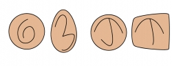
Ears
Ears may seem like an uninteresting part of the drawing, but there are many different styles to choose from. For the most part, they are circles, but ovals, squares, triangles and almost any shape that's reasonably familiar will do. Most important of all is how to add detail within the ear. Take a look at any number of animated shows and you will see that some characters have a "3" in their ear, some have a "6", others have a "T" or a "J", while others have nothing at all. Depending how authentic you want to be, look at your own ear in the mirror and try to figure out what the best shape would be. The basic rule is that it will be one or two simple lines, nothing too detailed.
Ears - Visual
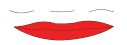
Mouths
Mouths are very simple most of the time, and have basically two styles: a
simple line for guys and lips for girls. Using the pen tool in
illustrator and drawing a straight line with 3 anchor points will give
you plenty of versatility for smiles, frowns and blank looks.
For lips, an extra anchor point is needed, having 2 points near the
center and one on each end. Just curve the outer points upward to make a
semioval on both sides of the center points. Use the center points to
create a small line and that's it. For the bottom of the mouth, three
points is all you need. Just curve the center point and pull it down to
make another semioval stretching the length of the mouth.
Mouths - Visual
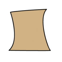
DRAWING THE BODY - Neck
The body is clearly the area that will take the most time. Or is it? Chances are, as long as you keep it simple, it rally shouldn't take as long as the face. All you need is a neck, a body and arms.
For the neck, I like to use a tall rectangle with the sides curved in. The key is to hide the top and bottom of the neck behind the head and shirt, respectively. It's a very simple part of the drawing and very quick to create a good one.
Neck - Visual
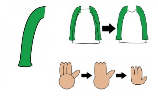
Arms and Body
The arms are next, don't worry about the body yet. Draw a line almost
directly outward from the neck, then curve down. Take a look at the head
and neck to try and estimate how long the arms should be. A good measurement
will likely be 2-3 heads for a long shirt, or 1 headlength for a
t-shirt. Continue the line across to create the sleeve, then curve back
up to the armpit to complete the shape.
***Secret tip*** Copy and paste this shape by going to
Object-->Transform-->Reflect and choose "Vertical". Then, use the
Window%uF0E0Align panel to line up the two shapes vertically. Place the
new arm under the head and neck in about the same relative position as
the first arm. This will keep things a bit more even and save a lot of
drawing time.
With the arms in place, drawing the body is pretty simple. Just draw a basic rectangle shape, with the sides "hidden" behind the arms. To make this easier, give the arms a fill color. For now the rectangle will be on top, but we'll adjust it later. Curve the top of the rectangle however you wish for the top of the shirt, depending on a t-shirt, v-neck, turtleneck or whatever style your character wants to wear. Finally, do the same at the bottom, again based on the style of shirt. Feel free to curve a few corner points to flare out the ends of the shirt, like we did for the shirt sleeves. You can even add anchor points all around the shirt and curve each one, moving them in and out from the body to add more flow.
To me, the hands are the hardest part to draw on a cartoon character. To
make them look real AND simple is sometimes a tough task, especially
when trying to draw them in a realistic pose. I like to do ovals for
each finger and a circle for the hand, combining all the pieces into one
shape with the pathfinder. Most characters have 3 fingers and a thumb
to keep thing more simple, and to keep the fingers from looking too
thin.
The wrist is a bit tough to figure out, but just remember that the line
from wrist to thumb is more curved than the line from wrist to pinky.
Thankfully, most of the wrist can be hidden underneath a long sleeve
shirt. Some artists even have their characters cross-armed to hide the
fingers.
Arms and Body
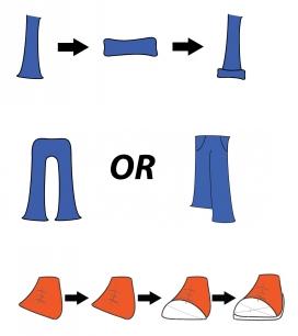
Legs and Shoes
Legs are about as easy to draw as the arms, maybe even simpler. I like to use a rectangle shape, curving a bit on its way down and flaring a bit on the end of the pants. You can also cover up the end of the pant leg with a rounded rectangle to give a loose, baggy look to the pants. Be sure to add a few extra anchor points and smoothly curve each one to make the material flow a bit more realistically.
Depending on the character's stance, you can draw both pant legs in a number of ways. For a straightforward stance, two rectangles side by side works very well. For a tilted stance, try drawing one pantleg longer than the other, with no division between them. Remember, the more distant leg will be a bit shorter than the other, as it is farther away from the viewer. Go back and draw a curved line up the center to show the difference between the legs. Don't forget to add some pockets as well.
Shoes can get a little tough, but a basic sneaker works pretty well, especially if you hide the details behind the front end of the sneaker. Decide on the angle of the shoe and draw a basic rectangle that gets smaller towards the top. Adjust the lower anchor points based on the angle of the shoe and you have your base shape. Add a few lines and laces for the shoe. Draw a semicircle shape to cover most of the shoe's front end and finish it off with the sole of the shoe, angled so it tapers away as it goes farther back. This can be done simply with a shape that mirrors that of the main shoe, adjusted to sit underneath the entire drawing.
Legs and Shoes