How Color in Architectural Designs Affects People’s Mood
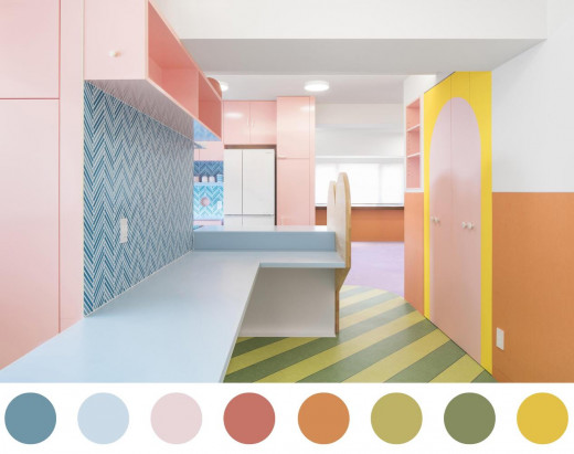
From the first dwellings of early man, he chose to beautify these places with paintings that showed the kind of lives they lived in such moments. The art of colour design can be said to have thrived from humble beginnings to a more advanced stance as can be noted presently. From the beginning of the existence of humankind, the emphasis in the places where he lived was accorded much respect in terms of how it looked. For man, it was also important for him to have things that assisted him to survive in such an environment instead of making such a place appealing in the fast place. This means that matters of colour were considered nobility and evolved over time. It is, therefore, necessary for us to understand humanity and the history of design, plus the impact of colours on people’s mood in order to come up with the best style and architectural designs that would be deemed as the best in our settings.
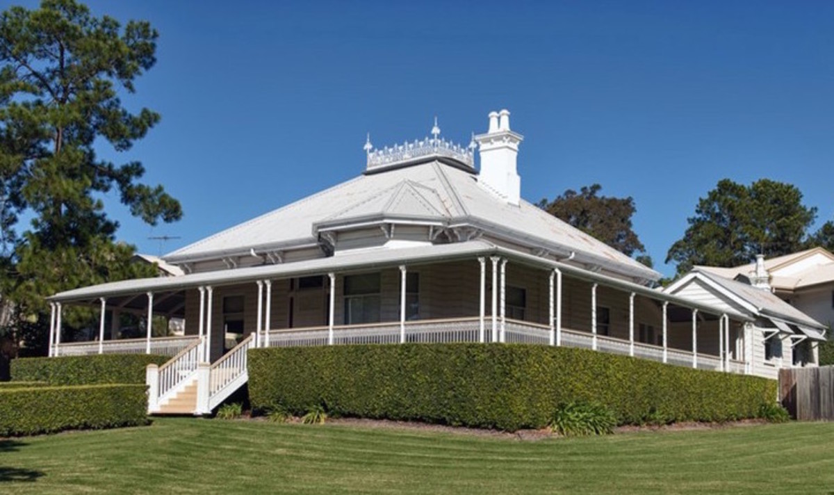
Colour is found everywhere, in architectural design; it becomes important in establishing moods of a particular place. In fact, the impression is created as soon as one enters a room and notices the color choice employed. Color is used to minimize the faults in architectural designs, uniting the furniture, and establishing the visual illusions of emotions, moods and even the room. Colour is essential since individual moods, minds and emotions respond in a variety of ways in accordance with their experiences and personalities. Although there are no research findings, which indicate that all individuals react in a particular way to particular colours, there is no doubt that colour elicits people’s moods, physical feelings and emotions. Owing to this impact, it, therefore, becomes necessary for designers to choose colours that may bring out the desired effect to the immediate occupants or dwellers of the place and not just those that seem to combine well.
Use of Color in Architectural Design
The utilization of colour in organizing and improving architectural designs and as a way of motivating the occupants in feeling pleasure while in the place as well as protecting them provides a good startup. Owing to the extensive use of colours in architectural designs, the crime rate is said to have gone down in many places that have employed specific colours. This is because the designed space does not feel anonymous any longer and the occupants have become more fearless. Colour has, therefore, been used more effectively and in turn, it has increased security.
It would be important to note that various contexts in architecture will carry different levels of colour significance to different users. For example, the colour requirement in an office set-up may be quite different from that in a meeting room set up though, they may be all be for the purpose of administrative works. Several other examples could be provided, however, research is not explicit on how the users perceive these colour senses. Apart from being considered as guides, it should also be noted that colour is the space builder.
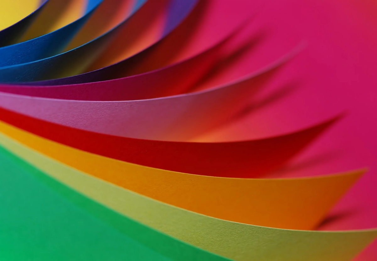
In the design of a particular place with personality in mind, colour is the most crucial element one should think of. There are more than 16 million colours today, which can be used to inspire and draw people at the same time. This is so because, in reality, people are psychologically wired to notice and react to the colours. Specialists in the field of design can acknowledge the power of colours in changing the mood and attitude of individuals. They contain strong influences on people’s spirit and mind in different ways. Ultimately, different colours may produce moods such as cheerfulness, energy, optimism, safe, meditative, sensual, luxurious and so on.
There has been an increase in the use of colours over the years. Individuals are becoming more acquainted with how best to define colours to fit the different styles. This has enabled designers to implement different colours within the interior designing, architecture, installations, art elements and designing of products. The result has been a fashionable explosion of these colours.
Colour can be considered a sacred issue in visual elements. It is also acknowledged by design specialists that colour expresses the design elements. It acts as a non-verbal communicator by revealing meanings and intended messages. In addition, it works and stimulates the human sense, thoughts, and abstract concepts, expressing fantasy as well as producing aesthetic or emotional responses. Emotional responses derived from colour are impulsive. This reaction may either be positive or negative, owing to an individual’s perception.
Research has long supported the notion of people’s moods being influenced by colour. What has, however, not come clear is which colours can be influenced to do what. For instance, sky blue is regarded as soothing, white and silver are said to be airy, leaf green is thought as calming, yellow and orange are also calming while violet is thought to be holy or royal. It has become a challenge for researchers to determine that specific colours cause-specific influences or certain changes in an individual’s mood.
The psychology of colour has continued to develop since the 1970s. Many governments are painting prisons in pink colour to suit prisoners and food chains are painting their food joints in orange in an attempt to make their clients eat faster. However, scientists have been defeated to know in specific which colours are related to the same emotions.
Different communities and cultures relate to different colours in different ways. For instance, you will find mourners in Asian countries wearing white clothing. Brides and grooms in India wear red. This is quite different in places such as America where the colour of mourning is usually black while brides wear white. Some cultures may also relate to one colour in two different aspects. For example, the Catholic Pope in most cases wears a red robe, while Satan is also depicted as wearing red skin. In particular, if the red colour makes individuals have vitality, the feelings towards such vitality might change in relation to the context of the situation.
In the year 2000, the government of Glasgow incorporated the concept of blue street lighting in its capital city in an attempt to reduce crime. Interestingly, reduced criminal activities were reported in this area. Various media outlets picked up this report and relayed them to several countries. Japan also borrowed this concept in 2009 by installing blue lighting on all its stations to control the rising case of suicide and homicide among its citizens. Several other countries have also followed suit in incorporating this idea.
In separate studies, research has shown that the colour wavelengths (violet associated with long waves and red associated with shortwave) relate to individuals’ hormonal systems in altering their moods. These findings have however been questioned owing to the fact that similar colours may be made in a variety of ways. This means that the wave pattern for two colours, which may seem identical, may not always be the same even if the observer feels that they might produce the same emotions
In a 2008 study termed “the effects of proper and improper colour stimulus in odour differentiation” individuals who try to undertake a particular task under green or blue colours performed worse than those who did the same tasks in an environment of red, orange or white colours. Another study revealed that individuals who have been presented with a green juice of strawberry or cherry in a glass did not recognize the kind of odour from this liquid. However, they could recognize the odour when the colour of the liquid was red.
A study that was meant to find out the effects of colour on people’s moods was conducted by assessing individual reactions to colour and presenting the findings on a scale. This study established that the effects of brightness were almost similar to achromatic and chromatic colours. On the other hand, blue-green, blue, red-purple, purple-blue, and green happened to be the most pleasing for individuals, colours that were the least pleasant included, green-yellow and yellow. The most arousing colours were green, blue-green and green-yellow while the least arousing colours were blue-purple and red yellow. Green-yellow dominated the red-purple.
Research on the effects of a logo by Doyle, and Bottomley, (2009) required that participants rate the appropriateness of the colour in companies that were fictitious on the basis of each companies’ products. Respondents were given a choice of products, which were fictitious that were in a variety of eight colours and were asked to rate the relevance of the colour with regard to the products presented. The findings were that the sequence of the appropriateness of the colour logo was on the basis of the function of the product. If the respondents regarded the products as being functional, solving their problems or meeting the needs, then the most appropriate colour was the most functional in this perspective. If these products were seen as sensory social, conveyed people’s perceptions, or social approval, then it resulted in a sensory social colour being perceived as more appropriate. Organizations should, therefore, decide the type of goods or services they want to make and choose appropriate logo colours that could align with the functions of such goods or services.
Color, combined with light affects people’s attitudes concerning specific environmental settings. Those perceptions, which may not be associated with colour such as food palatability, may also be indirectly determined by colour. Moreover, not only the food colour alone but also all the objects around the eatery environment.
Conclusion
The choice of colour in decorations can at times be intimidating if not challenging. It requires that people plan carefully concerning which colours to use and which can be suitable in a particular setting. It is clear that colours do influence emotions, though studies have not clearly affirmed the facts concerning the same. Therefore, it would be better for architectural designers to choose colours that may generate the desired effects in a particular setting. The colour choice should be carefully decided upon because it will directly or indirectly affect occupants of that specific place. Research on the relations of colour to mood has been along and evolving and it continues up to the present day.

