Photoshop Tutorial: Playing with Layer Effects and text to create eye-popping graphics

With websites, like any visual medium, what your site looks like has an impact on how people experience the message that you want to convey. If your site looks unprofessional or boring, your users will experience your product in the same way.
As with any other ‘introduction', you have seconds to make a good first impression - and I'm here to show you how to use Photoshop Layer Effects to create funky, mind-blowing header graphics or banners that will blow your visitors away.
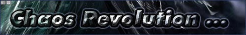
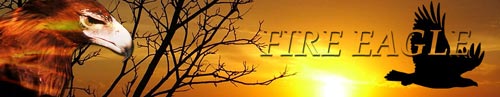
This is what we'll be creating:
Now, don't panic. It's a lot simpler than it looks.
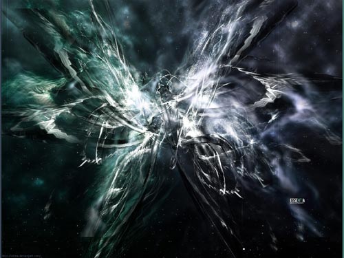
Here's the image that I started out with:
Step 1: Creating the canvas
There's no hard and fast rule about size when it comes to header graphics on a website, you can make it as large or as small as you wish; though in my experience and as a rule of thumb, I tend to stick to 770 x 100 pixels. It gives you enough space to create something gorgeous without taking up so much screen space on smaller resolutions that your actual message is lost.
Create your new Photoshop document and also open your base image in Photoshop as well. Drag the base image to the new document you've created.
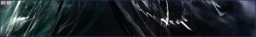
My canvas now looks like this:
Step 2: Choose your wording and text/font style
I chose ‘chaos revolution' as the text to use, but this can be anything you can think of.

Looks a little boring, but we'll be fixing that soon enough.
Me, I'm a font addict - I'm forever searching for and downloading fonts on the web. I don't use funky fonts in normal document writing - legibility is a key factor here, as is general availability of the font on the PC the document is being viewed on. But I do use the more creative fonts in creating these types of banners.
- Tips for using fonts in this way: Depending on how many effects you're going to be layering on the text, stick to fonts with clean lines. The more complex the outline of the font you're using, the less visually effective your effects are going to be.
- Choose a font with solid, perhaps even chunky, letters. Too thin, and you won't see the effects that you apply to the font. An exception would be if you're creating a very large graphic - the increased space allows you to use a bigger font size which gives you more freedom to experiment. But for our purposes, small space = chunky fonts.
I chose Futura Italic Extra Bold for my banner.

Step 3: Create the ‘overlay’ image and using Clipping Groups
Now here's the first secret step to making the banner above come to life. I copied the initial image layer (background image) and moved it around a little so that it still has the same ‘flavour' as the background, but isn't an exact copy.
Move this layer above your text layer you created in step two.
Next, you want to create a clipping group. Wait, wait ... a what?!? A clipping group is a grouping of layers in Photoshop that uses the bottom-most layer as a mask for the entire set of layers in the group.
Let me show you:
I used the text layer and the ‘overlay' layer to create a clipping group with the text layer as the base one. This means that everything I put on top of the text layer in the clipping group will only show through the text, not cover the whole image.
There are two ways of creating a clipping group.
- Hold down the ‘alt' (Windows) key or ‘options' (Mac) key on your keyboard. Position your mouse pointer on the line between the two layers you want to group. Your pointer will change to an image of two interlocking circle. Simply click and voila - one clipping group created.
- Alternatively, select the layer you wish to group and select ‘Layer > group with previous' from the menu at the top of your screen.
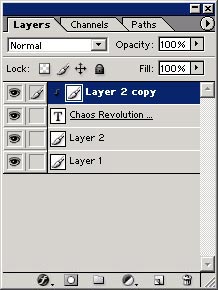
So, your Layers Palette is going to look something like the image on the right.
Step 4: Having fun with Layer Effects
We've created the base of our banner image ... now it's time for some real fun. There are several different layer effects that you can apply to any layer in your Photoshop project. The three I use the most in design, especially for these types of projects, are:
- Bevel and Emboss
- Drop Shadow
- Outer Glow
Depending on the nature of the image you're working with, the effects you use are entirely up to you.
You can access the Layer Effects menu by clicking on the little symbol at the bottom left of your Layers Palette that looks like an ‘f'. Alternatively, you can select Layer > Layer Effects from the top menu on your screen.
So let's get started. All the effects we're going to be applying to our project will be done on the text layer. Remember, the text layer is forming the base of our clipping group.
Bevel and Emboss
This layer effect us typically used to make the object you're working with look 3D. This is an optical illusion created by applying highlights and shadows to your text.
There are several options you can choose from and the best way to get to know the tool is to play around with the different settings to see what effect you get on your image. There have been numerous occasions where simple fiddling around with the settings has given me amazing results that I wouldn't have thought of.
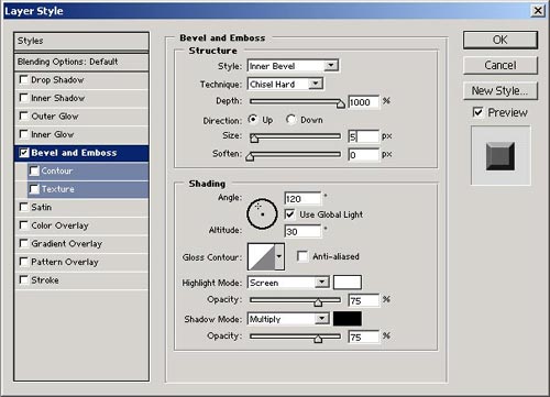
I wanted a chiselled hard-edged look to my text. The settings I used were:
- Style: Inner Bevel - this creates the bevelled effect inside the outlines of the text
- Depth: 1000% - This setting determines how ‘deep' the bevel effect is applied to your object.
- Size: 5px
- The rest of the settings I left as is.
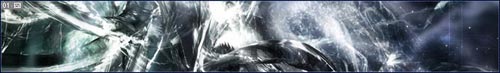
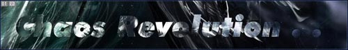
My banner now looks like this:
Outer Glow
This layer effect applies a ‘glow' around the object. It can be any colour you chose, as close to the object or as far as you wish. Once again, playing around with the settings gives you a good feel for what this tool can do.
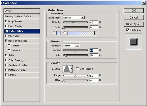
An insider's tip: Don't ignore the ‘Contour' option here. With several pre-made options, each contour can have a dramatic influence on how the Outer Glow effect is applied. Go ahead, play with it and see what happens.
By using a different contour option, I could change my look from:

to
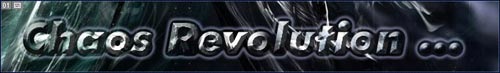
It's getting there, but still not quite right. I feel the text is disappearing into the background a little.
Stroke
This effect does exactly what it says ... it puts a stroked outline around the text.
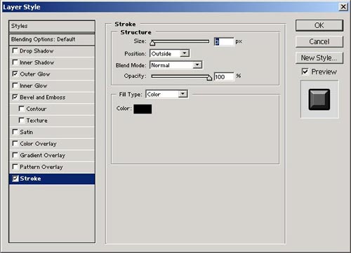
And again ... play! See what changing the options does to your image.
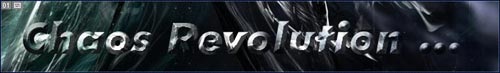
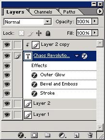
Your layers palette will look something like the image on the right.
Step 5: The Final Result
By using an interesting image, clipping groups and layer effects - we went from boring to eye-popping in no time at all.


Final Thoughts
If there is one thing I can't stress enough it's that you need to play and experiment with the layer effects that Photoshop makes available to you. The more you fiddle and tinker, the more familiar you become with the tools and the easier it is for you to create something truly unique.
I have my way of doing things and my tools I prefer to use, but yours might be different. Remember - the only limitation to your ability to create amazing graphics is the limitation that you place on yourself.
Other Examples


")


