American Dream: Poverty - Has Spending on Public Assistance Really Helped?
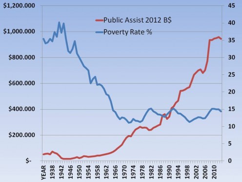
Poverty Level Vs Public Assistance Spending 1935 - 2014
The 1000-Word Chart Doesn't Tell What It Seems to Tell
THE GENESIS OF THIS HUB IS FROM A SERIES OF COMMENTS between Landmark Wealth (on the Right) and My Esoteric (on the Left) in a Hub Entitled “The American Dream: Why is the American Middle Class So Damn Poor? Under discussion was whether the federal government's spending on public assistance (excluding Social Security Insurance and Medicare payments) helps reduce poverty in America. It should be obvious that Landmark Wealth thinks it did not while My Esoteric thinks it did ... and does. In fact, by my calculations, for every 10% increase in public assistance spending (within certain limits), the poverty rate should decline on the order of 3%; that translates to 1.3 million people at today's rate of 14.5%, which, one hopes, will decrease to 14.1%
Poverty Level Vs Public Assistance Spending 1947 - 2014
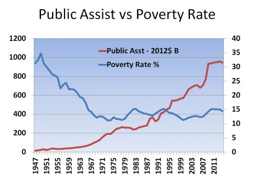
This round began with a chart (similar to Chart 1 above1) I found in that far-left rag, The Heritage Foundation, the great defender of liberal thought. OK, so I exaggerated a little bit, but its still a good chart. Heritage, of course, was using it to support an argument that public assistance spending 1) doesn't do as advertised and 2) creates mass dependency on a welfare society. And, if you only glance at the chart, that is exactly the opinion you might draw; but, I saw something different.
Heritage comes to this conclusion because first, there is a dramatic drop in poverty rates from 1947 (where their chart, Chart 2, started) to 1964 (when President Johnson first announced The Great Society program), yet there was no apparent increase in public assistance spending. This suggests no relationship between spending on poverty and the poverty rate itself (or that is what Heritage Foundation wants you to think). followed by a continuing decline until about 1970. On the other hand, public assistance spending appears to be very low from 1935 - 1964 when it began to ramp up. By 1970, it had increased to about $200 B. Spending appears to skyrocket while the poverty rate seemingly remains constant. Heritage, and Landmark Wealth, thinks this tells a devastating story about the value of public assistance spending ... to me, it tells an entirely different story because I am not predisposed to believing public assistance is worthless.
1. I start from 1935 to give a somewhat more complete picture by adding in the end of the 1929 depression as well as the 1937 recession.
Poverty Level Vs Log of Public Assistance Spending 1947 - 2014
What My Esoteric Sees
I MUST SAY THAT I HAVE AN ADVANTAGE OVER MANY OTHERS in that one of my careers was analyzing data just like this. And, one of the things I learned is you can't look at something like this in a vacuum; in other words, without taking other factors into account. First consider the huge drop in the poverty rate from 1947 to 1970.
It occurs to me that prior to 1947, America was coming off of a war-footing. Before the end of WW II, Americans were 1) fully-employed and 2) drawing two incomes, if you were married. That accounts for the drop in the poverty rate from the beginning of WW II to its end in 1945. Then you get the sharp spike from 1945 to 1947 as incomes dropped when women were forced out of work and the soldiers returned home to few jobs. From 1947 on, the economy made the switch from war to peacetime with ever increasing number of jobs available for the men who were once at war. Also going on was an ever increasing amount of federal spending devoted to public assistance.
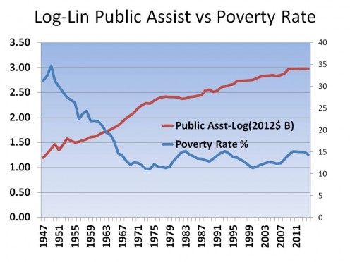
When there is a wide range of values in a variable, such as there is with Public Assistance spending, then the pictorial differences when the size of the numbers are small is hidden when, in fact, they can be quite large. Consequently, while many people see a flat spending line between 1947 and 1964, I take into account this scale effect and know there is a much larger one in reality; Chart 3 is the result1.
If I had presented the actual numbers, you have seen there is about a 300% increase in public assistance in the 16 years be 1947 and 1963 where the increase seems very small. But if you consider the 15 year period 1965 and 1980, there there "appears" to be a huge increase in spending, it is actually the same 300% increase. Chart 3 doesn't tell quite the same story, does it? In fact, it now looks like public assistance spending did help bring down the poverty rate.
1. The chart is known as a log-linear plot where the value of one variable which has a reasonably linear value range is plotted against the "logarithm" of the variable which is not linear. For example, when you hear that an magnitude 1 earthquake happened one day and another of magnitude 2 the next, then the second earthquake was 10 times more powerful, and not simply twice as powerful as the numbers would suggest. The same is happening with public assistance.
The Second Half Tells a Different Story
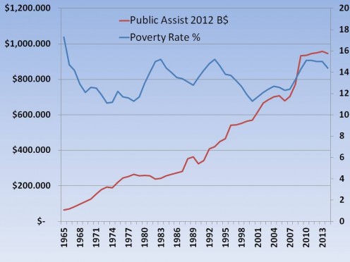
In the next 15 year period, 1965 - 1980, public assistance increased 300% again, notice that is the same rate as the previous period. Here, while spending increases poverty keeps declining for a few years before leveling out at a little less than 12%. But, why didn't the rate continue declining? Well, if you consider what was happening economically from 1972 - 1980, one might see why. During the 70s, due to the oil embargoes and the Middle East crises, the economy was in great turmoil; this is when President Nixon dropped the gold standard altogether. One might wonder why poverty didn't increase! Could it be the increased spending kept it check?
Now look at the 1980s. What happens besides the 1981 recession with 10% unemployment? We see that 1) spending stopped growing, a President Reagan administration priority and 2) the poverty rate increased 25%, growing from ~12% to ~15%. In terms of people, that puts around 7 million more into poverty. During the boom years in the mid-80s, the rate dropped slightly before bouncing back up during the recession in the early 90s.
In the next 15 years, 1990 - 2004, public spending increased only 100%, although because of scale it looks like it is much more, but looks can be deceiving. In any case, we can see a Decrease in poverty rates back down to a little less than 12%. Then, in 2006, when the bubble burst and the economy started heading into the Great Recession of 2008, spending and poverty rates rapidly increased 37% and 15%, respectively, in 3 years, topping out in 2009. Finally, during the recovery, spending growth stopped and poverty rates began decreasing slightly.
Again, throughout this whole period, I detect a definite correlation between public assistance spending and poverty rates. This, of course, contradicts The Heritage Foundation conclusions. As I said, this is what the charts appear to tell My Esoteric; but appearance must be backed up by statistical analysis.
Analysis Results
IN THE SERIES OF HUBS BEGINNING WITH More Legal Guns ..., I went into great detail about how I develop this type of statistical analysis, and I refer you to that for an in depth discussion of my methodology. So, in this Hub, I will leave most of the math behind and just focus on developing the variables I tried and what the final result is.
The first thing one needs to do is decide an initial set of likely variables which might be involved. Two come to mind immediately are 1) the Poverty Rate (the Dependent variable) and 2) Public Assistance Spending (an Independent variable). The Poverty Rate is the dependent variable (dependent on the values of all the other variables) because that is what we are trying to predict. Public Assistance is the independent variable because our "null hypothesis" is that there is an indirect relationship between the two, i.e., the more money spent on public assistance, the lower the poverty rate. ... the hypothesis which Landmark Wealth and The Heritage Foundation maintain does not exist.
Obviously, however, there are many more possible independent variables which might raise or lower the poverty rate. The following are what came to mind for this iteration of analysis:
- Population
- Unemployment Rate
- Taxing demographics
- Economic demographics
- Major world events, like war
Population
POPULATION WAS FACTORED IN TWO WAYS; one as a raw number and the other as spending per capita.
The idea for raw population is that as it increases there are more opportunities for "scale" to influence the poverty rate. For example, as the population grows it may become harder (or easier) to find work simply because the scale may make it that way. Another example is that as population grows, so 'might' raw spending on public assistance and how the growth happens may determine how much public assistance is spent.
Public assistance "per capita" does just the opposite, it factors out population growth and focuses solely on how much is spent per person. This way true growth in spending for public assistance is measured by looking at the change per person.
Both factors 'could' show up as significant, or neither can. In this case, only per capita spending turned out to be significant; we'll get into how it tracks with poverty rates later.
Unemployment
IT WOULD MAKE ALL THE SENSE IN THE WORLD that unemployment and the poverty rate would be tied at the hip. After all, if unemployment goes up, absent anything else, so must the poverty rate since people will be earning less money. One would expect, however, the degree of increase to be mitigated by any government support provided.
Tax Implications
THIS IS ONE OF THE MOST HOTLY CONTESTED FACTORS. Those on the Right would it has either no effect or, if it does, lower the better. The Left, on the other hand, maintains that how people are taxed has a great deal to do with whether people live in poverty or not.
The Lefts theory is that the flatter the income tax, and all other taxes for that matter, are, the more likely people will be forced below the poverty level because the higher taxes they must pay (because the well off pay less as a percent) eat into the minimum amount people need to survive.
For this iteration, I tried out the following tax related variables:
- Top tax rate
- Dollar floor of the top tax rate
- Lowest tax rate
- Dollar threshold for lowest tax rate
- Ratio of tax rates
- Ratio of floor and threshold
The idea for the top rates is that the more the rich are taxed, the more of the income that "trickled up" to wealthy is passed back to the lower class. The lower rates and threshold might be important because the lower one or both are, the more income the poor get to keep. One might also surmise the the ratios of high to low might offer up similar information. In the end, for this trial, only the Floor of the top tax rate came in as significant.
There are more that make sense but I will leave those for different study.
Economic Variables
THERE ARE MANY TO CHOOSE FROM TO SEE if they influence poverty rates. The ones looked at this time around were
- whether there was a recession or not
- whether these was a recession one period (year) from now
- whether there was a recession two periods from now
- whether there was a recession one period ago
- whether there was a recession two periods ago
It is common sense that a severe economic downturn will have an impact on the poverty rate. The question is, when does it start showing such an effect? It could be during the recession itself, or people might start falling below the poverty line as the economy heads into a recession or, more unlikely, coming out of one. When I ran the regressions this time, the only significant economy related variable I looked at was two periods prior to the official beginning of a recession.
Major World Events
IT STANDS TO REASON THAT MAJOR WORLD EVENTS may increase or decrease individuals income and wealth. The only one I looked at here, though, was significant war, Iraq or worse. The presence of war did turn out to play a roll.
There are other events, like oil embargos (which might be considered economic), the cold war, etc which should be considered at some point in time.
A Word About Methodology
RARELY IS A SET OF DATA IN SHAPE TO ACCOMPLISH meaningful analysis. The main reason is the string of numbers which represent a variable is not linear in shape; if you plot them, they would looked curved. This is important because most, but certainly not all, regression analyses want an outcome that looks like X = aW + bY + cZ +...; that is the form of a linear relationship (X = a*Y*Z would be one of the non-linear forms).
Consequently, if you are working with non-linear data, you need to do something to straighten it out; this is called transforming the data. Once transformed, you can regress all of the data to obtain a relationship between the dependent variable (X) and any significant independent variables, assuming there are some. That is what I did in this case and once you have your equation, it is a simple matter of reversing the transformation to get an answer in understandable and relevant terms. When you see the equation below, you can tell what the transforms were by looking at anything with a power (^) function. If you want more detail, please refer to my series about gun control.
And The Answer Is ...
[If you don't care to know what the model actually is, you can skip down to the Sensitivity Analysis or What To Make of It All sections]
YES, VIRGINIA, THERE REALLY IS A CORRELATION BETWEEN PUBLIC ASSISTANCE SPENDING AND THE POVERTY RATE. And the relationship is:
BC-Poverty Rate = 0.9856 + 0.0364*A - 0.5406*B- 0.5233*C - 0.046*D - 0.0173*E
Where:
A = BC-Per Capita Spending (BC stands for the Box-Cox transformation)
B = BC-Adj Btm Tax Threshold
C = Unemployment Rate
D = Major War
E = Minor War
Makes perfect sense, doesn't it. Well, don't try to read too much into this because this is the 'transformed' equation as represented by the "BC" in front of most of the variables. BC stands for Box-Cox which is the transform method I used. What might make a little more sense is the following equation:
[2] 1/(Poverty Rate)^0.25 = 0.9856 + 0.0364*LN(A) - 0.5406*B^0.025 - 0.5233*C - 0.046*D - 0.0173*E
Where:
A = Per Capita Spending
B = Adj Btm Tax Threshold
C = Unemployment Rate
D = Major War
E = Minor War
Where (numbers in parentheses are the rage of data points or "relevant range"):
- Poverty rates are in percentages (11.3% to 40.2%)
- Per Capita Spending is in Thousands of 2012 constant dollars ($108 to $3,029)
- Adjusted Bottom Tax Threshold are in 2012 constant dollars ($4,025 to $67,035)
- Unemployment Rate (0.012 [during WW II] to 0.104)
- Major and Minor War are dummy variables which are set to 1 if the event is happening.
Now, I realize the above equation probably doesn't mean much to most of you either for it is quite complex. So let me offer this in the way of explaining what is going on with each variable as it relates to the Poverty Rate:
- Poverty Rate INCREASES if
- - Public Assistance Per Capita Spending DECREASES
- - the Adjusted Bottom Tax Bracket Threshold INCREASES
- - the Unemployment Rate INCREASES
- - there is a major war
- - fhere is a minor war
So, bottom line is if more money (within the "relevant range") is spent on Per Capita Public Assistance Spending, the Poverty Rate 'should' decrease; all else being equal.
This is a very robust model, given the Adjusted R2 is 89% (meaning about 89% of the variation between the actual and predicted Poverty Rates is explained by these six variables. Further, each of these variables is significant to < 1% (meaning highly significant).
Some Sensitivity Analysis
TO GIVE YOU AN IDEA OF HOW MUCH EACH INDEPENDENT VARIABLE contributes to the Poverty Rate, one can run some sensitivity analysis. It works like this - we change the value of an independent variable by a known amount and see what happens to the Poverty Rate. First let's set up the baseline by replicating the 2012 input variables:
- Per Capita Public Assistance Spending - $3,026
- Bottom Tax Bracket Threshold - $17,400
- Unemployment Rate - 0.083
- Major War - 0
- Minor War - 1
This results in an estimated Poverty Rate of 13% (the actual for 2012 is 15.0%)
Now let's vary each independent variable, on at a time, by 10% to see what happens to our Poverty Rate.
- If you increase Per Capita spending to $3,260, the Poverty Rate changes from 13% to 12.7%, a 3% decrease
- If you increase the Bottom Tax Bracket Threshold to $19,140, the Poverty Rate changes from 13% to 13.2%, a 1% increase
- If you increase the Unemployment Rate to 0.091 , the Poverty Rate changes from 13% to 13.5%, a 4% increase
- If there is no major war and no minor war. the Poverty Rate changes from 13% to 16.3%, an 25% increase*
- If there is a major war and no minor war. the Poverty Rate changes from 13% to 11.5%, a 12% increase*
* These are pretty large changes and deserve more analysis in a later iteration.
Further Enhancement
LANDMARK WEALTH REVIEWED THIS HUB and still takes issue with it. To see what they are, go to the comments section of
http://myesoteric.hubpages.com/hub/The-American-Dream-Why-is-the-American-Middle-Class-So-Damn-Poor#comment-16394279
His view is that the rate of poverty has nothing to do to what is spent on it but instead, the amount of spending as a percent of GDP. I take exception to that because the numerator (public assistance (PA) spending) and the denominator (GDP) don't necessarily have to be correlated, meaning the numerator and denominator could be independent of each other and therefore produce false results.
So, I tested the idea (as well as spending as a % of GDP per capita) and found the following from the set of data I used:
- The poverty rate is poorly correlated to GDP and/or GDP per capita alone and in combination with other variables.
- The amount of per capita PA spending is marginally (R2 > .75) correlated with both GDP and GDP per capita
- The amount of per capita PA spending is moderately (R2 ~ .85) correlated with both GDP OR GDP per capita
- The poverty rate is correlated with PA Spending as a % of either GDP or GDP per capita
- Substituting either or both of the above for straight per capita PA spending produces a poorer model.
- The amount of PA spending per capita is highly correlated (R2 = 0.97)with ratio of PA spending to GDP per capita. This is extremely important as we shall see in a moment and goes to disprove Landmark Wealth's hypothesis.
- HOWEVER, adding PA spending as a % of GDP per capita did produce a potentially better model
As a consequence, the new model is, with an Adjusted R2 of 0.93, compared to 0.89 for the previous model:
[3] - 1/(Poverty Rate)^0.25 = 0.4557 - .0571*A^0.51 + 0.0923*LN(B) -0.3144*C^0.025 - 0.3825*D - 0.0331*E
Where:
A = GDP % spending per capita
B = Per Capita Public Assistance Spending
C = Adj Btm Tax Threshold
D = Unemployment Rate
E = Major War
None of the signs changed so are sensitivity analysis for the new variable is:
- A 10% increase in the % of GDP per capita rate (either by increasing PA spending or decreasing GDP or some combination of the two) will drive a 9.8% increase in the Poverty Rate!
Well, this is a counter-intuitive result ... the result says more PA spending per GPD dollar per person, the HIGHER the poverty rate, not lower as theory (but not Landmark).would have it.
The reason we get this odd result is the first two independent variables are highly correlated with each other, as pointed out in bullet #7 above (this is called multicollinearity), and if present, can cause very strange outcome, as in our model's counter-intuitive result. So, what does one do with one of the offending variables? Toss it out.
The next question is, which of the two variables to keep. The answer to that is you use the one which gives the better model. And that would be our original model using just the amount of PA spending per person.
Getting Even Better
AS YOU CAN SEE, THIS KIND OF ANALYSIS IS AN ITERATIVE process as new information or ideas appear. In the last case, those new ideas didn't lead to any improvement in our model. After further discussions with Landmark Wealth, I hit upon a few more variables which, in the end, gave a much better model. That model is:
[4] - 1/(Poverty Rate)^0.1 = 0.4694 + 0.0311*LN(A) - 0.1544*B^0.025 - 0.3217*C - 0.0188*D + 0.1220*(1/E) - 0.0103*F^0.16 + 0.02280*(1/G^4.5)
Where:
A = Per Capita Spending
B = Adj Btm Tax Threshold
C = Unemployment Rate
D = Major War
E = Gini Index
F = Ratio of the Top Tax bracket Floor to the Bottom Tax bracket Threshold
G = % difference between this period's GDP and last period's GDP
Those last two new variables add a couple of more dimensions to the model to account for other factors that weigh on the Poverty Rate. The first is something called the Gini Index (published in the Census data). This index, in this case, measure the degree of income inequality in our society; the higher the number, the more inequality there is.
The second factor brings in recessions by looking for negative changes in annual GDP. If it is negative in a given year, that would generally mean the economy is in recession. When the dust settles, I end up with a very strong model whose Adjusted R2 is 0.96!
Table 1 below displays how an increase in each variable changes the Poverty rate. Table 2 gives the results from running a few trials on data ranges in which Landmark was interested.
Effect on the Poverty Rate With a Change in a Given Variable
VARIABLE
| CHANGE
| RESULTING CHANGE
|
|---|---|---|
Public Assistance Spending
| Increase
| Decrease
|
Bottom Tax Rate Threshold
| Increase
| Increase*
|
Unemployment Rate
| Increase
| Increase
|
Major War
| Yes
| Increase
|
Gini Index
| Increase
| Increase
|
Tax Floor to Threshold Ratio
| Increase
| Increase*
|
Change in GDP
| Increase
| Increase
|
TABLE 1 - *To me, these are counterintuitive results and needs further research. I would welcome comments.
Results of Trial Runs
DATE
| MODEL RESULT
| ACTUAL POVERTY RATE
| % Difference
| MODEL CHANGE
| ACTUAL CHANGE
|
|---|---|---|---|---|---|
1978
| 11.5
| 11.3
| 1.77
| ||
1983
| 15.3
| 15.2
| 0.66
| 3.8
| 3.9
|
1984
| 14.1
| 14.4
| -2.08
| ||
1992
| 14
| 14.8
| -5.41
| -0.1
| 0.4
|
1993
| 15.4
| 15.2
| 1.30
| ||
2001
| 13.4
| 11.7
| 14.53
| -2
| -3.5
|
2002
| 12.2
| 12.1
| 0.83
| ||
2006
| 13.2
| 12.3
| 7.32
| 1
| 0.2
|
2007
| 12.2
| 12.4
| -1.61
| ||
2014
| 13.4
| 14.4
| -6.94
| 1.2
| 2
|
TABLE 2
All-in-all, I am pleased with the results. Obviously, I need to understand what is going on with 2001, but the result is the result. I would like to have had all of the differences less than 5%, and I suspect with more tweaking of the transformations, a more accurate model can be produced. I am also pleased that, except for 1984 - 1992 tracking changes between years was relatively close and in the same direction. Even the one ending up with opposite changes, the changes are close.
Conclusion - The Poverty Rate Is Changed by Public Assistance (Welfare) Spending
WITHIN THE RELEVANT RANGE (and that is key) one can conclude that 1) the Poverty Rate and Public Assistance Spending ARE related and 2) their relationship is an Inverse one; when spending goes up, the poverty rate comes down. Besides emphasizing the spending must not exceed the relevant range boundaries ($108 to $3,029 per person, in this case) it must also be caveated that the above analysis does not prove a CAUSAL relationship; which means public assistance spending is the Cause of changes in the Poverty rate. It only means that it is Likely, because of the strong correlation between the two; strong enough to use in a predictive manner.
Also important is the Bottom Tax Bracket Threshold or that point of Adjusted Gross Income passed which the second lowest tax rate applies. Further, the equation indicates that the higher the threshold, the higher the poverty rate. Let me say that this result is, to me, counterintuitive, but. in this model, the Bottom Tax Bracket Threshold varies directly with the Poverty Rate. What this says is as the threshold increases, so does the Poverty Rate. It would seem to me the correct response is that as the threshold goes up, more and more people would be paying at the lower tax rate leaving more money to spend which should Lower the Poverty Rate, not increase it. The same idea holds with the ration of the Floor to the Threshold. On the other hand, one might posit that as the lower threshold is raised, other, related actions are taking place at the same time which tends to increase the total number of people paying taxes. That could explain what is happening as well; but in any event more analysis is needed.
I highlight these three variables, PA spending and tax related, because of the eight, these three can be directly manipulated by governmental fiscal policy. The rest cannot be directly legislated. And this gets to the heart of all of this work, in addition to establishing a relationship in the first place. Policy makers can use tools such as this, more sophisticated than I can create sitting on a couch watching TV of course, to determine either the potential impact certain policies may have or to determine starting numbers for the policy itself.
For example, suppose Senator so-and-so thought it good too raise spending on public assistance by increase the amount spent to $4,000 a person (it is currently at around $3,000 in 2012$). What could he or she expect to happen? Well, if my model is correct, they could surmise that the poverty rate would fall about 10.8% from 14.4% today to 13% in the future, everything else being equal.
Similarly, what if someone proposes to raise the top tax rate to 50% (a move I would support) without changing the ratio between tax floor and tax threshold, what could one expect? I developed another model that says doing that potentially could reduce the Gini Index (lower income inequality) by 2% from 0.468 to .459. Again, everything else being equal, one might see a surprising 6.4% drop in the poverty rate. That kind of outcome, if true, makes a powerful argument to raise the top tax rates more.
To conclude, the reason this Hub was written was to establish what kind of relationship, if any, exists between spending on poverty and poverty itself ... and we succeeded in doing just that. Those who deny this relationship need to either 1) find something wrong in my methodology or 2) do similar analysis showing a different outcome.
Opinions Matter!
Do you think that spending by State and Federal governments on Public Assistance helps reduce the Poverty Rate?
Demographic Survey
Are You
Interesting Links
- A Hub From the Question About "Which is the main rea...
Poverty, the form of government, and the economic system are all related. That is why what started out as a very good Hub Question about Poverty, Money, and Education, has migrated to a full-blown Hub on Capitalism. - American History IV: Do You Know Who You Really Are?...
- American Dream: Poverty-What % of Your Tax $ Goes to...
When I say - Poverty: What Does It REALLY Take To Survive In Amer...
What income does it really take to barely make it in America, meaning what goes into a
Amazon on Public Assistance
© 2015 Scott Belford


