American Dream: Economic Inequality
A Year Or So Later
I THOUGHT I WOULD REVISIT THIS HUB WITH NEW INFORMATION. Behind this update is the knowledge that income inequality is linked to marginal income and inheritance tax rates in an inverse relationship; I will explain that later. The new book to the right takes a new look at a mass of contemporary economic information to draw very surprising conclusions regarding taxes and income inequality. Couple that with the 2013 tax compromise between President Obama and the GOP to prevent the 2012 "fiscal cliff", and you have the potential for new analysis. At first blush, the results are encouraging.
The Bible on Capital in the 21st Century
THE MEASURE OF ECONOMIC INEQUALITY
THE GINI INDEX
ONE WAY TO MEASURE ECONOMIC INEQUALITY
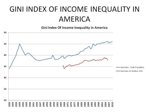
IF YOU STARE AT THE ABOVE CHART long enough, you probably won't make heads-nor-tails of it, yet there is an amazing amount of information in these simple looking lines. What you are looking at are called Gini Coefficients or Gini Indecies which measure inequality between groups from the same set of things and are named after Italian statistician and sociologist, Corrado Gini; it is one way sociologists measure income disparity among groups of people.
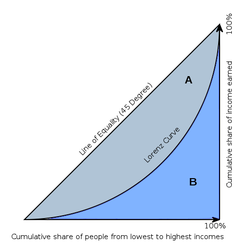
In our case, we are considering income inequality between the various income stratification's most economists use in their studies. The math behind the coefficient is relatively complex, but at the top level it is very easy to understand. The coefficient, or index, which I prefer to think of it as, ranges from 0 to 1 and it measures the relationship between "the cumulative share of income earned with the cumulative share of people from lowest to highest income", oh my!; fortunately, that is as complex as it is going to get, so please don't run away. In more understandable terms, this means that a Gini Index of 0 (zero), indicates all of the people in a group earn exactly the same income, while a Gini Index of 1 indicates that only one person in a group earns all of the income. Reality, of course, is somewhere in between, but, as you can see from the chart to the above right, which depicts what I said in words, as a graph, it is non-linear; it is the ratio of the area above the curve to the total area.
To put this in perspective, if we consider what the theoretical goal of a pure "socialist" environment might be, maybe one envisioned by Karl Marx, we would expect to see a Gini Index approaching zero. On the other hand, if you allowed "free-market capitalism" to run its natural course in a pure laissez-faire environment, á la the Ron Paul model, we would expect to see a Gini Index approaching one; because unregulated capitalism, by its very nature, concentrates more and more wealth and power in fewer and fewer hands. This latter result also occurs in non-capitalistic economies such as dictatorships, but not necessarily monarchy; practical Communism; and most Third-world countries.
HOW DOES AMERICA MEASURE UP?
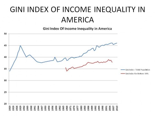
I HAVE REPRODUCED CHART 1 from the top of the hub and relabeled it Chart 3 in the figure to the right for easy reference; at this point it isn't really necessary to be able to read the numbers, you only need to be able to follow the curve and know that it starts at 1920 and ends at 2010. By the way, the red line on the bottom is the Gini Index if you remove the top 1% of income earners; it tells a powerful story which I will get to later on.
To put things in context, let me start off by stating that prior to 1933, except during the frequent recessions and depressions, the top 10% of income earners received roughly 46% of America's income; this is also the case after 1981! The other 54% of income was spread over the remaining 90% of Americans. During the period of Keynesian economics however, from 1938 - 1980, the top 10% received around 34% of total income, still a large number, but much more reasonable; in fact, probably desirable.
It is this kind of income inequality in America that you see represented in the Gini Index above. You can see, that beginning in 1920, after coming out of WW I and a few recessions, the Gini Index was at a low point (meaning income was more evenly distributed among the population). It then rises sharply until 1929. What happened between those two points? The Roaring 20s happened, that is what. A question to ask then, is why was income relatively equal, or better said, not so unequal in 1920, only to exhibit enormous inequity nine years later?
One principal reason is that in 1920, America was in its last stages of yet another major recession, one in a long series of often devastating recessions and depressions; this one particularly effected the super-wealthy which drove down their share of total income to around 40%, compared to the average I spoke of a couple of paragraphs ago. By 1928 however, the top 10%s share had increased to almost 50%! Surprisingly, the top 9%'s proportion of income actually remained about the same during this time period, 1923 - 1928; it was the top 1% which "Roared!", rising from 15% of total income to a whopping 24%!! The rest of America whimpered.
THE ZERO-SUM GAME
If you sum up all of the income earned in the American society for any given year and then discuss the various ways this income may be distributed, you are involved in what is called a zero-sum game, it is "zero-sum" because you are working with 100% of all possible income. Therefore, if you stratify income into various income groups and watch income grow in one group, the only place it can come from is one or more of the other groups because the sum must always equal 100%, don't you see. In the Roaring 20s, then, it is pretty obvious, that the top 1% of income earners received their extra 9% of total income from the lower 90%, given the 90% - 99% remained unchanged. This can be nothing other than, as I have proven in other hubs, a redistribution of wealth from the less wealthy to the more wealthy and why the Gini index rose so sharply during that period. This is all the more depressing given the fact that during the "Roaring 20's", real economic growth was a healthy 2.7% (compare that to the 2.5% real GDP growth from 2010 to 2015 many people are complaining about).
With this idea as a guide, let's consider the rest of the chart. After the high point in 1928, the Gini Index fell once again with the on-set of the Great Depression. The pain of the depression, as is true in almost all financially-based recessions and depressions, is generally felt among all income levels, but more acutely as the higher one moves up the income scale. Consequently, it is a natural economic leveler, isn't it. Exceptions are 2000 where the pain was felt almost exclusively at the top income levels, and the 2008 recession, where it was felt mostly by those making less than $250,000. Anyway, from 1929 to 1933, as the economic crash was in full swing and incomes plummeted, so did the Gini Index as income and wealth once again leveled out among the income groups. Starting in 1933, resulting from President Roosevelt's measures, the economy began improving until the 1937 recession it all reversed again.
From 1937 until the mid-1950s, America was either in the 1937 recession or in some sort of major military conflict; the latter events prompting a significant increase in taxes on the wealthy, another leveler of disposable incomes. After the Korean War, President Eisenhower lowered taxes a little bit followed by President Kennedy, who, in the early 1960s, made the first significant tax reduction. The next major tax reductions were in the early 1980s and early 2000s. It is also worthwhile noting there were minor tax increases on the top tax rate in the early 1990s and again in 2013.
Using this as a background, one can begin to analyse the Gini Indices presented in Chart 1. First, you can see the top index (total population) didn't change much from 1941 to 1960; that little up and down around 1958 is from a recession. During that period, the country faced WW II, the Korean War, and the expected economic turmoil in their wake. Consequently, it was hard for the economy to find stability and people of any income group to establish themselves; this kept income distribution within society relatively stable.
It isn't until after the Kennedy tax reduction does the Gini Index of income inequality begin its steady upward march. The increase isn't much at first because even though the tax reductions were very large for the wealthy, they were ALSO pretty good for the middle and lower class as well. The next sharp increase in slope, i.e. inequality, is after the 1981 tax "decreases" by President Reagan. This cut had very real positive effect on the wealthy, but only minor to modest ones for other income groups; in fact on the lowest income groups, it amounted to a tax increase. While the Bush I-Clinton tax increases and Bush II tax cuts weren't as large as previous ones they nevertheless still had predictable and observable results as can be observed from Chart 1.
WHAT CAN WE LEARN FROM THE U.S. GINI INDEX ABOUT ECONOMIC INEQUALITY IN AMERICA?
Before we begin this section, let me provide two more pieces of information:
1a. In 1963, the tax rate, adjusted for inflation, on income:
- less than $30,000 was 20%
- between $30,000 and $205,000 ranged between 22% and 43%
- over $205,000, ranged between 45% and 91%.
1b. In 1965, the tax rate, adjusted for inflation, on income:
- less than $28,000, ranged between 14% and 17%
- between $28,000 and $200,000, ranged between 19% and 36%
- over $200,000, ranged from 39% to 70%
2a. In 1981, the tax rate, adjusted for inflation, on income:
- less than $8,393, 0%!
- between $8,393 and $13,576, 14%
- between $13,576 and $60,723 ranged between 16% and 28%
- over $60,723, it ranged between 32% and 70%.
2b. In 1987, the tax rate, adjusted for inflation, on income:
- less than $56,000, 15%
- over $56,000, 28%.
I tried to set the ranges so that comparisons are relatively easy. Because 2b is so different, I added an extra range in 2a to make the change even more dramatic.
Let's first consider what happened in the Democratic tax reductions from 1963 to 1965? It is clear there was significant rearrangement of where the tax burden fell:
- The wealthy saw their top rates fell between 6 points and 21 points for the most wealthy, the 0.01%rs. Further, the thresholds, the income level where these rates kicked in, fell dramatically, from $2.9 million to $1.4 million.
- For the middle and bottom tiers, the improvement was a drop between 3 and 7 point
- Keep in mind that for the very wealthy also experienced the 3 to 7 point drop for the incomes they earned in those ranges; it is only on the incomes above those ranges, $200,000 - $205,000, where they saw the larger 6 to 21 point decline in tax burden.
So, when the dust settled, what were the final effects of the Kennedy tax cuts? First, all Americans who earned an income received the same tax reduction until their income reached about $200,000. Since this reduction was across the board below $200,000 it would have no real impact on the Gini index. In other words wealth distribution would remain relatively unchanged. However, for those who earned more than roughly $200,000, they received a bonus reduction, up to 15% for the top income earners (the 21% reduction less the 6% everybody got).
That means the wealthy got to keep a much larger percentage of their income. Where did this extra money come from? Well, because we are in a zero-sum game economy, the extra benefit those wealthier people received had to come at the expense of those who made less. Said another way, the government had to tax the lower income groups more in order to give more money back to the wealthy, everything else being equal. As a consequence, we see the increase in slope of the Gini index.
Now I know the common argument is that "it's their money anyway, why shouldn't rich get it back?" That is a fair question, but it is only applied to the wealthy. I ask why shouldn't the low and middle class get their money as well? Why shouldn't the reduction for the wealthy been limited to 6% like everybody else did?
What about the Reagan tax cuts between 1982 and 1987? They are a horse of a different color from the Kennedy-era cuts some 20 years earlier.
- The wealthiest saw their top rates decrease another 4 to 42 points, depending on how wealthy they were! In addition, the threshold for those new, lower rates fell from about $531,000 to $56,000.
- On the other hand, the poorest income earners saw their rates INCREASE from zero, for earnings less than about $9,000 to 15%!
- The next tier up, those earning less than around $14,000, their rate increased 1 percentage point!
- Only when we get to the third tier up, the middle class, those earning less than $61,000, do we see a decrease in tax rates of between 1 and 14 points; tiny compared to that received by the wealthiest Americans.
Here, we see that disposable income for the lowest income groups actually decreased as a result of the Reagan tax cut. For those making somewhat more, there was no particular impact. It was those earning more than $100,000, about 2 times the median income level, where the bonanza was felt. This was even more pronounced for those earning more than $500,000 a year.
This state of affairs, i.e., less income for the lower income groups and more income for the better off, means an increase in economic inequality, which is easily seen from the steep increase in the top Gini index. Once again, in the short-run, the only place the new wealth for the rich could come from is from those who make less and weren't allowed to keep as much of their income; in fact, some had to pay more!
There are, of course, many other things going on in the economy, but, in a capitalist economy, those generally benefit the wealthy more than they do the less wealthy thus tending to increase the slope of the Gini Index. This is especially true after 1981 when regulations put in place since the late 1930s to protect consumers and the less powerful from the vagaries of the rich and more powerful, were being dismantled by the newly invigorated Conservative movement, in line, of course, with their economic philosophy.
THE 1% THE "OCCUPY WALLSTREET" FOLKS ARE TALKING ABOUT
The most telling effect of both the tax and deregulation (which put downward pressures on wages as competition increased) polices, is when you compare the long upper line in Chart 1 with the shorter bottom line. They are measuring exactly the same thing with one minor difference, the top 1% income earners were left out of the calculations for the Gini Index in the shorter, lower line; what a difference 1% makes!
It should be pretty obvious that leaving out the effect of the top 1% income earners, income equality in America becomes more of a reality. Notice how much flatter the lower line is relative to the top line, that means the distribution of income between the various income groups, other than the top 1%, was becoming less equal at a much slower rate. Remember as well that in a capitalist economy it is expected the Gini index will increase over time, that is the nature of capitalism. But the question and challenge is ... how do you keep it from getting out of hand like it has been doing since the late 1980s?
Notice also that from the early 1960s until about 1980, the slopes to the two lines are roughly the same. That means even though inequality is increasing in America, it is not driven by the exceedingly wealthy. This would be one indicator, albeit a weak one, that most of America might be participating in the economic growth to some extent, not just those in the upper income groups.
Now look at the period from 1981 to about 1986, the slope of both lines increase noticeably, indicating the negative impact on the working class from the Reagan tax cuts, i.e., only the more well off benefited. Then, after 1986, the top and bottom lines diverge dramatically; the day of the 1%ers has arrived.
What also arrived was the era of massive deficits and debt and the slide into the 1990 recession, which is that up and down in the top line, but not the bottom line. What this means, of course, is that it was the 1%ers who suffered most from the 1990 recession and the end of the Reagan era. Everybody else suffered as well, obviously, but more or less equally. (Amazing what you can tell from a couple of lines, isn't it?, lol)
After the 1990 recession, we enter the Clinton era with the Bush-Clinton tax increase which, although it is hard to see, actually led to a small flattening of the Gini index slope of the top line, but not the bottom, showing the effect of the tax increase had on the wealthy, but nobody else. Of course, as we all know, this was followed by 10 years of unprecedented growth ended with the Dot.Com bubble bursting.
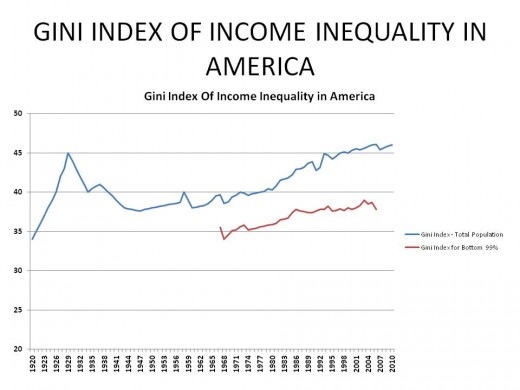
Again, it should be easy to tell by now that it is the top 1% who benefited the most from this economic boom, while the other 99% participated roughly the same with what was left; that is until about 2002, when the housing bubble began and the Bush II tax cuts for the wealthy kicked in.
You see something new as well ... the bottom (red) line increases significantly for a short time, while the top line continues to increase at the same rate. What does this mean? It means that income inequality was now working its way down into the bottom 99%. In this case, the Bush 43 tax cuts primarily helped those earning over $200,000 and had little effect on those who earned less.
Another thing was going on as well regarding the housing bubble, a lot of middle income types finally saw some economic mobility. Mortgage brokers, real estate agents, construction workers, and financial workers of all types were able to cash in on the unprecedented, and unwarranted increase in housing prices from 2003 - 2006. That segment of society saw a mighty increase in their wealth, while the rest of America remained stagnant; this characterized the George W. Bush administration. The increase was short-lived, as you can see. By 2004 - 2005, the bottom line of Chart 1 begins to drop, probably indicating those who recently made money, were now losing it; the housing bubble was beginning to burst at this point. The very rich, those who work in Goldman-Sachs, AIG, and the like, were still making money hand-over-fist, as you can tell by the top line.
Finally, in 2007, the bottom begins to fall out of everything, the housing market stagnated three years earlier and was now crashing, and you see the first big decrease in the overall Gini index, the top line, meaning the wealthy class were beginning to take more of a hit, relative to those earning less than they were; that didn't last long though.
Notice the Gini index swings quickly back up which tells me the working class was now being hit hard by the recession; it was at this point that lay-offs were starting in earnest, by the way, from mid-2008 to the end of the Bush term, about 2 million jobs were lost with another 1.3 million lost before Obama had a chance to say boo. As you can see, unlike other recessions and depressions, the wealthy were relatively unaffected by the downturn, when all was said and done, at least, I am guessing, the long-term wealthy. I further suspect the newly minted wealthy from 2000 on, took it on the nose, for unlike other massive economic downturns, there weren't many major corporate bankruptcies outside the financial industry.
That is the story which Gini is telling us; a meteoric rise in wealth for a few during the Roaring 20s followed by an almost as stupendous collapse during the Great Depression; this is where the Gini index increased from its low, in our study anyway, of about 34, in 1920, to a high of 45, in 1929, only to settle at around 38, in 1941. It took 40 years for the Gini index to increase just 2 points,\. But then, it took just 20 years to increase another 5 more to get back to its previous high of 45 (adjusted) and in 10 more years, it raised 2 additional points to reach 47 before falling back a bit. It is now around 46 (adjusted), even after the Great Recession of 2008.
These two time periods, 40 years and 30 years, are not a coincidence for they match when different economic theories were being followed. For the first 40 years or so after the Great Depression, America adopted a Keynesian economic philosophy, abandoning the Austrian economic school which America had been following for the last 120 years. Then, starting in 1981, President Reagan began moving us back to the Austrian school which lasted 30 years, until 2009.
I have presented what has happened during these respective periods, so I will let you connect the dots for the time being. In the next hub, however, I will take a look at how the U.S. compares to other nations, vis-a-vis, the Gini index. Following that, we will look at Economic Mobility, which can mitigate some of the effects of Economic Inequality and then Social Inequality in America. I will conclude this set of hubs with a summary that looks at Economic Stability, Economic Inequality, Economic Mobility, and Social Inequality in terms Conservative economic philosophy in light of 150 years of actual application in the American laboratory. Following this, I will begin a series looking at these same measures but from the Progressive point-of-view.
YOUR OPINION IS NEEDED
WERE THE CONCLUSIONS REGARDING INCOME INEQUALITY IN AMERICA A SURPRISE TO YOU, OR DID YOU KNOW IT ALL ALONG?
DID YOU FIND THIS DISCUSSION REASONABLY UNDERSTANDABLE AND USEFUL OR TOO TECHNICAL, LEAVING YOU SCRATCHING YOUR HEAD?
© 2012 Scott Belford

