- HubPages»
- Technology»
- Computers & Software»
- Computer Software
Using the Regression Tool from the Analysis ToolPak in Excel 2007 and Excel 2010
Introduction
Welcome to my latest hub investigating the tools available in the Analysis ToolPak which is part of Excel 2007 and Excel 2010. Today, I will be looking at the Regression Tool.
Regression allows you to examine the relationship between a number of variables mathematically. It allows you to predict variables when you know the value of other variables. The results of a regression test are typically shown on a Scatter chart with a line representing the regression. A positive relationship is indicated when the regression line slopes upwards (bottom right to top left) and a negative relationship when the line slopes down (top left to bottom right).
Regressions use two types of variables, independent and dependent.
- The dependent variable is the variable we are interested in investigating.
- The independent variables cause change in the dependent variable.
In today’s hub, I will run through an example before discussing the results and drawing a conclusion based on the results of the regression as to what they indicate.
In my example, I am a farmer who runs a fish farm. I am interested in ensuring that my fish are not harmed by substances in the water. So in this example, fish mortality is my dependent variable. My independent variables are the levels of Phosphate and Nitrogen in the water. In my regression test, I will be looking at relationship between the levels of Phosphate and Nitrogen and the mortality rates in my fish.
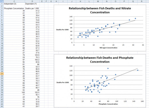
We will end up with results which are similar to those shown below, with scatter charts showing the regression on top and the results of the actual regression below.
Creating Scatter Charts in Excel 2007 and Excel 2010
The first step in examining the relationship between our independent variables (Phosphate and Nitrogen concentration) and our dependent variable (mortality rates in our fish) is to create the Scatter Charts. These will visually illustrate the mathematical relationship between one independent variable and the dependant variable.
To create a Scatter Chart in Excel 2007 / Excel 2010:
- Select the data you will use in the graph (if the columns are not adjacent, select one and then hold the Ctrl key and then select the other)
- Click the Scatter button in the Charts group on the Insert tab and select Scatter with only Markers
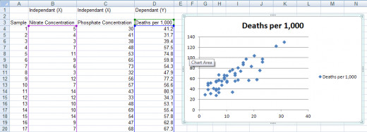
Now we have the chart created (see the above figure) we need to tidy it up and add the regression line.
- Click the Title and type in something more meaningful (I used Relationship between Fish Deaths and Nitrate Concentration)
- Click and delete the Legend
- With the chart selected, click the Layout tab and the Axis Titles button and add a Primary Horizontal Axis Title (select Title Below Axis)
- Next, we add the vertical axis title. Again using the same Axis Titles button, we now add a Primary Vertical Axis Title selecting Horizontal Title
- Give both axis titles meaningful names as we did with the chart title
Finally, we need to add the regression line to the chart.
- Still on the Layout tab with the chart selected, choose the Trendline button
- Select Linear Trendline
Now that the first chart is completed, repeat the process to create any additional charts you need. I have a hub that covers creating charts and graphs in Excel 2007 and Excel 2010 in greater detail here:
http://robbiecwilson.hubpages.com/hub/Creating-charts-and-graphs-in-Excel-2007
Performing Regression Analysis in Excel 2007 and Excel 2010 using the Analysis ToolPak
Before using the Analysis ToolPak we need to ensure it is already loaded into Excel. I have a hub that covers adding the Analysis ToolPak for both versions of Excel and also looks at adding the Developer tab, which can be found here:
http://robbiecwilson.hubpages.com/hub/Using-the-Analysis-ToolPak-in-Excel-2007-and-Excel-2010
Note: Sometimes, the ToolPak is selected but the Data Analysis button is not visible. To fix this, deselect the Add-in and then reselect it.
To begin the regression analysis:
- Click on the Data Analysis button that we enabled above
- Select Regression
- First, select the Input Y Range which will be your dependent variable
- Then, select the Input X Range which will be your independent variable(s)
- If you have labels in the first row of your data then check the Labels box
- Under Output Range select either where in your existing sheet you want the analysis to appear or select a New Worksheet or New Workbook
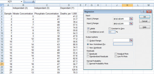
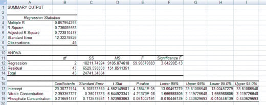
Excel will chug away for a short time and then present you with your data. You will be presented with a table similar to the figure below.

Now that we have our results we need to understand what it all means!
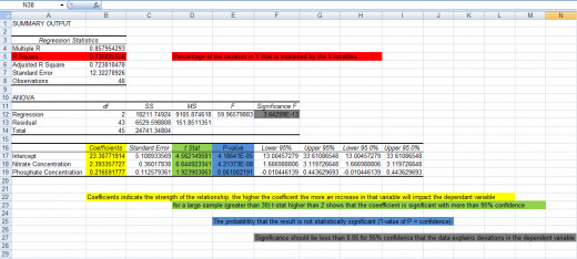
The below figure illustrates the important results within the regression’s results.
- The t Stat, P-value, R Square and Significance all provide a level of confidence in the statistical validity of the results.
- The Coefficient indicates the strength of the relationship between the dependant and independent variables.
So for my results:
- R Square = 0.736 so 73.6% of the variation in fish mortality is explained by the presence of Nitrogen and Phosphate in the water
- The Significance F is very very low so the result is significant (it is much lower than 0.05)
- The Coefficient shows that relationship between Nitrogen and mortality is stronger than that of Phosphate and mortality
- The t Stat result shows that Nitrate coefficient is significant with 95% confidence and that the Phosphate correlation is not
- Finally, the P-value backs up the t Stat result showing the Nitrate result is statistically significant and that the Phosphate result is not
- Confidence of 95% means that you are 95% confident that the results you see are not the result of something random. In other words the chance of these results being random is 5%.
So in summary, Phosphate and Nitrogen contribute to 73.6% of the variation in fish mortality and also that the correlation is significant for Nitrogen but not for Phosphate at a 95% level of confidence.
Where does this leave my fish? More study is required to determine additional causes of mortality in my fish and a bigger sample size would allow me to re-investigate the link between Phosphate levels in the water and the death rates of my precious fish
Conclusion
Regression is a very powerful tool which allows you to investigate the relationship between a dependent variable and any number of independent variables mathematically.
- We first created Scatter Charts to visually represent the data before adding a linear trend line to illustrate the relationship between the data.
- Next, using the Regression Tool from the Analysis ToolPak we tested the correlation between all the variables.
- We then analysed the results before coming to a conclusion on the data provided to us by the regression. I also discussed in depth the important aspects of the results and what those results mean.
I do hope that you found this hub useful and informative and that you are now not only able to run a regression on your data but also to understand what those numbers mean.
I have a number of other hubs on the other tools available in the Analysis ToolPak. These include:
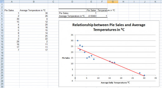
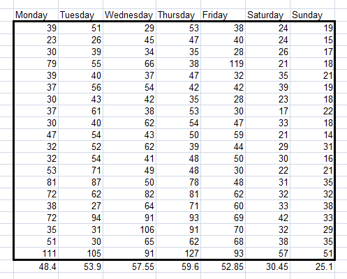
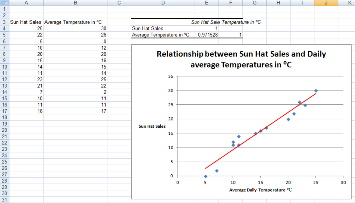
Correlation: allows you to test the strength of the relationship between two variables. In my example, I test the relationship between daily temperature and pie sales.
Sampling: this tool enables you to create a random sample from a larger population. In this hub, I created lottery numbers from a pool of numbers.
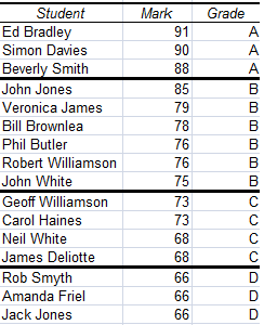
Rank and Percentile: use this tool to rank your data and to organise it into percentiles. In my hub, I take exam results and group them into grades based on their position in the classes’ results.
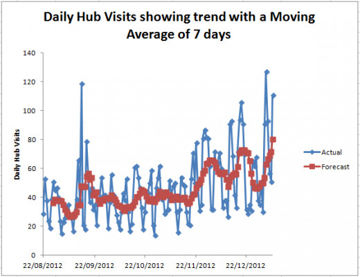
Moving Average: investigates whether your data shows a trend and charts any trend that is found for you. I use my historic web hits data for my hubs and investigate it for a trend in my hub on this tool.
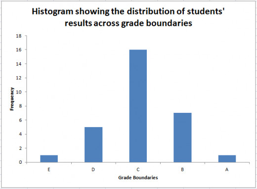
Histogram: charts the distribution of your data based on the boundaries that you configure. I again look at the students’ results and chart them based on their grades.
Many thanks for reading; I hope that you found this hub informative and useful. Please feel free to leave any comments you may have below.

