Why a Handicap Sign Looks the Way It Does
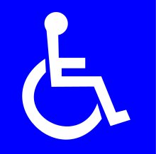
If you are to look at handicap signs all around you, you will notice that each one looks almost identical to the other, with some differences in design due to where these are used (such as those used to indicate where ramps are found). With this rather common design being shared by numerous signs, don’t you ever wonder why these look the way they do? Why are majority of handicap signs identical to each other?
There are many good reasons why these signs look almost exactly like each other and this is because of the fact that these need to be easy to understand and find by those who need them. In other words, the commonality of the design of these signs is for them to be recognized easily by the people who use them. When you go into a parking lot, in order to locate the spots that are reserved for vehicles that are used by those with disabilities, or vans that carry wheelchairs, all you need to look out for is the sign that carries a pictogram of a person in a wheelchair.
These slots are usually found nearer the entrances of the establishments that people go to, making it easier as well for those with disabilities to get to. These signs are often placed at a higher level as well, when it comes to parking lots anyway, so that people can see that these spaces are indeed reserved for those who have disabilities. They cannot use the reason that they did not see these signs either, or did not realize that these slots are reserved for those with disabilities, since what is on the sign is usually painted on the floor or pavement of the very same parking spot.
Other Places Where This Same Sign Can Be Found
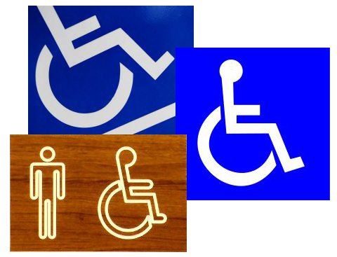
There are a lot of other places where this very same sign can be found. While majority find these in parking lots, these can actually be seen inside buildings, and alongside roads where these are of great use and help. For those signs that you see on the side of the road, these usually indicate areas where an accessible ramp is located. These signs are sometimes customized in such a way for you to not mistake this particular usage by having this very same pictogram placed atop a triangular shape on the sign to indicate the presence of the ramp in that area.
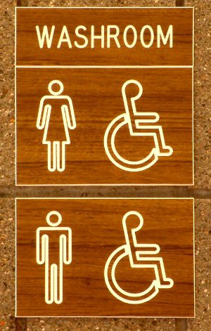
You can also find this very same pictogram on signs that are used for restrooms that have cubicles made specifically for the use of people with handicaps. Special cubicles for those who are in wheelchairs are bigger than regular bathroom cubicles, and come with helpful features such as grab bars. These are also laid out in such a way that makes the maneuvering of wheelchairs within easier.
These signs can be found on the main door of these restrooms, and also on the door of the cubicles with such features. This enables people to find out immediately whether a bathroom has facilities for those with disabilities or not. The use of the same pictogram on the door of the cubicle also enables them to find the stall right away, cutting out the need to check each one for these special features.
Familiarity is the Main Reason for the Standard Design of the Handicap Sign
Whether these signs are used on bathroom cubicles, on parking spots, or for accessibility options inside and outside buildings, the fact still remains that these all carry the same design, and more often than not, the same color combination as well. While there are some of these wheelchair signs that do not use the commonly used blue and white color combination, majority do. You can see signs that carry the wheelchair symbol on it but these signs are not in blue and white, and this is usually because these signs are customized to look like the other signs in the building, with these signs following the color scheme chosen for such signs.
The fact still remains however that even with variations to the color combinations and other design elements, when a person encounters a sign that has the wheelchair symbol in it, they know that it means accessibility options are nearby. This is the reason why a standard design is followed for handicap signs – it is for familiarity and easy recognition of the sign to make for ease of use and understanding.

