Photo Capsule Advanced Techniques
The HubPages Photo Capsule
Learn how to optimize your photo images to communicate well with both search engines and human readers! Are you sure you know all about the thumbnail feature and how to use it in conjunction with a slideshow?
Most hubs about the Photo Capsule cover only the basics and stop there. Since this hub covers advanced techniques in depth, I will omit the basic stuff and just go for the tips and tricks beyond that. If you find that something here seems incomplete, the links to the lower right of this are the best sources for basic instruction. For ease of navigation in this hub, you can click on links in the numbered table of contents below to jump directly to any section.

Basic tutorials for the Photo Capsule
- Basic Photo Capsule instruction
- Photo uploading: Step-by-step
- How to take good photos
- Selecting pictures
- Legal use of images and photos
- SEO for photos
Table of Contents with links
Photo size
The most significant thing about photo size is that you can adjust the height of the Photo Capsule to ease your hub layout.
A Photo Capsule can be either full width or right-hand column only. Furthermore, three image widths can be specified: full, half and quarter. Half-width and quarter-width images will appear the same size in either size Photo Capsule. A full-width image (usually of short height) only displays full in a full-width Photo Capsule and defaults to half-width in a narrow Photo Capsule.
To put it another way, all three image sizes are available for the full size Photo Capsule, but only the two smaller sizes are available when the capsule is used in the right-hand column.
Side-by-side comparison photos
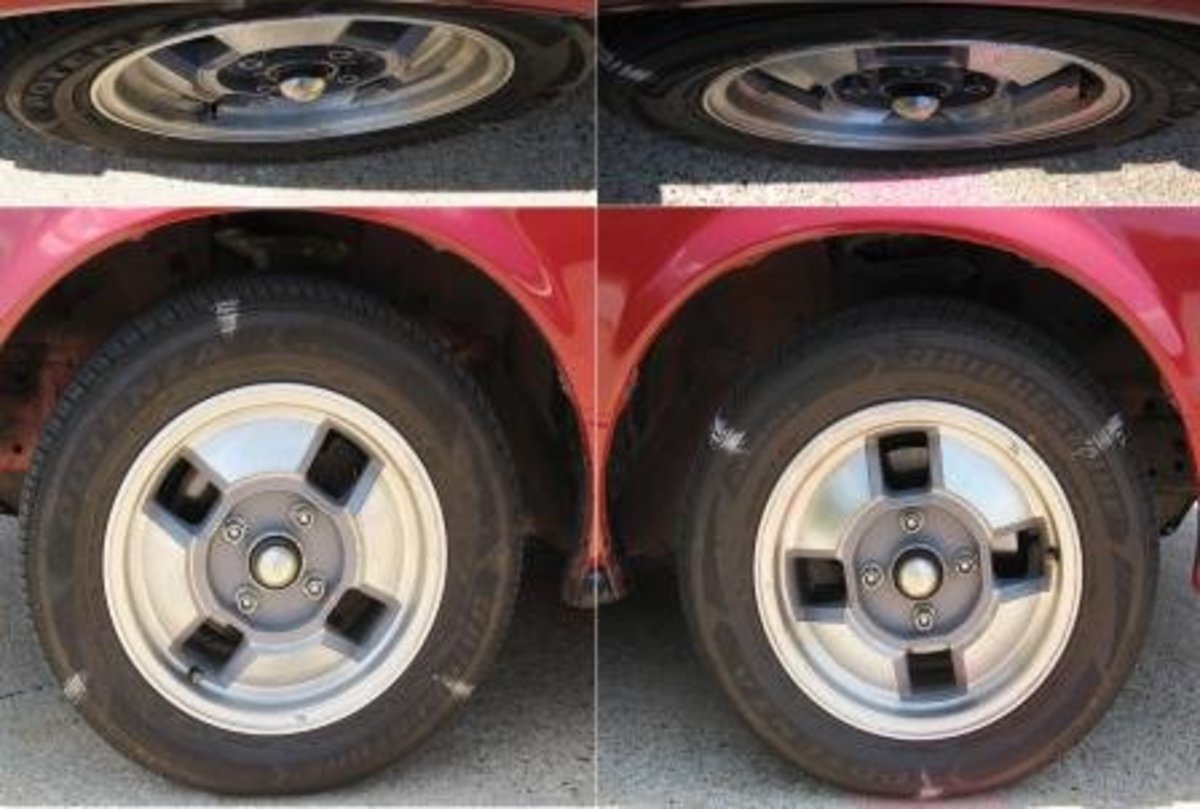
It is possible to give the appearance of side-by-side photos or left- and right-hand columns. Use any photo editing software to join two photos into one image. Then insert the result into a full-width Photo Capsule. This is very useful for before and after comparisons.
It should be apparent that a smaller file size will enable a page to load faster.
JPGs saved at the size that will be displayed do not waste time downloading useless resolution. Pages load faster when images are presented as thumbnails (to be discussed below) instead of free-standing photos. Palettes of fewer colors load more quickly as well. For graphics with solid colors and no gradients, GIF is suitable and loads faster than JPG.
Special effects with minimum photo sizes
There is some magic about the "minimum" file size of 200 pixels wide by 150 pixels high. Images smaller than that are sometimes desirable for separator bars, sample avatars, etc. The small size prevents them from appearing in slideshows or as the photo of hubs you "spotlight" at the top of your profile page. For either of these purposes, they would be considered too grainy.
Undersize images--if the first one--will still appear, however, as the cover photo [my label] of your hub when it appears alongside summaries on your profile page. There are times you might want to use this to good effect. You can select a first photo somewhat uncluttered and size it just under 200 pixels wide or 150 pixels high. Then select a quality second photo that will work well in the spotlight position at the top. Now your hub is featured twice, but with different teaser photos.
HubPages crops the first photo

Full-width photo under the title

Location of first photo
Ensure that your first photo will work when cropped square. Rectangular aspect ratios display fine in the body of your hub. In some other places, however, HubPages crops the long dimension when placing it next to its title or summary. If HubPages cropping tool won't work, you can use other software to create a square image by adding to the shorter dimension.
Where to place that first photo depends on the kind of hub and kind of picture. For most hubs, you probably want to allow enough room above the first photo for a Google AdSense ad. If you think, however, that your first two paragraphs aren’t strong enough to keep the reader on the page and you’ve got an attractive photo, put that at the top with AdSense right below it. Another time to push the AdSense ad lower on the page is with sales hubs. That can be done either with a photo or an ad capsule, both of which should be what you are trying to sell. Finally, if your first photo is full width, it may be best right under the title so that it doesn’t break the flow of text. See the illustration of the convertible at right.
Be sure also that the first photo does not consist of fine detail, because that will be lost when it is reduced to a small square. For example, the casserole on the left below is more appealing than the ad capsule how-to on the right.

In the body of the hub, you can (and should) place a border around images that have indistinct edges. These are more apt to be screen shots and graphics than photos. But that border won’t display on the thumbnail that appears next to the hub’s listing, as in the example above. For that reason, it works best for the first photo to have a dark background for contrast on those pages.
Optimize images for Google Image Search
Google looks at four parts of each image to determine what it is: capsule title, caption, source (and image filename, over which HubPages gives us no control). If you fill in these fields, you can bring in some views from Google Image Search and increase your search engine rank position (SERP).
How does Google "see" images?
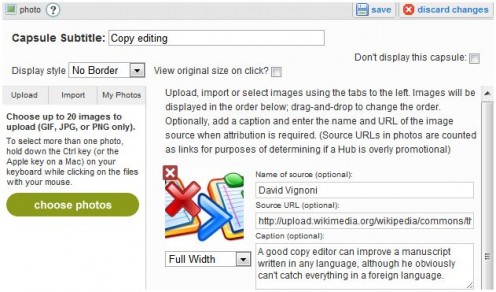
Source name and URL
If you took the photo yourself (see image above), and want to get extra link juice, put your name as the “Name of source” and the URL to your profile page as the “Source URL.” You can alternatively link the "Source URL" to your hub (as I did at right).
If you specify only the “Name of source” and no "Source URL," the link will not be live, thus, How to Copy Edit in a Foreign Language.
If you specify only the “Source URL” and no "Name of source," you will have a live link, but in the non-aesthetic form of http://howards.hubpages.com/hub/How-Copy-Edit-Foreign-Language.
For photos and images that you download from another source, besides ensuring that you have permission, give credit to the “Name of source” and provide the “Source URL.” It is nice to leave a comment at the source site, if appropriate, though I am not sure whether you get any kind of backlink.
Capsule title
The title of a Photo Capsule counts just as much as the title of any other capsule. You should, in fact, try to title all capsules of any type if it works OK for the hub. This is a good place to use an alternate of one of your text capsule subheads--like I've done with most of the Photo Capsules in this hub. Although it is allowable to place several photos in a single Photo Capsule, you can only give the capsule one title. Using separate capsules for each photo allows you to title each one individually and also allows more layout flexibility.
Image caption
Search engines crawl the description text like they do the content of text capsules. This is an opportunity to use synonyms of keywords. The description becomes especially important to readers if you use the slideshow function (see next section). When the slideshow is viewed, the surrounding text and context is obscured, so if you want your reader to know anything about the photo, e.g. in a photo gallery, art gallery or step-by-step procedure, paraphrase it in the photo descriptions, which will display with each slide.
The slideshow function
If your hub has at least two photos (at least 150 pixels high x 200 pixels wide; the number of capsules doesn’t matter), the slideshow function will turn on by default. You may read in various places about turning the slideshow function on or off, but this is no longer an option. A minimum of 1000 pixels wide is recommended for best slideshow results.
When you hover over the photo, a tooltip will appear offering to "View all 10 photos" or however many. There is currently what feels like a bug, so that the tooltip does not always appear. Sometimes it will appear when hovering over some photos but not others; sometimes it will fail to appear on any photo in a given hub. The slideshow, however, will still work.
Note that the slideshow will not be active while in edit mode, but you can view it in preview mode before publishing.
The thumbnail function
If I have several photos that are related, I will often insert them as thumbnails. This pulls them all together into one spot for quick selection and comparison. Thumbnail capsules can be employed more than once in a hub (unlike the slideshow function). The manager of a French bed-and-breakfast effectively uses eight separate sets (capsules) of thumbnails to present virtual tours of her facilities and nearby attractions. Notice that there is essentially no limit to the number of thumbnails that can be included in a single capsule; they simply stack in rows above the first photo. A web designer uses thumbnails artfully to control the many photos needed in her cooking hubs.
Thumbnails prevent borders

Thumbnails used creatively
Click thumbnail to view full-size
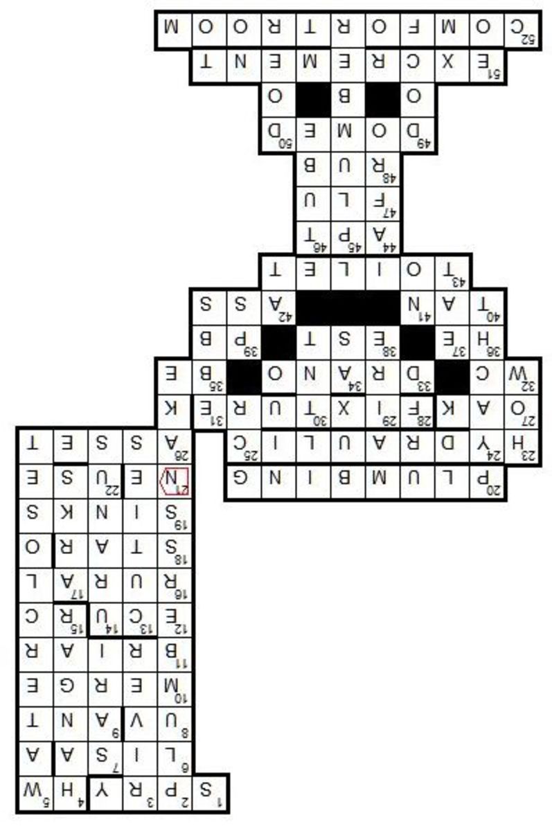


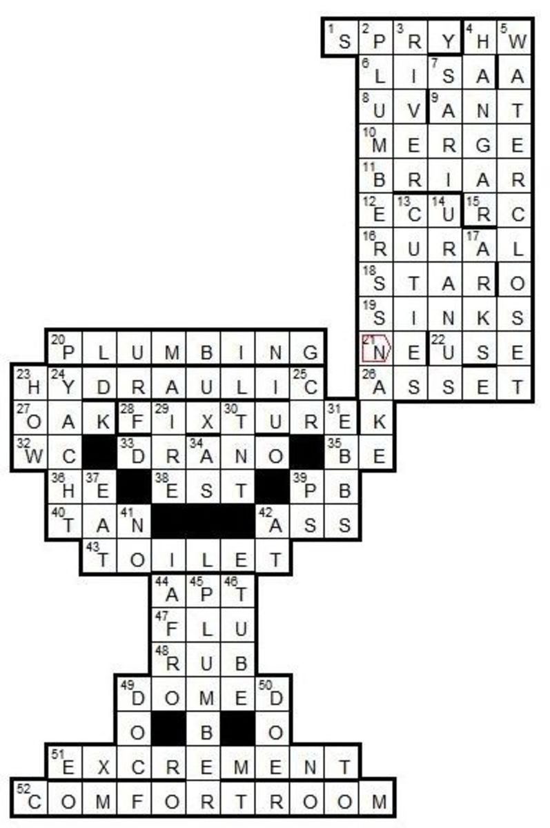
One drawback of thumbnails is that you have to choose between a thumbnail view and a border of the photo; you can’t have both. This can be a problem with objects set against a white background, e.g. the line drawings in the screenshot of the example at right. One work-around for this (not employed in the example here) is to use other photo editing software to give each image a border before uploading it.
Another drawback of thumbnails is that they are so small as to be nearly indistinguishable until they are clicked on. This problem is illustrated in the example here as well. I realize that we’re trying to get the reader to click and view it larger, but they have to be able to tell what’s there in order to be enticed to click it!
Think creatively!
Finally, there are many creative ways to use thumbnails in graphic design. In giving the solution for the Plumber's Toilet Crossword Puzzle, I needed to make the solution small enough not to tempt cheating, but accessible for checking the correct answers. Furthermore, those who view the solution on screen need to read it right-side up, but those printing it out to work on elsewhere need the solution of readable size, but upside-down. You can see how five thumbnails accomplished all of this cleverly; instructions above the thumbnails explained how to view it for each purpose.
I am displaying this particular photo capsule here in its full dynamic state. Go ahead and click on each thumbnail to see what it does. Notice that I utilized the description field for each of the arrows as well. And, of course, clicking on either of the toilets a second time permits them to be enlarged to full-size.
Thumbnails preview a slideshow
Click thumbnail to view full-size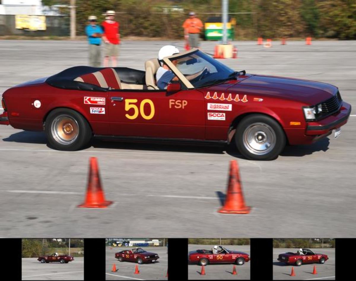




Thumbnail plus slideshow
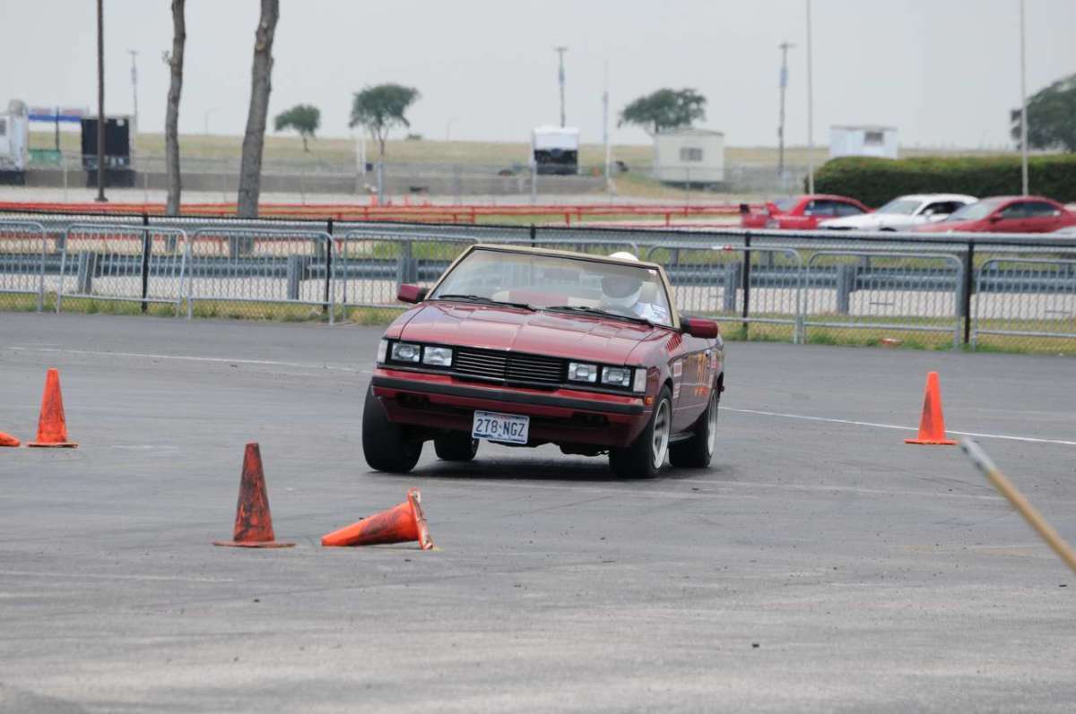
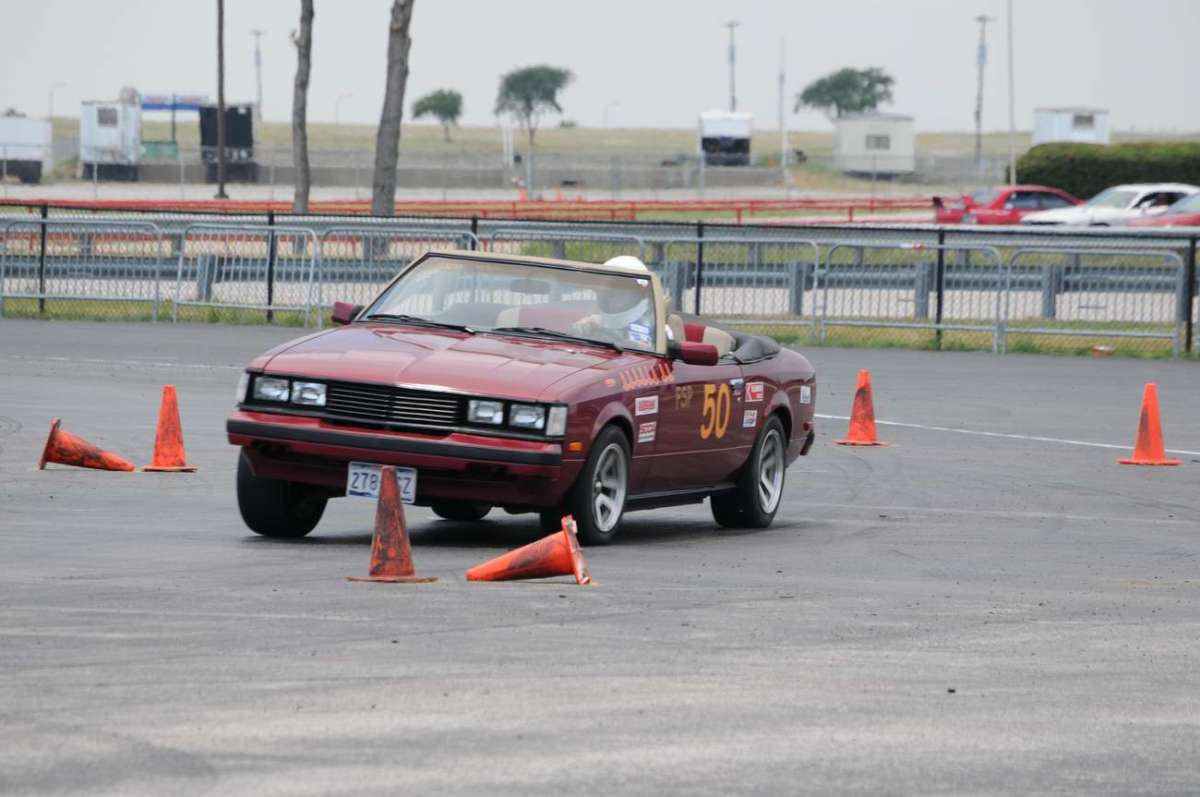
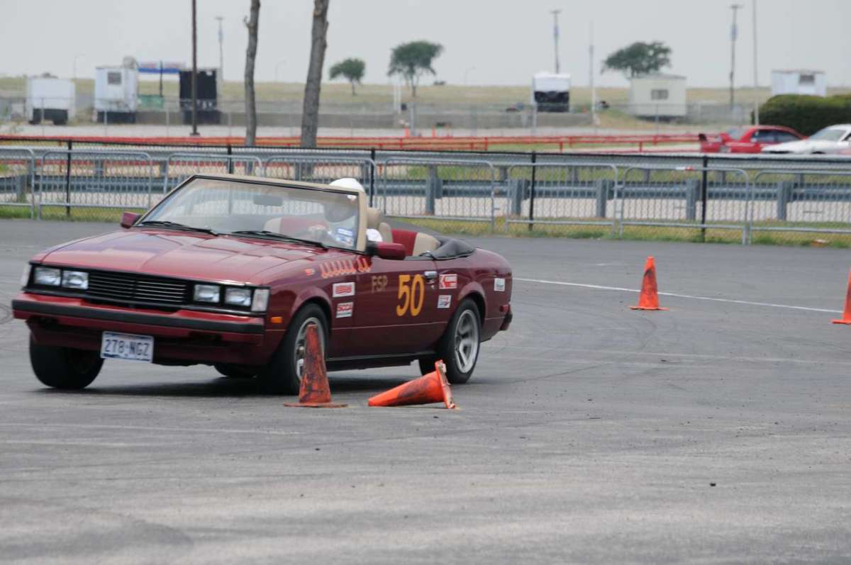
Another advanced technique is to combine the thumbnail and slideshow features, either in the same capsule or in separate capsules of a hub. I used this technique for a series of seven time-lapse photos of my sports car taking a corner in a four-wheel drift. In this case, the thumbnails are a preview to encourage watching the slideshow. And it’s cool to see how fast your computer can move from one slide to the next, giving action to the slide (pun intended). I’ve made it active here; try it.
I have already mentioned that the first slide of the slideshow can occur before the set of thumbnails. There can be multiple sets of thumbnails in a single hub—I’ve used two in this hub—but only one slideshow.
That about covers the advanced techniques I’ve learned so far about the Photo Capsule.
If you know advanced techniques I missed, please share below:
(Note that some comments below refer to features no longer supported—the content above is continually revised to describe the current features.)

