Economic Mobility and the Lack Thereof

The American Dream
“That dream of a land in which life should be better and richer and fuller for everyone, with opportunity for each according to ability or achievement regardless of the fortuitous circumstances of birth or position.”
—James Truslow Adams, “The Epic of America” (1931)
WARNING: This is a long one, but it does have a lot of good charts and tables, that tell quite a story all by themselves, to break things up a bit. If you want, you can go to the last section, "Circling Back" for a good summary of what was said.
REACHING FOR THE AMERICAN DREAM
WITHOUT ECONOMIC MOBILITY ONE CAN NEVER ATTAIN THE AMERICAN DREAM. Economic Mobility is the ability to start in a lower economic and social level and be able to, through hard work and initiative, climb up the economic and social ladders. The reasoning is that each American is guaranteed by the Constitution an equal opportunity to succeed on their own merit; that there are to be no laws or regulations interfering with the People's ability to get ahead. This, in theory, would mean the black daughter of a poor family has the same chance of becoming wealthy as the white son of a wealthy family remaining so. The American Dream , however, doesn't mean she is guaranteed great wealth; it just means that by dint of hard work, determination, talent, and a little luck, she has the same chance to do so as the next guy or gal.
Well friends, I am here to tell ya', it ain't true; it never has been true and it never will be true, not in America anyway. As mentioned in the first sentence above, the measure of the American Dream is economic mobility, the movement of the children of parents in one economic strata into another, hopefully higher economic strata by time you are 30 years old. That age, for many people, establishes which economic strata they will remain in for the rest of your life until retirement, when it might decrease (unless you are in the top 1%). Further, what most studies worth their merit have found is that economic mobility, save for the American frontier, has been relatively stagnant/non-existent for almost all of our history!
The American Dream folks, is a myth perpetuated by those on the Right as having been achieved and their policies will help sustain that societal ability. Those on the Left are more pragmatic, and while understanding that achieving the goal James Adams so eloquently described has been nye on impossible. Consequently, most of the policies the Left (including the Middle) promote are designed (sometimes poorly) to allow the myth to become reality. On the other hand, the policies promoted by the Right, ironically (and not intentionally, I believe), work against the American Dream from ever becoming a reality.
In fact, what upward mobility there has mostly occurred in the more supposedly "socialist" (they're capitalistic actually) nations of Canada, Australia, and in Europe as well as the 40 year period after WW II in America; in the rest of America's history, unfortunately, both social and economic mobility were mere dreams, go figure. For example, according to a Pew-Sage Foundation study, in America, children born to parents who are either less educated, less well-off, of lower natural intelligence, or any combination of those factors are less likely to move up the economic ladder when compared to their counterparts in the UK, France, Germany, Sweden, Denmark, Italy, Finland, Canada, and Australia. Why is that? Also, why is it that in America, those children from well-off families score better on skills needed to be successful, such as vocabulary, than do their peers in these other countries while those from poor families do worse? This is a clear example of where America lags in reaching the American Dream; isn't it ironic that that those people from "socialist" countries do a better job at obtaining the American Dream than Americans do!
The Pew-Sage study, which looks at 2010 data, approaches the mobility attribute from many different angles; and in almost every one America is lagging or at the bottom. That is a sad commentary about a country so wedded to individualism and unfettered capitalism, isn't it.
Aspiration or Reality?

How Do We Determine Mobility?
BEFORE WE CAN TALK ABOUT HOW CONSERVATIVE OR LIBERAL (modern connotations) POLICIES might work for or against mobility, we need to have a much deeper understanding on where are and what has been. The studies I have been able to find so far indicate the United States was doing much better relative the rest of the world in terms of economic mobility several decades earlier. Clearer still is the fact that Americans were much more mobile in the 1960s and 1970s than their counterparts after 1980. In terms of comparing America with other countries, those studies I found which looked at cross-national data made statements that indicated the relative standing of the U.S. with other nations; but, unfortunately, the supporting data was a bit sparse. Not so for U.S. data.
There are three methods of conducting mobility studies; 1) longitudinal, 2) Intergenerational, and 3) Intragenerational; each tells a different story. These studies can compare a nation as a whole or any subgroup such as women or minorities. By definition, as it relates to economic mobility:
- Longitudinal studies look at gross mobility data over a long period of time, such as in Table 1 below
- Intergenerational studies assess individual (by birth cohort) progression over a lifetime
- Intragenerational studies compare one generation with the previous generation.
Starting With Income Inequality
TO DISCUSS THIS, I NEED TO POINT OUT that "economic mobility" and "economic inequality" are NOT the same thing. Even though, in real life, there is a high inverse correlation between the two, it isn't necessarily (although it could be) true that one causes the other. Having said that, because this is the real world we are considering, one cannot talk about mobility without understanding the underlying inequality first. This is so because although you can fabricate a scenario where there is mobility in spite of high inequality, that is all it is, a fabrication.
The converse is true a well, You can have modest inequality but hardly any mobility because of the multitude of non-economic factors that impact mobility. But, in today's world, they do go hand-in-hand.
While you can derive understanding for inequality and infer things about mobility from Table/Chart 1, they primarily address income (wage) inequality.
LONGITUDINAL DISTRIBUTION OF INCOME FOR LOWER, MIDDLE, AND UPPER CLASSES IN THE U.S.
Group
| MYTHICAL EGALITARIAN
| 1968
| 1980
| 1990
| 2000
| 2006
| 2008
| 2009
| 2013
|
|---|---|---|---|---|---|---|---|---|---|
LOWER CLASS <20%
| 20.0
| 4.2
| 4.2
| 3.8
| 3.6
| 3.4
| 3.4
| 3.4
| 3.2
|
MIDDLE CLASS 20% - 80%
| 60.0
| 53.2
| 51.7
| 49.5
| 46.7
| 46.0
| 46.6
| 46.4
| 45.8
|
UPPER CLASS :> 80%
| 20.0
| 42.6
| 44.1
| 46.6
| 49.8
| 50.5
| 50.0
| 50.3
| 51.0
|
SUPER RICH > 5%
| 5.0
| 16.3
| 16.5
| 18.5
| 22.1
| 22.5
| 21.5
| 21.3
| 22.2
|
TABLE 1: SOURCE - U.S. Census Bureau, Table A-2 of Income, Poverty, and Health Insurance Coverage in the United States:
2011, updated for 2012
")
WHAT ARE TABLE 1 and CHART 1 TELLING US?
FIRST, I PICKED THE YEARS TO PRESENT FOR A PURPOSE for they encompass periods of modest inequality and periods of high inequality.
- To begin with, the Egalitarian column is for comparison purposes only and it reflects what an income distribution looks like when spread evenly among population groups (a pure socialist world).
- 1968 provides a baseline for it reflects the end of the period when economic mobility had been modest (it has never been "high")
- 1980 provides the next snapshot as it falls at the end of period of high economic turmoil in terms of inflation, stagflation, and recessions. One characteristic that will change when we enter the next period is that there had not been a substantial change to the tax code since the mid-1960s.
- Next, we take a picture 10 years later, in 1990, where the top 80% overtakes the middle 60% in terms of percent of income. This is when the full effect of President Reagan's tax policy began to be felt as this is where the tax burden was shifted from the rich to the poor.
- Presidents H. W. Bush and Clinton mitigated the ill effects of Reagan's tax policy by pushing the tax burden, ever so slightly, back to the wealthy.
- Then, I jump just six years ahead to 2006 which is the height of economic prosperity in the Bush 43 administration,
- The next look is just before the greatest impact of the 2008 recession were being realized.
- Recovery began in 2009, meaning the decline began to slow down before going turning around to positive in 2010. 2013 is the last data I have at the moment.
SECOND, LET'S UNDERSTAND what those percentages mean in each column of Table 1 as well as their corresponding point on Chart 1. The first cell in a column represents a "quintile" of population, meaning 20% of the population. The next cell is three quintiles, or 60%, representing the Middle Class. The third cell is the highest 20% while the last cell is informational only and provides information for the top 5% of income earners.
To put it all in perspective, if our world contained just 100 people whose cumulative earnings is $1000 then Table 2 shows you how that $1,000 is distributed according to Table 1 for the years 1968 and 2013.
Population 1000, Total Income $1000
YEAR
| # OF PEOPLE
| AVG ANNUAL WAGE PER PERSON
| TOTAL INCOME
|
|---|---|---|---|
1968
| |||
Lower
| 20
| $2.10
| $42
|
Middle
| 60
| $8.87
| $532
|
Upper
| 20
| $21.30
| $426
|
2013
| |||
Lower
| 20
| $1.60 (-24%)
| $32
|
Middle
| 60
| $7.63 (-14%)
| $458
|
Upper
| 20
| $25.50 (+20%)
| $510
|
TABLE 2
Consider a couple of things that are buried in Table 2. The first is both the lower and middle class incomes per person actually decreased while the upper class increased. The other is the transfer of income from the lower classes to the upper classes. In our example,
- $10 of annual income was transferred from the lower class ($42 to 32) to the middle class ($532 to $542, theoretically)
- $74 transferred from the middle class ($542 to $458) to the upper class ($426 to $510)
That is what increasing income inequality looks like in today's world! So, what major events occurred during this 45 year time span to account for this dramatic shift in income? They were:
- the end of the Vietnam War in the early 1970s,
- the oil embargoes throughout the 1970s,
- the recessions from 1980 to 1982,
- the stagflation in the late 1970s and early 1980s
- the tax cuts in the beginning and end of the 1980s that disproportionately and purposefully favored the upper class,
- the end of the Cold War in mid-1980
- the first non-war related debt bubble by 1990
- small tax increases on the upper class during the early 1990s
- the creation of the super-manager during the 1980s and 1990s
- the transformational change in American politics to a polarized Right and an increasing polarized Left where the voices in the middle were marginalized from the mid-1990s to present
- the longest period of sustained growth in American history during the 1990s
- the bursting of the tech bubble in early 2000
- the 9/11 attack in 2001
- further, somewhat fairer tax cuts in 2002
- the housing bubble and subsequent Great Recession of 2008
- the resulting hyper-growth of the debt
- the slow, politically encumbered recovery from 2011 to present
- the small tax increase on the upper class
Of those events, which ones can mitigate or exacerbate income inequality for the middle to long-term? I would argue that #3, #5, #8, #9, #10, #11, #12, #14, #15, #17, #18. (underline = recession; bold = tax change) As a rule, recessions and larger tax increases on the wealthy relative to other classes tend to mitigate/reduce income inequality. On the other hand, tax decreases on the wealthy (relative to other classes) necessarily increase income inequality. Further, permanent changes in wage structure will also change income inequality. In our case that would be the development of the very highly paid super-manager class created from the changes in the tax codes in 1986.
This last event resulted from the closure of many tax shelters coupled with a much reduced top tax rate in the 1986 Tax Act. To maintain their standard of living a "super manager" class was created that paid extraordinarily high salaries for the same work being done prior to the tax change. Of the many positive and negative results from this sea change, one was a sharp increase in income inequality. It is this reality is what caused the crossover you see in Chart 1 between the upper 20% and the middle 60% around 1990.
So, in a nutshell, the above discussions hopefully made it clear that the way the bottom 20%'s share of income becomes smaller, wealth must transfer up to the other quintiles, increasing their share of income. The same has become true when considering the middle 60%; they have transferred so much of their income to the upper 20% that they fell behind in total share of income. What is the obvious outcome of this state of affairs? Societal income inequality, of course. And what do you immediately see as you scan across the years from 1968 to 2013? What I see is growing inequality, i;e,, the rich get richer while the poor get poorer; and in America, so is the middle class.
I hope I have made my case that growing income inequality is a fact in modern America and given you insight as to why it is happening. Now, I can move on to economic mobility.
MIXING INCOME MOBILITY and INCOME INEQUALITY
IN ITS MOST FUNDAMENTAL POLITICAL MEANING, AMERICAN ECONOMIC MOBILITY is when somebody is born in America, or immigrants here, they can partake of the American Dream which gives them a reasonably good chance of improving their economic standing in society IF they work hard and have the talent. For the American Dream to become a reality any structural hurdles which are in the way must be overcome before one can move up the economic ladder. By structural hurdles I mean things like systemic discrimination, laws that favor business over labor (rather than being even-handed), and a systemic unequal access to quality education from preschool through graduate school. Each of these and many more interfere with an individual's ability to achieve the American Dream; and are mostly ignored by those on the Right as being superfluous.
To put it another way, two people who have exactly the same talent, drive, and goals should have exactly equal chances of moving up the economic and social ladder, regardless of where their parents started. This is the argument laid out by William Graham Sumner in his book On Liberty, Society, and Politics. Sumner is the person who is credited with making the first comprehensive treatise on minimal or limited state liberalism (what most people who consider themselves conservative really are) which basically says there is no reason two babies from radically different circumstances shouldn't be able to do equally well in society so long as they try hard enough. Consequently, he argues government has nothing to do to insure this possibility happens other than to guarantee access to equal "opportunity" (notice I did not use the term "rights".)
This would mean, in Sumner's view, the following:
- Assume one of babies had access to Harvard, because of his parents Wealth
- Assume the other baby had the same grades in high school, was of the same intelligence, and had the same talent, and abilities as the first, ended up going to a second class public college in a southern state because he was black with no money and Harvard or similar school didn't have any full scholarships
- The second kid, after graduating for college is in just as good a position to begin life as the first kid. At this point in time, the argument goes, each graduate has an equal chance of fulfilling their goals in life.
Active-State Liberals beg to disagree. Their champion is Herbert Croly, who wrote The Promise of American Life which lays out the argument for "Active-State Liberalism". Active-State Liberals agree with their Minimal-State brethren that nobody should be given a free-ride to the American Dream and that it needs to be earned through blood, sweat, and tears. They do differ, however, on the role of the government to keep the playing field level. Both sides realize there are systemic barriers that favor one group of people over another. e.g. discrimination or gender. The minimal-statists solution is for the black or women to work harder to overcome these hurdles. The active-statist, on the other hand, ask WHY should the black have to work harder to achieve the same end as the white. Or, WHY should the female struggle to break through the glass ceiling while their male counter-parts don't have to bother? That is the difference between the two flavors of liberals, one sees a need for government to help break down those barriers while the other does not. (True conservatives, btw, think those barriers are appropriate.)
It is the battle between these two ideologies that make it important in understanding economic mobility and economic inequality. They are important, because they measure the degree to which obstacles like these inhibit personal achievement. Table 1, in terms of economic inequality tells us things are getting worse in America since the 1980s, not better, implying more barriers are being created to impede ones ability to increase income, let alone amass wealth. It also implies that the ability for people to move from one economic level to a higher one is also becoming harder than ever.
First, one must understand that if everybody shares equally in economic growth, then both economic mobility and economic inequity remain unchanged. All that has happened is everybody is earning the same percentage increase. Say GDP increased 10% over the year. If everyone benefited equally, that would mean everybody's income increased 10% and all remain in the same relative position to each other. But, it is when various segments of the economy do not share equally that mobility and inequity can change.
Consider the 1968 statistic that 20% of households in America receive only 4.2% of available income; that is the $42 in the example from the previous section. Since there were 20 people in our hypothetical, that means, on average, each person's income was $2.10. Fast forward to 2011, now that 20% of the population only receives 3.2% of total income or $32 (which is $1.60 per person) in my hypothetical example; that is a 24% decrease in buying power over the 43 year period! If the American Dream were alive and well, that should have been a 24% increase (or some such figure.)
Well, maybe you think these 20 people (20%) are simply slackards and want to live off of the State rather than work hard for a living; a common complaint you hear from the Right side of the political spectrum. Let's say that is true for them moment and turn our attention to the Middle Class who by definition are people that are not bums and who would rather work for their living. (Mitt Romney;s snarky remark about the 47% seems to disagree with that assessment, however.)
In our hypothetical population, 60 people (60%) are considered to be in the Middle Class. In looking at Table 1 you see that in 1968 they, as a group, earned $532 or $8.87 per person. Now, if this group worked hard and had the talent, then their share of total income should remain the same as GDP increases over time. In fact, the opposite is true in reality. Their share has fallen such that they earn only $458 in our hypothetical. So who made out like a bandit from the 244% growth in GDP from 1968 to 2013 The upper 20%, of course, and more specifically, the top 50%!
So, let's look for a moment at what that means in the real world via Table 3 below.
Hypothetical and Actual Growth in Mean Incomes
Total GDP Growth 244%
| 1968
| 2013
| % GROWTH
|
|---|---|---|---|
Actual Mean Incomes
| |||
Bottom 20%
| $10,595
| $11,651
| 10%
|
Middle 60%
| $43,524
| $55,114
| 27%
|
Upper 20%
| $109, 235
| $185,206
| 70%
|
AVERAGE
| $51,235
| $72,641
| 42%
|
Hypothetical Mean Income based on 42% Growth
| |||
Bottom 20%
| $10.595
| $15,045
| |
Middle 60%
| $43,524
| $61,804
| |
Upper 20%
| $109,235
| $155,114
|
TABLE 3 - THE EFFECT OF INCOME INEQUALITY
So, consider Table 3. What this table simple does is compare the change in wages given current income inequality trends with hypothetical wages if income inequality didn't grow anymore; meaning all workers receive the same percentage benefit from the 244% growth in GDP. For me at least, this result is astounding bad in a nation where the American Dream is alive and well. On the other hand, it is what is to be expected where the American Dream only works for the well off.
The factors that drive this undesirable outcome in terms of income inequality (and I haven't even talked about wealth inequality which is much worse), are some of the same factors that suppress economic mobility
Intergenerational Economic Mobility
CHART 2 BEGINS OUR LOOK AT MOBILITY, the stuff of the American Dream. While it might look impressive to some of you (confusing to others, I suspect) it tells us very little. The reason is, it is just a snapshot of the total U.S. population. Until it is compared against something, in this case similar charts for other developed countries, or if the population is stratified, it is of limited use. So,let's spend a few minutes talking about what it can tell us.
First, the chart is constructed such that the population of parents are split into equal (20%) income groups just like what we discussed with income inequality. The stacked bars represent what percentage of that 20% whose children didn't move or moved to a different income level. For example, in the lower left-hand corner you see that 34% of the children of parents whose income is in the bottom 20% income group remained in place, i.e., no mobility at all. In contrast, using that same quintile, we see that 11% made it all the way to the top 20%; the essence of the American Dream.
Likewise, looking over to the 5th quintile, the top dogs, you see that fully 38% of the children are able to remain wealthy. This contrasts to only 7% of the kids who blow it entirely and end up in the bottom 20%. What is clear from this chart, especially if you consider the other 3 quintiles, is that it makes a major difference in ones ability to move up the economic ladder.
Take, for example, the lowest parental quintile - only 45% of the children are able to advance two or more income levels above their parents. Only 29% of those starting from the Quintile 2 are able to move up the ladder while 27% actually retreat one group. The other quintiles tell the same story. But, until you compare this study's result for the U.S. with comparable studies for other nations, then you can't make a judgement as to whether this picture normal or not. We will get to that later, but first I want to cover this chart in more detail ... for that does tell a tale.


Does Race Make A Difference?
CLEARLY IT DOES! A SIMPLE COMPARISON OF CHART 3 WITH CHART 4 tells you that blacks lag far behind in achieving the American Dream. You cannot argue with the disparity one sees between, say, the percent of black children reaching the top (4%) given a start from the very bottom and that for white children (11%). Or, why is it that 39% of white children from wealthy families maintain that status while only 21% of black children were able to achieve the same feat. To me, those are very damning numbers to anybody that says there aren't system-wide barriers against blacks to either get to the top, or stay there.
A lot more could be written regarding this outcome, but I will save that for another hub because I think I made my point here to the degree necessary. Even if America compares favorably as a nation with other nations (we don't), the stark disparity seen here says there is a serious problem.


How About a Gender Difference?
YEP, THERE IS. NOT AS BAD AS BETWEEN WHITE AND BLACKS but bad nevertheless. It must be noted that Chart 5 and Chart 6 have a probable bias built in because we are considering Male vs Female. This thought is based on the fact that women have alternative choices to pursue other than paid work; and that, of course, is choosing between child rearing and pursuing a working career, a choice that men generally don't have in our society. Having said that, it is hard to discern how much those numbers are understated for females.


Looking At Race and Gender
CHARTS 7 - 10 TELL THE SAME STORY when one considers race and gender together. White Men have the easiest when compared with the other three categories. They are closely followed by White Women. Far down the rankings come Black Men and then Black Women.
Another way to look at this, which was not mentioned in detail earlier but applies there as well, is the relative change in status of the children when one considers Quintile 1 and Quintile 5. Notice that for Quintile 1, it is much, much easier for white men to climb to the top with 12% getting there. Compare that to the 9% for white women and 4% for both black men and black women.
On the flip-side, it is even easier for white male children of the top 20% of income earning parents to remain there, 44%! Falling quickly behind are white women at 33% and for black men and women, 18% and 19%, respectively. Using common right-wing arguments of welfare state, laziness, apathy, and the like, a scenario can be created to explain (wrongly, of course) why blacks do not progress as well from the bottom to the top. But, the same factors cannot be used to explain why children of the top 20% of black parents fair so badly in being able to maintain that position; the differences are disturbingly starke. To a lesser degree, the same question can be asked for white women ... why the 10 point drop in their ability to stay in the top 20% when compared to white men. Clearly there is something wrong in how American society operates.
Chart 11 below, looks at the same issue in another, hopefully more dramatic and clearer way. This chart breaks income levels into cumulative 5% increments and then tells you what percent of a given race-gender mix who are able to achieve at least a 20-point increase in their economic standing (in other words, mobility). I'll just point out one comparison and then leave you to ponder the rest on your own (I will also get into more detail in a future hub).
Consider the group of parents in the lowest 5% of the income scale. What this chart says is nearly 98% of white male children escape to at least the 25 percent level. On the other hand, only 45% of the black female children who start from the same place achieve the same level of income growth. Things get worse when considering the lowest 10% of parental income earners. Here, 99% of white males can make it to at least the 30 percent level while only 41% of black female children.
The question is ... Why?

Note also how much better black women fare when compared black men than white women compared to white men. What causes that?
What Are The Causes of Suppressed Mobility
THE PEW STUDY I AM DRAWING MOST OF MY FACTS FROM considered this question. They did analysis on the following possible reasons:
- Overall education level as measured by the Armed Forces Qualification Tests (AFQT)
- Number of years of education
- Non-cognitive traits of Fatalism and Self-Esteem
- Family Structure
- Health
Of these, only the first two show they affect the gap between white and black mobility. The rest had little of no effect on changing the gap, but, they several did have quite a lot to do with the degree of mobility for each race.
I will explain that later, but first I want to focus on education, specifically the AFQT test. This test is administered to new entrants to the armed forces to gage "trainability" and "predictor of on-the-job performance". That purpose meshes nicely with the ability to move up the ladder. Consequently, those conducting the study regressed AFQT ranking against mobility data; their results is Chart 12.

Education Makes a BIG Difference!
From the title you can see the study presented results only for movement up 20 points from the bottom quintile. The bottom scale on the chart are the rankings from the AFQT (which, btw, are not equivalent to IQ scores). Each number represents what percentage of test takers scored worse than the testee. The numbers on the vertical scale represent the chance that children will move out of the bottom quintile for a given AFQT. For example, for those who scored 1% on the AFQT, 32% of the blacks in that group will move up one or more quintiles and 41% if whites will do the same.
The amazing thing about this chart is that the whites and the blacks who scored between the 21% and 46% percentile of AFQT scores have almost identical chances of real mobility. What this means is the AFQT score accounts for almost 100% of the variation between the chances of whites and blacks moving up when they are in the middle of the AFQT range. Once you move past the 56th percentile, then the white's chances of mobility out pace those of the blacks. (But, because there are fewer and fewer people, especially blacks, that fall into those ranges, the margin of error increases dramatically; meaning it is possible the scores you see might be the same).
The bottom line from the above discussion is that IF white and black children have access to the same quality education, up to a point, then they have equal chances to at least move out of the bottom quintile. Consequently, in order to solve, to some extent, the disparity in mobility between races, a lot of work must be done to insure black children get the same quality educational facilities, teachers, and resources as whites already enjoy. Right now, they don't.
There is Another Education Variable to Consider
WHILE AFQT SCORES ARE A GREAT INDICATOR OF ABILITY move out of the bottom quintile, the number of years is a good one. As you can see in the chart below, the more years of education blacks receive, the closer they get to white's chances to increase in income level. To do that though blacks must basically get four years of college or more. Until then, however, years of education do help blacks climb out of poverty, but not as much as it does for whites.

What About the Other Factors?
THEY ARE CERTAINLY NOT TO BE IGNORED, but as explanatory variables for the gap between white and black mobility they don't cut the mustard. While each of the variables listed earlier DO influence a person's mobility, they do so to both blacks and whites approximately equally.
FATALISM SCORE:
As one would expect, the more fatalist a person is, the less chance they have of getting out of the bottom. Strangely, when you get to the top end (most fatalistic) blacks may be a little more likely to improve themselves.
SELF-ESTEEM:
At the bottom end of this scale (low self-esteem) both whites and blacks only have a 15% chance of escaping. After that, whites quickly move ahead and take up about an 18-point gap. This means that while both groups improve their chances as self-esteem grows, whites have about an 18-point advantage over blacks.
FAMILY STRUCTURE:
Whites have an 80% chance of doing better from a single parent family compared to blacks chances at 55%. Surprisingly, however, white children from two-parent families lose ground to blacks with chances of 75% (down!) and 60%, respectively.
HEALTH:
Again as expected, the healthier you are, the better your chances to leave the bottom, but whites maintain an 18-point lead in this category as well.
Snapshot vs Changes Over Time
IN A STUDY ON CHANGES IN MOBILITY OVER TIME, the result contradicts popular belief. This study, and one other I looked at, concluded the degree of disparity between whites and blacks has not changed in at least the last 6 decades and probably longer!! That blew me away for sure. So, what you have seen in the discussion above, you would have seen if I had written this hub in 1960.
Before I get to the conclusion, I wanted to point out another explanatory variable not yet covered, but will be in a subsequent hub. And that it definitely does make a big difference in your ability to climb the social and economic mountains depending on if you were born and raised in one part of the country as compared to another.
A Final Consideration - Comparison With Other Nations
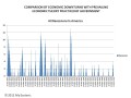
THE LAST CHART PORTRAYS DIFFERENCES IN MOBILITY across nations. Specifically it considers the developed nations of Europe, America, and Canada. The columns are arranged such that the least intergenerational mobility is to the left. The red numbers at the top of each column tells your how times a child from a family in the upper income bracket will earn more than one from the lowest income bracket once they become adults. So, in America, children from rich parents can expect to earn 3.21 times more than a child from a poor family. If there were perfect mobility, then a child from each bracket could expect to earn the same amount as the other when they become adults.
So you can see countries like Denmark, Sweden, and Norway are closer to the American Dream than America is; how ironic is that. The point I am obviously making here is that when you compare America with Denmark, it is like comparing blacks to whites in America. It is certainly not the story we want to hear about ourselves, is it.

A MUST READ IF YOU CARE ABOUT MOBILITY AND INEQUALITY

Circling Back
IF YOU HAVE MADE IT TO THIS POINT, YOU covered over 6,200 words, three tables, and 14 charts, congratulations and thank you very much. We have covered two major themes, income inequality and economic mobility learning, among other things, they are not the same.
Income inequality, we have seen, has grown from a reasonable level in the 1960s to dangerously high levels in 2013; and it isn't stopping there. Chart 1 is particularly poignant in 1) the wide separation between the lowest 20% and everybody else and 2) the crossover between the top 20%'s share of income and the middle 60%; that is very telling.
With Table 3, it is clear that as American GDP has grown 244%, only the wealthy have participated in that growth; that is one reason why you see the crossover in Chart 1. This is the main complaint for the last 25 years that has been trumpeted by the Left and the Right has even more stridently denied is happening. As you should easily be able to tell that the Right is wrong when they say there is no income inequality. There certainly is and it is killing our nation.
Then we detoured to consider the philosophies behind those who insist there is nothing wrong, or if there is, nothing should be done about it; these would be minimal-state liberals and their mentor is William Sumner. On the other side, Herbert Croly's active-state liberals, who know there is a serious problem and think government must do something about it.
All of this led up to talking about economic mobility, the real purpose of this Hub, and the lack thereof. Here are the take-aways:
- The U.S. is far behind many other developed countries in its youth being able to do economically better than their parents
- There is a definite indication of a large disparity in the ability of children for poor families to move up the latter than those from families in better income groups
- That white children have a much better chance of improving their lot than black children
- That white male children have a better chance of improving their lot than white female children
- That black male children and black female children have equally poor chanced of breaking out of poverty
- That equal education almost eliminates the disparity between white and black mobility who have come from average schools (by white standards)
- That if white and black children both acquire more than 16 years of education, the mobility gap between whites and blacks become statistically insignificant
- That other factors, while have a definite impact on ones ability to be economically mobile, the effect is about the same for both black and white children
I hope my presentation has been entertaining as well as informative and that it has changed some preconceived notions regarding income inequality and economic mobility.
ACCOUNTING FOR INFLATION
IF YOU EARNED $20,000 TODAY, that would be about:
- $1,200 in 1940
- $2,100 in 1950
- $2,600 in 1960
- $3,300 in 1970
- $6,600 in 1980
- $11,200 in 1990
- $15,000 in 2000
- $19,100 in 2010
IN ANSWERING THE POLLS BELOW, PLEASE ASSUME 1) YOUR INITIAL INCOME LEVEL IS YOU ANNUAL WAGES AFTER HAVING BEEN IN THE WORKFORCE FOR MORE THAN 3 YEARS and 2) YOUR PARENTS INCOME LEVEL WAS JUST PRIOR TO RETIRING
To help you figure out what yesterday's dollars are worth today, use THIS CPI calculator from the Bureau of Labor Statistics.
ALSO, ASSUME THE RUNGS ARE, in today's dollars
- $0 - $20,000
- $20,001 - $40,000
- $40,001 - $60,000
- $60,001 - $80,000
- $80,001 - $100,000
- $100,001 - $120,000
- Greater than $120,000
INTRAGENERATIONAL QUESTION FOR 50 YEAR OLDS AND UP
IF YOUR PARENTS EARNED LESS THAN $50,000/YR, HOW FAR UP THE LADDER DID YOU GET IN 2015 DOLLARS?
INTRAGENERATIONAL QUESTION FOR 50 YEAR OLDS AND UP
IF YOUR PARENTS EARNED $50,000 OR MORE, HOW FAR UP THE LADDER DID YOU GET USING 2015 DOLLARS?
DEMOGRAPHIC SURVEY #1
Thinking about your political beliefs, do you find yourself
DEMOGRAPHIC SURVEY # 2
Are you
DEMOGRAPHIC SURVEY # 3
Is your age between (inclusive)
RELATED HUBS
- Why the Rich Should be Taxed More: Flat Taxes, Progr...
Economic justifications for progressive taxation. The rich are not as affected by tax increases as other groups, the rich will always pay more in taxes, and high inequality and low interclass mobility are bad.
© 2015 Scott Belford