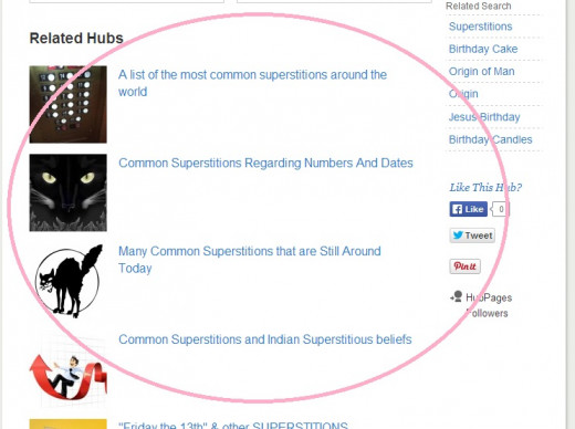
Anyone else see a change to the way "Related Hubs" are displayed?

Jump to Last Post 1-9 of 9 discussions (39 posts)
  1. LCDWriter profile image89
    LCDWriterposted 10 years ago

    http://s2.hubimg.com/u/8872065_f520.jpg
    Look at one of your articles and check out the format for the Related Hubs.  On mine it now looks like a list.

    1. Author Cheryl profile image81
      Author Cherylposted 10 years agoin reply to this

      Yes mine looks like that.  I guess they want to connect hubs to each other which is a great marketing strategy.  It may also let others read your hubs that normally wouldn't by yours being included in the bottom.  Sharing is caring lol

    2. Blake Flannery profile image92
      Blake Flanneryposted 10 years agoin reply to this

      I'm not happy with it, because I can't control the hubs that are linked to. This is even BIGGER than the way they were listed before. When you add up the misleading "related search" and these huge links at the bottom, that's a lot of exit links that I'll see no benefit from if people click them. Not only that, but the quality of my work could be negatively perceived. I think it would be fine for pages with no links in the text, but when I've already hand-chosen 8 related links in my text, it's frustrating to see low quality photo links so prominently displayed.

    3. RachaelOhalloran profile image82
      RachaelOhalloranposted 10 years agoin reply to this

      It is awfully big and very intrusive. The presentation overtakes so much space that one almost misses the comment section below it. I understand that HP wants to promote hubs, but this is too much "in your face" with the size of the section. If they could cordon off one section of space - like Google does with "ad related" space, maybe that would be good.

    4. profile image0
      sheilamyersposted 10 years agoin reply to this

      I've noticed them that way on some hubs and not others. I like the older way where they were smaller and in two columns. It might be just me, but the smaller ones looked more professional and visitors don't know we have no control over them so they think we made an ugly mess with the big ones.

    5. tsmog profile image86
      tsmogposted 10 years agoin reply to this

      I liked the previous method better. It was easier to read. They were not cluttered and more conducive to reading the titles with ease of reading. I really didn't like scrolling through them.

      They do not offer any value to me as the hub designer it seems. To me they offered clues at times how that algorithm connected with other hubs. If all the recommended hubs were on the subject I wrote of then I felt I was inline with the content. I could very easily compare and contrast with other hubs that algorithm made connections and tailor my hub better. Differences would occur with changes or of least I seem to think so. Maybe not true. If they made connections with other topics I felt I needed to make edit changes.

      Oooops! I got off topic. No, I liked much more seeing them all at once with a glance and using 'chunking' reading methods. I do  not like the large print and pic icons. I don't like large icons in my pic files either on my PC either. Too hard to read.

      The one advantage it does offer is it is easier to click on the recommended hubs (my two in the same group or their recommended hubs) to bail out of the hub rather than the effort to scroll up to get out.

    6. bravewarrior profile image87
      bravewarriorposted 10 years agoin reply to this

      Yep, I noticed that too. It takes up too much room. HP should put them back in a box with two columns as they had it before. A non-Hubber may not realize there's a comments section below.

    7. EricDockett profile image96
      EricDockettposted 10 years agoin reply to this

      I think I prefer how it was before, but it's not terrible now.  My real issue is I would prefer to have control over what appears in related Hubs and be able to plug in my own Hubs.

      It would also be nice if related Hubs, Hubs linked by grouping and the voting buttons would appear BEFORE the ugly minefield of ads at the bottom of the Hubs.  As it is, I've been creating links at the bottom of my Hubs in hopes of getting people to click away before they hit that awful "realted search" and "Sponsored from Around the Web" section.   You can write the best Hub in the world, but when image links like "15 celebrities with ugly spouses"  or "Gorgeous New Tanner" appear at the end it just looks terrible. 

      I hope HP reconsiders how they manage the space at the end of our Hubs.  Consider allowing Hubbers to plug in their own related Hubs in this section, and consider making it appear before people get to the ugly and VERY unrelated "Sponsored from Around the Web" ads.

      It seems to me the related Hubs and grouped Hubs can be a great tool for keeping people on-site and moving them on to other Hubs, and that has to be good for traffic, ad impressions and revenue.

    8. Marina Lazarevic profile image77
      Marina Lazarevicposted 10 years agoin reply to this

      Apart from ads, Related Hubs are what readers click on when they visit a Hub. We've been running experiments to see if changing the way Related Hubs are displayed increases the clickthrough rate on them. This layout performed 48% better than the former, two-column one! In addition to a huge boost in CTR, reader engagement with the rest of the page increased by 10.3%. That is, readers are more likely to click on other parts of the page with this layout compared to the previous one.

      I can understand why it seems like a bad thing for readers to leave your Hubs. The thing is, most signed-out readers leave after visiting one Hub anyway. More engagement with the Related Hubs section results in increased readership on HubPages in general, and that benefits all Hubbers.

      We realize that Related Hubs now take up more space than they used to. We're testing whether a shorter listing (5 Hubs) will perform better than or at least the same as the current listing (8 Hubs), and although this experiment is still running, preliminary results show that the shorter list converts slightly better. For the next couple of weeks, expect to see some changes until we settle on the perfect design that keeps readers visiting as many Hubs as possible.

      1. LCDWriter profile image89
        LCDWriterposted 10 years agoin reply to this

        Thanks for the information!

        1. The Examiner-1 profile image60
          The Examiner-1posted 10 years agoin reply to this

          I was going to suggest that perhaps it has to do with mobile views of them.

      2. bravewarrior profile image87
        bravewarriorposted 10 years agoin reply to this

        Would HP consider sending emails to hubbers or including these experiments in the weekly newsletters so we're not caught by surprise? Filling us in - especially with the statistics you present above - would keep us in the loop and keep the community vibe alive.

        1. Marina Lazarevic profile image77
          Marina Lazarevicposted 10 years agoin reply to this

          I think that's a great idea! I'll bring it up with the team at our next meeting. We know that many Hubbers prefer to be in the loop about what we are working on, but also don't want to inundate you all with announcements  (we've tested about 10 changes to Related Hubs alone!)

          That being said, a weekly update via the newsletter might be the perfect way to keep everyone informed on a weekly basis. Thanks for the suggestion, bravewarrior!

          1. bravewarrior profile image87
            bravewarriorposted 10 years agoin reply to this

            You're welcome, Marina. Thanx for acting on it! :-)

            1. Marina Lazarevic profile image77
              Marina Lazarevicposted 10 years agoin reply to this

              Hi bravewarrior! The community team discussed your suggestion today. I'm afraid that the newsletter may not be the best place for updates on what is currently being worked on at HubPages. Instead, we will use the forums for these types of announcements. Your point about keeping Hubbers in the loop when tests/experiments begin resonated with the whole team and we plan to do this on a regular basis moving forward.  Thanks again!

      3. EricDockett profile image96
        EricDockettposted 10 years agoin reply to this

        Is there any discussion about allowing Hubbers to include their own Hubs more often in the Related Hubs section, or changing the way Hubs are chosen so more of the Hubber's own Hubs appear?

        I understand how the Related Hubs section is helpful to Hubbers and HubPages in general.  What's frustrating is when HP is plugging in other people's Hubs on my page when I have a similar Hub I'd much rather send them to. 

        I can use links at the end of the Hub as I've been, but the Related Hubs section with the thumbnails is much more attractive.  It would just be nice to be able to use it more effectively.

        1. Marina Lazarevic profile image77
          Marina Lazarevicposted 10 years agoin reply to this

          There are issues with having Hubbers pick Hubs in the RH listing. For one thing, Hubs might become deleted, moderated, or lose their Featured status - the RH algorithm will only show Hubs that are published and Featured. The algo does prioritize Hubbers' own Hubs assuming they are related enough but ultimately it chooses to display the strongest matches. If you have a series Hub, the RH listing on one of those will almost always include the other Hubs in the series. The algorithm also takes into account the CTR for an individual listing, and will prioritize displaying a Hub that has a higher chance of being clicked on. There are other factors, but that's the gist of it.

          I think it's great that you want to show more related content to your readers. Instead of putting the links in list form at the end of your Hubs, I suggest placing them within the text of your Hub. Inline linking provides the best reader experience -- assuming the links are related and high quality, of course. The links within your Hub engage your readers early (i.e., while they're reading the Hub) and are in context.

          1. EricDockett profile image96
            EricDockettposted 10 years agoin reply to this

            Thanks for your reply, Marina.  I do see how there could be potential issues there. 

            I do use links in the Hub text, but I also use them at the end of the Hub to offer more related Hubs to readers (and keep them on my subdomain).    I figure, they must have liked what I've written if they made it all the way to the bottom of the Hub, so why let them go away without giving them the chance to read something else I've written?  With Related Hubs, they might read another of my Hubs . . . or they might read someone else's.

          2. janderson99 profile image54
            janderson99posted 10 years agoin reply to this

            I suggest that the 'Next' and 'Previous' links be made the same size as the related ones. Why make the author's related links so small?
            http://www.wotheheck.com/toosmall.jpg

      4. Suzanne Day profile image94
        Suzanne Dayposted 10 years agoin reply to this

        Thanks for letting us know Marina. I don't think it looks good but what matters is the bottom line in any case, so it was most helpful to hear your explanation.

      5. profile image0
        sheilamyersposted 10 years agoin reply to this

        Marina: Thanks for the explanation. If the new format continues to lead to more reader engagement in the rest of a hub or in other ways helps the hubber on which they appear, I'm all for it.

      6. Alison Graham profile image93
        Alison Grahamposted 10 years agoin reply to this

        On the topic of related hubs, at the bottom of each hub, before the related hubs list, we each have a 'previous' and 'next' would it be possible to change the default for these as although we group hubs by topic, the next/previous one might not be the MOST likely one that the reader of each hub might read.
        This would be more beneficial to each hubber as the click through would be to another of their hubs.

  2. LCDWriter profile image89
    LCDWriterposted 10 years ago

    I just wish it didn't make it so far for people to scroll and comment but maybe it will be for the good of all of us.

    1. Author Cheryl profile image81
      Author Cherylposted 10 years agoin reply to this

      I think it will be a benefit because if someone is searching for a topic and there are a few to read, that gives them more information.

  3. ChristinS profile image41
    ChristinSposted 10 years ago

    Don't like it - it's too big and intrusive, we have no control over what displays there and the related hubs display much larger than the "next" hubs of our own.  Not pleased with this change.

    1. RachaelOhalloran profile image82
      RachaelOhalloranposted 10 years agoin reply to this

      After one reads a hub, the section of related hubs is so huge (I counted 9 titles!!) that readers will be too distracted to leave a comment, and be more inclined to go off to read the related hubs. We have to hope some of our other hubs are in the list!

      The reason this new section is especially bad for hubbers is that it will make less reader interaction on your site.  Because Google partially ranks your site by how long readers interact and stay on your site, this "distraction" of related hubs is sure to make interaction go down and will rank our overall individual sites lower with Google.

      1. profile image0
        calculus-geometryposted 10 years agoin reply to this

        9? wow. The most I ever saw was 8, and a long time ago the  max was 6.

      2. ChristinS profile image41
        ChristinSposted 10 years agoin reply to this

        ^This - I completely agree.  It not only looks huge and intrusive, I believe it takes away even more control and interactivity from our own hubs.  The two column layout from before was perfectly fine and was working as I do get traffic from other hubs.  This change was not necessary and it looks tacky when there is a huge list of SO many other hubs.

        1. RachaelOhalloran profile image82
          RachaelOhalloranposted 10 years agoin reply to this

          yes, it does

  4. profile image0
    calculus-geometryposted 10 years ago

    I like the new look, but there are still too many on most hubs. Eight has been the  max for a while and it's overkill, especially when quite often the suggestions aren't related to the original article.

    Four would look much nicer, and given that the algorithm that chooses the related titles isn't sophisticated enough to choose the most relevant titles, it would reduce the weirdness of unrelated options that pop up.

  5. viryabo profile image95
    viryaboposted 10 years ago

    I just noticed this too and i am quite okay with the way it’s laid out. I find it clearer and less 'jumbled up'. I like the visibility of the "related hubs" column better.
    Different strokes . . . i guess!

  6. Sherry Hewins profile image91
    Sherry Hewinsposted 10 years ago

    Whatever, I didn't like the related hubs before, but it didn't do me any good to complain. It does seem like a long way to scroll to get to the comments.

    However, I  seem to get some pretty good traffic coming from other people's hubs sometimes, so I don't mind sending some back the other way.

  7. Helena Ricketts profile image92
    Helena Rickettsposted 10 years ago

    I personally don't mind that people have to scroll down further to the comments section because we don't get paid for comments.  We get paid for views and clicks. 

    Don't get me wrong, comments are nice and the conversations can be interesting but in the end comments make us zilch on payday.  Hub views and advertisement clicks do.  This new set up will send more traffic to where it counts, in our wallets.  smile

  8. Suzanne Day profile image94
    Suzanne Dayposted 10 years ago

    I preferred it the old way because it was nice and neat, easy to read and people could pick where to go next. This new thing looks like some graduate played with the web design and has no idea how to fit in with the overall look of the site. Please revert at once before damage is done and we lose visitors!!!! PS - you could fit more related hubs into the old layout than this one. Can't you at least make this new layout smaller so it looks good?

    1. Suzanne Day profile image94
      Suzanne Dayposted 10 years agoin reply to this

      Sorry, didn't mean to sound nasty, just annoyed that new change makes my hubs look bad ;(

  9. keepvid profile image58
    keepvidposted 10 years ago

    i think it is great for everyone to get seen, it improves the overall performance of hubpages and reduce the bounce rate.

 
working

This website uses cookies

As a user in the EEA, your approval is needed on a few things. To provide a better website experience, hubpages.com uses cookies (and other similar technologies) and may collect, process, and share personal data. Please choose which areas of our service you consent to our doing so.

For more information on managing or withdrawing consents and how we handle data, visit our Privacy Policy at: https://corp.maven.io/privacy-policy

Show Details
Necessary
HubPages Device IDThis is used to identify particular browsers or devices when the access the service, and is used for security reasons.
LoginThis is necessary to sign in to the HubPages Service.
Google RecaptchaThis is used to prevent bots and spam. (Privacy Policy)
AkismetThis is used to detect comment spam. (Privacy Policy)
HubPages Google AnalyticsThis is used to provide data on traffic to our website, all personally identifyable data is anonymized. (Privacy Policy)
HubPages Traffic PixelThis is used to collect data on traffic to articles and other pages on our site. Unless you are signed in to a HubPages account, all personally identifiable information is anonymized.
Amazon Web ServicesThis is a cloud services platform that we used to host our service. (Privacy Policy)
CloudflareThis is a cloud CDN service that we use to efficiently deliver files required for our service to operate such as javascript, cascading style sheets, images, and videos. (Privacy Policy)
Google Hosted LibrariesJavascript software libraries such as jQuery are loaded at endpoints on the googleapis.com or gstatic.com domains, for performance and efficiency reasons. (Privacy Policy)
Features
Google Custom SearchThis is feature allows you to search the site. (Privacy Policy)
Google MapsSome articles have Google Maps embedded in them. (Privacy Policy)
Google ChartsThis is used to display charts and graphs on articles and the author center. (Privacy Policy)
Google AdSense Host APIThis service allows you to sign up for or associate a Google AdSense account with HubPages, so that you can earn money from ads on your articles. No data is shared unless you engage with this feature. (Privacy Policy)
Google YouTubeSome articles have YouTube videos embedded in them. (Privacy Policy)
VimeoSome articles have Vimeo videos embedded in them. (Privacy Policy)
PaypalThis is used for a registered author who enrolls in the HubPages Earnings program and requests to be paid via PayPal. No data is shared with Paypal unless you engage with this feature. (Privacy Policy)
Facebook LoginYou can use this to streamline signing up for, or signing in to your Hubpages account. No data is shared with Facebook unless you engage with this feature. (Privacy Policy)
MavenThis supports the Maven widget and search functionality. (Privacy Policy)
Marketing
Google AdSenseThis is an ad network. (Privacy Policy)
Google DoubleClickGoogle provides ad serving technology and runs an ad network. (Privacy Policy)
Index ExchangeThis is an ad network. (Privacy Policy)
SovrnThis is an ad network. (Privacy Policy)
Facebook AdsThis is an ad network. (Privacy Policy)
Amazon Unified Ad MarketplaceThis is an ad network. (Privacy Policy)
AppNexusThis is an ad network. (Privacy Policy)
OpenxThis is an ad network. (Privacy Policy)
Rubicon ProjectThis is an ad network. (Privacy Policy)
TripleLiftThis is an ad network. (Privacy Policy)
Say MediaWe partner with Say Media to deliver ad campaigns on our sites. (Privacy Policy)
Remarketing PixelsWe may use remarketing pixels from advertising networks such as Google AdWords, Bing Ads, and Facebook in order to advertise the HubPages Service to people that have visited our sites.
Conversion Tracking PixelsWe may use conversion tracking pixels from advertising networks such as Google AdWords, Bing Ads, and Facebook in order to identify when an advertisement has successfully resulted in the desired action, such as signing up for the HubPages Service or publishing an article on the HubPages Service.
Statistics
Author Google AnalyticsThis is used to provide traffic data and reports to the authors of articles on the HubPages Service. (Privacy Policy)
ComscoreComScore is a media measurement and analytics company providing marketing data and analytics to enterprises, media and advertising agencies, and publishers. Non-consent will result in ComScore only processing obfuscated personal data. (Privacy Policy)
Amazon Tracking PixelSome articles display amazon products as part of the Amazon Affiliate program, this pixel provides traffic statistics for those products (Privacy Policy)
ClickscoThis is a data management platform studying reader behavior (Privacy Policy)