Hub Design Part Two
Hi everyone! We just rolled out an updated Hub design. Read about it in today's blog post. Report any issues or bugs here.

Updates:
- (5/5/15, 12:31pm PDT) Previous / Next is fixed. Thanks for your patience!Marina: The social buttons are not showing on my articles.
I suspect that whatever screen you're using (small laptop or tablet?) to view your Hubs is too narrow to see the buttons. Do you happen to have access to a larger monitor?
The buttons are definitely on your Hubs - I see them!I did not see them on mine either (using a desktop full screen), but I did see them on other hubbers' hubs.
Hi Rochelle! Do you mind posting a link to one of your Hubs that doesn't have the social buttons? Thanks!
They aren't showing on mine either, but I love the new design.
Marina, are you saying we must somehow find a larger monitor, rather than you fixing the problem?
To be fair, I do like the new "More by this author"; # of hubs and followers under author's name; and the "updated date" under hub title. Thank you.
Phyllis, unfortunately, you'll need a higher resolution monitor to see the buttons on desktop OR you can zoom out using on a smaller monitor. From Google Analytics data, we know that the majority of HubPages readers have large enough screens to see the buttons.
I will "need a higher resolution monitor"? IS HUBPAGES GOING TO PAY FOR THAT SO I CAN RUN DOWN TO THE COMPUTER STORE AND BUY A NEW MONITOR?????!!!!!! I have no car and am recovering from back surgery - so it looks like I am screwed !!!!
"Unfortunately" this is totally screwed up !!!!!!!!!!!! I do like some of the changes as I mentioned in another post - but, any change you make that will cost me money, stress and changes to my computer set up is so unfair and uncalled for.
Even having to take the time to zoom in and out is an added time issue problem.You can also can zoom out to see the buttons. Here are instructions for how to do that on Windows and Mac: http://lifehacker.com/5815125/how-to-zo … a-web-page
I don't think we should expect our visitors to do that, to look for share buttons and the stuff on the right hand column, especially since they can't even see that there is more on the page.
The former design didn't require this and the new design shouldn't either.
What happened to all of the experiments which proved that the previous share buttons were in the best place with the best design? http://blog.hubpages.com/2014/06/12/the … -are-live/I so agree with this. There were complaints about the share buttons and the problem was fixed and it worked well for hubbers and visitors alike. Now we all have to play guessing games to hunt for the buttons.
WF, the old implementation won because it was the only placement we tested that anchored the buttons on the page, giving them the most prominence. The left side implementation was not tested at the time, but it makes the buttons visible for the entire duration of a user's visit. Additionally, the old buttons were stuck below an ad, which didn't make thematic sense. Now they have a distinct placement and anchor for the entire visit. We believe this implementation is superior to the old one and will result in more social shares. That's why we decided to go with it. If this ends up not being the case, we will certainly reconsider.
As for lower resolutions, all I can add is that computers with screen resolutions lower than 1366x769 have been obsolete for a few years now. Our buttons need a screen of 1100px wide to be seen. If you want numbers, approximately 10% of all desktop visitors (5% of all visitors) will not see the new buttons. That number has only one direction to go with time, and that is down. No, it's not perfect, but we think we can live with it.
Mobile is a different story, and I've already said elsewhere that we will reconsider adding the buttons to mobile.
I do not feel I have to go to extra time and trouble to find the buttons. I think you should fix the problem and put them back where they worked well. And who is going to explain the troublesome new steps to find buttons to visitors? Do you honestly think visitors will care to share if they have to dance around looking for things?
Yep, I agree the social media buttons should be displayed 'in your face' not hidden away on BOTH PC and MOBILE versions. So soon after the viral hit showered bags of money to HP due to social media (Facebook and Pinterest) - this is staggeringly unbelievable and retrograde. Come On! Social media sharing is very important for the future of HP, especially on mobiles! There are no buttons at ALL on the mobile version - truly unbelievable! Just fix it - please!
How can I put this?
Any change which expects the reader to have second sight and to know that there are buttons there if they would only adjust the size of their screen so they can see them TOTALLY FAILS TO UNDERSTAND WHY ALL WEBSITES NOW NEED TO BE BASED ON RESPONSIVE TEMPLATES .
The whole point of responsive websites is to make EVERY part of a site accessible irrespective of what size your screen is.
It seems to me that everything you are saying is very "old hat" technology.
The people who code the Hubpages site need to remember that
1) more and more people view sites via mobile devices with very small screens
2) Google now rewards sites for being compatible with mobile devices ie their ranking if they are not compatible will suffer if and when they are viewed via mobile devices. A reduction in ranking means less traffic.
So my suggestion would be that HubPages go away and have another think about this one. You need to work out how to add in social share buttons so that they can be seen via a responsive template on every size of screen - otherwise they're irrelevant.
(PS I absolutely cannot believe I have to explain any of this!)I also recommend your views. Hubpages should seriously consider this problem and make it easy for all members and viewers. I can't purchase another computer to work here. I simply can't afford it.
Ctrl + - for zooming in. Ctrl + + for zooming out. Ctrl + 0 for default. Or you could hold ctrl and scroll to adjust zoom.
By the way, half of the people aren't going to see the share buttons.Marina, my monitor is of 1025 pixel width which is the maximum size allowed on it. So, what can I do? Am I to purchase new computer to enjoy the new design facility?
Hi Venkatchari, I'm sorry that the social buttons are not accessible for the 1024 px wide screen. You don't need to purchase a new computer to view them, however. You can either (1) zoom out when viewing Hubs, or (2) copy and paste the URLs of Hubs you would like to share directly to Facebook/Twitter/Pinterest/Google Plus. While social buttons do make sharing much easier, they aren't the only way to share content online. Also, keep in mind that the vast majority of HubPages desktop readers can see the buttons.
A few Hubbers seem very upset that HubPages doesn't have a responsive site. It's easy to criticize. We'd love to have one too, but we're a small team and making our site responsive is a considerable project. It's much more straightforward to make a site responsive from scratch than it is when working with a codebase that's been around for eight years. We have more immediate problems to address in the short term, like content quality and search traffic. If we can solve those two problems, then maybe we can move on to designing a fully responsive site. For now, all design work we do will be iterative.
edit: clarified that by 'vast majority of readers' I mean desktop. We've never had social buttons on mobile."Also, keep in mind that the vast majority of HubPages readers can see the buttons. "
This is inaccurate. 60% of Hubpage Readers view hubs on mobiles. The mobile render has no buttons for anyone. 6 months is too long to wait for this to be 'considered' IMO. Fixing this would boost trafficSure. This was always the case, though, and not a result of the latest design update.
I don't see why sharing buttons can't be in one static location. It's not as if readers are going to think the option to share has disappeared when they scroll and the buttons go off the screen for a little while. Most people have enough common sense to look for the buttons either at the top of the article or below it.
They certainly can, but we AB tested test static vs not static and the latter resulted in twice as many shares.
Thank you Marina for responding. The distress among us is when people do not even seem to be hearing to our problems. I can understand your limitations. When you clearly mention your problems, we can understand you.
I personally do not like complaining. I share my hubs with the help of URL. But, I was concerned when many of them were complaining the same issue and admn is not responding. So, I had to repeat my problems again and again to drag your attention.
Now, I hope others may also be seeing this response from you and may feel better now that you are hearing to us. Thanks once again.
The social buttons are not showing on mine, either, though I see them on other people's hubs. I noticed another hubber who doesn't have them, as well.
Was just checking it out. I like it a lot; features author's articles more prominently and I like how the ads show up. I like how it moves a lot of it to the side and not the bottom. A winner as far as I'm concerned.
Marina, I looked at your Hub 'Tips for Apartment Hunting in San Francisco' and this is what it shows for 'More by this Author':

Those Hubs aren't even closely related and so they are like spam links at the very top of the Hub because they are not even remotely related to your Hub topic. This is now happening all over the HP site.
I have to reduce the page size 67% to even see the social sharing buttons or the ads on the right. (No, I'm not on a small laptop or a Tablet and what difference should that make anyway if people using those devises can't see the ads or the social sharing buttons?) When I reduce the page size by 67%, the large images on my Hubs are too small and the font size is too small to read comfortably. Did anyone even consider User Experience in this design?
All of the links to Previous and Next Hubs from my Groups are gone so I will have to add my related Hubs manually on all my Hubs.
There are no contextual AdSense ads.
It's really disheartening to see changes like this when traffic is down and the Stats are broken. (My Ad Impressions show the exact same number of impressions for each of the past four days, which is impossible.)
I could go on and on, but this is just too much of a stomach-turn already.Writer Fox, I am sorry that you do not like the updated design. I will say, it is impossible to make everyone happy with this sort of thing. What constitutes "good" design is often just a matter of opinion.
A link that is not contextually relevant does not make it spam. This is particularly true of links that are placed outside of the main content area of an article. Visit any reputable site and look along the periphery of the article: you will see plenty of unrelated links.
"More by this Author" is there to promote the author of the Hub by showcasing more of their Hubs, not to show the reader related content. The selection criteria is based on both quality and relatedness. If it turns out that most Hubbers don't like this feature, we will consider removing it.
As for not seeing the social buttons, you are in the minority. The vast majority of our desktop readers have screen sizes 1100 px or wider. Mobile and tablet browser have built-in sharing buttons so we chose to exclude buttons from these devices. So, yes, we did consider user experience and made our decision based on data we have about our visitors.
Can you provide an example Hub where previous / next disappeared? This might be a bug.
I hope I addressed everything. Please let me know if not!
edit: I was slightly off on the the minimum resolution required to see the social buttons. It's 1100 px not 1024 px.Hi Marina,
My felting tutorial on felt beads has not one related hub currently. Without the more by Author, none of my other tutorials would be seen at all. This does not seem right to me..
In one of my hubs http://sallybea.hubpages.com/hub/How-to … nd-Flowers there is only one related hub appearing, one of mine and that is it.Hmm, I wonder why there is only one Related Hub showing up. I'll check with an engineer and get back to you!
OK, we figured out what is happening. We will have a fix soon and your Hub will display more Related Hubs. Thank you for bringing this to our attention!
No fix yet this morning but thanks for looking at it Marina.
Is there some way I can influence what is being shown as related hubs because it is most upsetting for me to look at http://sallybea.hubpages.com/hub/Turn-o … t-Necklace and find that I don't even have one related hub displayed! I must have at least forty from which you could choose.
What do I have to do, add more keywords to make my own work appear?
Why should I bother to write in my niche subject when other authors have priority over my work?
I am one unhappy bunny.Hi Sally, sorry for the delay with this! If you look now, that Hub has three Related Hubs, all of which happen to be yours. The semi-bad news is that there were two different bugs here. One of them has been fixed, and the other one is a deeper problem with the Related Hubs algorithm that will not be fixed for a while because it is not prevalent. I hope this is at least an improvement. Thanks for your patience.
Hi Marina,
There are only two ads which appear in the NEXT section. There are no ads in the RELATED SECTION which is rather disappointing. It is hardly relevant, but, t but I do think that our pages are in danger of appearing far too spammy, the ads on the right-hand side are very large and I think they really do detract from the content. Thanks for trying to sort this out, I know you guys have a lot of your plates at the moment ..........Hmm...are we talking about the same Hub? I see 5 Related Hubs on the DIY Felt Necklace Hub and 3 on the Wet Felted Hat and Flowers Hub.

Hi Marina,
I sent you an email. I could not post an image here so sent you some instead.
Sally
Marina, would you take a look at this one please? It is not one of mine, but it is an excellent hub that has the most ridiculous array of recommended hubs.
http://peeples.hubpages.com/hub/The-Lup … ould-AvoidLTM, these recommendations come from Google, not us. The Hubs they recommend may or may not be related to the content. They do look for contextual signals, but I believe the Hubs they select are mostly based on user (reader interest). There's more detail in the blog post, but I'll copy the selection criteria here:
"More specifically, Google’s algorithms generate recommendations based on:
- Contextual signals: pages with the same keywords and/or the same themes
- Audience signals: pages that interest readers within the same audience
- General popularity: pages that are popular amongst site visitors
- User Interests: based on the site visitors’ interests."Hi Marina. Google has changed the line-up on the carousel to far more appropriate choices. Perhaps there's a time factor involved in processing their algorithms.

What makes for good design is NOT a matter of opinion.
What makes for good design is functionality and design which enables everybody to see the site irrespective of their size of screen.
That's now rule 1 in Website Creation 101!
If you can't see the buttons when using Google's test of mobile compatibility https://www.google.co.uk/webmasters/too … -friendly/ then it is by definition NOT good design
Has everybody at HubPages HQ read Google on the topic of mobile devices http://googlewebmastercentral.blogspot. … pdate.html
and
http://googlewebmastercentral.blogspot. … endly.html
After reading Matt's post, I was able to find the social link buttons. One thing, though...the average reader would not know that the listed "more by author" articles are links to them. Cold you not put them in bolded blue or purple so people would know? Thanks.
It looks great! I like the buttons showing at the upper left corner and the three featured hubs instead of one.

Marina, I do not see the social share buttons anywhere on my hubs.
I am loving the new Hub layouts! A big thumbs up from me. They look a lot more professional and less spammy, and I like how there are more options in there to carry the reader through to other Hubs that I have written. Thank you.
On the mobile version the recommended hubs scroll extremely slowly. (I have a windows phone).
And there are a couple of things I'm not keen on in the desktop version.
1. I much preferred the previous "more by this author" section, with one large image and link, over the three links we now have. IMO it looked more professional.
2. I think the layout should have related hubs OR recommended hubs, having both looks far too cluttered. When you overwhelm readers with too many choices they tend to make no choice in my experience.Yeah I concur with all the points put forth by Susana. I feel only related hubs should be kept, but is it possible to do A/B testing? Or even A/B/C
The three options could be:
only related hubs
only recommended hubs
both of them
EDIT: Just read about matched content on the blog post. Not deleting what I already suggested, but this is well worth watching if it's based on user interest too.Yes, we plan to do some testing with these sections.

This is what has me worried. We had a redesign just a short while ago; now another one. I feel like the HubPages domain is slipping and the team is flailing about trying to find a fix. It smacks of desperation.
Last time we were told in advance about the new design. There was a kind of pep rally. This time it was just sprung on us. Does the team do any research on the design before implementing it?
I understand that no matter what is done, you can't please everyone. And I am certainly not an expert, although I feel I have a good "eye" for design. Tell me it has been tested and it brings in more views for authors and I will shut up.You can say the team is failing when they are not doing anything new, until then they are a great team.
From where I sit, it looks to like they are doing a mighty fine job.
I DON'T see any share buttons such as Hubpages, Google, Facebook, and Pinterest at the left side of my hubs. Please put them there. I share my hubs on Google+. I zoomed and still no share buttons. There were share buttons before so please put them back.
Oops, my bad, the share buttons are there. I have to zoom to 75 from 125 in order to see the share icons. If one does not see the share buttons on their laptop computer, either zoom up or down, those buttons are DEFINITELY there!
Not your bad. In fact, "I have to zoom to 75 from 125 in order to see the share icons" is a major part of the problem. Not knowing there is anything else to see, visitors won't think to zoom.
Now, I am seeing the Previous/ Next buttons on my hubs just now. But share buttons are still missing. Does anybody see those buttons on my hubs?
I can see them on my hubs and on yours, too, Venkatachari. I see them only because I zoomed out. They are anchored on the left of the hub. I had to adjust my screen width to see them and I do not like that, for it means that some of things I need to see on the right side of my screen are now too far out and I cannot see my up/down scroll bar on the right side.
This is how I widened my screen:
I minimized everything I had open.
- right clicked on clear space on my screen
- scrolled down to properties
- clicked on the settings tab
- raised my pixels to 1152 x 864 and I can now see the share buttons
I do not like the share buttons on the left like that. I think they should take out the "Related Hubs" and put the share buttons back where they were on the right.I followed your instructions and opened settings tab. But my pixels are already highest. In advanced settings, there is provision for changing the DPI of my screen. If I increase it from present 96 to 120, I am able to see the buttons. But, it spoils the appearance of other windows. I should review it again and see if there is any other way.
Thanks for your suggestions and help, Phyllis.You are welcome, Venkatachari.
Our screens have to be at least 1100 pixels wide to see the share buttons - but it does mess up the right side of my screen, just like yours.
I know I found this out late, but I can't find my share buttons to share stories to Facebook, etc. Any help would be appreciated.
I'm thinking you probably have to zoom out (or in, never can remember till I do it). Not sure what browser you're using, but on mine there's a thingy you can click on in the upper right corner that looks like three horizontal lines stacked on top of each other. Click on that and you should, if you have the same browser I use (Firefox) and you will see a plus and minus sign, a percentage in between them, right around the top of the drop down. Hit plus or minus (experiment) to see if the social media share buttons show up after the adjustments.
- Engeltaposted 11 years ago
0
I love the new design! I only have one request: I think it would be better if the social buttons were just below the Hubpages Author Bio. It is easier to see them, because in the left they are like 'out of the box' and it is more difficult to see them. The eye does not catch them if it is not looking for them on purpose. Thanks

I like the new design.
Added: I was in a hurry and on taking a quick look at a couple of hubs before dinner, I didn't see the problems, just the new design.Sorry, I don't like it at all. Related hubs are completely unrelated, how can hardwood floors and computer hard drives have anything to do with wet felting. I have enough wet felting tutorials not to expect to share my pages with unrelated images and hubs. The print seems smaller and so do the images. . The only good thing is that the social buttons have moved up but I preferred them on the right anyway.
More by this author does not exactly draw the reader in and why put the date when the hub was last updated? This just puts more pressure on the author to continually be updating their hubs.I understand your concerns. I agree that you have enough wet felting hubs that they should be featured not something unrelated. It just needs some fine tuning.
Could someone run and check that the AdSense ads are still working and didn't somehow get knocked askew in the process? My clicks have dropped dead. And why am I only seeing one ad on the right side, instead of the usual four? See any hub on my other account at http://paradigmsearch.hubpages.com/
edit: and it seems to be happening only during my 60% of the impressions.
edit2:
I'm in panic mode here, but so far the neighborhood cats are safe.Went to the first hub on the featured list and found that you had three adverts which were identical and one other.
Went back again and there were four more ads, all different but some of them were incredibly slow to load. I actually had to wait for them to load.Alas, those multiple ads appeared when it wasn't during my 60% of impressions.
Intriguing, I was not aware that it was possible to know when it is that one receives 60% of the impressions! Would you mind enlarging on that for me please. I notice that the ads are being duplicated on other authors hubs as well, Interesting fact though is that CPM is at the highest it has been since I started writing two years ago.
I checked a few of your Hubs and see all of the ads.
edit: sorry, paradigm search, I misread your initial report. I too am seeing fewer ads on your share of impressions, but this is because you deactivated the Ad Program. When this happens, we run our Ad Program layout on our 40%, and the AdSense-only layout on your 60%.Those multiple ads only show when it isn't my 60% of impressions. When it is my 60% of impressions, only the one ad shows.
Straight AdSense only shows one sidebar ad while HP Ads shows four? That is not fair, right, or ethical. Are you sure? There used to be only a difference of one fewer ad, now the difference is three fewer ads?
AdSense allows up to three ads total per page and up to two link units. On HubPages, our AdSense-only layout consists of:
- one ad at the top of the page
- one ad in the sidebar
- one ad at the bottom of the Hub content
- one link unit below the ad above
These are the best performing locations even among the HP Ads layout.I thought HP had been granted an exemption in this regard. Oh, well. I am officially scampering back to HP Ads as you read this.
We have been granted an exemption...sorry for the confusion! We have a special agreement with Google to run more than three ads (like we do on the HP ads layout) - this only applies to our publisher ID though, not individual authors' ids.
Tough town, the internet. I am once again safely encamped back in HP Ads Land, let the ads proliferate.

Marina, just a quick thanks for this post. Caused some ad rearranging on my website it did.

None of those locations mean anything when a site is viewed by a mobile device.
I've noticed that the adverts now make a complete nonsense of some of the layout when viewed by a mobile device.
On your Kale hub I see one ad in side-bar and one at the end of your content, plus a Sponsor Links ad with 5 links.
- calculus-geometryposted 11 years ago
0
Where are the 'previous' and 'next' hubs from our groups?
The 'Recommended Hubs' carousel at the bottom is offering an awful lot of unrelated stuff. I checked lots of hubs randomly on my account and other people's accounts.I'm pretty sure the missing previous/next is a bug. We have an example Hub and are looking into it. More soon.
The Recommended Hubs carousel is Google's new content match product. It's supposed to show readers content that they might be interested in, based on what Google knows about them. Other publishers that have tested this product report positive results. We'll see how it does on HubPages and go from there.Okay, but I think overall there are now too many untargeted "hey look at this other junk!!!" links on the page, since the "Related Hubs" are quite often unrelated as well.
What has the Recommended Hubs section got to do with Google Ads? It looks incredibly spammy. Just when you hover the link, it has "googleads" in the link, so you'd think that you are clicking on an AdSense ad. Why's that?
I, too, have raised concerns about the AdSense icon there. Especially as to being assured we are not accused of clicking our own ads.
edit: never mind. I see you found my other post.
I like the idea of the "More by this Author" section, but I think it could look a whole lot better. Why not have thumbnail images just like Related Hubs? If I had to choose, I'd prefer the last edition with the large image of one other related author Hub in the sidebar instead of three text links in small font.
Really, I'd prefer to see "More by this Author" with thumbnails appear at the bottom in the sidebar where Related Hubs are now.
I'm not seeing Previous/Next on any of my Hubs either. Is it a bug?
I do like the new layout for the social media buttons. Nice.I agree. A nice little picture is more alluring.
I agree. the more-by-author section should look like the related-hubs section. but I've calmed down. If you don't like something wait 5 minutes. The hub design will be revamped again. OK maybe wait a month.
I really like the new look. I like the "last updated" under the title, I like the author information inside the gray box, I like how the "Related Hubs" stay in sight while scrolling down the page, I like the social button on the left side where they are visible at all times. In other words, "I really, really, like it!"
Thanks for making these new changes.I haven't seen the changes on a desktop, but none of these changes show up on mobile. Why are there no social buttons on mobile view?
Does your mobile device not have its own social sharing buttons?
Social media buttons ABSENT on Mobile version
This is a huge oversight. The reference to clicking the 'three dots' and following such a long an tortuous path to Sharing is not a solution - no one will ever go there. Why not put them in the '\/' button, to the right of the author, that pulls up when clicked with the 'More Hubs by listing', if you want to save load time. Better still put them under the author so they display the same way on PC and mobile. Or add a 'Share' button.
I really think that having 'in your face' share buttons + Pinterest are very important for getting traffic in the social media age. Howstuffworks and Ehow both have social media or share buttons on their mobile versions.
Please reconsiderI missed the three dots. Don't recall seeing that on Kindle Fire.
I'm desperate for any improvement in sharing options which work for all devices and no matter if you are on a mobile device and in mobile view and I loved your ideas about that janderson99. I write articles which I want shared on social media easily, and they were prior to the last 2 layout changes. No complaints about lay out I just need those share buttons on my pages please!
I've been busily clicking on recommended hubs listed on my hubs. Then I suddenly realized those critters have the Adchoices icon. Yes, I understand the new Recommended Hubs are powered by Google now. I just wanted to mention this in case someone forgot to remove the rat-out-self-ad-clickers code that would normally be associated with this icon. A long shot, but you never know...

Is there any way we could also get the originally published date on the Hub? Here's one reason why I think this is needed- I wrote a movie review a few years ago, then recently wrote a review for the sequel. I can tell from my hits that many people are going to the old review thinking it is a new one. If the originally published date was next to the updated date, a reader could easily see this is the review for the older movie. (My "more by this author" at the top does have related hubs, as well as the new review, so I think readers will easily figure out to click on the link to the correct hub instead of leaving the page.)
While I know this may get people off the page faster, I also don't like deceiving my readers with a recently updated date because I tweaked a few words and added a link to the new hub.
Thanks!I was scrolling across the 'recommended hubs' at the bottom of one of my hubs, happy to see the vast majority of them were my own hubs.
Then I took a look at the bottom of another hub and was surprised to see the 'recommended hubs' are not mine ... and not at all related to my subject.
I guess I'll just wait and see how it looks when the dust settles.
Also ... on the subject of 'More by this Author', the choices seem to come directly from within 'Groups'. So anyone who has seemingly unrelated content there would perhaps do well to create many smaller groups to best fit in with this new design.
My decision on how much I like the new design will be largely influenced by future stats ... so I'll wait and see. However, I would like to express my gratitude to HP for making an effort to keep us all successfully competing online.
I'm on my Kindle Fire. Looked at three of my hubs. I don't see share buttons. Layout is nice. Sleepy, will check out desktop later.
Desktop view is nice, saw share buttons to the upper left corner. Maybe too high? How do you know you want to share it before you read it. Will searchers return to the top after they're done reading just to be generous and share? Maybe hubbers will. Or do the share buttons float? I agree with everyone about the "Related hubs." It seems the logic is based on function and not similar content. For example, crafting encompasses making stuff, whether it's kitchen cabinets, wet felting, or floral arrangements. Maybe the categorizing can be more streamlined.
I would like to know whether most of you are seeing the social share buttons and previous, next topics also on my hubs. I do not see them. I have blocked only ads on my computer. So, ads will not appear on my computer. ( I hope all of you find ads on my hubs).
So, excepting ads, everything else should be visible to me on my desktop. Why the social buttons and, as some of you say, the previous next links if any should be present on my hubs also.I took a look and I can see your ads, but not any of the share buttons or the previous/next links. I am viewing in desktop mode on a Windows device.
I can see all of it on desktop, stricklydating. So I think it depends on each person's device. I used Google.
I also use google chrome on my desktop and not seeing the buttons on any of your pages or mine or all hubbers.
Thank you, strictlydating. I am not seeing the share buttons and next/previous links on your hub or any others' hubs also.
Well, I've been doing more perusing of the related and recommended hubs on my hubs. The times that my own other hubs come up are few and far between, not to mention as have many others that most times the hubs are totally unrelated; especially in regards to the Google recommendations.
I've decided to do something about that. Think about it, we've been given our very own little SEO testers in the form of Recommended Hubs. As such, I've already poked Google with a stick 11 times today. I'll give the modified hubs a week to reindex and see what happens. Meanwhile, Happy Tuesday!I don't think so. As of this post, there are already 358,000,000 pages about SEO out there already; oversaturated topic indeed.... Besides, all SEO is is "Let's try such and such and see what happens..."

A Radical Suggestion - One Design Fits All, Designed for Mobiles First and Foremost, Renders on PCs secondarily
The future is mobiles, 60% of pageviews are on mobiles and in 5 years or so it will be 80%. I suggest HP look to the future and design a One-column fully responsive layout for mobile that renders well on PCs. This is the reverse of the current strategy where the layout is designed for PCs and is responsive - changes to render on mobiles, or their is a mobile version (as applies for HP). Make the mobile design the mother layout which renders on PCs. I have done this on my own websites and it works well. It is extremely fast on PCs. Essentially it is a One column responsive layout that fits any screen size. HP has asked authors to consider changing their hubs so they work on the mobile version, by shifting the half column stuff to full column etc. The new approach would do this universally and simply.
The advantages of this approach are:
=> The site would have the same appearance on PCs and mobile devices
=> Huge advantages in load time and quick rendering
=> Bigger fonts and simpler layout
=> Shifts the focus to delivering content designed for mobile users who want different things and are constrained by delivery time. Pizza sites on mobiles START with the ordering menu, with all the other background stuff in the background. It delivers what people want - Pizza
=> Readies HP for the Google search future where more and more emphasis is on mobiles and delivering content within the constraints of mobiles (loading and rendering time, screen size, etc.)
=> It would simple to design and save a lot of time and money for HP which has to constantly work on two designs all the time (twice the work).
=> It would avoid all the debate and discussion every time there is a design change on how it will affect mobile version, etc.
Design FOR mobile FIRST and FOREMOST - One Responsive Design fits all!
Medium started this revolution
https://medium.com/The Previous / Next bug is now fixed, everyone. Let us know if you experience any other problems with this. Thanks!
They seem to be working fine on my hubs I checked, Marina.
Thank you!Thanks for that. It restores the balance between "Related for Author" and "Related for HP" a little, especially with the thumbnail images. The 'More by This Author' listing is hidden under a "\/" button on mobiles which is disappointing, but the Previous and Next are much larger (including the images) on mobiles which is nice. Could the"More Hubs in This Series" heading that appears above the next/previous on mobiles, be added to PC version? This would clarify what the Next/Previous is about. Cheers, down scope.
So, how's your day going so far...?

Meanwhile..., yep, the previous/next thingy is working just fine on my hubs.
My two-cents re: the share buttons... From what I've seen on the other professional looking websites, what HP has done is right in line with what is rapidly becoming the new industry standard. In other words, I think they are perfect. Here's another example, https://www.seroundtable.com/google-no- … 20252.html ; I think we can all agree those guys aren't clowns.
And as for the left hand side not showing on some devices, http://edition.cnn.com/2015/05/05/opini … index.html has solved that problem quite nicely. It apparently is not an industry no-no to have two sets of buttons (will need to scroll to see the ones on the left). HP could simply put back the ones that were on the right. Just a thought.
I'm another one who can't see the share buttons on the left without zooming out (on the device I'm now using). I'm sure finding out how to make them visible for all screen resolutions would be worthwhile.
Another option would be to put an extra set of static buttons at the end of the article where 'Last updated ...' used to be. But I guess the team will just say that another set of buttons will slow loading time.
On all accounts, I find this lack of button visibility to be a defect.I agree. Too many people are not seeing them. I'm rapidly becoming enamored with the idea of a second set. And as long as counts aren't displayed, hopefully loading time wouldn't be an issue.
My Previous / Next is there and working. Thanks, Marina.
Thanks but now the shortened URLs are not working and the social bookmarks are not on the hubs anymore.
The social bookmarks are definitely there on the upper left side. However, one must zoom down in order to see them.
I bought my new laptop 3 months ago and the share buttons are not visible unless I zoom out. That is ridiculous. Please put the share buttons back to where they were, or somewhere where they can be found. Or do we now have to write a text capsule on each hub instructing our readers to zoom out if they want to share our hubs on social media? Come on! Not finding the share buttons on most current devices like small tablets and relatively new laptops is not a clever move. In fact, it is a big mistake - plain counterproductive and unacceptable.
What is the native resolution of your laptop?
As Marina mentioned above, the minimum width in pixels to see the social media buttons is 1100.
http://hubpages.com/forum/post/2732255
Please try the following.
1. Maximize the browser window (make it full screen and not a windowed view smaller than the full screen resolution).
2. Make sure your browser is zoomed to 100% using CTRL -
3. Make sure to disable any browser plugins that are taking up screen space (toolbars, etc).
4. Clear the browser cache, check for and install any browser upgrades, and restart the computer.
If you are still not seeing the social media buttons, then please share technical details for the computer you are using to team@hubpages.com
Here are the sort of details for which we are looking in order to do further research.
http://hubpages.com/forum/topic/99079Matthew,
The problem is, do you want to have to explain this to everyone having this trouble?
I once wrote for a site that decided not to be compatible with Explorer. Unfortunately, most of my readers were using Explorer. It was not fun trying to explain to each person having trouble with the site to switch to Chrome or Firefox. Knowing what happened to my stats, it appeared to turn people off to have to go to another browser, and they stopped clicking.
So, if you don't want to ugly up each page with these instructions for readers and you don't want to make it more complicated for readers, it should be fixed.I don't see what 'research' needs to be done to uderstand this. Just please
BRING BACK THE SEARCH BUTTONS!I agree, I don't understand all the defensive stuff about 5% of users affected, menus for mobiles, etc. Why not simply restore/add the 'in your face' share buttons for mobile and PC versions at the top of the page and move on. Very, very important. Such a waste of time all the debate about screen sizes etc.
ALL users should be able to share simply and easily. More traffic!! Why is this so hard for gifted engineers?I find it rather insulting that the team is trying to fob us off with this '5%' statistic. And even if it is true, 5% of our visitors still matter!
FYI- these are the top screen resolutions visiting my hubs in the past year:

.
Needless to say, your post caused me to check my own stats. Sure enough, over 40% of my visitors are not seeing those left hand share buttons.
.
.
.
.
.
.
edit. And wouldn't that solve the mobile issue as well? Especially the CNN version.Most of those screen sizes represent mobile devices. The mobile Hub design has never had social buttons, so this isn't anything new or a result of this design update. In fact, the only two desktop resolutions on that list (#4 and #10) should have no problem seeing the buttons.


I have still become a major fan of the CNN version of a second set, http://edition.cnn.com/2015/05/05/opini … index.html
Actually, I just discovered they are all mobile resolutions... for some reason analytics only gives me mobile resolutions... sorry for any deception there... mobile does account for 52% of my views.
You don't think it important that the increase in people viewing sites via mobile devices is exponential?
BTW - HubPages needs to remember that if its statistics suggest that only a small percentage of traffic is via mobile devices then that means the sites don't work well with mobile devices.
You should be seeing upwards of 30-40% of traffic via small screensI think she means that only a small percentage of desktop users can't see the share buttons (I think 5% were mentioned). Apparently, these don't matter.
What I find odd is that only a very, very small percentage of hubbers frequent the forums, yet it seems that quite a lot of those hubbers are unable to see the buttons (without zooming out), so I'm inclined not to believe Marina's statistics. Statistics can always be manipulated to suit the person who's quoting them.About 60% of traffic on HP is on mobiles. The mobile render page for HP has no social media button. So adding small screen PC users who can't see the buttons, 2/3 of people visiting HP cannot see and use quick share buttons. The viral spikes arise from social sharing and many mini ones, so why deny authors this opportunity. Pinterest is a major source of traffic.
HP has said that they may consider this glaring hole in getting traffic, but will not consider doing it for at least 6 months. This is a tragedy as authors will miss out on traffic. Why do the new design to add 'in your face' social media buttons for PCs, but not do it for mobiles. This make no sense to me. DIY I say!Well said - I'd very much endorse this perspective.
What i don't understand is why they don't include the social share buttons as much smaller icons in a line just underneath the title. That's the way Squidoo used to do it and I got tons of shares for my lenses that way.
Plus of course everybody would see the buttons!
My screen resolution is 1024x600 and I cannot see the share buttons without zooming out.
As Marina mentioned above, the minimum width in pixels to see the social media buttons is 1100.
http://hubpages.com/forum/post/2732255So the template being used for non-mobile devices is not responsive? That seems a rather retrograde - if not vintage - approach to web design.
One doesn't have to zoom to 75 from 125 or larger on their computer laptop, one can just zoom to 100 to see the share buttons.
The Recommended Hubs (Matched content) at the bottom of the page shows bizarre unrelated links to You Tube videos.
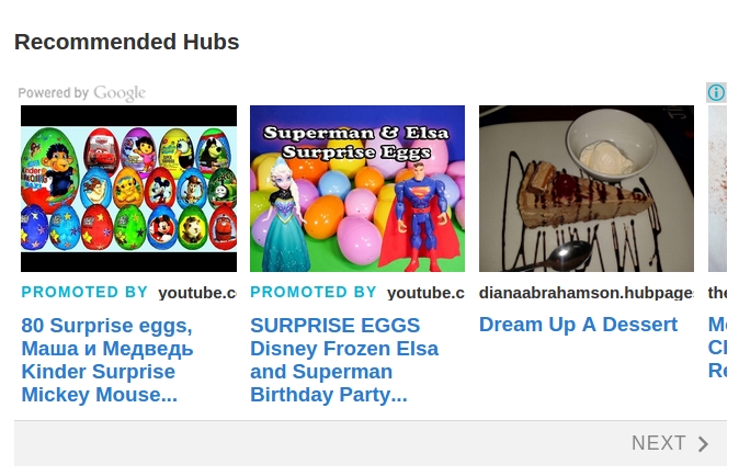
to quote from blog
____________________________________________________________________
Matched Content
Matched Content is finally ready to go and will be placed below the Hub Feedback Bar (i.e., where Related Hubs used to be.) For those of you who haven’t heard, Matched Content is a Google content recommendation engine currently in beta. It will show readers recommended Hubs based on both their interests and topical similarity.
---------------------------------------------------------------------------------------------------------------
Does this mean all sorts of stuff will be lobbed in here?Well this is surprising. Thank you for reporting. Google told us that eventually, Matched Content will recommend content from around the web in addition to Hubs. Apparently they've already started with YouTube. I'll find out what's going on.
Is HP going to add 'in your face' social media buttons or links to the mobile render? You stated that HP will 'consider it'. Has it been considered? What was the decision? I ask because I am considering adding DIY links to fill the vacuum. Thanks
When I said we would consider it, I didn't mean it would happen that day.
 We have a process for deciding what new features we will undertake. We re-review new feature candidates quarterly, and we plan to consider social buttons on mobile for Q3 of this year. Our Q2 (April-June) schedule is already packed with other projects.
In the meantime, here is some food for thought: Why I'm Done With Social Media Buttons
I was not getting help from Marina (except for her to say I need a newer monitor), nor clear explanation from Matt on how to fix my screen so I can see the share buttons. I found out through research on my own an easy way to fix the problem.
I minimized everything I had open.
- right clicked on clear space on my screen
- scrolled down to properties
- clicked on the settings tab
- raised my pixels to 1152 x 864 and I can now see the share buttons
Easy ! If someone had told me that to begin with, I would not have stressed out so darn much !!!
Now I can barely see the scroll down / up bar on the right side of my screen and some things on pages run off the side - but, I see the share buttons.
I still think the share buttons should be put back where they were, anchored on the right side of the page. If "Related Hubs" section was taken out we could have the share buttons put back.
PS: I also think the new pages look very spammy with so many ads and all the links to other hubs plus the Google recommended links - very spammy and cheap looking.If we cannot see the share buttons our readers cannot either.
BRING BACK VISIBLE SHARE BUTTONSI just thought I'd post the link to Quantcast's profile of HubPages traffic https://www.quantcast.com/hubpages.com?country=GLOBAL
From this it can be seen that traffic from mobile devices is about 60% of the total traffic.
Can somebody explain to me what improvement projects could possibly be more important than making sure that share buttons are available to 60% of the TOTAL TRAFFIC TO HUBPAGES?I cant see them either... so either EVERYONE who hasnt commented CAN see them, or that 5% was just pulled from the sky along with most of HP staff's explanations for things
Yes, if so many members who are commenting here can't see them, I dread to think how many of our visitors can't see them.
Marina, does the new design have anything to do with why Search Data is not showing? I just looked at a hub with over 800 google searches in the past 30 days with no search terms showing.
Hey LTM, no this bug is unrelated to the design. We're aware of it though, and eng. says it should be fixed within a couple of days.
I am not seeing any share buttons on hubs today.
They have been there for me to see since the redesign.Yes, I saw them on your Avatars Guide hub. and realized I had to zoom out to 110 to see them on my hubs because I was at 125. (blush)
This whole thread has been revealing to me as to the zoom thing. I thought I was in the vast minority when it came to having to use zoom to be able to read the text. Turns out there are a whole bunch of us! It's nice to know I'm not alone.
It's so real though.
The zoom is so handy for lots of reading.Just goes to show how well the team thought this through.
Please bring bak the share buttons where everyone can see them.
