The new Hub layout is live on Fashion & Beauty Hubs
Last week, we announced on the HubPages blog that we are giving Hubs a makeover, and that the new Hub layout will be first tested in the Fashion and Beauty category.
I am happy to say that the change is now live! Stop by some Fashion and Beauty Hubs to see it live.
One thing you'll notice about this format is just how important good quality images are (photos of adequate size are what enables a Hub to be prominently featured in the sidebar and at the end of Hubs). We hope that this encourages you to work more original or legally used high quality photos and images into your Hubs!
After we're confident that this new design is free of bugs, we'll be rolling it out in Hubs across all topics.
Big thanks to MickiS and Fawntiafor the beautiful update.
Now I can update my fashion and beauty hubs, thanks!

A few things I don't like about this.
One is the voting buttons at the end. I wish you'd just get rid of them, but if you have to keep them, can you make them look more professional - i.e. get them all in one line, not half on one line and half on the other, not aligned.
I also don't like the overwhelming size of the top right "related Hub". It's huge and draws the eye away from the Hub straight away. Though I do like the look of the grid of images at the end of the Hub.
Finally, I know it's an optical illusion, but the Hub itself now looks awfully skinny, as if it's been squashed up to make room for advertising. If it could be made just a fraction wider, I think it would look more balanced.I agree. I don't like it, either. All those photos at the bottom of the hub that link to other hubs make the page look too cluttered and confusing. They overwhelm the actual hub.
The picture for the related hubs on the right hand side look bigger than the pictures in the article being read. It made me think it was part of the article (not a related hub).
That said, I like the idea. It really plays off of Pinterest's visual bookmarking.
I also like the new title/author section at the top. That looks very professional.
I am not a fan of the "pinboard" below the comments - I would have expected one or two hubs shown there, not as many as there currently are. Save the pinboard for the Topics pages...
Overall, I like it - just please make the top right picture NOT look like it is part of the hub.Exactly. Especially as the Hub looks so narrow by comparison. I don't have any problems with the rest but that image is really getting to me!
I agree. This is the first time I've looked at mine and I HATE it..yes capitals! Immediately my eyes went to the related hubs on the right....not to my content or the Adsense ads. Then as I scroll through, I'm drawn to the mass amount of pictures of related hubs on the bottom. This is horrible. Please tell me now if this is going to eventually be the layout of all hubs. I've even visited hubs of other people...and I seriously had no interest in the content or ads; the pictures are overwhelming.
While I appreciate the effort that Hubpages puts into positive changes, I can't believe someone looked at this and thought it would be beneficial to the writer OR the reader. It's a cluttered, chaotic mess....but then again, so is my brain sometimes...so maybe it's just me?I agree. The related hub pic on the right is too big and the amount of related hubs at the bottom looks pretty scary! Exaggerated, if I may say.
I agree with you Marisa. I came here to rant about it especially the related hub. I don't like the heading either, where my profile pic and stats are. They look all jumbled. The look reminds me of FACEBOOK and I am not a big fan of Facebook.
I say put back my avatar and stats to the right, have a cleaner heading and place all related hubs to the bottom as are the others.I'll second all of these points. The Hubs certainly look different with the new layout but the changes seem to make them look less professional and less aesthetic.
I am disconcerted by all the related Hubs found at the bottom of a new-design Hub. There are so many that it looks like 100 "relateds" to me. Don't know if it is good or bad yet.
That was my initial "gut feeling," too - there are a LOT of related hubs at the end. I like the pin-board style, but perhaps the number related hubs could be reduced. There is also the empty space on the gray "share" bar at the top of the page. Otherwise, I like the concept!
I agree with Relache and Patty. Two rows of related hubs at the bottom is enough. That empty space under the ads to the right, place my other related hubs there. But even though the related hub at the top right belongs to me, I think it still takes away from the actual article. I would prefer my avatar and stats there and below that the first related hub (mine of course).
All those hubs at the bottom of the page is pointless.I agree with Cardisa 100% no matter what the hub is on the right people will click it. And the worst part is that they don't open in new tabs!!
Not to mention that this layout pretty well insures that no more than one hub will be read per author. With all of the distractions on the page, how can a reader be expected to do anything else?
I think if related hubs are being shown, the first related hubs that should be shown are by the same author.
I agree with everyone else that the related hub at the top right is really a bad idea! That was a total turn-off!
Wow! Nice new layout. I did a fashion hub to try it out. However, I see some similar issues. I used two tags, and have quite a few unrelated hubs showing up on my page. Keep in mind that Google ranks a page UP by "related" links, not "non-related" links. Plus the readers will get frustrated and exit instead of clicking on actual related links...this in turn drives my Google Analytics bounce rate higher, and detracts from other hubbers having their related hubs read.
Now, my wife stood here while I loaded the hub. She is a web designer. Her first reaction was very negative by all the huge related hub images. What is there? 50 to 100 at the bottom of the page? The photos are all pretty and such, even the non-related hubs, lol, but the load time is not good. Sure, I can load fast because I have high speed internet, but the "majority" of the world, and many in rural areas in the U.S. have slow internet, and the page will never load, or take too long to load and again, exit, stage left, driving up my bounce rate, and HubPages losing traffic.
Also, I just went back and used the "suggest links" tool, and after adding a few of the suggested hub links, I see there is no way to exit the tool. We used to have the option of a click to "stop suggesting links".Sorry, but I don't like it.

On the example that I checked out, the main hub was overwhelmed by a clutter of large photos, relating to other people's hubs.
It was just too much, in my opinion. The hub seemed to disappear amidst it all.I also did nt like the new look much.. the large number of links to other hubs at the end of each hub is very cluttered and looks bad.. the link to images gallery opening in a popup window is also not good as it blocks the whole window and looking bad on IE... and adding more to my disappointment there is a drastic drop in my hub views and my adsense earnings after the new layout has been implemented..
I love the new look, but the hub I was viewing "I don't floss my teeth anymore and my gums are more healthy" by Pamela N Red, the voting boxes show up as blank along with the follow box. Other than that, I love how our profile shows up at the top of our hub. Thanks! A job well done!
tlpoague, yes, we saw that problem, too, as soon as we released it! We're working to get it fixed soon.
Glad you like the new design otherwise!The picture of the related hub to the right is entirely too big in comparison to the hub itself. It definitely draws the reader away from the hub.
I just moved one of my hubs to this category and now this related hub image is way too big! Not only is it too big and distracting, it is almost in complete contrast to my hub topic! How are the related hubs determined, only by category?
I also like the profile information showing up at the top. The pictures at the bottom don't bother me because they have to read our entire story before they get there. I'm not sure about the large photos to the right but can get used to it.
It has a pin board feel to it which someone mentioned. Seems to be a popular trend now so might help some get exposure that wouldn't normally.
Oh, someone mentioned loading time. I have the slowest speed Cox offers and didn't notice a loading problem. It's not video so there is no reason for it to bog down the download time.
Just my two cents.
I LOVE it-- really great improvement. (I only have one in that category, I think.) -- The other categories are coming soon, right?
We're going to test it for a few weeks in Fashion & Beauty to make sure everything works properly, that users like it, collect data, etc. But, yes, the plan is to roll it out to all categories over the coming weeks.
I'll try to come up with some fashion and beauty stories to see how it works.
Holy Hot Dog! Are you guys sure about this? The images on the related hubs overwhelm both the primary hub's content and ads. Particularly the ones after comments. The visitor will be too distracted to go anywhere near the share buttons or ads...
Example hub: http://doloresmonet.hubpages.com/hub/Re … an-England
edit: Paradigmsearch has gone back to study the images some more...
edit #2: I also predict the possibility of Google having fits over load time issues.Well, paradigm search, the reasoning is this: if a user has gotten to the pinboard after the comments, they have already consumed the content of the primary hub and passed on ads. So, now, let's give them a compelling reason to stay on HubPages.
Most hubs won't have the number of insulating comments that this one has. The information overload will start before the reader reaches the end of the article.
I guess what I'm saying is that you guys did too good a job!
Another thought. Different personality types flock to different topics. I'd be more tentative on the roll-out schedule. Instead of phase II being all topics, maybe do a more gradual expansion schedule. That would also give you more time to evaluate what the effect is on the share buttons, ad clicks, and a whole bunch of other stuff.
edit: This is a major, major change HP is implementing. Me being me, I would tread slowly and cautiously. Oh, and btw, that vicious rumor about me being wrong about something in 1978 is true. So, admittedly, I'm due again.Thank you for the compliment.
I guess we are being you. We are treading very slowly. The design is based on a lot of data that we have collected already about how readers use Hubs. We currently only have the design live in one topic--Fashion & Beauty. We're collecting lots of data over the next week or so and will decide how many topics and how quickly we go from here based on the data that we see.
Slow and cautious. That's our approach...so maybe you'll only be wrong that one time back in 1978. :-)MickiS - I understand that you all are focusing on the reader, but can we please reduce the picture's size on the right or at least make it the same size as the actual hub itself? It makes the hub look insignificant when compared to the huge related hub picture on the right.
Yes, because scrolling back up is impossible.
And it is, with approximately 282 large images to scroll through, tempting people to click through.
Don't you think that's going overboard? Is HP HQ that desperate to hijack my traffic?
I agree!
Looks too spammy to me.I think serious readers won't like it.
Also, the "pin tweet like" overlays on the pinboard at the bottom only seems to work on the first few images. The ones further down don't have the overlay appear on mouse-over.
Nice job overall!An objective user view - I wouldn't get to the 'overload' of pictures at the bottom. In 99% of cases I do not read comments, I read the main content - so I'd never see the related hubs below the comments.
I see 2 related hubs on the right - I'd much prefer to see half a dozen there - I'd be more likely to click on those. I'd never click on a picture that far down the page...Excellent feedback, SimeyC. Thanks. This is why we are in 'preview' mode in one topic.
Looking at it again - I think the number of 'related hubs' on the right should expand based on the length of the hub perhaps.
On very long hubs there is a lot of gray space that I feel needs to be filled!
On short hubs I like the look of the hub - still not sure about the related hubs below - it's OK if there are not comments, but with hubs with a lot of comments they become irrelevant.
The whole thing has a Pinterest type feel - not quite sure how I feel about that yet
Not to be nit-picky, but is there a reason that the hub score is aligned to the TOP of the adjacent text? It looks odd.
Secondly, the area circled in the grey box is a lot of empty space. Is there a plan for using that? I am not a designer by any stretch of the imagination, but it looks like all the text and graphics are up against the left side and the right side is just empty.
(I still like the changes!)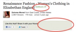
Thanks for the feedback and comments GinnyLee.
Yes, the HubScore was moved to 1) follow the title 2) be smaller so make it a bit less prominent and 3)we added the label so that newbies and less experienced users would know what the number is. Perhaps we can see about centering is more rather than top-aligned.
As for the space on the right, in your screen shot, the author has elected to not allow their content to be shared on Pinterest (tho, it's such a great traffic driver, but that's another subject). So, the Pinterest button is missing. I do, agree, though, and we are looking into creating new icons that are larger to better fit the space.Where is the option to share on Pinterest? I also have that area grayed out but don't recall seeing a Pinterest button. I went into edit and didn't notice it there either. I love Pinterest and don't have a problem with sharing there.
I like it, it's a nice change. I like the narrow format, and the comments also seem to be easier to read? Interesting. I like the top with our author avatar, name, etc. I've often thought that sometimes readers may not even see our avatar/name on the top right. The related hub pic looks fine to me, (I'm looking at one on my hub). I don't see it as a distraction. I think if the hub itself has nice images, it wouldn't appear to be a distraction unless it's much bigger, as some have mentioned. And I do like the ads on the sidebar.
The bottom related hub images look great, but I do agree with GinnyLee that there may be too many. But I love the look, and I see some hubs that I myself will check out! I think it's great that they're there in contrast to expecting readers to find the topics category. And if they make it that far and browse the images, it adds to time on our page.
It inspires me to want to add to the category. Fashion and Beauty is always a hot topic. I think I only have one at this time.
Nice work HP. LOVE the continual updating to stay current and progressive.That you for the feedback, rebekahELLE. Much appreciated and glad that you like it!
I hesitate to make my images in the Hub bigger, because then the text squeezed down the side becomes harder to read.
I have to say, I like the look of that area, too.
The changes are awesome; but, I guess there could be a few minor tweaks? Please correct me if am wrong though
I'd say, that the top right image of the related hub surely out beats the hub itself and people will surely click it if they're really interested in the actual hub they visited (as its related) - The least you'll could do was make them open in new tabs (Otherwise people won't even read the actual hub they visited!)
The list of related hubs at the very bottom is cool. But, the load time would increase. Instead of loading more and more it would be nice if you could load just two to three rows? - Of course you'll could check out how this works as you'll would be doing some stats analysis right? I wonder how that will work as search engines hate pages that take time to load!
When you hover over the individual hub score, it now tells you what it means. I was looking forward to that. But, I just read one hub by Tammyswallow titled -"What Your Prom Gown/ Prom Dress Says About You!" and it had a score of 79 when I checked it and I'm sure that the quality is far better and it deserves a higher score if you don't take into consideration the amount of traffic it gets and stuff. But, for a scale of 1-100 I'd see it as 79 and think that it's a low quality hub if I were a visitor to it. I doubt people will bounce because of it; but, I guess that's a possibility?
Again, correct me if I'm wrong
Edit: Btw great improvement and I can't wait for it to slowly move on to other categories
lobobrandon, glad that you like the new look. There can ALWAYS be tweaks! This is the point of our preview.
No corrections to make to you. It's all excellent and well taken feedback! Thank you.Yup, I know its a preview and I'm glad that this has finally happened - I couldn't wait after reading the blog post
MickiS, I second lobobrandon's concerns. The hubscore is not only telling other hubbers that the hub is of lesser quality compared to other hubs on the same topic, BUT it seems to viewers outside Hubpages that it is rating the article 1-100 standard. So, it seems to mean to outsiders that this particlular article with 79 rating out of 100, is less relevant or of lesser quality compared to another that has a higher hubscore.
I have a lot of hubs with low hubscore, so I'm concerned about this.Yes, same problem here and that's why I pointed it out. My hub which gets the most traffic and the average time being 7:54 seconds as per analytics has a hubber score of 82 whereas one that gets just 5 views a day has a score of 94 - 96 (I do consider it my best hub but the traffic is low as its relatively new, just about 2 weeks old). And the time spent on it is an average of 3 mins.
I'm actually wondering what counts to the score of a hub? The one with more traffic and longer view times is lower!
Am I dreaming, or has that top "related Hub" image already been reduced in size?
Or does it depend on the size of the original image?
I just looked at another of my Hubs and the related Hub image is just that bit smaller, and it looks great!The width of the image is always the same, but the height varies.
I really think there needs to be some kind of limit on the height. I can see the logic of putting a "related Hub" image there, because of Google's new limit on 'above the fold' advertising - but the largest images are so big, they look like they are part of the Hub, and if they're not totally relevant that's confusing.
Wow - that is quite a difference! I love change and updates and overall the new design looks great, I particularly like the new pinboard look for the related hubs after the comments.
Couple of thoughts:
- A couple of hubbers have already mentioned that the related hub at the top right is too prominent and I agree. Seems to me this space would be better used for advertising, and you could add a couple of more related hubs images to the sidebar further down the page. I noticed that for long hubs (and we should all be writing loooong hubs!) there is an awful lot of empty space after the two adverts and two related hubs images = Plenty of space for related hubs images!
- I'm an admin for several Facebook Pages and the first think I noticed when I loked at the first fashion and beauty hub was that my 'FB icon' asking me to switch back to 'Linda' to be able to use the FB share button fell outside the allocated 'box' - see screen grab. Most readers won't have this problem, but it looks a bit unpolished for all of us FB admins )
)
- I really like the pinboard after the comments and I think it'll improve traffic through the site overall. But for hubs with hundreds of comments it totally disappears as noone is likely to read all comments and arrive at the end. Any way you could show only, say the latest 5-10 comments with an option of expanding the view to see all? Just a thought...
Thanks for the feedback. A few answers to your comments to clarify things:
--If an ad is in the first position in the right rail, it usually has a less likelihood of being clicked by a user. Readers recognize it's an ad, largely ignore it, and therefore ignore everything in the right rail. In this design, the related hubs in the right rail are the same size as the ad unit and there are the same number of them as ad units. One of the many data points that we are tracking is the click rate of the ads in the right rail before and after this new design. Stay tuned.
Re: the comments. Totally agree. showing 5 comments or so would be ideal. Problem is that by not showing comments, you can negatively impact search engine traffic. It's another one of the data points that we are testing with this new design. We're hoping to find a way to balance the user experience and readers to discover the pinboard without impacting traffic.I like reading the comments of the hub, because there is sometimes additional information about the topic. I also like to read them so I am not duplicating the same information when I write my own comment. I would prefer to have all the comments stay on the hub.
Please tell me all Hubs are not going to this format.
Or at least we have a choice between the new illegitimate child of Pinterest layout and old standard one.lol "new illegitimate child of Pinterest" ... Good one, sabreblade!

Yup, that's one thing I hate - The pinterest format! Just 2 rows is more than enough that too would be too much I guess. But, the stats are yet to come
I agree - two rows of related links would be nice, more than two is too much. The other issue I have is that most of my topics don't lead to pictures. Sure, there are nice photos of money, but they don't really tell you much about the quality of the hub.
I just checked the Parisian women hub that I moved to this category and I don't like the related hub featured at the top. The image is overpowering and doesn't fit with my hub topic. What do we do in this situation? I may switch this hub back to Travel for a few more days.
I noticed that my other Fashion related hub is at the bottom. It would make more sense to have our own related hubs featured at the top. How are the featured related hubs chosen? I don't think either of the two top related hubs are related to this hub topic. Do they change? I don't know how to do a screen shot or I would take one.I went to respond to a comment on my latest beauty hub and thought there was a glitch...lol
The related hub is too prominent. Not sure if I like the entire layout. I think it needs work.
Where is my author score? The other hubs have it but the beauty hubs don't. The hubscore is very squingy on the hubs.
There is a huge empty space on the right below the first related hub, the ad and the second related hub. Then to the bottom all the other related hubs are all jumbled. It makes no sense. The page needs a lot of work.
I say, place all my related hubs to the right along with the ads and at the bottom all the other related hubs.While I like some of the layout changes, I changed the hub above back to Travel-Europe-France until the bugs are worked out. The two top related hubs were just too distracting for my taste. I would like to see the author's related hubs in those prime positions.
I think the hubs that the hubber adds to groups should show in the related hubs on the top the main one!
I don't know how many 'related hubs' everyone else has on their hubs but my eyes glazed over when I counted up to 250 related hubs on a Hub of mine. I'm sure many of them where duplicate entries?
It's an endless stream of related hubs, which probably means that everyone has all the related hubs displayed on their hub.
yes I can see that! and in theory every Hub related in that topic will eventually show up? If that is the case I'm not sure if I like that?
It also does not explain why some hubs are showing up more that once?According to MickiS, people will only go to the extent of loading up all those related hubs once they are done with the actual hub and so the feature is only there to give more options. What exactly is it that you don't like about the number of hubs?
As for the duplication issue, it might be a glitch or it might be due to the method of selection for inclusion. This might be something that has always been around we just couldn't see it because there used to be only a small amount of related hubs shown.
One minor problem. In order to include my tracking code, I've always scrolled to the bottom and used "link to this page." However, now the bottom of the page never comes; I keep getting more and more "related hubs" and I can never get to the bottom of the page!
This could be fixed with a "skip to the bottom of the page" button near the voting buttons.I agree with everyone else who say:
1. The so-called related hub image at the top is too big. It takes attention away from the hub.
2. And it should show the author's own related hub, not any hub in the same category that may have nothing to do with the hub being read.
3. All those hundreds of link-photos at the bottom of the hub make the content of the page look like a mere vehicle for advertising other hubs, like on cheap commercial linking sites with no valuable content.
The balance is all wrong. The WRITTEN CONTENT of a hub should dominate the hub, not links to other hubs or advertising. It looks like HubPages are getting greedy for attention through an overpowering, imbalanced lay-out, which, b.t.w. you recommend we shouldn't do.
The new profile details at the top is about the only improvement I can see.
Sorry, I'm not happy about this at all.PS: Talk of duplicate content, if every hub in every category carries photos and links to every other hub in that same category! I think it's insane.
Im not sure how I feel about this new layout but I do know that the best way to cope with change is to help create it. With that said, I think that;
1- The position of the author info and the 'like this Hub" is out of sorts for me.
Personally I would like to see the author Info on the right,on top of the first related hub. Placing the author info and the "Like the Hub" underneath the title takes away from the flow of what is to come.
2- As for the "like this Hub" .. if the reader does like the Hub what are the odds they are going back up to the top to do so. This position just does not make sense to me, unless it is put there to let the in pending reader know others liked it. Its almost an oxymoronic placement if that makes any sense!
3- Most probably wont be bothered by this, but the colors of the buttons for the Vote Up, Vote Down, Flag and Share are horrendous. There are just too many unappealing colors for all the buttons and they just dont meld well with the next set of buttons (Level of the Commentator, Hub Author, Deny, Reply, and Moderate my Own Comments. It strike me curious to understand how it is that the Vote Up and Unfollow buttons are the same color. Every team has a set of 'standard' colors and I think that now is a good time for Hubpages to define what theirs are.
4- As for the pinboard at the end, I like it, but the amount of Hubs here feels like overkill. There are just toooooo many. Sometimes less is more!I'm not sure I love the new layout, either. Like many others' comments, I think that the related hubs photographs to the right are too large. I do like the explanation for the hub score - that is an improvement.
I know that photographs draw readers to content, so there has to be a happy medium whereby we can keep traffic on HubPages with images of related hubs, without drawing away from the hub that is actually being visited.
A magazine-like layout can be clean and fresh. But I think additional changes should be made to the new layout for the Fashion and Beauty Hubs.Personally, I dig the new look! I have quite a few fashion hubs and I think they've gotten a well-deserved facelift. I'm not quite getting the criticism posed by some that the hubs look too "skinny" now. They don't seem any skinnier to me than they already are. Perhaps it's somewhat of an optical illusion since we now have large images floating to the right. I *can* see the point about the related hubs images being a bit large, however.
I don't think the position of the "like this hub, etc..." tab is optimal, however. I have a hard enough time liking articles when they're at the end.
I really like the never-ending pinboard at the end, personally. I think it's very visually appealing and fun, frankly. I appreciate the fact it might keep a viewer on my page longer, too. And that's a good thing in Google's eyes.
Kudos, I say!Why would I want my reader to have this tremendous amount of options to click on? I want them to click on my Adsense or Amazon and that is it. Giving readers all these options is doing absolutely nothing to benefit me, and as a reader...I can't stand to be on a page that is so cluttered with this many decisions. If they are going to click through to another Hub then I want it to be my Hub.
I don't have all that many Hubs in this category, but I will be moving them when I have time. I hope that the other Hubs stay the way they are.
Like you said, it does keep a reader possibly on the page longer, but I only run Adsense, not the Hub Ads. I want them to read the Hub and click, not browse around.
My Visitors are down my earnings are down and I think they will go down more with this new layout, I do like the layout but why do the links to other hubs have to look like the advertising on the hubs? whoever thought that one up had a serious blonde moment, it wont work for us and needs to be changed after all if We lose money Hubpages you lose money too.....jimmy
I like the idea of showing other people's hubs, but I think the other hubs should be based on what the reader is looking for.
They are looking for information on a particular subject, so lets show them all our hubs on that subject. They are more likely to click on these than on a hub that is totally unrelated.
This could be done based on the tags and keywords we use or using the top keywords from the Keyword stats box for that Hub.
For example, I have a hub based on creating a minimalist wardrobe. A person who wants to read this is looking to declutter their belongings, and live a simpler, more minimalist lifestyle. Some of my tags are minimalism and minimalist clothes, so you could include other hubs with these tags, maybe on topics such as living a simpler more minimalist lifestyle, or decluttering.
At the moment, on my minimalist wardrobe hub, it now shows other Hubs on topics such as getting a tattoo, and creating fake nails, and that is really not what that reader is looking for so they are unlikely to click on that hub.
However, I also like the idea of showing unrelated hubs too as it is interesting for the reader, but I think it is all about balance. Maybe 80% of the hubs shown could be related, based on tags and keywords, and then at the bottom, 20% unrelated for a bit of spice.Sorry forgot to add....
Please can you make the boxes smaller? I think they will look better and you can fit more columns in.
I also agree with other Hubbers that the two top right boxes are too big and there is too much grey space underneath.
They are also on topics unrelated to my hubs and are therefore unlikely to be clicked on.
If you make them relevant based on tags and keywords, it is good for the reader and good for us as it should lead to more traffic and earnings.
Also, thank you for trying to make another improvement to hubpages.
My traffic has jumped by 25% today so something good must be happeningRontlog, glad to hear that you're traffic is up. Thanks for taking the time to provide feedback.
Fyi, the Related Hubs are calculated as 'related' based on keyword and tag information. But, if authors aren't good about including tags (or poor quality tags) that does degrade what is determined to be "related."You may not be aware that there's been a lot of discussion about how UNrelated many "related" Hubs are recently.
One thing I've noticed is that Hubs seem to be matched based on individual words WITHIN tags and titles, as well as whole phrases.
For instance, someone might use the words "white noise" in a Hub about sleep aids. That Hub will then show related Hubs based on the word "white", including Hubs on "white exhaust" (cars).
One obvious way to reduce 'mis-related' Hubs would be to choose related Hubs from within the same Category only.
Also, is there any way the tag tool can be improved to only match tag phrases?
I can see where that can be a problem, but sometimes the context is not the same even if there are related tags. On one of my hubs about a certain look, there is a section about makeup and I have corresponding Amazon ads, and often there are google/HP ads makeup ads. The related hub at the top is about how to look great without makeup. While it has a related word, my topic includes using makeup.
I have another related hub which would be perfect in that spot, but I noticed it is the first one at the bottom. What determines which hubs make it into those prime spots? Is it the size of the photo? But in some cases, as others have mentioned, the images are too big and overpowering. Thanks for listening. I do like a lot about the layout, but I'm not sure about the top related hub choices and how it helps our own sub domains.Copyright Issues.
The images for related hubs have no copyright statements or sources specified.
Whose responsible for potential breach of copyright?
My understanding was that each author retained the copyright for each article they publish on HP - but now these articles have a heap of images inserted into them by HP.
Can someone please clarify this? Maybe HP should be renamed Hinterest! or Hindinterest!Excessive Linking Penalty
Can HP lease give an assurance that the huge list of related links at the end of the article will not be viewed negatively by Google as a 'link farm' or equivalent, particularly in relation to its recent update on linking - the links appear to be do-follow.
The description for the "More Related Hubs" is interesting:
id =>"pinboard_heading" More Related HubsFor related issues regarding implementation to the whole site see:
http://hubpages.com/forum/topic/95799The only thing I really appreciate about the new look is the position of the author's name. But then again, if it's previous position will only be replaced by a too huge image of a related hub, I would still rather prefer that the author's info be placed in its original position. The related hub image is definitely distracting and it's placed in a position that is just odd. It's in line with the title, the first thing a reader supposedly reads, leading the eyes of the reader towards that humongous image. And I keep on wondering why should a related hub be placed there at the very top? I think it can still be prominent even if it's placed one or two "boxes" below. An ad deserves that top right position I think. I also think that it would be better if the images are smaller, somewhere in between the previous one and the one from the new look. The never-ending related hubs below the comments section are not pleasing to me as well. Can you at least make the boxes similar in size? It's not very eye-friendly when they are not aligned. And I think 5-10 links are enough. We never know if that amount of links will be viewed negatively by Google or other search engines for that matter, whether now or in the future.
As I notice, the trend nowadays is minimalist design. It's very apparent even in the top web browsers today. I would be happy if HP also goes towards that path.I think I agree that the author image/info might be better where the top related hub is. The more I look at it, the more I see how distracting it is. I think it gives the impression that the author of the page placed it there. It's bigger than our author image/info.
A couple more observations, then I'm going to sleep.
On our current layout, it gives the author more prominence, which I think is important because it's our sub domain. Our image is larger, there is a 'contact the author link' and 'read more hubs by author' link. I don't see those links on the new layout. How do viewers contact us if they don't want to comment? Do they know how to find a list of our hubs? Most likely they won't bother if it's not easily found with an obvious link.Those are very good points. With the new layout, there's no indication that the author has a collection of work on the site - unless that top "related Hub" image points to another of our Hubs. While the blog says our own related Hubs will get priority for that position, I'm not seeing that happen in practice reliably.
I totally agree with the above 2 quotes. We are all losing out here for the benefit of other Hubbers. Of course to HubPages it doesn't make any difference WHO gets the views, but don't forget, individual Hubbers are the bread and butter of the site and if our individual views go down we'll soon go looking elsewhere to place our articles.
I'm in total agreement with what was stated by rebekahELLE and the comments by Marisa and Sue. I think that we as authors will ultimately lose out if these changes stay in effect and are instituted onto all of our hubs. Between this and the stealing of our hubs by Big Ezine. com (purposely not giving them a link here) this is all very upsetting. I hope our voices count for something.
OK, I just saw one of these for real.
No good at all for me.
I am trying to write pages that someone will like enough to read some more of MY pages.
Not wrap the entire thing in an other people spam fest.
I know. I don't like change. But I really don't like where this has gone.
Why in heavens name would it benefit the author to show a competing article in the top right corner? Related or not?
What I would like is for that section and the awful Pinterest style tail to consist of my hubs - from my related groups.
I guess HubPages figure they can make more money this way, or that the links are worth something in Google's eyes. Maybe we all benefit, because my crappy hubs will be appearing as spam on someone else's.
Doesn't feel right though.Mark, this was always an issue even with the old layout, because the related Hubs were always more prominent than our "group" links at the bottom of our Hubs. This new layout has just made it much worse - but I suspect HubPages will just say it is 'swings and roundabouts' because your Hub will appear on other Hubs and vice versa.
The theory is that the "related Hubs" should favour the author's related Hubs - but in practice, it doesn't work that well.As Marisa had stated earlier, the related hubs would focus more on the individual Hubbers hubs, the blog post did mention that. But, I've checked a few hubs and not one of them had hubs from the same hubber. I think the best way to make that work out is to include hubs from groups (The groups you set as a hubber)
Even if one of my hubs will be the one shown at the top right corner, I'm still not sure if I'd like that. It's just too prominent in my opinion. The searcher might not even bother reading my article and just scroll through it quickly to look at the images on the right side.
The related hubs are too huge and it feels overwhelming.
The article seems suddenly small compared to the related hub and their photos...Sorry to say, I don't like the huge pictures and links to related hubs at the bottom of the hub. It all reminds me of Google Images or Bing Images. I found myself thinking, "Will this never end?" But that's only a comment about the bottom of the hub, and I guess people have different tastes.
I have a fair number of hubs in the Fashion & Beauty category, by the way. I took a look at one of mine which gets a lot of traffic. The related hub that is featured just to the right has a visually stunning image, but I doubt that the hubber had the rights to use this photograph. In fact, I'm 99% sure of the web site where the original photo appeared.
I work hard on incorporating images that are legal to use, or that I got permission to use. Just seems unfair to me that the reader might be tempted to click away to the other article, just because their image is so huge, and dominates the page space.It would appear that this is the HP Admin tactic - show great images to get the reader to click to related hubs, and to generate Pinterest, and so get extra HP income.
How the related hub is determined is a mystery (as it does not follow any logical rules and there are glaring errors), but I am starting to get suspicious and it may relate to how appealing the images are, ad CPM scores, etc.
Whatever - the author of the article that got the original hit, loses income:
=>users will be less likely to click the ads and many will leave straight away by going to a related hub.
=> the original article will be penalized because HP inserts a list of UNrelated links that looks like a 'link farm'.
=> The suggestion that the top-right related link will be one of the author's related articles does not reliably occur, except for extremely narrow niches.
=> The winners are those that score 'related hub' listing on hubs that have high traffic that get a free ride - its a bit like a flea on a cat
The new layout looks pretty - but underneath it has an ugly side - fleas!
I just looked at Dolores Monet's hub... http://doloresmonet.hubpages.com/hub/Re … an-England
The first "related link" at the top was not even hers! The second one below it was and then it was followed by gray space all the way to the bottom of her hub which was all bunched up on the left side of the page. Why all the wasted space?
I agree with the others who have already stated that the related link images are WAY TOO LARGE even if they DO relate to the subject at hand.
There seem to be fewer ads on the page and since that is how we earn money, that is also a negative. One of the ads was actually placed BELOW the comment section in the 2nd row of photos leading to other hubs. Most people, if the comment list is long, would never get down that far to notice it amidst all of those colorful HUGE photos inviting them to go to other people's hubs.
If I had a vote regarding the state of what this now looks like, sadly my vote would be negative. I would HATE to see all hubs being shown with this new format. Glad that I do not have any hubs in this category for now.
I REALLY HOPE that the way hubs are portrayed do not follow the example that I just viewed. PLEASE at least give us a choice as to which design will be implemented such as you did with the Pinterest button. I would wish for mine to stay as they are right now instead of the new look.
Wish I could have given a positive review as that would have been my preference. I am assuming you want real feedback, however.Tip: If you want to see what a searcher will see then log out of HubPages to get the top adverts showing.
I've been doing some stats on my Blog pages v HubPages - pages visited, time on page and bounce rate.
Not quite ready to release them - I need to make sure I am reading them right but they imply that my blog searchers spend more time with me, and read more pages.
Yet my blog is not as polished or content rich as my HP output - because I have largely used it to fill in time where I haven't wanted to put the extra effort in when I write a hub.
Do I think this layout change will result in better figures on my HubPages?
No.
Does anyone?I like the new layout, BUT I would like MY OWN related hubs shown on the right side, not competition. It is MY PAGE, MY HUB, MY BLOOD, SWEAT AND TEARS (so to speak), so I don't really want to advertise other hubs IF I have other hubs on the same topic.
Suggestions:
1. Allow us to choose which related hubs to show on the right side.
2. All our OWN related hubs showing in our groups, should outrank the other related hubs showing on the side and bottom of our page.
The top right hand side on my page, advertising in a huge photo a competing hub, when I have my own related hubs, is upsetting to me. Why should I give them FREE TOP advertisement on my page, when I spend hours, even days, working on my hubs? This is so NOT right!The April fool's blog April 1 (first point) may be worth re-reading
- http://blog.hubpages.com/2012/04/
I agree and if that could be accomplished, that would be one positive step. But the photo is still way too large...even if it would be from another one of our hubs. Draws attention away from the hub itself which if people clicked on it to begin with, it should be the center of attention.
I love the fact that you've given my hard won visitor hundreds of chances to click away from my hub and not on an ad or to my profile with that pinterest like mess at the bottom.
Please do not make this for all categories!!!!! I personally hate this layout!
I looked at the hub paradigm listed for example.
#1---I was totally distracted from the beginning of the hub by the over-sized related hub images. Way too big! AND...it pushes our best AD space out of the prime location. Not good!!!
#2---Why does the hub article looked "squeezed" in the page??? Looks like the hub is only half page wide now. Bad look there with all the wasted space to the right.
#3---The bottom AD might as well be deleted. It is lost below in the bottom corner. No one will see it anyways, costing the hub author the revenue potential by that AD.The only thing that worries me is, as darkside said, it takes the reader away from our ads or other links. Maybe if the pictures at the bottom were just to our own personal hubs then it wouldn't be so bad.
I agree with Michael Willis and Nell Rose. As to all of that wasted space on the right with our hub squeezed to the left...would you like reading a newspaper or magazine with that format? Dead space on the right with smaller print and other capsules on the left? I know my answer.
I have seen pages like this on the web and found the experience horrible to read. I go to a link to read the "Article" I clicked to see, not be bombarded with "Come here" "Go here" all over the page.
It takes away from the work of the author. The hub space should be 2/3 of the space and the right 1/3 if not smaller.
And like Nell has just said, the related hubs at the top should automatically be from the author if he/she has one.
Actually, now I have taken a look, its not so bad. I didn't see the comment above about if the reader gets to the bottom then they are unlikely to click on ads etc. I think it looks fine, but would still like to see our hubs in the right top corner, but yeah, getting used to it now!
I don't like the new format at all.
Having said that, it could just be my age showing as I just don't like change!
I'd be interested to hear how it affects traffic/earnings as I'm sure this was at the fore of HP's mind when they initiated the change, so until those results come back (I don't have enough hubs in this category to tell), I'm of a 'wait and see' opinion.I vote for individual authors having the option of specifying that ALL the related hubs should be from the Author's own subdomain:
=> allows HP and author to get same benefits from click-throughs
=> allows the author to maintain control over the copyright of their own images and not have to deal with issues related to foreign images pasted on their pages.
=> ensures all links are related (from the same subdomain) and avoids being penalised by Google for UNrelated hubs.
This is a win win outcome for HP and each author who can choose.- kelleywardposted 13 years ago
 0
0I just looked at one of my articles and the first thing I noticed was the big related hub picture to the right. I think this needs to be reduced or moved down some.
I like how the author is placed first, this might help with stealing hubs etc. or at least help the reader easily locate the author.
I like the pinterest look at the bottom and the pin it or like it buttons but it's so far down I'm not sure many people will find it??
I think it would be helpful if the actual hub pictures were bigger and not so narrow looking.
Thanks for your work in trying to make the site better! I am sorry to say, 'I hate it!'. Though on most of my gemstone hubs, the related hub also is mine... I hate to say that it takes the attention away from the main hub. Also the page looks all cluttered. I like the previous layout better. Since I normally write hubs on group, rarely I get to see any other hubbers hub on the related section. Now that is not the case, and I hate it!
However, I like the voting buttons at the end and the author info on top.Forgot to mention that the authors picture in the new layout is too small.
I agree with you Anamika. It reminds me too much of FaceBook! I really don't care for it but with a few tweaks it could look much better.
- timmathisenposted 13 years ago0
People don't like change. That's a given, but I really like the prominence of the larger photos for the related hubs on the right rail. This adds a nice design element to the webpage. The problem, which Patty Inglish, MS, noted, is the bazillion related hubs at the bottom. That seems tacky. Limiting related hubs to maybe 5-10 at the bottom would be more effective.
It's not that people don't like change...change is great when it's beneficial, which this is not. I want readers to click on my ads, not have the choice to click on 100 other hubs. Never give a reader this many choices. I'll say it again...it is horrible!
I looked at a couple more of the Hubs in Fashion and it is very reader unfriendly in my opinion. The Hub as a Sidebar (as it looks now ) does not keep my full attention because the right hand side images are so big that they demand the attention.
As I have mentioned before, if I follow a link, I want to read that hub and not the related hubs chosen by the site! Any site I visit that I have to filter through to get to the information or if a page is filled with clutter, I hit the "back button" and go somewhere else for the information.
I would definitely hit the back button on this new layout. So no fashion hubs for me.I hate it, the top right 'related image' looks like it is supposed to be relevant to the hub it is on, (which of course it isn't) and all those horrible pictorial links to other hubs at the end look completely tacky. This just cheapens the overall appearance of the hubs and detracts from the hubs actual content. Horrible, please change it back, the old system worked well, and 'if it ain't broke, don't fix it!'
Funny, that was exactly what I was thinking this morning about this new layout. The old layout was just fine... "if it ain't broke, don't fix it!"
What's annoying me so much, is that the related articles that are showing in gigantic photos to the top right hand side of my pages are not my own related hubs, but someone else's. Ok, I'm not exactly annoyed... I'm really really PI$$ED!LOL, I know what you mean. That huge picture appearing on the top right makes it look like it relates to your hub, when in actual fact it is relevant to (most likely) someone else's. Right now it looks like the Header Photo/Featured Image for your article, and of course it is usually a completely irrelevant picture when it comes to your hub's topic.
Exactly, Misty! Almost all of my fashion hubs are in black & white, so showing huge colored photos on my page is tacky!
PLUS, we write related hubs and group them together for the purpose of establishing ourselves on topics we write about. It is just fair that our own related hubs should outrank other hubs on our own page.Exactly. In this new layout, any attempts to be an authority on a subject are simply blown out of the water. Unless I go in and create a table of links on each Hub, my readers would have no idea I ever wrote another Hub on the topic.
True, some of my related Hubs are in the section at the bottom,but it's such a morass I doubt they'll notice!
My concern is that good Hubbers who specialize in a specific topic will be driven away from HubPages if this layout goes ahead, because they'd be better off putting their material on their own single-subject blog, where readers won't be distracted.I have noticed that the only reliable way is to deliberately write a series with a common element in the title + common tags.
Much to do about nothing: Ern Malley
Much to do about nothing: Great Con Artists
Much to do about nothing: Literary Deceptions
+ add 'a table of links on each Hub' in the body of the text+1.
Although 1 is not really sufficient.
It is obvious that those writers who have some sort of niche go to considerable effort to Group them together. This does good things with Panda ranking - associated content - and more importantly perhaps means that a single search hit might lead to more than one page being read.
Until hopefully they eventually leave through a sales channel.
As an example I have one possible niche - stickmen. Don't ask why anyone would bother with it, but I do. I would very much like my reader to look at my stickman page and hopefully think "this is nice, I wonder if he has anything else - ooh look there's one with a giant sperm on it."
Not go wandering off, never to return because he or she realises any fool can draw stickmen.
I am trying to see the positive of having someone else's pages advertised on mine, and I just cannot see it.
Live off accidental hits from a Pinterest crazed reader?
Or set up mini website for related content?
I don't mind being persuaded this will work - but I just cannot see it.The only logic is the flow-on delivery of more impressions through 'related hubs'.
HP is serious about this as Paul E has said in another forum
"............we are testing about three different related hub algorithms. We are looking at things like user engagement and seo".
also previously it was stated:
".......the reasoning is this: if a user has gotten to the pinboard after the comments, they have already consumed the content of the primary hub and passed on ads. So, now, let's give them a compelling reason to stay on HubPages."
i.e. the strategy appears to be 'sticky content' and if the original author's content 'ain't sticky' enough to hold-'em we'll provide some really sticky stuff via links to 'related pages' that are really engagin'
That is the point Marissa. ..My concern is that good Hubbers who specialize in a specific topic will be driven away from HubPages if this layout goes ahead, because they'd be better off putting their material on their own single-subject blog, where readers won't be distracted...
The niche I write in, the vast majority of hubs would be lost with all the clutter on the page. I would have no choice but to move all those hubs or lose everything I have worked for. My largest audience is from men and men do not "shop" while reading articles they look for. They would leave and either I would have to leave or just give up on the niche. (Not...it is my money-maker!)
Still showing 'duplicate' hubs. Right next to one another as well?


