An Overview of the New HubPages Features and Redesign
As jimmythejock was quick to pick up on a few days ago (man, he's good!), we have been working hard on coming up with a new overall look and feel for HubPages and in the process we've also added a few cool, new features that we think you'll all really like. We'll be launching this new redesign sometime later this week and if any of you have some thoughts or comments on what's to come, we'd love to get the feedback.
I'm going to post a few screenshots from some of the new pages below so that you can get an idea of what everything will look like and what new features we've added. I've also recorded a video screencast where I explain some of these new features and I've posted it over here in our blog.
New Home Login Page (while signed in)
We've changed up the new home login that you see when you first sign into you account. You'll see that the information such as your Hubtivity is moved around a bit and there is also a new section for the blog entries and Q&A requests.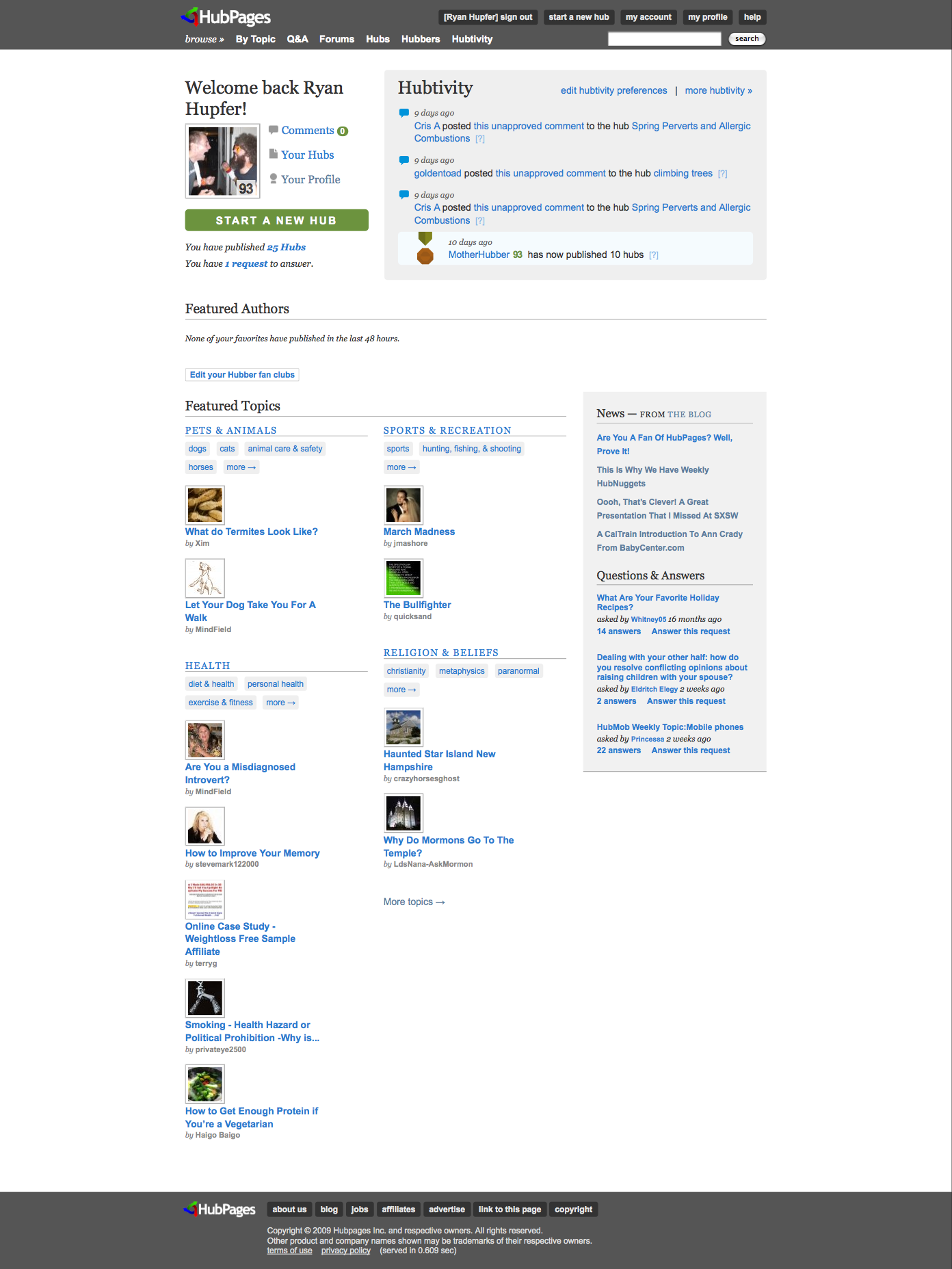
New Profile Page
The new profile page now features a little more on your description and allows you to add some more text about who you are and what all you're into writing about, which is a very important thing to tell your fellow Hubbers. Also, your visitors now have some cool, new ways to move through your Hubs.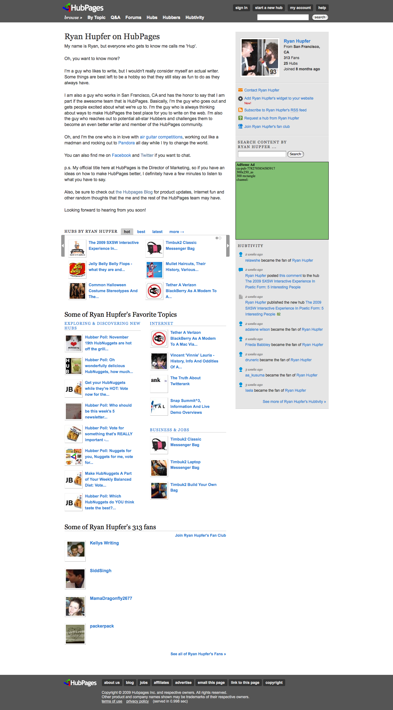
New Search Options
The new search is much, much more feature-rich than it ever was and it now allows you to search all across HubPages or just specifically within certain sections, such as Hubs, Forums, Images and Videos.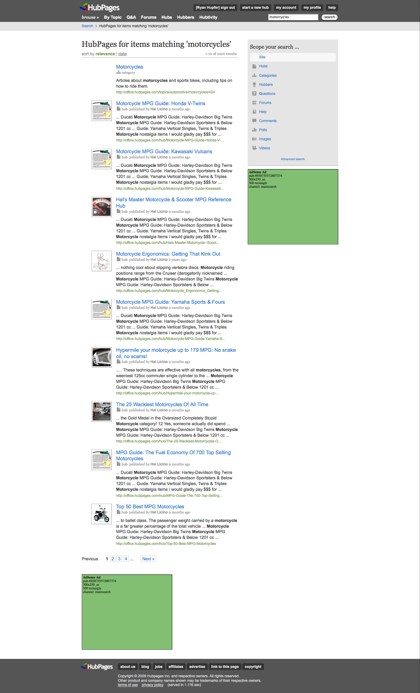
New Category Pages
If you haven't categorized your Hubs yet, now's the time to do it because we're officially rolling out specific pages that showcase the best Hubbers and the best Hubs that are in each category.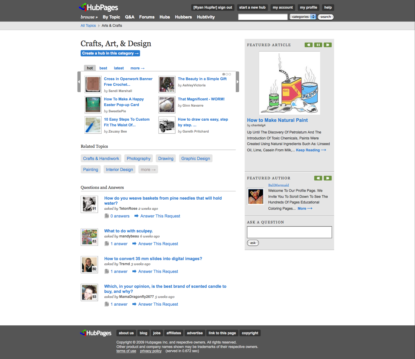
New Forums Design
The forums have gone through a redesign and now display the most active topics throughout all of the forums as well as each of the overall forum sections that you're used to seeing. Also, within each specific forum section there are leader boards that display which Hubbers have been the most active.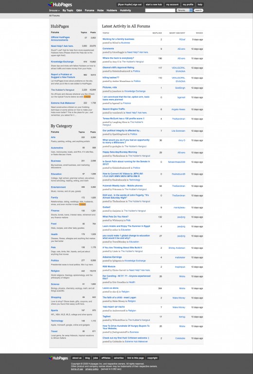
Easy Edit Buttons
One of the new features that has gotten some great feedback is the addition of the quick edit buttons in your My Account screen. These buttons allow you to edit your Hubs without having to view them first. This should be a real time saver for all of you rockstar Hubbers out there (you know who you are).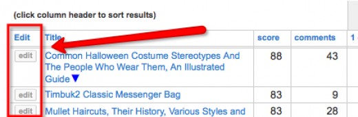
Question and Answer Section (formerly Requests)
The old Requests section is now labeled Q&A for Question and Answer and although it looks differently, it still works the exact same way that it always has.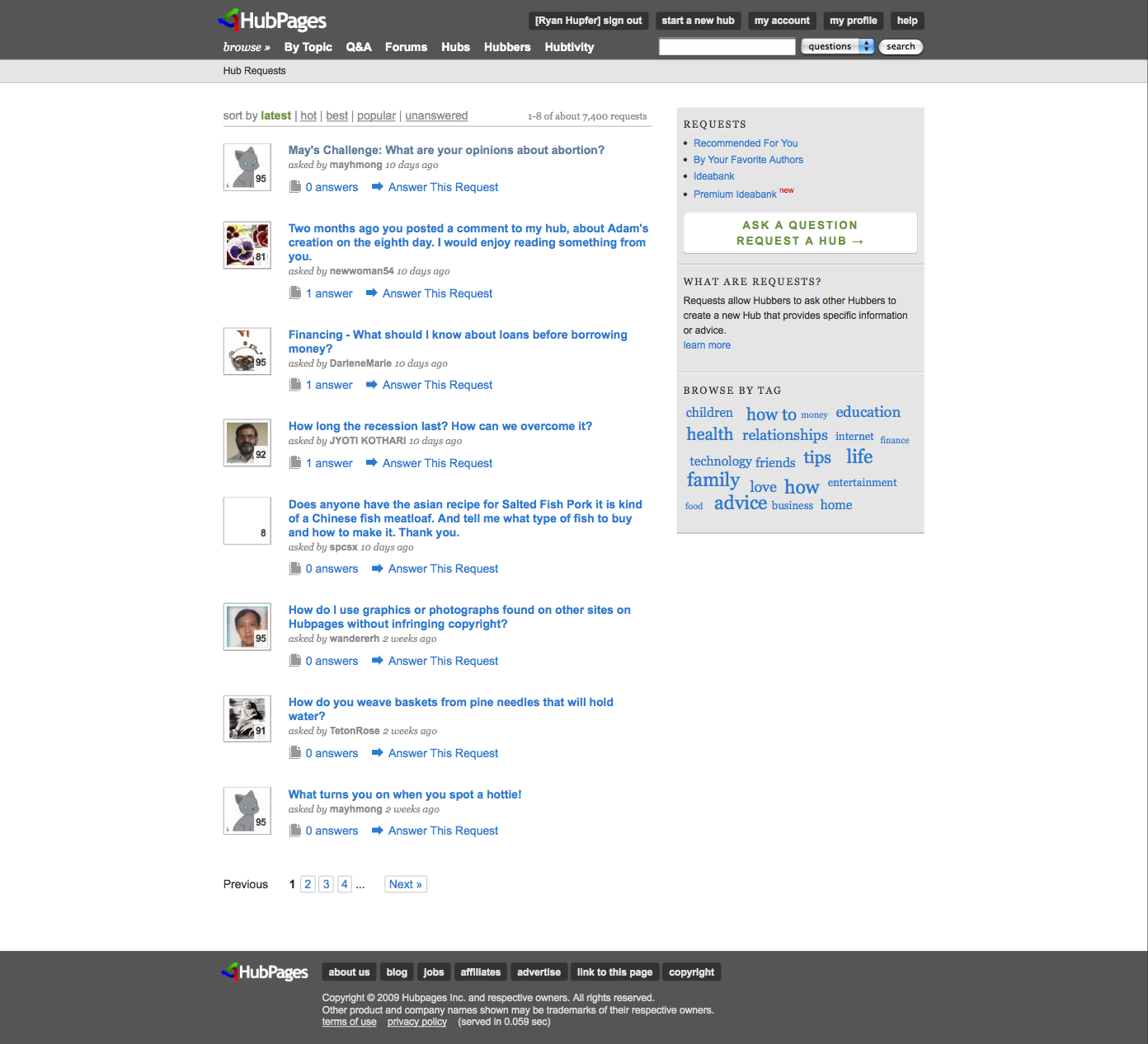
I love how the category page is going to look! but are the other pages going to be that LONG?
 that's lots scrolling
  lol
lolI think they just look long -- I pulled the full page screenshots, so it's a little misleading I think.
Looks interesting. Is this the reason for the problems over the last few days?
Just when I finally figured out how hubpages work. Almost. Well, the catagory change looks interesting, I'm going to check on my catagories right away.
A list of the most active hubbers on the forums. Hmm. That will be interesting - and is sure to some people a fright!
I'm looking forward to seeing the new features. They look great. Well done HP.Interesting, change is always good most active hubbers now that is a bit scary, it should be exciting and I am certain that as it comes up there will be a few hiccups, but nothing none of us cannot overcome.

Now that's the attitude that I like to hear!
I think that the changes won't be so dramatic that you'll feel overwhelmed -- most of them are just design changes, but as you see we did add a few cool, new features while we were at it. Hopefully it will make things easier, not more confusing. But, you all can be the judges of that.
- shinujohn2008posted 17 years ago
 0
0I am waiting to go through the new Hubpages and only thing i hope is that all pages loads faster like before. (New features should not make hub page heavy. Most adsense ads appear only after the page loads completely )
Thanks for adding the Easy Edit Buttons as it is very useful.
The only doubt i have is why the Hubs are not wider
In every page in this Site, there is lot of space wasted on the right hand side. At least a vertical column is wasted near to the scroll bar. If ads are placed in that space it would get more attraction. In the main topics page also space is left blank on right side. If some text is placed in this space , it would have shortened the length of a page. (Example : In Topics page there are two columns , if there are 3 columns then the length of the page will be less, likewise)
Is there any special reason why the pages are not wider or that space is left blank. I always wanted to ask this question.I think it's because long text on a computer screen can be quite difficult to read.
Text on a computer screen is much easier to read when the line doesn't exceed 80 to 100 characters. Plus you can also scan the text easier if you don't have the time to read a hub.That's the reason we settled on 520px about 3 years ago. If you look at most well designed article sites (newspapers, blogs, etc), the width of their main column is almost universally between 500 and 600 pixels. The other issue, is that changing widths now could easily mess up carefully chosen formatting on existing hubs, especially those with elements in the right column and those designed to accommodate our long standing algorithm for placing ads within the content.
This doesn't mean we won't ever widen the content area a bit, but to do it right would be a major undertaking in of itself -- and not something we wanted to attempt this go around (we had enough to do!).Thanks for explaining the real reasons.
Thanks in Advance for the upcoming Redesigned Site and for everything Hub Pages Team has done for its users. HubPages Team have really worked hard Day and Night to make this site look really great with its New Looks and Categories. And i am 101% sure that this is the best Adsense Revenue Sharing Website in the whole internet.
I am looking forward to all the changes. Just hope that hubpages loads fast as usual and doesn't slow down after this make over.
I have put our Hubs into catagories, but am not sure that I have been consistent. Will it be possible to move Hubs between catagories?
Yeah, you will be able to change your categories for your Hubs at any time -- just go to your My Categories Page and you'll be able to edit them.
I'm not sure I like the new look. We will see I guess... :-/
The search feature looks interesting. But, I don't think I'm a fan of the overall look from what I've seen... I do like how the share it buttons are now more visible, but other than that I'm glad to see not much changed with the hub layout. Will is be centered now? Or still left aligned?
"Q&A" makes me think of a FAQ page. That would be my first thought if I had never seen the video.
Oh an love that you guys are finally adding the 'edit' button to the account page. I remember it was requesting a LONG time ago and we were told no, and it was brought up again fairly recently. That'll definitely be appreciated.
Ooo... And I don't like how we had to shorten out profile page description for the current layout just a few months back, and now we can have the longer profiles again with the upcoming layout. Makes me wish I had known because I wouldn't have shortened it, if I'd known we were eventually going to have the extra space for more text.
Sorry for so many complaints... :-/It will be centered.
You didn't *have to* shorten your profile text. But I see your point. You can blame me for this. Sorry! We would have told you that we were going to eventually change it to better accommodate longer text, but we didn't exactly have it all planned out at the time.
I suspect that you will like it (or at least hate it less) once you actually experience it. But feel free to continue giving us feedback, positive or negative. We can take it.You are right in that we didn't HAVE TO shorten it, but in a way it was recommended that we do. I figure that it wasn't fully planned at the time, but it's still frustrating. :-/
I hope that I will like it better once it's released, I get used to it. It just looks like a bloggish style site from the video and screen shots.
Oh and I'm very thrilled that it's going to be centered! That is one thing I do look forward to. The rest, I'm a little leery about.VERY cool that hubs will finally be centered! I've always thought that looked weird ... but just got used to it. The new "Edit" buttons are also great.
Love the aesthetic changes - feel that they will lend a more current feel to Hub Pages. Also, the new features are great - especially like the "edit" button; as it stands, editing hubs is a little cumbersome, so thanks for that! Nice work.
The changes to HubPages look good! Can't wait til they go into affect
Question: Will this new look put an end to the dread techno-farts?
Ummm, I'm not really sure what the 'dread techno-farts' are, but I sure hope that this takes care of 'em.
I hope most of the changes are cosmetic. I'm quite happy with Hubpages ability to rank well in the SERPS, and one concern I have is that the number of hubs linked to from your profile page seems to have dropped quite a bit, and I assume the result is less Page Rank from your profile page gets passed to your hubs. Hopefully that gets offset some by the category pages.
If anything, the opposite is true. It's difficult to tell from the screen shot, but up to 12 of your hottest, 18 of your best, and 12 of your latest hubs will be featured in addition to your hubs by topic (category). Not all of them are visible at once because you have to click to browse through them.
Excellent work! Now,I am looking forward to the overall new look of Hubpages.
I hope the new Hubpages will be as lovable if not more then the current one.
~thranax~Just logged on and saw the new look. I really like it. I think it looks cleaner, more polished/professional, and more "tasteful-looking" than before - just in time for Spring and "out with the heavy-looking, old, stuff".
Wow!!! This is very nice, the only thing I don't care much for is the forums are easily accessed before you sign-up allowing outsiders to spam or comment more. I would recommend tuck the forum in and having them join before they have access to that part of HP, just my opinion. Besides that the lay-out and design is wonderful!!!Great Job!!!
The new design really kicks ass visually.
The profile page seems a bit busy to me; but I think I am just not used to it. Can't teach an old dog too many new tricks in a short time span
Q&A was also a bit misleading to me. I thought it was the hubpages Q&A forum at first.Like I said, it makes me think of a FAQ page. It is misleading to new-comers and those who haven't seen the video.
Posted this in another thread that's opened.
Adding darker side bars on the outside of the pages (that match the top and bottom borders) will help the space A WHOLE LOT!!!!
There is a good inch of spacing in between most things that I've seen. (between the start a new hub arrow and filter your hub box in the account page and between the filter your hub box and the list of hubs are 2 places that look the worst.)
Hubs now look airy.
Forums are also very confusing when you first pull them up.
I do like the profile page though. But again it's very airy and spacey with all the white.
by beta-style, I mean like a new site who hasn't really set a design and theme. It's like a blank slate with all the white, like severely missing something.
Well played on the redesign! If you've used HubPages a lot in the past it takes a little getting used to. But I think it is all a change for the better in the long run.
One more thing that's always bugged me. Can the symbols on the account page to the top instead of the bottom, so that they're more noticeable.
Much impressed with the new look.
I will let you have my complaints when I have had a better look around.
Gorgeous! The design is really well thought-out and professional.
I love the way the display ads in the sidebar fit seamlessly into the page. Do Hubbers share in the revenue for these ads the same as they do with AdSense?If you "Preview" your post, you lose everything you wrote when you click "Go back". I assume "Go back" means go back and modify your forum post...but it's all lost. Am I missing something?
If you want to modify your post, edit the text in the box below the preview. Don't click on "Go back." I can see why that is a bit confusing, though.
Meanwhile, the redesign is beautiful. I love the combo of serif and sanserif fonts...traditional, yet contemporary. Like "retro" can be. I think this type combo adds a lot of class.
It would have been ncie to add a splle checker to the forums. Maybe next tiem.I like the redesign so far -- the only thing that really bothers me is the hub rank number over the photos. Particularly on our profile pages. It's really maddening to me; makes me feel like I have a vision problem. (And no I don't!)
I may be the only person this bothers, though.
Everything else looks like a massively gorgeous improvement.I love the redesign! Everything looks beautiful and seems easy to navigate so far. Great improvement!
It looks great, nice and crisp and clean. I really like how the hubs are centred
What a nice surprise, when I logged in to see such a new look, I like the way it is easier to navigate around the site better, before it seemed that everything was separated now it flows better with all the parts more connected together. Thanks for the new look.
The new design for HubPages is very nice. The clean white background and layout of everything makes the pages look much more professional.
I love the new design, but is there any way to switch back to the old Hubpages?
Hey Johnbo.
I'll answer your question with a question: If you love it, why would you want to?It's going to take some time to get used to it as I'm still searching around for what I used to find easily. However, the design is HIP. Love it! Thanks, Sally's Trove for the heads up on previewing....nothing makes me madder than a hadder....than to lose what I wrote.
) Maybe that's a quirk "they" are working on?? hopeThe new feature is interesting , but looks to work slow to open the pages.
When I search some topic the lens rank is not being displayed, so unable to find the quality of the lens.- shinujohn2008posted 17 years ago0
Hubpages has become more easy to navigate. Browsing through pages have become easy through the slide show like navigation through hubs and topics.
What happened to "author's status"? (Hall of Fame, All Star, Expert, etc.) I don't see it anywhere. Maybe I'm missing something?
Looks like they got retired... I don't see them anywhere too. Not that I am too disappointed about it, I still was a prodigy

Misha, glad your eagle eye is at work here. You may be a Prodigy to you, but you are an Expert to me.
If that's the case, then Help needs to be revised. I'm guessing Help hasn't been revised at all, about any of these improvements, although I haven't done a detailed review.
LOL thank you Sally, it's always a pleasure to receive a compliment
Here's a little search problem. I know Elena's Hub name. It is Elena. With a period. If I enter Elena. (with the period) into the search box, there is no result. If I enter Elena without the period, she's there (with the period after her name, as expected).
When you improved the search features, you did a great job by taking variations into consideration, but what about if you are exact, and the search fails?I don't think this has changed from the old version. I've often found that the search doesn't find Hubbers, even though I know they exist.
My only complaint about the new version is the Q&A (as has been posted elsewhere). It's an even more misleading name than the old "requests". I also assumed it was some kind of forum or FAQ and it took me a few minutes of reading it to realise what it was supposed to be. If I can't work it out, what hope does a newbie have?I also found in the past that a search did not take variations on a search term into account. But that has changed. So now, if I search for "Marisue", I will get "Marisuewrites", once I click "Hubbers" from the "Scope Your Search" option. This is a great improvement, and I think I'll have a greater chance of finding Hubbers when I remember only a portion of their names.
But it seems as though certain characters are now being ignored, characters such as a period. So, if you know the exact name of a Hubber (as in Elena.), you may not find that Hubber on a search. This is a problem.
I agree with you 100 percent about the Q&A, and voiced my suggestions in that forum thread.


