HubTool and Floated Capsule Update
- Christy Kirwanposted 8 years ago
 0
0Check out the latest HubPages blog post for some important announcements. You can expect these changes to be live within the next hour.
Please feel free to let us know if you have any questions.I'm fine with this....have been doing it anyhow for quite awhile. Hasn't seemed to affect anything negatively.
Looks good. I haven't aligned anything to the right in a long time. So I'm good with that except old articles, I'll have to look those over. Don't know if I'll ever try to write an article from my phone though. Too tiny of a work space for me.
I've been fixing mine slowly as I have time. It's only my really old hubs that still have Amazon Products or pictures placed on the right. Anything we want to submit to a niche has to reviewed carefully first anyway.
I'm deciding which hubs I can delete, but keep finding ones that I can fix up, because I know more now. Thanks for the 90 day notice.
Suggestion: it'd be nice to have a way to filter out Hubs where becoming full-width would make some images grainy (the one's that tell you at the top about potentially blurred photos).
I sometimes used text capsules floated right for "sidebar" statistics or backup information that wasn't really part of the main article. I will miss it.
Unfortunately, that use of the right-floated capsules became useless a long time ago, when they decided to make them full-width for mobile users. If they had allowed us to retain the blue background it would've been OK.
I did the same! Those blue or grey shaded capsules (or even an unshaded, floated right capsule) were great for supplementary information which the reader could look at or ignore as they wished. It is another sad loss resulting from these changes.
What happens to the thumb nail feature where clicking on the top picture reveals the other pictures behind it. I have used these in recipe hubs to show the various steps in making the dish. I have also used it once in a while to illustrate a point. For instance, I used it once to show various art works showing smiles. Will this still work or will I need to have a series of pictures all in a row without text between them?
We are not retiring image galleries. They will still work normally. They will just need to be full width.

Thanks. I checked the photo galleries in my hubs and made them full width.
Another issue with the half width capsule--I used them for side-bars. Usually just a few sentences to say something tangential to the main point of the hub.
I experimented by substituting the call-out capsule. I found that the "Classic" format looked best.
I'd like a call-out with the light blue background and left-justified text to use for side-bar type info.The Callout Capsule is definitely a great alternative. We've designed the format to look good on mobile as well, so if we do add additional Callout styles at some point, it will be in collaboration with our designer and focused on a style that looks good on mobile.
It would be great if the callout capsules could have a better choice of backgrounds (the grey is ugly) and have the option of a normal-size font.
The right-floated text capsule was useful to highlight a particular fact - we can use the callout capsule for that, but if it's more than a sentence, the font is too large. Having the option of a callout capsule with the blue background and normal-size font would be a good option.
My feed is full every day of "I'd like feedback . . . " This was a horrible idea for new hubbers and is attracting poor quality writers in droves. Please reconsider this option for the overall benefit of the writers who have worked long and hard to be here and those who enjoy reading quality articles.
I get why this is being done... however, as someone that writes about computer hardware it's a bit unfortunate. While 60% of HP readers may be mobile, most of my readers are likely reading from their PC.
Ugh! This is horrible news at least how it relates to Amazon capsules. I have had a great deal of success floating them right and wrapping text capsules around them. They are more attractive this way and less intrusive for the reader. Centering them forces the reader to trip over them to read more of the article.
If we are going to be forced to center them can we at least have bigger, better Amazon images that are actually centered instead of those tiny little floated left thumbnails?We recommend using in-text Amazon links rather than capsules; they tend to perform better. Don't forget that the majority of readers are on mobile devices as well, where your capsules are all already full width.
Do you have any data that could you could show us on that? In my experience that does not seem to be the case. Especially when it comes to highly visual products the image is very important.
This HubPages blog post from 2015 went a little deeper into the numbers when our mobile traffic was only 60% of total traffic. Today our total traffic is about 2/3 mobile (users on smartphones and tablets).
I mean data on text links converting better than image links. :-) From what I see on my own accounts, especially my big niche account, image ads definitely get more click throughs. I think it probably depends on the product though.
Our data does show that they tend to perform better. I'm not sure if we're willing to talk numbers yet, but I'll check with the team.
Understood. But if I'm doing something that's really working well right now you can understand why I wouldn't want to change that without data right?
When the Big Orange Buy Now button appeared a few years ago, click throughs soared. That visual alone was enough to make a difference. When it vanished due to a glitch a few months ago clicks dropped. So it appears the image and what's in the image is very important.
Also: The Amazon images look great on mobile. They are large and centered and attractive. If it's going to look like that on desktop I would be thrilled.
Yes, full width Amazon Capsules already have larger images on desktop than right-floated ones.
I would prefer to use Amazon Capsules as I feel that this type of advertising is more honest. Capsules are more often than removed by staff and replaced with links. Why do we have this facility available to us if staff don't want us to use them? It would be so nice if HubPages could provide some stats for which type of ads are working best. Formerly with E-Bay products, we were able to see which ads were working as we were provided with the stats for which hub achieved a sale. With Amazon, people buy unrelated products and there is still no way of knowing which hubs resulted in a sale. Occasionally a product is purchased which is required for one of my tutorials but I think readers would buy more if there were images provided rather than links. Just my opinion!
Amazon does not provide us with the specifics about which article a purchase came from, etc, which is why we are not able to provide that information to authors.
While editors do prefer in-text links, and they tend to work better, we do sometimes leave very well-placed, necessary Amazon capsules that include a lot of the author's personal experience with the product.Thanks, Christy. Unfortunately, my experience thus far has been that even personal experience of a product results in my capsules being changed to links by staff. The other problem I encounter is that many of the products which I use can only be purchased from e-Bay and not Amazon. I would love to be able to include products from e-Bay but if I add a link to something which does not earn me anything it seems pretty pointless (or is it pointless?) Is there any advantage for me to link to a product which can be bought directly from a company website other than Amazon or E-Bay? For instance, I have been wanting to do a review on something which I own and love but it cannot be bought from Amazon, only direct from the manufacturer or his website. Does one earn from direct links to a product other than those which can be bought from Amazon?
Amazon is the only program you can earn from on HubPages for sales, currently.
If an article includes more than one product, those will almost always be converted to links in order to prevent the page from looking cluttered and spammy, but in situations where your article only contained one product and it was necessary and helpful with your personal recommendation, you can always email the editors and request they they reconsider allowing it to stay in a product capsule.OK, thanks for the explanation Christy. Is the limit still 2 products as currently, I am writing something which I think would benefit from having 3 links to products because they are necessary for anyone to tackle one of my tutorials? They are not only necessary but the benefits of using them are explained.
There is no limit to the number of products you may include as long as they are absolutely necessary to the tutorial, products you talk about using yourself, and items your readers are unlikely to already own. (If your readers are looking up a craft project tutorial, they are likely to already own a pair of scissors, but if they need a special pair of scissors to create a wavy border, for example, it would be appropriate to link to that product and mention why you recommend that particular one as well.)
We do, however, recommend using in-text links any time you include more than one product in an article.Christy got it! Thank you so much. Appreciate your help.
My pleasure! And please do feel free to talk to your editor/s about specific articles that have been edited or snipped. They may be willing to reconsider in some situations, and even if not, they will always be happy to explain why a particular change was made.
Thanks, Christy! How do we get in touch with our editor(s)?
I agree sallybea! I've had a hub on delishably for a long time with a side amazon capsule. I just moved it to the middle per there new design and it was just removed. However, I didn't see anywhere where they inserted a link instead. I even had personal experience to back up my Amazon capsule as well. What is more frustrating is that I make money off that capsule, so now I have to go in and try and find a good way to insert a link for it instead. I don't understand why it matters if we use capsules or links, but I vastly prefer the capsules and agree with you that they seem more honest. I also find them less spammy than a link.
Just a suggestion to others. If your images are too small you can easily create a transparent backround of 1000px width and place the image in the centre of this background using paint.net. I've done this on a few hubs and they look great.
@Eric, in my case text links tend to work better in general for not too expensive products that people need in order to complete something they are reading up on. But I had way more success with the capsules for the high end products where I review products. Not sold a single one since I switched to text based links on a particular hub.That makes sense. Big, pretty products require big, pretty images.
If you're going to recommend a roll of industrial strength tape for doing a project a text link is probably good enoughAlthough I don't sell any high-end stuff on my own sites, I mostly use images for Amazon products and this seems to sell quite a few products. I've had almost no luck with text links for Amazon products. Of course, maybe those products that I sell would sell either way. Not that I care here on HP because product reviews and that kind of thing is never really what I write here for the most part, I'm fine with getting traffic to informational articles. But I'm just making an observation as far as my own sites go.
GREAT IDEA, Lobo. Why didn't I think of that?
 That would let me "enlarge" floated images that become too grainy when full-width. Here's an Atta-Boy!
Nice. I am not too worried about full images. Can I just let the system fix it or is it best I go in and manually do it?
I was wondering when this was going to happen. I've been preparing for it with my new hubs and edited hubs over the past year. Glad it's official now as I see mobile usage picking up rapidly.
It's ok with me, I'm in the process of updating hubs anyway. Lots of work to do and not nearly enough time during sheep inspection season.
There's a problem with editing a photo capsule in the HubTool, at least on my system. I'm using Safari on an iPad. When I try to edit the caption of the photo, the cursor appears at the start of the text box and can't be placed anywhere else. New text can be typed where the cursor is and then deleted by backspacing, but any text that's already in the caption box can't be selected, edited, or deleted.
The Name of Source and Source boxes work better when I try to edit them, but they have problems compared to the way in which they used to work, too. The cursor appears at the end of the text in the box and can't be placed anywhere else. The only way to edit the text is by backspacing until I reach the error and then retyping.- Will Apseposted 8 years ago0
Floated right capsules have been redundant for years. I occasionally get an old fashioned webpage on my phone with text and images all over the place. I don't stay long.
As to the Amazon issue, I am still trying to persuade myself to update pages with Amazon ads but I have no confidence in editors to understand the issues and that freezes my hand.I rarely use Amazon capsules, even if I think the product relates to the hub and I endorse it, the administration doesn't agree. I never made a payout from Amazon. Books are mostly the only thing that relate to my biggest niche, though I am adding capsules or at least one in niche sites.
This is sad

One of the things I always loved about HubPages was the ability to make our Hubs look visually attractive, and the floated capsules were a big part of that. I know most people are now looking at our Hubs on a mobile, BUT a percentage are still using desktop or tablet, and I'd have liked those people to have the advantage of an attractive layout. And it's SO simple to set up the floated capsules so they look good both ways. But I have been expecting this.Progress marches on, right Marisa? I also thought the freedom of using floating capsules made the articles more professional looking.
I absolutely agree about the appearance of hubs on the larger screen. Except for me it is much more than sad. Hubs, when using the floated capsules correctly, have been among the most attractive and readable articles on the Internet when viewed on desktops and laptops. On mobiles, that attractive layout is destroyed.
And even if future articles are composed with the full-width format in mind, there are all the existing hubs to attend to. For those of us who have always used the split screen with many many photos or additional text capsules to the right, the work involved in reorganising so many hubs to even make sequencing coherent, let alone attractive, is colossal.
The implications for me are more than I want to think about at the moment. I need to gather my thoughts about this, but for me this is the worst news to come out of HubPages since I joined six years ago. It will spoil the appearance of so many articles.Don't forget that 60%+ (and climbing) of your readers are on mobile devices and therefore already seeing a single column layout.
And unfortunately, while some very skilled writers (like many of you commenting in this thread) have used floated capsules attractively in ways that enhance the look of your content, many, many times more writers on the site use them poorly in ways that leave large blocks of blank space, make the content look cluttered and spammy, etc. These changes will save our editors a lot of time spent fixing those mistakes.Switching to a single column layout might seem like its a good choice to fit mobile readers, which it will, and I do think that a lot of the uproar is users picked Hubpages over other writing sites or there own sites because of the creative stylistic choices it offered in a quick and easy to understand package. While I agree that the wrong elements put together can result in spammy elements, you yourself say a major issue is "Leaving large blocks of blank space" which a single column now does with many of Hubpages capsules.
This could be a great switch and help Hubpages a lot, but in order for that to happen the current tools have to be edited. Even simple options to give more freedoms to make current Hubs look good could in turn both excite and motivate us Hubbers instead of aggravate the ones who are used to using your platform in a particular way.
Some ideas most people would like are:
-Being able to use an Image comment on the Left or Right of it instead of just Bottom. This could replace the loss of the first paragraph while appealing to Mobile users.
-Making a single "Duo" capsule that allows similar functions to the float right, but only on capsules that have large amounts of white space, like poll.
-Allow the format for Polls and other content to be centered OR reformat them to fit a wide column.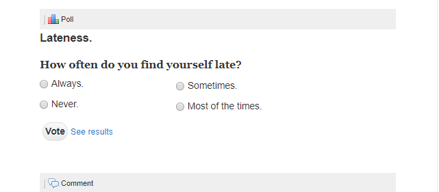
Add the ability to have multi-column polls like the "table" capsule.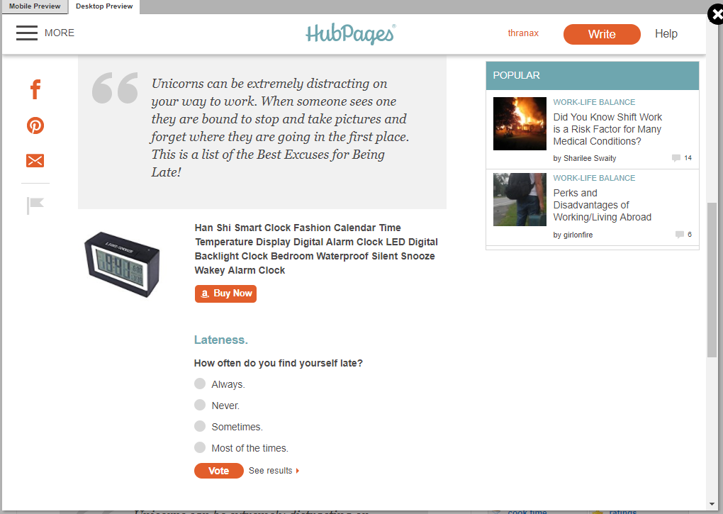
Allow the centering with an option of smaller less space required capsules like poll or "ratings"
Sure, centering stuff doesn't fix everything but having the option to would help greatly.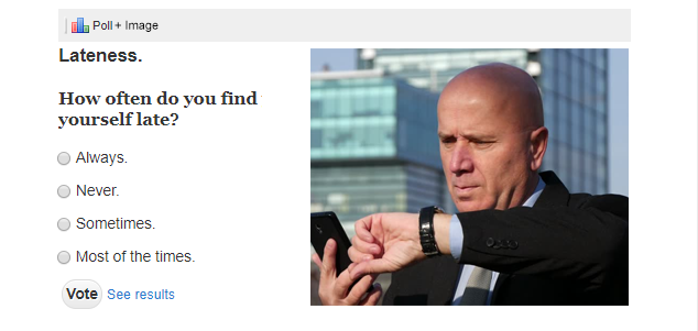
Example of a Poll Duo cell. This would work AMAZINGLY with callouts as well.I do wonder Christy how that 60%+ figure is arrived at. Is it known what proportion read hubs in this way? Or is this merely the proportion who access the Internet using mobiles? Of course many will use a smartphone for texting, emails, social media etc, but do a majority really use a smartphone to carefully read through articles which may be several thousand words long?
But in any case, it's not really relevant what the proportion is. Those who wish to use a smartphone have been able to and would continue to be able to without this change of policy. The mobile format is not radically changing as a result of this. What is changing is the desktop format, and that is getting so much worse. Even if it is only 40% who use it, why make the experience so much worse for them?
As far as the second point is concerned, why is it necessary to penalise those 'skilled writers (who) have used floated capsules attractively in ways that enhance the look of their content'? The editors do not have to waste time fixing poorly floated capsules. Just unfeature them and make clear the reason. Then it is the author of the article who has to waste time fixing them. If that was really part of the reason for this new policy, then the baby is being thrown out with the bathwater. In order to get rid of poorly presented hubs, well crafted hubs are also going to be ruined by such a radical change.I will say the truth because the team at Hubpages can't - its because less then 1% of Hubpages user base is generating a profit and putting time and effort into the Hubs they create. The reason why there is a Hubbot and Editors is because the site is based on making money by having webspace - its why we are free to write what we want.
I remember back during the days that Hubpages was flooded by bad and low quality content from India. Non-sense translated English and worse of all...Indian Aunts! Oh my god there must have been thousands of Hubs just about India Aunts! The horror was unreal.
The way they are phrasing it is because they have to be considerate of all new people to Hubpages. Lots of time the editors might work on real hard work devoted Hubs from people who just simply don't know better. There are a lot of great writers who aren't great marketers. On that note, there are a lot of people who aren't good at creating Hubs, but they do anyway, and instead of just removing them all they use them as a base to edit and create something that has monetary potential.
Just look at the people replying to this post as an example. While I might not be a "power user" anymore like I used to be back in 2008-2010, I still am here and a part of this change. Everyone else who posted in here are high performers who ether have:
1. Monetary Success.
2. Creative Writing Success.
3. Marketing Success (high traffic levels).
The majority of writers on Hubpages don't care about this change because they aren't seeing any of those things and that is why Hubpages themselves pay humans to transform these low quality but well written hubs into something successful for both the user and the company. Without making these pages profitable there is no motivation for the user to write more articles fuel the business.
They also can't leave the option for "power users" and top performers because then it would be unfair. Its hard to keep a community healthy and happy and the stupidest little advantages over someone else is enough to make anyone who doesn't have them to quit. It must be equal for everyone, the 10 year old power users and the brand new account started today.
They also don't see this as a penalty like we do. This is something that hasn't been changed or modified in 10 years total. If they thought it wouldn't help then they wouldn't implement it. Don't get me wrong, I hate the choice that they made, but as a former power user and the other Hubbers in this community I know (such as Marisa) will still be able to make high quality, content packed, and feature loaded pages that will be successful on all platforms.
It might feel a bit weird, but in this case, everyone who posted so far in this thread isn't in the 99%...we are the 1%.Thank you for that explanation thran. If what you are saying is correct, then the suggestion is that the real purpose of this change is nothing much to do with the increasing use of smartphones, but rather to do with writers who fail to use the floated capsule options in an attractive way.
But it really isn't difficult to use those floated capsules - if it was, then I wouldn't be writing here! I'm sure you agree that all it takes is time, and I've given a lot of that to the organisation of my hubs. Hundreds of hours. It is distressing that all that seems now to have been wasted, and I do feel there must be some other, less ruthless way around this issue, other than to administer what seems like a huge slap in the face. Would it not be possible for Hubpages to begin the new policy with new articles, and just draw a line under the already published hubs, leaving them in the old format - featured or unfeatured according to their quality?
On a lighter note, I smiled at your reference to those 'Indian aunts'. Though I haven't personally seen any Indian aunt hubs, I do know what you mean. Having said that, I had to do some Google Analytics research for my last but one article and found out that - next to Google.com and Google.UK - Google.India was the biggest regional market for my hubs. I hope not to lose them!
Greensleeves Hubs, yes, we do have specific data on what devices readers of HubPages and Network Site articles are accessing us on. Most are on mobile devices.
I know I am coming to this thread very late but the latest reference to the floating capsules removal drew my attention to this now. (During the summer, this announcement missed my attention.)
Christy, you say here that this change is being done because of some unskilled writers who don't know how to use the capsules properly.
This seems unfair to those of us who use them very well. This change is going to ruin many of my high-performing hubs that I spent hours and hours designing to make them perfectly balanced. I have several hubs on the top pages of Google and I think these changes will affect my traffic and revenue.
I don't have time to go and change all of the articles I need to change and I am very unhappy about this shift. I really wish the programmers could have come up with a different solution. I believe my traffic will go down and if it is true for me, I can't be the only one. I guess you guys have already decided this but was there really no other way?
I agree completely, Marisa. I spent a lot of time formatting the hubs so they would look the most attractive and balanced. This decision feels like a step backwards.
Whilst many things the staff have done in the past have been steps forward, this is the biggest step backwards they have ever taken - it does not improve the quality of writing, but it damages the creativity of the writers.
Just to put my mind at ease... it's okay to edit niche site articles without having to re-submit them, right? Sorry, too lazy to look for the answer myself.
Yes, we encourage you to update your articles, including the ones on HubPages Network Sites. Your article might be quickly looked over again by an editor, but basically, unless you are adding spam, your article isn't at risk of being taken down.
When making a text capsule full-width, you lose the capability of setting background shading. I substituted a colorized call-out instead, but a callout has its own format look which sometimes looks weird (center indenting, for example). Be nice if text capsules at full width retained background color capability.
I believe you can create this with picmonkey.com...a free graphics program. Give it a try.
I'm fine with this since I've been using full-width capsules in 90 percent of my articles, and mobile growth will only continue so this makes sense.
I like the new Hubtool layout as well, it makes mobile editing a lot more seamless.- Will Apseposted 8 years ago0
It depends what matters to you. If you just want to read a page, a straight up and down layout is best.
Rubbish.
The whole point of the right-floated capsules was that it enabled you to read 'a straight up and down layout", NOT one that's interrupted by full-width adverts and pictures.That's right. An article reads far easier if the reader has the opportunity to bypass or quickly scan photos, maps etc to the right of the main text rather than having to scroll down to the next section of text (and then maybe scroll back to the picture if the text refers to it.)
I agree too 100% Marissa. I often used the right-floated capsules for photo's in portrait which otherwise would show way too big if displayed in full width.
I liked the ability to read about a topic and see, right next to the text, an illustration of what the text is saying rather than flipping up and down the article. I use many old images and they will not translate well to full page. Also, some of the pictures become HUGE when full page, so huge that you can't even see the full image without scrolling.
If you'd rather have images that look smaller, we recommend putting several images into a collage for your article.
But that doesn't address the rest of Dolores' point - the ability to see a photo next to the relevant text, rather than having to scroll down and maybe back up again. Those and other display options were what made Hubpages's articles stand out from the rest. They made the difference between a very ordinary looking page and a really well presented hub. Now that's being lost.
I remember Squidoo pages that had been really worked up with scripts, and whatever. They looked like intricate clockwork mechanisms. Wonderful...
But try to read one and you were essentially braving an obstacle course.
Okay, if you like a textbook kind of approach, but never necessary and now obsolete.
Learning to use some kind of image editor (like Photoshop or GIMP) will really add to an article. That gives you worthwhile options of helpful and original graphics.Will, there is nothing obsolete about good presentation - but the presentation on a smartphone full width format where all you can do is endlessly scroll down, certainly is not good. AlI I can suggest is that you look at one of my hubs which has 20 plus photos (perhaps one of the travel pages?) and view it on a desktop format with floated capsules, and then on a smartphone and see what you think. There is absolutely no way it looks better on the smartphone format, which will now be the only layout available to us.
Having text next to photos and supplementary information in side capsules is not an obstacle course - it's a coherent sensible layout which is far more readable. There is no doubt about that. HubPages will be the poorer for this change, at least for anyone who views articles on a desktop or laptop.I'd prefer if they left current articles as are, but prevent half-width photos from here on out. That way, the Hubs designed to use them would be kept in their ideal format, but future articles would maintain a uniform organization.
That would certainly go a long way to easing the stress that this is going to cause Jeremy. I've got 160 published articles and nearly all of them have numerous right floated photo capsules, including vertical/portrait images (which expand to a huge size when made full width), as well as other half width capsules such as links, tables, supplementary text etc. It just isn't going to be possible for me to make them even a fraction as well laid out as they currently are. Frankly they are going to be ruined by this process.
There are other hubbers with many hundreds, or even thousands, of articles. I can't imagine how long it's going to take them to re-format their work.
I don't like the policy, full stop, but at least if they left already published hubs alone and introduced the new policy just for new hubs, that would be a sensible compromise which would enable us to move on from this without worrying about all the thousands of hours of work we've done in the past.Existing articles are already being switched to full-width for the majority of readers, I'm afraid - because mobile devices show everything at full width already. Only those using desktop or laptops are seeing the old layout. Although those people are in the minority, I still like to know they are seeing a nice layout, which is why I'm sad this change has occurred.
However, HubPages could avoid a huge amount of work if they set the mobile layout to expand half-width capsules BELOW the related text instead of above it. Right now, if you have a right-floated product or photo, it expands full-width above, which obviously makes no sense to the reader.Agreed, I've noticed half-width capsules appear above when made full-width, and it seems an odd decision. Usually the item to the right relates to its left-aligned counterpart; better to put the main topic first followed by the supplemental information rather than the other way around.
Yes, it's so breathtakingly obvious, I was very surprised they didn't think of it.
Frankly, I think the mobile layout was the quick-and-dirty solution. Look at the way you create a right-floated capsule: you put a capsule ABOVE the one you want it to relate to, and then click the green arrow. So the mobile layout is created by simply undoing the effect of the green arrow. It would have taken some programming effort to then move it BELOW the paragraph, and they didn't want to devote the time - or maybe there was some major obstacle that prevented them doing it.
Will, as I said earlier, the whole point of the right-floated capsules was that they AVOIDED an obstacle course. The main text could be read easily without a break, while supplementary information and photos were tucked neatly out of the way on the right.
Even if you do have a program for adjusting image sizes (and I do happen to have one), a collage of images still does nothing to "add to an article". A smaller image, located close to the subject matter for which it pertains to in the article provides appropriately "timed" visual emphasis, as well as being far less distracting for readers. When I consider all the times I've been prompted/encouraged to add photos to make an article "stand out", I'm rather dubious how putting up some huge, passage-separating image makes for a professionally presented article. Google-condescending, yes; reader-friendly, uh....?
Will - do you mean using Photo shop to shrink images?
Also, should image appear above or below relevant text?
This will all keep me quite busy. I will adapt.I'm fine with the full width capsules. I've been slowly updating my articles and making them full width. I'm glad I've only written a few hubs though and not hundreds! Although I used a desktop computer, I understand that a lot of people are using mobiles now to read hubs.
If you're fine with full width capsules than you should take a closer look at your own hubs and see what full width does to several of your photos. Mind you, I'm not criticizing you, just trying to explain how it works when photos that were fine in the right floating capsule are changed to full width. They get pixalated in full width. I scrolled through 3 hubs and there were pixalated photos in all three.
- Will Apseposted 8 years ago0
My general feeling is that the fewer options hubbers have, the less chance they have to mess up, lol.
Besides, the discipline of writing in a straight forward way is not that arduous. Samuel Beckett wrote many of his later works in French to escape the tyranny of styles and associations imposed by his native English. Constraint focused his mind.
Samuel Becket never floated text right.Now you're just being obtuse. Samuel Becket was never required to put images in his text.
If he had been, I bet he would have wanted right-floated images, so they would not interfere with his prose.
Are you suggesting we should delete all images and ads and just write text?I was asking you to pick out a general principle from a specific example.
The specific example being someone who did not have the opportunity to use images in his text. The relevance?
Generalization is one of the most notable characteristics of human thought. It is also the holy grail of machine learning, far more difficult to acheive than mere classification. For you, it is obviously an irritation.
Nothing to be done about that.
But I can say, the fact that a writer who was extraordinary in his capacity to use English (try some of his earlier works) should abandon that language in the pursuit of meaning and clarity, is worth giving some thought to.
I'm sure you're right about Beckett. I wish we could ask him! Frankly Marisa, the only way hubs can look as good with the mobile format is if we do just that - write text only articles, or perhaps use letterbox shaped photos. As soon as we start introducing square or vertical/portrait style photos (enormously large when used full-width) or any other kind of capsules, the mobile format without right floated capsules becomes ugly and less easy to read.
Check out how successful sites use images, learn a few skills with an image editor (there are plenty of tutorials online) and you will have solved your problem. Hanging on to a format that was fewer and fewer users every year is not a strategy.
Will, you are trying to suggest a solution to one particular aspect (large photos) as if that solves the whole problem with layout. I do have limited ability to edit images as in the example below from a hub called 'The Elephant Parade', which gave me a full width image. In that particular instance it worked better that way, particularly as the two images were of the same model elephant. However in many other instances it just does not work so well.

But in any case, photo editing still will not allow one to put text next to photos, or supplementary text in a side panel, or do any of the other things previously mentioned to improve the layout. In other words, our creative flexibility to make best use of the design area is being drastically reduced.
What's more I have 160 hubs. Many of those have 20, 30 or more images (for which thumb nails would not be appropriate). Many of those hubs will also have polls, references, subsidiary text etc which look best in a side capsule. Can you imagine the huge amount of work involved in trying to reorganise these in such a way that the sequencing of main text capsules and everything else remains coherent? In fact with many of my articles it simply could not be done without deleting some capsules, thus making the hub less complete. And then text would also have to be adjusted both to take account of the deleted capsules and to make it relevant to the new sequencing of the remaining capsules. Other hub members of course have many more hubs than me - a thousand or more.
You say 'hanging on to a format that has fewer and fewer users every year is not a strategy'. No one is suggesting that hub format should not be adapted for smartphones, which have no substantial width. HubPages for some time has accommodated that, with both formats coexisting. But is it really so impractical to continue to give desktop users (still a very substantial number, and very likely to remain so) the benefit of enjoying a much better layout? Or even if this new policy is employed for future hubs, at least to save hubbers the enormous task of rearranging all their old work?
Sigh, Hubpages has changed so much in 9 years. The last thing I thought i'd ever lose is the float right option for capsules. I can already see putting rating and quiz capsules in the middle of text so everyone has to stop reading and deal with the capsule. I was always a fan of the floating an image to right at the start of an article.
I will miss it so.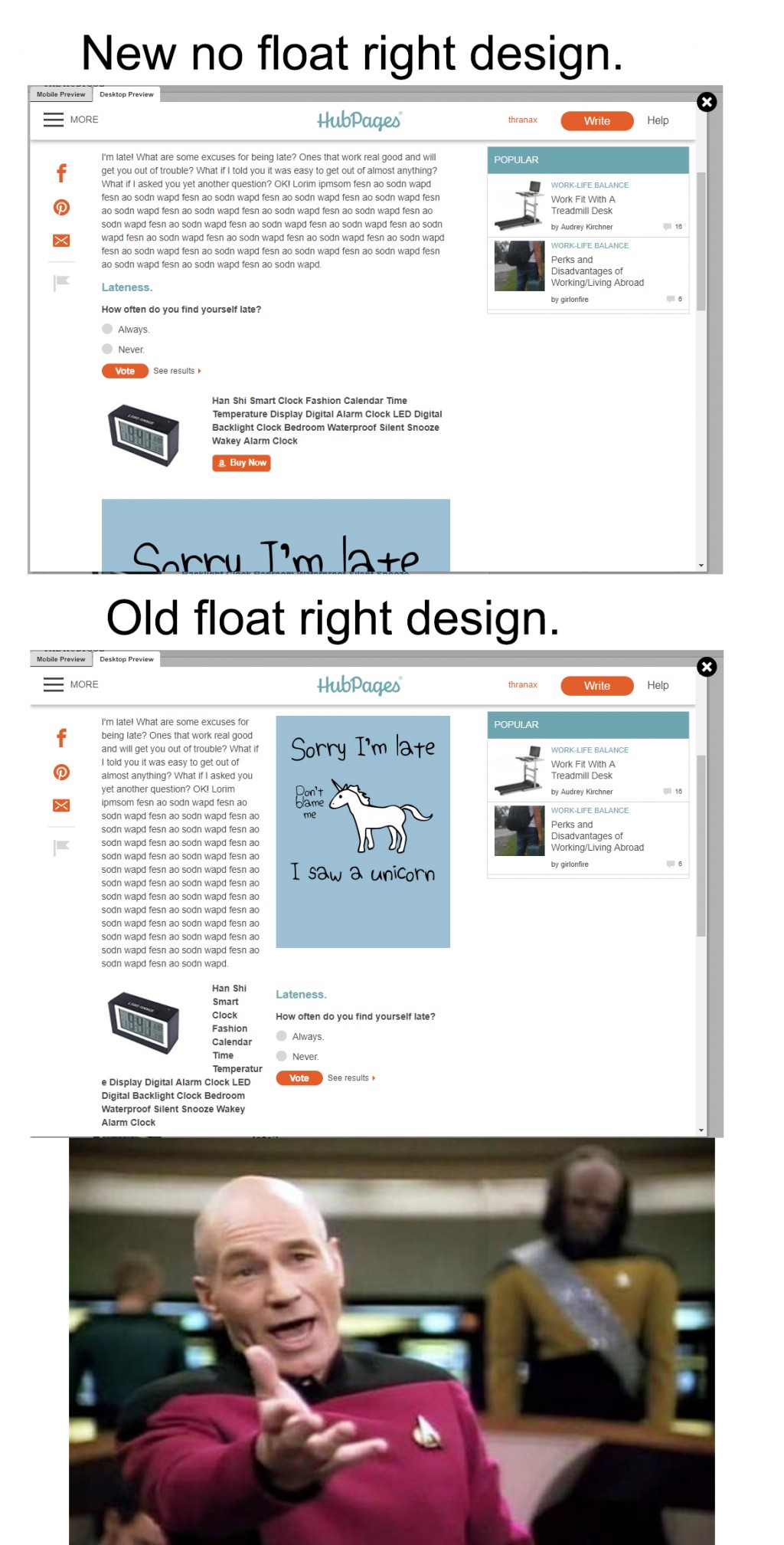
The perfect example of stuff all over the place, lol. Thanks for that.
Writers should avoid aesthetic decisions.How can you not see that in the single width example the whitespace around the poll and amazon capsule look horrible, and the ability to float the poll next to the amazon capsule and the image on the right allow the page to look ordered and have all the elements viable in the first frame without scrolling? While I can't say i personally like the poll on the right of the amazon capsule and wish that the poll could be on the left and the amazon ad on the right, it still gives a better picture of the effort and work put into a piece in the first frame. Most visitors wouldn't stay long enough to scroll in the first place - especially if the entire frame is nothing but your profile picture and text. I know the site is based on the "article" but just like in magazines, no one starts reading an article without captivating imaginary to attract the reader.
You are of course right - and that should be obvious to anyone. In the half-width floated capsule example you put up, more can be seen without scrolling, and it looks more coherently ordered.
Also, the 'Sorry I'm Late' picture capsule is scarcely visible in the other, full width version - judging by the size of it, one would have to scroll through a whole screen just of that image, in order to get to the next section of text.
Will Apse says in his previous comment ' writers should avoid aesthetic decisions'. But it's not really about 'aesthetics' or 'prettiness'. It's about clarity and ease of use. HubPages has no monopoly on good writers. So the only thing that clearly and distinctively sets a site like HubPages apart from another site is the quality of presentation. On desktop layouts that quality is now being lost.
I disagree about the white space looking horrible, to me it looks a lot less cluttered and gives the reader room to breathe when going through it.
Short 2-3 sentence paragraphs followed by breaks makes it easier for the reader to process the information but if you're bombarded by images, polls, Amazon capsules, and the text at once then it can be a huge distraction.
I do agree about having the expanded capsule be below the text though.Thats understandable, but the way it is currently set up is painful to anyone who has any kind of design background at all. The shape the white space creates is just bad and there is no fix to using a poll the way it is currently set up. Its why I chose the poll for the example, if it could be centered on the full screen it would at least be able to be worked in with an image for example, but the way it stands its almost impossible to use a poll in a single column and have any kind of balance.
In typographic sense, its the "ragged edge" on the right of the entire document that makes me uneasy and makes it appear sloppy. The two columns hold the edge so much nicer.
Simplified : The Poll Capsule is aligned Left in a single column layoutWhen you talk about being 'bombarded by images, polls, Amazon capsules and the text at once', you are not comparing like with like. Of course how many images etc one should ideally have in a hub is certainly a question which can be posed, (though we've always been encouraged by HubPages to have lots of those in the past!) But in the example given we're assuming the same number of images, polls etc in mobile format as in the floated capsule desktop format.
If you imagine a page with lots of such capsules, do you really think it is more of a distraction to have these pushed over to the right side of the screen where they can be ignored if the reader wishes? Surely you must concede it is much more of a distraction after reading just a few sentences of text, to then have to scroll down through a photo, and maybe a map, or a poll, or a table, to get to the next body of text? In that full width format, these subsidiary features cannot be ignored. The reader just has to put up with them and wade through them (if they can be bothered).
I'm fascinated by the notion that ALL PICS MUST NOW BE 1000px wide!
IMO you just don't need images that big and they can work against you if you want traffic.
I predict the repercussions will be:
1) Those that don't know how to edit photos will put up high resolution images at any old width - and will slow down their hubs as a result (as well as eat up space on the HubPages drives - although assuming these are cloud based I assume they have lots of space to share)
2) Anybody who is referencing anything they have themselves created will be very unhappy - and that's because the bigger the image the more likely it it to be stolen
3) those reading hubs will get bored scrolling past loads of huge images
4) those with slow internet will especially NOT love huge images which take forever to download of not sized to 72dpi - leading to a drop in traffic from readers with internet issues (and do not underestimate how many that is!)
5) Nobody is going to bother to change images for hubs that aren't getting much traffic - which probably doesn't matter
I don;t think HubPages has quite reconciled the format required for mobile devices (which certainly don't need 1000px images) with those needed for a desktop reading experience
A bit more pondering on the suggested implications might be in order.....
Reviewing major news sites would indicate a few things or two on how to make the desktop/mobile experience a good one. BBC News certainly don't use 1000 pix images on their desktop site.
(PS I love my Weebly sites which I set up in two columns - which are a fast read on desktop and are also ordered and formatted so they work well on mobile devices - which shows them as one column as HubPages does with all hubs.)1. The average download and upload speed in the US is 15.8 mbs a sec. The US is number 22 in the world for internet speeds. The majority of people will not have an issue downloading these. Also, its 2017 and almost every smartphone, tablet, TV, and soon desktop+laptops will have a higher then 1920x1080 screen in which they view these images on.
2. As a graphic design student one of the things we learn right away is as soon as an image is posted online without a significant watermark it should be treated in a way it is made to be copied by millions of people. While you do hold copyrights, unless your personally rich or the person who is using your image is rich then a lawsuit would be impractical - and the ability to find your image again even using Googles exact search by image can be rather slim. The difference between an image asset and just an image is the desire to sell it under license or defend it with legal authority (which even can still be out of reach for example if someone in Finland is using it just like how "The Pirate Bay" has been legal for over 10 years directly sharing copyrighted movies, music etc.)
3.This is untrue as well. Your still under the mindset that the average internet reader "reads" your articles. Only a handful of people ever read an article in its entirety. Most users will look at images, maybe read the title and a sub title to see if anything there is relevant to them, maybe a sentence if your really lucky, then they will click an ad, a link, or the back button. Using higher quality, large images, are the "bait" to your words - as anyone who fishes knows, bad bait results in no catches.
4. Hubpages and images are static non-changing web elements. Any internet that isn't dial-up including mobile 3G will load static pages with images just fine. Nowadays, mobile carriers are so fast I can load full movies over my AT&T 4G internet in the woods at a lake in Maine. If your debate was auto-playing videos, loading animated GIF files, or using unoptimized scripts (other then advertisements) then yes, slow internet would be a problem here.
5. The people who don't change their images aren't receiving traffic or signs of success in the first place.
Also, just to say, bbc.com does in fact use an image that is 976 x 549 pixels.(The starting image can be many times bigger then 1000 x 500, but thats the bare minimum.) When resizing your browser on desktop the image is responsive (just like how hubpages codes their images.) The image uses a script to resize itself for mobile to tablet to desktop. The system always starts with the largest image file then shrinks to because shrinking images has a lot less effect on quality then expanding images. Here is the image, and here is a video showing how images resize that I made myself:
https://youtu.be/eSs7838kVyE
So yes, large news sites especially BBC uses large 1000 px wide images. I get that your annoyed and upset about the changes, we all are, but at least know what your talking about before calling it out.
(1000 x 500 is a tablet specific size that fits most 8-10 inch tablets like ipads for example)I take it this is a student speaking. I'm pretty sure it's somebody who was still at school when I first started using the internet i.e. yours is the voice of youth (and your teacher) and mine is the voice of some considerable experience.
1. Speaking as the owner of a blog which is 11 years old with over 11 million page views and the capacity to review DATA about screen sizes any number of ways (in terms of time periods) I can tell you that there is a VAST DIFFERENCE between
* what is theoretically possible in terms of screen size and
* what people actually own and use to view sites like this.
2. As an artist who has had to deal with theft of images I can tell you that every artist - or graphic design student - needs to know the very simple and no cost ways of stopping people ripping off your images. One of them is don't post big images without a watermark! (If you need further help you might want to take a look at my Art Business Information for Artists website).
PS Nobody goes to court unless your design has been ripped off by one of the major merchandisers (happens all the time) - and even then there's no need to go to court. Outing them on the internet via a site which has a big readership - and sending them an invoice - works much better.
3. I'm not just of the mindset that people read - I know they do. There are two types of information posted online - "nothingness" which comes with pretty pictures and serious stuff which comes with words as well as pics. Have you looked at the length of any of the major articles on the premier broadsheets recently? There's also a very good 1,600+ words article in the New Yorker at present! It went viral and got quoted around the world!
4. Bully for you having 4G Internet. Are you aware that a lot of readers of HubPages do not live in the USA and even those that do are not all operating on 4G? More than a few are still on dial up.
5. I was quoting for images (and I checked a few) as viewed on a 27" screen on an iMac. I assume that's not what you're using "in the woods at a lake in Maine". (PS I remember trying to get internet reception at a lake in Maine a while ago and got precisely zero!)
Do try reading properly and not skim reading. I'm NOT UPSET and I'm NOT ANNOYED. I do however feel that more thought might have been given to issues for both hubbers and consumers.
I've no intention of changing the size of my images. The only action I'm employing at the moment is moving content to new sites elsewhere which tackle the question of image sizes and design much better.
The only place I use 1000px images is for the banner images for my new websites - where they look fabulous! On my iPad the text sits next to the images because I run with two columns - and as a result nobody has to wear out their finger while scrolling through my pages (which focus on very precise topics and contain lots of information - and get lots of traffic!)
Finally - trying to find a one size fits all solution is very difficult - and I do sympathise with the HubPages designers.
if your content is limited to a few fabulous images and even fewer words than 1000px images are for you!
However, if you like to write a few more words and use smaller images and/or like having your pics next to your text (eg in a recipe) then it's worth remembering that other approaches to displaying your content are available.
I mean, reading properly and not skim reading? I am pretty sure I researched everything I typed to be a fact about the internet? I mean, your in London. Your countries internet is faster then the standard US. As for "a lot of people are still using dial-up? Umm...3% of the US is using dialup. Thats 9.4 million people - 2.1 million are on AOL dialup. Thats a very small few. I also stated that 3G is fast enough for Hubpages using 1000x500 px images...I thought I did might not have. I made a video myself that shows the image being 1000px wide then scaling for different platforms. Hubpages scales too!
I only refer to increasing screen sizes. Its a fact more and more people are buying 4k+ monitors, its the next technology. In theory, your data probably includes some old CRT monitors too - that doesn't mean you optimize for older tech purposefully.
All artist face this but watermarks protect photos mostly, not all vectors or clean artwork like logos. Its easy enough for anyone to use photoshop to Fill->content aware and remove a watermark. If the design is simple, like a logo, anyone can just redraw the lines over the watermark. I see you like creating fine art, and your really good too!
Your right, Im a student - an older one, but still a student. I get my BFA in Graphic Design at the end of December. One of the field trips I took was to an older students studio. What she does is make "fan art" shirts and products. She made the business a corporation and pushes all copyright laws on major things such as Han Solo from starwars. She had her work DMCA'ed before, almost one out of every 5 designs in fact. What we were taught from our teacher is push the limits and just do what you need to do. If a legal person comes knocking, take it down and try other things. People do this all the time and the most famous designers are the ones stuck in legal battles over products. Theres a reason why we learned about corporations rather then llc's - specifically its because if you piss off the wrong company they can freeze your personal banking accounts etc and make life a living hell. With a corporation, legally a person, your personal accounts are safe during these debacles. Is it wrong to cater to the fanbase of a show you didn't create but a design you made yourself based on it? That up to lawyers and individuals to decide.
3. Yes, I read some long articles about M.2 storage drives and other computer technology. I based my assessment on the "internet average" for time spent on a website. I do not devalue your personal blog experience, but most blogs have "fan bases" that fluently enjoy the similar content. I am just stating any random individual reading any random page. You might have collected great readers and have solid content, but that doesn't mean your not preforming better then the average.
5. I have a 25 inch ultra-wide LG ips monitor I use as my daily driver, a Macbook Pro 2015 $2400 laptop with the radeon 2gb graphics option, a 50 inch 4k television I often game on from my computer, a HTC-Vive for Virtual Reality, a 1920 x 1080 windows tablet, and a samsung note 3 for a cellphone. I live in Massachusetts, and have a family owned cottage in Maine I go to every other week or two during the summer. Your statement would be a correct assumption *if* I wasn't also an avid gamer and content creator.
The 1000x500 images start that size to be resize-able for both the mobile phone in your pocket and the 25 inch ultra wide I use. As a graphic designer who focuses on creating website graphics, book graphics, and marketing materials I understand how the new HTML standard for "responsive" layouts work. You can restrain pixels and keep your blog from shrinking or expanding past a point, thats your option, but it isn't what modern companies are using. In graphic design using even larger then 1000x500 pixel images only improve image quality once shrunken. Determining your niche's and contents general audience is what should drive your design choices. If you write specifically for dial-up users in an article say "Your still on Dial-up in 2017? Reasons to upgrade!" you should probably optimize it for dial-up...and IE 5 standards...No - I just make sure I cater for all sorts and not just the graphics and gaming crowd who do so love their technology.
I don't suppose it's occurred to you that not everybody has the funds to upgrade despite the availability of technology. Not everybody wants or is able to spend a significant proportion of their disposable income each year on catching up with technological changes.
That's why I keep an eye on traffic data about operating systems, screen sizes and type of device being used for the websites I create and aim to optimise for the average not the leading edge - because if I did the latter I'd cause all sorts of problems for those who are slow adopters - or like me like have learned over time there is absolutely no need to upgrade for every development out there. I could afford to do it but I regard such expenditure as a complete waste of money!
- Will Apseposted 8 years ago0
Sorry, if I was a bit harsh yesterday, Thranax. It was one of those days. I remember being a little upset myself when I felt forced to change all my articles to a mobile friendly format.
Bottom line is, the changeover caused no harm to either traffic or user metrics. So it helps mobile users without upsetting desktop users.
And it is the readers that matter in this business.No worries Will, changes and points of view always result in some form of hostility. People who even agree upon something can still be at odds against the effects they bequeath. Its going to be good for the site overall, and I am more then positive it will turn into an even better Hubpages with innovations to the tools we have and some that have yet to be created.
We often rail against changes and this one had me fuming. But I have been going through my hubs and catching some images that just don't work well with the new look. Heck, I found some images that don't look good at all. This has forced me to upgrade some of my images!
- davidlivermoreposted 8 years ago0
I really don't feel like going through 100+ hubs to deal with this. I used the floating right capsule a lot. I wish we had more of a choice in this. What's the harm in just leaving it alone?
David, the problem is that the right-floated capsules will go full-width ABOVE their related paragraph. Sometimes that will look wrong - for instance, if you refer to an image or a product, you could have that image or product to the right of or below the text, but not above.
David I completely agree and sympathise. What you say very much echoes my own feelings about this so I just took a quick glance at three of your hubs, and - similar to me - you have made full use of right-floated capsules which makes for a very much more attractive, readable page on desktops and laptops. Those three hubs do look as well presented as any I've seen, and athough Marisa's point about the sequencing of right-floated capsules on mobile formats is entirely valid and should be attended to by all of us, I know it cannot provide the whole answer to your problem.
I suspect that, like me, you have written and organised your articles primarily for the larger desktop format, and with so many right sided capsules it just isn't practical to rearrange them all. With my hubs, even if I made more use of thumbnail images to group several photos together, the only way I could create a readable layout on the mobile format would be to delete a lot of capsules, including photos and subsidiary text (ie: helpful and explanatory text which is not 100% essential). I've lost all enthusiasm to do that at the moment, and the time it would take is huge.
For the past couple of years or so I've actually included an advisory note to smartphone readers saying that my hubs read best on desktop/laptop devices, but with an increasing number of people seeing our hubs in mobile format, HubPages has decided to just go for that one format to avoid discrepancies in layout. I know the staff are considering other layout changes - hopefully they will include some way in which at least a little text can be included side by side with photos - but at the moment I'm afraid this is the way they've decided to go, and those of us who have used a lot of right-floated capsules will just have to find our own best ways of coping with it. Best wishes. AlunI very much doubt it, frankly. I can't recall when HubPages introduced this mobile layout, but I'd say it's at least two years ago. At the time I was angry, because it ruined the layout of all my Hubs on mobile. If they had simply programmed it so right-floated capsules open UNDER the related paragraph, instead of over, most of the problems would've disappeared - but for whatever reason, they didn't.
At the time, I decided it was a "quick and dirty" solution to the problem and waited patiently for them to bring out a properly-considered mobile layout. It's been so long, I wonder if they will bother now.I agree. I understand there's always going to be funding and staff limitations, but from my limited computer science knowledge this doesn't seem a terribly hard feature to implement. Perhaps the issue is lack of awareness.
- davidlivermoreposted 8 years ago0
Ugh.
I just went through a couple of my best articles, and this is going to be a nightmare. Either I remove some pictures, thus creating a huge wall of text, or have a bunch of pictures in between text. Too many pictures can be bad as well.
I'm just going to wait for my hubs to be converted, then I'll clean up. I spent the first six months of the year editing and cleaning up my existing hubs and rarely wrote anything new. I don't feel like doing it again over the next six months.
So, convert when ready, I'll clean them up when I can. My problem with images is that many were quite old. Images that looked fine when they were small were a mess after they were enlarged. I have tried to replace some but would up just offering fewer pictures. I a m concerned that too many large images will slow loading time. If I find a site that takes too long to load, I quickly move on.
I've been going through a few of my hubs and I really dislike putting some of the pictures full width - it is just so in your face on the desktop it just takes over the whole thing... :-(
I totally agree
Images like text also have a hierarchy and an emphasis - there are major and minor images. I much prefer sites where I have much more control over the size and placement of images.The problem is, that they don't appear on phones and tablets as they do on a PC screen. As the majority use mobile devices these days, there's no point us making pretty pages for computer screens any more.


