New Developments with the Hub Redesign
Hullo gorgeous Hubbers!
We've got some new developments in our bracing Hub re-design saga! The new Hub design we rolled out on Hubs within the Technology Topic was a resounding success- much more so than the first re-design we tested on Hubs within the Fashion and Beauty Topic.
We are now subjecting this streamlined design to further investigation by also rolling it out on Hubs in the Fashion and Beauty and Food and Cooking Topics.
Because this is a preliminary test, we have yet to create custom backgrounds for those Topics, so you'll notice that, unlike on Technology Hubs, there is just a gray background. Should we continue with this testing, each Topic will get is own fetching theme.
In addition to testing the streamlined Hub design on Food and Cooking, Fashion and Beauty, and Technology Hubs, we're testing it on ALL Hubs under certain staff accounts, to see if it has any significant effect on one's entire account (regardless of one's major Topics).
So rest assured, Hubbers, we're being thorough! We'll keep you posted with new developments as they come
I "tentatively" welcome this experiment, Simone, as a huge percentage of my Hubs are within food and cooking. I suppose that means I have a great deal to gain by its success. I don't think about the alternative - I'm a glass half full sort of person!

That's great
 I have some in the tech category but they're relatively new and not yet on the top. They're on the second page so I've not seen a huge increase or anything
I don't understand why this new setup is so great. It looks terrible it's so blank looking. All of the hubs with food, fashion or technology have no adsense ads on them how can that be good for us. I don't understand the reasoning and the whole time we may be losing money while their fooling around with our hubs. Just my opinion.
@moonlake the tests show the pages earn at the same level. They also show that readers greatly prefer the test page.
We are working to improve the page, so this isnt a final design, but the direction looks promising.Couldn't agree more. I moved my tech hub into a new category just get the old layout back. Can't see the point of all that information being lost to the customer.
I agree with moonlake, I'm losing alot of money. Not nowhere near what I used to make. If this keeps up I'm gonna go elsewhere.
Please don't forget Photography......I feel like and orphan poster child.......

How about a 'contents' capsule where you can list your capsule headings with hyperlinks and reader can scroll right down on a click; handy on long and deep hubs.
Not so sure about the topical background. One such appeared on one of my tech hubs. It displaced information like related hubs etc., and maybe a Google add; correct me if I'm wrong, I may have missed something.
I like the new slide show, though I wouldn't mind the pictures clicking up larger.
Apart from that; thanks for providing Hubs in the first place.
A couple of data points on the design getting rolled out. It's over twice as fast as the current design. Readers are spending significantly more time on the page, and monetization has been equivalent to the previous design. It's significantly outperformed the fashion test.
We are doing focus groups with readers as well and working on finding the optimal layout. Their is more tuning coming.
This layout is also across a handful of subdomains, so we can collect account wide data as well.
One tip, almost all of the readers prefer a leading image on a page.Paul, what do you mean by leading image? Did it make a diff if the pic was on the top right or used the whole top for a pic followed by the hub?
Here is one of my Hubs on the test layout with a leading picture.
http://pauledmondson.hubpages.com/hub/C … ped-Recipe as an example.The image does look attractive and inviting but I do have a question. With a leading image that is also a slideshow, are viewers returning to the hub or continuing to click on additional slideshows? I noticed on the slideshows that there is no longer an option at the last image to return to the hub other than clicking on the x.
I would still love to see our profile image/info on the top right. I think it looks like we write for a magazine instead of viewers immediately noting our author info and that we do have other hubs. Why do we have sub domains if viewers don't have access to our hubs other than a byline? I would imagine most readers do not click on the name. I know load speed is one of the criteria for the new design, but to take away the author info/image seems like it will take away from us, the authors.
Is the entire right side going to be blank?Thanks. Seems like we have sacrificed a Google ad or two with this new lay-out? On yours I see no ads, so I would guess you do not have it set up for ads. On mine I see three Google ads with none in the right column.
Paul I went to your hub and it does look much better with the full photo on top.
But is this not counter productive? You have eliminated the main Google Ads that always go there when the first capsule only contains text. Also I thought Google wanted as much text and information above the fold.
I write a lot of recipe hubs and have always put my first photo on the second capsule for this reason. Do you not think that we should sacrifice what looks good for more earnings?viking305, here's an example of one of my Hubs with a leading image:
http://mickis.hubpages.com/hub/how-to-m … fect-steak
It does not eliminate the first google ad. It just moves it to where there the first text capsule is that can accommodate it.
This hub looks really sleek, and well-designed. I like how it makes the reader focus only on the article and the great pictures. Thumbs up!
The "read more by this author" needs to be back on the right sidebar of the hub!!! I liked your recipe in the example and would have liked to see other recipes to check out.
Making a person have to go back to click the name, go to profile and THEN...look for more hubs is too much work to read more. Instead, I left the page, as others reading the hub would also.
The author should ALSO be promoted to gain readers. This is no longer the case with the new layout. It is only about the site.The related hubs are above the comments. Readers are clicking them in this location more than the sidebar.
Yes I agree. Put yourself in the shoes of the reader and you'll know. As long as you're reading something that you searched for you won't bother about things around. But, once you're done you're mind is open to reading more on related topics or maybe completely diff topics too
All well and good, but the phrase "Others are reading..." means nothing. Actually it's misleading, as it's all links to hubs by the same hubber. So why not have the lead line simply say: "Other hubs by this author"? Is HP trying to downplay that Hubpages is (or used to be) a WRITERS' site?
The Related Hubs, are that...related Hubs. If an author has their Hub in a Group, we include those as related, but for the most part, they are Hubs from other authors. FYI.
You are about the third person to say this but my bet is that you will be ignored.
For whatever reason, it seems that HubPages wants to minimise the idea of us as individual authors.
I would very much like to know why.
Good to know. If this design is adopted, is there any chance the Hub could be made a little wider (since the right sidebar space is effectively going to waste)?
We are going to work on the width to see if we can maintain the performance but balance the page out.
The sidebar may return. It's not final. However, I believe the by line is getting more clicks than before. Ill have to double check that.Hey, where is your mug shot? No more author's photo? I do like the side bar for sharing though. The other sites I work on do this and it seems that I get more shares that way. Also why is the G+ gone?
95% of my hubs are of recipes which have been getting good traffic; so I hope this is a hit.G+ is gone because no one ever clicked it. We added Pinterest instead as it's a very popular site with readers and send a lot of traffic. Way more than G+.
Not many clicked it. But, a few did and that helped in the SERP's. As of today the what you say - weightage given to the G+ may not be that prominent. But, later Google for sure will consider this as a leading factor when ranking pages. So, might as well begin collecting some before we realize we're way down the SERP's?
I used to click Google + and I am not on Pinterest so I never click that

We actually don't know how much traffic G+ is sending us. Very often when I search for something I click links that people in my circles +1'd and I'm sure many ppl do this as these pop up on page 1. And I doubt these views are seen as views due to the +1 rather they are organic searches. So, who knows which does better? And pinterest mostly does well for the fashion niche and recipes maybe.
Or an alternative is to make the background design just a little bit wider. The gray area between the design and the hub looks empty.
fast is good-- and an increase in $$$ sounds like it might just follow---what more could a girl want?
For what its worth I think the new tech design looks very clean and cutting edge and I'm keeping that leading picture tip in mind too. Thanks for the heads up, Paul
I looked at your strawberry leading image-- would this also be effective as a half width image at the top next to text?
I know that the old recommendation used to be text block then half image next to the second block of text.
Should we put whole or half images next to all of our hubs?At the top, I mean...
I just completed year four and suddenly feel like I am starting over from square one, as far as traffic goes.A hubs width is over 500 pixels wide. There have been quite a few studies of the optimal width and layout. A text capsule that is half width is in the optimal range for readers to start reading a hub with a picture floated right. In our recent studies, we showed pages that had no image, full and half width images.
Readers preferred the full image.
Now that is absolutely fantastic!

The hub needs to be a little wider and if we are able to choose our background designs eventually, the palette colors should be to the right of the article.
FB, Twitter and Pinterest should remain at the top.
Nice that our fonts are changing that is a plus!
I like the new design, but I think like rebekahELLE said, there needs to be more attention brought to the author, if for no other reason than to tell the reader we have other articles and this isn't just a guest article. I miss the hubscore too... lol
Sorry, with the huge right column empty it looks unfinished, half-baked and like any error occurred ('Under-construction'). Is the Void to be filled?
The single column is what readers have shown to prefer. I personally would like the page to be balanced, but it may not perform as well as offset. We will test it.
I have always read the three column was the better performer in tests with readers.
BUT...that was probably before Panda and Penguin and all the other crap Google has done.I guess my main issue Paul is that while you are testing the layout you are "testing" all the hubber's recipe hubs. We are the testers per say and were not given a choice of being apart of it on our own. Which concerns me.
As your team rolled out the initial beta stages for the fashion hubs you found that it was not a good idea; I just hope that in efforts of making "everyone's" interest here worth while, ie, earnings that in fact you are not hindering it.
That empty space, I think, should of been addressed before going live and switching all the hubs over. It does look like "dead" space that has no purpose. Just my humble opinion, I know or assume that Hubpages wouldn't have gotten this far if they did not have the right intentions for its community.
The empty space on the right just looks like the page is not done. Like another said earlier, "under-construction." Reminds me of blogger.
I looked at my recipe hubs since you added this to the category. The offset is weird now. The offset may have done well with past hubs, but there was something on the right to help "balance" out the page.
If this is the new design, the text should be moved to the middle. I still vote to have the author capsule back with the info.
How will not having the larger Ad on the right affect us financially? In the fall I only use Adsense. (Topic of main niche hubs dictate this)
I learned quickly last fall that I made no money with Hubads and switched back to just Adsense. The upper right Ad, I still believe, was my best Ad on the page.- Will Apseposted 14 years ago
0
Well, if it works for readers, it works, period. So congratulations.
If the magazine approach has failed, it is a pity. It was always going to be difficult because of the very uneven quality of Hubs. But I thought it was worth trying.The feedback and the data showed, that while there were aspects of it people liked, the fashion design under performed on metrics like engagement and monetization. So, even though it was a bit of work, we are retiring it for Hubs.
The current test design has demonstrated core improvements, but it's still early and more data is needed.There were parts of the fashion hubs that people did like - the related link box on the right was something I really liked. - I just wanted it a bit lower so that the main hub took the main focus.
It looks clean and crisp. Is there no way to also lead people to knowing that we author other hubs except for the mention of what "other people are reading" at the bottom?
On my latest food hub, the ads seem to be diminished. I realize that this is a test. If it affects us, it also affects your income...so obviously you will be doing everything to maximize both. Appreciate all of your efforts to increase readership and income for everyone involved.Well I think the new design is going to take a little getting used to for me. But if it means more money in the end then I'm all for it. I like how the "share" buttons are on the side throughout the scrolling of the hub. Is there any way to give the vote up/down, interesting, awesome, etc. buttons at the bottom a little more attention. They blend right in and I missed them altogether on the first two hubs I looked at. I also like that the first few hubs listed under 'others are reading' are our own hubs.
From what I have read, Google likes images, videos, engaging text above the fold. Viewers are more likely to stay on a page that quickly gets their attention in an attractive manner.
I checked my two hubs in the Fashion category and I think the layout looks much better! There was simply too much going on with the previous layout. I like the light grey background.Glad we finally have a design that you like, rebekahELLE.
I like the non packed look and I'm the happiest that I never have to see the pinterest style thing on my hubs
 luckily for me I had none in the fashion category
I do like the clean look and the ads tend to pop out more for some reason. The ads on my fashion hub looked fantastic when I checked this morning. If I was a viewer, I definitely would have clicked on the shoe ad.
I think tweaks in regard to the author's info and other published articles would be very helpful. If someone really likes our style of writing, they're usually curious as to who we are and if we have other work. Even if the author capsule isn't going to return , a 'read more hubs' link would be nice, or will we need to include our own read more hubs by author capsule?
Yep, I hear you (and the others) re: the author info. The right amount of info to show about the author is something that we are working on in the coming weeks.
Preliminary click data seems to suggest that more readers are clicking on the author name as it is in the current design. However, we will start testing how that click rate changes, for example, with a photo versus without, with/without other info (hubs published, etc.) in an attempt to find the optimal author attribution.Are there any plans/studies to improve the profile page performance? Making it cleaner, more organised and to fit in with the new design?
I find that looking for grouped/related hubs by an author from their profile page becomes difficult when they have a *lot* of hubs.
Woops, should have read the thread to the end. Looks like you are already working on it!
That will be one workaround, unless the links capsule goes bye-bye.
I like the clean look (the old one did look a bit cluttered). I agree with the questions asked about where the page will lead people (do they just leave the site?). I also think it would be great for authors to have more real estate in some manner - perhaps something on the right side that says "More hubs by this author." If readers are wanting good writing, they will follow authors, even if they see a topic different from the one they originally clicked on. But maybe that would drive Google traffic away, if there are titles from other topics.
It's great that you're testing out different layouts and colors. I know the goal is to keep readers on the site!Nice minimalist look and I am glad that there are focus group discussions conducted and to be conducted about the new layout. Getting feedback is always good! I think this is also good to gear away from G adsense concentrated layout to impression based. I think people are very visual, they love to see those videos and photos above the fold! Let us not forget that content in "words" is also important.
One thing that is missing from the feed back is getting response from the authors, who are after all the heart and soul of HP.
How about a poll or survey?
If the majority of authors wanted to retain the old layout, but optimized for speed, would it matter?It would matter, but the feedback we get from authors consistently is that you care about making money and getting traffic. Don't you care about that more than whether you like the layout? What if the layout is not what you think looks good, but it is the one that gets the most traffic and makes the most money?
I care about how what I write is presented to the reader.
I care about my long-term reputation as a writer.
I write because I like to write, and inform, and I believe I have something to offer.
I like to get some money on the side.
I enjoy being part of the writers' community on HP.
Back to the writing.
Cheers,
Hi janders, I think the HP staff answered that already i.e, importance of feedback from the author.
It is good that they are testing user engagement and monetary improvements pre and post application of the new layout with data plus there are focus group discussions. I am sure they will share the results later. Quantitative plus qualitative way of evaluating the structural changes are still undergoing so we can wait.
Author feedback is always critical and we are working on bringing those elements to the page beyond the main feedback we get.
Consistently, authors top two requests are more money:), more traffic. We believe site design for readers is one of the critical elements to delivering more traffic.
The focus groups and the data is undeniable that readers have a strong preference. This should lead to more traffic.
This is going to be an iterative process. Recently we brought back the share button, but designed in a way with significant performance gains.
Site width, author promotion (finding other content by the author are actively getting worked on.Thanks Paul,
That clarifies the role of the author in this.
I'll just get back to writing.
Cheers,Thanks Paul. Do you guys ever sleep? You must go to bed dreaming about all of this and how to maximize our HubPages for best effect. We appreciate it and thanks for listening to all of the feedback you continually receive.
You are right on the money (to coin a phrase) Paul. traffic = money and also, for writers, recognition is key. We authors have egos and for some of us, the recognition is as important as the money hence all the fluttering over removal of our avatars from comments and suchlike.
I'm liking the new look a lot and totally leave it to you to test and retest and get the best look for traffic and clicks-- after all when you make money we make money so we are all in this together-- but the Diva in me wants to know if you are going to revamp our profile page layouts to go along with the new design of hubs--maybe make it easier for people to get from a hub to our profile page or in some way give our profile pages a sprucing up? Just wondering.......Thanks Paul (and to Micki also) for letting us know you are hearing our concerns and working on them. It helps that you let us know what is going on with this as you make the changes.
Paul, thank you so much for that little sentence. When the beauty layout was being trialled, we got some initial acknowledgment of our suggestions then silence - and that had a very bad effect on HubPages-Hubber relations, as people felt their concerns weren't even being considered.
To know these two issues are being looked at properly is great.Since each of have our own sub-domains now, author promotion, etc, is extremely important. Otherwise we're all faceless worker bees for an ezine.
I noticed that one of my Hubs in the food category has a problem with an image and its nine thumbnails. The nine thumbnails used to fit in the row above the larger image. Now the thumbnails span two rows with some caption text mixed in.
I know we are not supposed to put links in the forums, but if you want to take a look at it (MickiS) then it is the Hub on turkey chili in a crock pot.I just looked at two other food category Hubs I have (the one on how to make Homemade Frozen Chocolate Chip Cookie Dough and one about Tortellini Soup) and the thumbnails and captions are REALLY messed up!
Clearly there is some sort of bug with thumbnail images/captions in new food layout.Can you check them again? They appear to be working now (I was looking at your Frozen Chocolate Chip cookie dough Hub). It appears that there was some sort of network error that was preventing the image servers from loading them. This is unrelated to the new Hub design.
Thanks MickiS. I checked all 3 food Hubs and after refreshing the pages they seemed to be working great. I then checked two other non-food Hubs with thumbnails (should have done that in my original test ...) and they were fine too.
I checked another food Hub of mine and they were messed up. I refreshed the page and then the thumbnails loaded. Good to know this has nothing to do with the redesign. Thanks for looking into it so quickly.Messed up food hubs can be a big problem. My ice cream sundae got mixed up with my mexican bean soup. it tasted evil!

Haha. That would be a problem, but then again if you read livelonger's latest Hub about ice cream shops in San Francisco, it sounds like the flavor might fit right in.
By which time they've left the page and do not leave any comments.
I foresee that as only one of the problems with this layout. Yes, it looks "cleaner", but "clean" can also be sterile, and the current layout with NO sidebar and NO author info looks sterile. Or, as has been suggested earlier, "unfinished". No pizazz.
I agree totally, it looks dull and unfinished.
Great! It's very nice to read your and Paul's responses to our concerns.
Something else I miss is the 'contact the author' feature. There are times when viewers want to contact us concerning our work. I know it is currently on the old layout, but it is no longer included on new design hubs or our profile. Will this be a consideration?
I think they must enjoy eating and having a few great drinks after reading some of their hubs. Sounds good to me!
The one thing I do miss is the authors photo alongside the comments. I remember when I joined hubpages that was one of the things that made it more personal to the writer and the reader. Other sites don't have photos and they always look vague and boring. Also with a photo with a comment it makes you feel like the person is actually engaging in the conversation, its just the psychology of it. Words can be so impersonal. Apart from that the layout is great.
I miss the author's photo/avatar next to their comment, too. I like to "see" who's making the comment, even if it's only an avatar consisting of a green frog in a silly hat.
For many of us, our profile pic/avatar is our "brand". Readers identify us with it. I comment on several newspaper and political websites and they all show a pic next to a comment if the commenter provides one. Is HP trying to depersonalize its members?I imagine the pages load faster without the profile pics and while we hubbers know the authors, and it is all very cozy within our community, the general public doesn't care who we are or know our pix from a hole in the ground (sad but true) so it may be that in terms of traffic and money, we may do better without profile pix-- I'll be interested to hear how the focus groups turn out. I'm still interested too in knowing if there will be some revamping of our profile pages

robie2, you nailed it on the head. The profile pics slow the pages down, so we took them out to improve the page speed. We're testing and gathering reader data about whether or not they make a difference (personally, I'm hoping that they do because I like them, myself.)
Yes, there will be revamping of the profile pages, too. Well in advance of any changes appearing on the site, we'll start to preview and give you a heads up of the changes. I don't want to say too much here as it's not the appropriate place, but we've been pretty carefully studying what you all put in your profiles and are planning to introduce some new features that make it easier for you to "brand" yourselves on the profile. Enough for now. Previews soon.Cool, I guess I have a pic in mind of what you'll could be planning.
Hmmm, give us a teaser about the profile page...and then "clam-up!" lol I see.
I have seen the background change for cooking hubs. It is ok, I guess. Will take getting used to. What I do like is it is subtle. No bright colors to distract. (Now if only testing will prove a little wider text area is good.) I know Paul said it would be tested. lol I am wondering where I have to go to bulk up the data proof for it.
Is it not possible that removing/reducing all those messy 'Pinterest type images' at the bottom of the page might make it more possible to allow the images of the commenters to appear (it would look a load nicer too) ?
Knowing quite a bit about how web pages work, our itsy bitsy profile pix shouldn't slow down page loading. It's the photo(s) in the hub itself that make a page a slow loader. Many people upload photos that while being within HP parameters for size and such, CAN be outside those parameters for other reasons and slow things way down.
It would be worth knowing whether or not this is the case

I agree that the avatar is "our brand."
I also miss this.The images tend to stick, and some of us instinctively look for the avatars of our friends in the comments sections -- even on the hubs of others. It reinforces the community concept.
I agree I like having the photos next to the comments. Its a great way both for the reader and writer to connect with each other. I usually remember someones photo or avatar before I remember their name. After a few correspondences I will remember the person's name.
I also agree that many of my favorite hub writers has a very distinctive photo.The idea to roll out a top page graphic side art for each general "topic" of Hub is a welcome addition. I like the floating bookmark widget at the side of the test hubs.
One thing; I would love to perhaps see a LinkedIn bookmark for some hubs, and an option when editing the hub, to decide what bookmarks we could allow to be on that hub, if we wanted. So many users of Hub Pages have so many accounts in so many Social Media sites, it would be a nice addition. There is an awful lot of writers there looking to publish something on the web, and Hub Pages is a great place for it!
This new test is great and it's wonderful to see Hubs developing and growing so much! Congrats to everyone for adding to the greatness of Hub Pages.- kelleywardposted 14 years ago
0
I like the clean look of the new design. I noticed this morning the little food items on the right of the page. I think this design is clean and simple. My only suggestions is to have the actual article take up more space on the page, i.e. a little wider. Thanks for looking for ways to improve Hubpages!
Question/Suggestion. - I know we have a ton of topics on the site, but once you're done tweaking the layout & design, will you be taking a look at adding new topics? Environmental issues might merit a bit more granular indexing than it has now. There may be others, too, that can be added, combined, tweaked, whatever.
I just read this again. Should we now move our prime first photo up to the top above the first text box?
Another question... The rating placement. Where is the optimal spot? If it is at the top under the photo as Paul's example, how many people are going to scroll back up after reading the recipe to rate it? Therefore, is it better placed at the bottom after readers have read the recipe...or at the top? Thanks!Peggy, great questions. In some of our focus groups with users, they have stated that they like a leading photo. Whether it's at the top above the rest of the content (as in the two examples posted by Paul and me) or to the right of the first text really depends more on your subject (and the quality of your photo). I think the big takeaway is just that photos engage readers and getting your first photo above the fold is more engaging.
As for the ratings placement, we haven't done any testing on that specifically. Perhaps, those of us who publish food Hubs should start a separate thread and share results? Personally, I"m with you in putting at the bottom. I don't want someone to rate my recipe based on the quality (or not) of my mediocre food photography. I want them to rate it after they've made it and find that it's really good (despite my bad photography)!There may be another good reason for doing this.
I got Panda'd late last year, so naturally I tried to identify what I'd been penalized for. I read that Google now penalizes too many ads "above the fold". I had always written a long first para to make sure I got a big ad in the top right hand corner - so I edited all my Hubs to replace that ad with a photo or video. My traffic has come back.
Of course, I have no way of knowing whether that change played any part in the traffic coming back - but it's something to think about.I would have thought that a large image above the fold does the same thing - pushes content down the page. Does the bot want to see text????
"So sites that don’t have much content “above-the-fold” can be affected by this change. If you click on a website and the part of the website you see first either doesn’t have a lot of visible content above-the-fold or dedicates a large fraction of the site’s initial screen real estate to ads, that’s not a very good user experience. Such sites may not rank as highly going forward."
http://googlewebmastercentral.blogspot. … ement.html
Users may like to see large images, but will they see the ad???
I think having a text paragraph above the fold (just long enough to allow the ad - 100 words min) is the way to go. Who knows??? Perhaps HP can tell us what works best.Actually, I have both - a text paragraph with a photo floated right. I have no plans to go for a full-width image - like you, I think a combination of text and photo is more likely to satisfy Google AND the reader.
Indeed it is something to think about.
For the longest time we were advised to let ads float on the right of a first paragraph. Now it's something very different. Three months from now, will there be yet another suggestion from HP that makes us go through all our hubs to come into compliance with a new guess?
I appreciate your sharing your experience.The new layout has about 1/3 of the area above the page 'Blank', but eliminates the huge ad in the top right corner. But I think its crying out for some text.
Paul's example of what user's like - a huge image that fills the whole area above the fold only has the title and subtitle as text (ten words]
Users may love it but Google could well penalise it. Who knows? I still think the bot wants text - give it 100 words to feed on!!!!
Thanks for your reply Micki. I'll try some with photos at the top.
I was also wondering about this. I just moved my first picture to the top at full width on one of my recipes, and that left the rating box looking kind of strange and lonely, since it wasn't long enough to be much of a second column along side the text and just looked funny. Maybe it should go to the end.
- Will Apseposted 14 years ago
0
I'm sure no one will read this but how about a new venture: Hubpages Niches. Set up some subdomains in particular, promising niches then offer hubbers the chance to write there.
The crucial part would be editorial control. You would need an experienced editor. Pay the editor partly out of the writers 60 per cent and partly out of Hubpages 40 per cent.
The tough part would be that the editor would have to be a pro and writers would have to accept the decisions. That might be asking a lot.
The pay off could be some really solid subdomains. I admit I haven't read every post in this thread, so maybe my question here was already answered. (You can all beat me with wet noodles.)
In the new design, I'm seeing lots of Google AdSense ads, but only one ad coming from other advertisers, the ad at the end of comments, sometimes.
What does this mean? Is HP not having success with other advertisers?If you're looking at a Hub for a person who's participating in the Ad Program, then it might be that Google has outbid our other advertising partners for that spot, so it is awarded the spot.
The number of ads has decreased from 6 to 4 in the new format, with the two very prominent graphic ads in the right column gone. Won't this decrease income? These ads used to generate income from 'impression' did they not? The new design seems to put much more emphasis on 'clicks'. Please explain why this has been done and how it will affect income.
Thanks,Micki answered a similar question in this post:
http://hubpages.com/forum/topic/96498?p … ost2067520Thanks for that.
Can you confirm that one of the lost ads (bottom right column) is the
'standard AdSense ad unit that is served and paid directly to you by Google'
I apologise if I'm out of date on this one as well.If you're running the Ad Program, then you have one (standard) AdSense ad unit on the page. That hasn't changed in this new design.
http://hubpages.com/faq/#hpads-appearanceBut the 'Blue' box is bottom right column in the old layout and I presume this is one of the ads missing from the new layout. Or has the 'blue' one been reapplied to another ad. Sorry, I'm just trying to understand why my direct adsense payment from HP has tanked.
ThanksMy apologies. I checked with Marina, and on these Hubs currently only the Ad Program is running (if you're using the Ad Program). We do have a story to replace one of the units with a standard AdSense unit, but an all-Ad Program test was easier to run quickly and gather data that we can process on a per-location basis.
Clarification please, Jason. I don't run HP ads, so is this why my Adsense earnings are basically non-existent? I'm really confused now.
No, if you're running AdSense only, then those slots are filled with AdSense ad units. It's an identical layout whether all Ad Program or all AdSense (again, for simplicity during the testing period).
You can check your Hubs (log out first) to see the ad unit layout.So you mean to tell me that with this new layout my Adsense is not active since I use Hp ads!! So I am losing any adsense earnings with this new "testing" How fair is that?!
Please thoroughly explain this; as I understand it the recipe hubs that use both ad campaigns now only have the HP ads NOT the adsense.Have you calculated the change in your eCPM across those Hubs in categories using the new Hub format, vs the eCPM for those Hubs which are not? That's the only meaningful comparison, and the data that we are collecting as we conduct this test.
You can shut off the Ad Program in your account and all of your Hubs will use AdSense only, if you like.I don't think that I should have to make a choice on the new format Jason. It should just stay as is; ad placement etc.
Would it be possible for you guys to split-test to see which ad choice is more profitable?
Because if it's more profitable for us, then it's more profitable for you and from what I'm seeing you're trying to get more clicks at the expense of getting impressions, right?
I mean, you drop two ads and you're obviously going to have 2 less impressions for every page view, right?
So, could you test to see which is more profitable... AdSense alone (since this new design focuses on clicks) or AdSense + HP Ads?
I mean, it could be possible to somehow see a rise is earnings per 1000 impressions, which might even out things and make it not matter that there are two less ads to get us impressions. I'm sure if people see that their ads are clicked more often they might pay more for their impressions.
But, if now people will be click happy, it doesn't hurt to see if having AdSense alone earns better with the new layout.Each Hubber can do that themselves. We know that, on the whole, the Ad Program + AdSense outdoes AdSense alone, which is why we run the former on our share of impressions. That seems to be the case for just about everyone who's reported in the forums, as well, although there are a few people who report they earn more via AdSense alone, or they can't use PayPal and thus can't use the Ad Program.
...we cannot conduct true splittests. That would be considered duplicate content, and we can't rotate versions of the ads off and on to be a true splittest, like you can do through Google Optimizer and if you control what type of ads are shown. Only you guys can really do that.
That's beside the fact that what people are reporting now is based on the OLD layout, which is still used on most of the hubs today.
I'm talking about what will come from the new layout, that has less ads and a more sleek look. Now, it does seem that with the old layout that impressions were king and that, on average, you needed the HP Ads program as well as AdSense to really make a good amount of money.
But now you have a whole new layout, focused on clicks, and all I ask is that you test both options. You're seeing now that HP Ads only (which is what you admit you are testing right now; no AdSense at all) earns about on the same level as... HP Ads and AdSense together did, right?
But you have no idea what HP Ads + AdSense will earn through the new layout yet... and an even tinier clue as to what AdSense alone will earn. What if you can double or triple your earnings with the new layout by using AdSense alone? Why wouldn't you want to find that out? I realize you might want to hang onto HP Ads, but you never know.
And no, we cannot test this out ourselves because we all know that the new layout is only for a few different types of hubs, at the moment. So, if we made the switch, our results would be a mixed blend of the old layout with the new.
I just think it's something you should explore, as a business, because if you could double what your 40% is then why wouldn't you want to?That is a very good point Bendo; I tried to configure the difference but like you explained I cannot acquire an accurate result.
HP, any suggestions as what we should do during the "testing" I think I am just going to leave it be for now and hope the site figures out the final direction by June.
My Adsense income from that one Ad has 'tanked' too

Thank you. Your answer is clear as mud. I am a/the person participating in the ad program, and yes, I'm looking at my own pages, logged in or logged out.
As for having "one (standard) AdSense ad unit on the page", I see at least three. One at the top (aligned with text), one before the comments, and one in the header area of the Hub when I'm logged out. Sorry, Jason, I don't get it. Ads other than Google's, for the most part, are not appearing on my hubs in the new formats.Hi,
I think you are right - the only one that is possibly not google is the one right at the bottom of the page (video ad sometimes). But because google feeds ads based on the user not topic its hard to tell. Basically the two graphic ads on the old layout are missing on the new one.

Ya want public domain tech backgrounds?
"tech wallpaper site:.gov"- jenuboukaposted 14 years ago
0
whoa, guess I should of read a little deeper into the forum; I didn't know you (Hubpages) were going to convert the old recipe hubs as well. I went to answer a comment and saw that ALL of my recipe hubs were in the new format.
I am feeling really discouraged and do hope this new change proves to be a success. I mainly write recipe hubs; so I a deeply concerned.
I guess I feel that with the old hubs we should of been given a choice on the "new" format. For those who put in a lot of work writing photographing food hubs knows that these do take some time if you want to do it right.
When will you be filling the gray area?Hi Jenubouka--On the basis of your post here I just went and read one of your recipe hubs. All I can say is Wow. You not only write clearly and well, you also obviously know your stuff-- culinary stuff that is and you seem to know how to photograph food as well. Your food hubs are just the best. I am now your avid follower.
Just my humble opinion, but content is still king and you create really top quality content. SEO is the icing on the cake..... not to be sneered at, but if you don't have a good cake to begin with, it's not cake, it's spam:-)
I think no matter what Hubpages does with the food and recipe pages, your hubs will shine through.The cream always rises to the top LOL ( are you sick of my food metaphors yet??)robie,
You have made my year! I really appreciate the compliment; for those who take recipe hubs seriously we put in a lot of time and work to make them worth anyone's while. My last recipe hub I sacrificed some eyebrows to get that close:) all in the name of food I say.
Thank you so much!Your passion shows through. I don't think that real quality content can be mass produced, which is why I never enter those 30 hubs in 30 days contests... maybe some people can do it and still produce good, well optimized content, but I simply can't.
Anyone can open a can of soup-- it takes real time, passion, and imagination to make soup from scratch. I hope you don't mind-- I took the liberty of adding a review and link to your onion soup hub to a Hub I did three years ago about my favorite Hubpages recipes.... it is kind of an ongoing, review of my favorite Hubpages recipes which I update from time to time. Here's the link-- I hot linked to the picture too, which I hope will help your traffic a bit. http://robie2.hubpages.com/hub/Hubpages … m-Hubpagesrobie you are an angel. I am flattered that you think my recipes are worthy to be added. Thank you!
HOTD, HOTD, HOTD.......keep stirring until someone at HP notices
 If I'd put in the effort, possessed the culinary, and writing, and photographic, and presentation skills that you consistently deliver in your recipe hubs, jenubouka, I'd be more than disillusioned at the lack of recognition from whoever selects the hubs of the day. Hopefully, the new layout will bring you greater monetary rewards instead. (Side issue to the discussion, I know, but just wanted to throw it in.)
That is why you are my hero and best ally WOL! I am not worthy of such compliments; perhaps it is due to my horrible writing or misuse of a few commas or grammar errors. Who knows...I am still deeply concerned about switching up the layout without having just a little say; but if it catches a readers eye and is more pleasurable well then, okay. However, I do miss the author pic there; some of us who navigate to other social networks use the same avatar, with our full names; it helps to see a face sometimes.....As always WOL you rock, you just rock!
JB, you are more than worthy. I agree with you re author pic/avatars. Without them, we certainly lose the cross-reference which I (apparently dumbly) thought was part of the whole networking/backlinking/build your profile/brand ethic. I still do, btw..
As to 'misuse of commas or a few grammar errors' denying you the rewards, that doesn't matter to HP any more. As you know, I'm pretty anal on the topic, (because I think to not take time to get it right is to say to your reader, "I don't care"). But I just wrote a Hub called "Why Writing Is Not The Key to Success On HubPages" which identifies the things which are now more important than the words/writing standards. Breaks my heart, but there you go.
If you don't believe me, take a look at this Hub (I didn't think we were allowed to link to Hubs in forums, but anyway..) It's Paul Edmonson's reference Hub, which he posted close to the beginning of this thread, in which he points out the importance of having a lead photo, and, inadvertently proving my point, within the first few lines, makes several grammatical and literal errors... Go figure,JB
"Here is one of my Hubs on the test layout with a leading picture.
http://pauledmondson.hubpages.com/hub/C … ped-Recipe as an exampleJB, that link didn't copy from earlier. Here it is again
http://pauledmondson.hubpages.com/hub/C … ped-RecipeI know, I know WOL. I read your awesome hub and it is a bit confusing/frustrating on how the whole thing is supposed to come together. As I say, Take you what you need and leave the rest; or go nuts and waste time trying to fight it or figure it out.

I'm a bit behind in all the info for the new layout but....
what happened to the "link" option under the "share" button? The "link" automatically provided the referral tracker. Does this mean we have to manually insert our referral tracker for each link?!?
I was just about to ask the same question-- I was looking for the "share button" too in order to add my tracker to a page-- doing it manually is going to be a pain.... bring it back somewhere in some fashion puhlleeeeeeze:-)
So glad I'm not the only one Robie!! I have to redo all my links for my hubs -- and this will be a chore if I have to do it manually!!

Paul et al, can you put the share button back on with the links + referral tracker??? Please.....
also, the width of the white page background is not matching up with the actual page width which is providing a band of grey to the right of the page. This is happening on in the Forums and on some of the regular hubs. I'm assuming there's some playing in the sandbox this morning??
Well, I can't see where this is all going but I am glad to see that HP does listen to its writers. The changes in the fashion hubs were not well accepted and so they are gone. This is giving me a lot of confidence. I really hated it and will now wait and see how this all pans out.
In my humble opinion, HP is indeed the most coordinated writer's site out there. Google really does need to get its act together and recognize that.
One thing that concerns me is the disappearance of the Google+ button. I remember staff saying it didn't bring much traffic to HP (correct me if I'm wrong about the rationale). But, I was under the impression Google uses +1's as a factor in determining quality page metrics. Am I wrong/off the mark?
That's the same thing I pointed out in addition to the many others. I seriously don't see the increase in load time adding that extra option. Anyway it only loads once you hover over the share option!
I would say "most of us".
Our avatar is our brand, like a signature, recognised on all our websites and social networks, which brings traffic back to HubPages. The avatar helps to be immediately recognised and remembered. I suggested a pop-up option which would show our avatar and the "more hubs by" feature" in the previous thread...
http://hubpages.com/forum/topic/96498?p … ost2060366
...but it was ignored.Many other sites put text links to the author's profile in the byline like HubPages does, but also have the avatar and a short bio or whatever about the author at the end of the article. This would work. It would ensure that the top of the page is the content that brought readers to the page in the first place, but still give each author the presence that their "brand" deserves.
But, HP has said they are testing and adding back features and testing some more. Hopefully, this will be one of them.
You can also use the link to this page at the bottom of your hubs, it includes your default referral tracker.
but that's gone too. I've looked over all my recipe hubs and the share button -- the "link" button is gone as well as the "share" with referral trackers. The "vote up/down" buttons are also removed. There is only the ratings left where the green strip use to be.
@ Paul et al -- what happened to the vote buttons? And, the "ratings" line should be colored or embossed so that it stands out on the hub. Whatever happened to Karma??? Sorry, just noticing all these little things today. It's that kinda day....
@ Sue Adams -- when I originally put this up as my avatar, it was a test to see "what" type of traffic/followers I would attract. There was some discussion amongst us as to whether a female figure would attract more followers and readership. For me, it didn't make a real impact. But, every time I changed my avatar, all my hubfriends ask me to put it back to my Canadian bikini.
  So, it's been left up now for almost three years.
  It's become my "brand".
  BTW, I love yours! It speaks volumes.
It would still require a copy and paste, but I'm referring to the very bottom, the footer, of each hub page. There is a 'link to this page' function which includes the tracker. It's there.

Oh Rebekah Elle.... I think I'm daft tonight!! I've gone onto one of my recipe hubs, and there is no footer that I can see.
I've looked at it in edit mode as well as in published mode. I've scrolled way down to the bottom, and I don't see any indication of a footer or url.
Could it be that this is different for the new layout??
- Arlene V. Pomaposted 14 years ago
0
Unlike most of the writers here, I change my avatar every month, but I like seeing those avatars go with the profiles. If I don't see an avatar or a profile, I move on. As a writer, you are creative in the first place, so why not go the extra mile with an avatar and bio?
Whether you pick up a magazine, newspaper or a book, there is a bio and a photo of the author. Sometimes, it's just the bio.
I understand that you are testing, testing, testing. So whatever you decide with design, we'll have to go with it. But I like those avatars. Whether it's a face, a portrait, a landscape or a symbol, I do remember the people and the names behind those bios when I read. But only if the writing is memorable and if they put the avatar and the bio there the first place. Say, if you wrote a column for a newspaper, that photograph next to your name and the title of your column identifies you and your work. And only you and your work. You are not some beat reporter who comes and goes.
Everything else, I can live with. Already there are problems about photo placement and what would draw the reader. But like everything else on a page, it will all fall into place in time. I love the clean, not too rowdy look of the new layout. But,do we see what the readers see from out computers? I ask because it's different when I click on it to edit. It goes back to the old layout with the tags and other hubs by other writers on the right.
It's there. The Share buttons are the on the left of the Hub and contain Facebook, Twitter, Pinterest, and HubPages followers.
Hey Micki...all I see on my recipe hubs is the share with followers. No Facebook or Twitter.
I have opted-out of Pinterest, but now ALL sharing is gone outside of HP. It is the same with slideshow.You have to wait 3-5 seconds for FB and Twitter to load. Their services are EXTREMELY slow to load (not something we control, FB and Twitter serve these up). But, if you click the 'Share' tab on the left of the Hub and wait, they do load.
If you still don't see them, can you take a screen shot and tell me which web browser you are using?I tried again, but still only see "share with followers." I am uploading a pic for you of two recipe hubs. One shows background and the other with No background. I am using I.E. 8
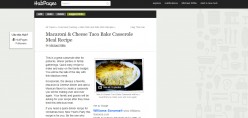
Thanks, let me investigate. I probably won't have an answer today. But stay tuned...
Michael, I think that this may be a network issue that is unrelated to HubPages or anything that you control. We've been able to get them to load here (and on your specific Hub). I think the loading of the buttons may be timing out. Not sure what else to tell ya.
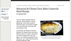
Thanks Micki. The important thing is...as long as readers can see the share buttons. If you can see them, I guess it is ok then.
Micki why not add the G+ button? Anyway it loads only after people want to share right? I'm sure one day the big G will rank based on G+ likes too if they aren't doing it already.
Here Here!!!! - if its in the floating button loading time is not an issue. Paul E advocates profiles linked to G+ => Why not jus do it? Peopl may not use it much now but they will in the future.
Big G is promoting G+ more and more, almost forcing people to comply. Say yes and get a big ++++ from Google.That's what I think too. If not today we may crash even further down the SERP's tomorrow
Micki...I just tested opening hubs in several different topics versus the new hub designs.
1- I had no problems with the old hub design opening and the page filling far quicker than the new designs.
2- In the new hub designs, the backgrounds and the share button were last to load. These took a very, very long time to load.
3- For some reason, the new formats are taking longer to load than the old format. This is even with less on the page.
When the new design for recipe hubs first was implemented, the page would load quickly. Now it seems to be the opposite. Is this a glitch on the pages?
I know what you suggested to me about the share button, but I have no problems on any hubs on the topics outside the new design.
Hmmm, I loaded two pictures Micki. Only one shows up now. The second one had no background image, just gray space. Maybe that timed-out also?
Amateurish, unprofessional, unsuitable, unsightly, counter-intuitive, and downright ugly - just like the Technology hubs. It wasn't broken, but you fixed it. I used to be proud of the way may hubs looked. The new layout looks like a half-finished school project. Terrible job, Hubpages.
I agree. I feel the new layout is unsightly
"View all 2 photos". Really? There's no way to turn off the slideshow? I have carefully laid-out my photographs for each hub and purposely turned off slideshows. Now that option has been removed and we're stuck with "View all 2 photos".
I have a feeling that you're making these changes in order to be better-viewed on mobile devices. If that's the case, you need to hire better software developers, because there are easier ways to accomplish that without sacrificing quality elsewhere.33% of the screen width is blank...and that makes sense how? If you want to eliminate ads and author information, why not just make the content larger? Is there a grown-up at home that we can talk to?
You should consider reading all the threads from the start rather than ask the same questions again and again - You'll get your answer as grown ups from the house you seek have answered it already.
I've read most of the comments, but must have missed that one. What page contains the answer to which you refer?
There are two threads one on Tech hubs and another on Fashion. Ok the reason of the small text is because research shows that on average 9 words a line is what people like. That's the reason it's not spread across the entire window.
If you're refering to the explanation on the first page, as a web designer I can assure you that hubpages assumptions are completely wrong. The width issue is a major problem, much more so than adding a few milleseconds to the download time. Someone with a 4 inch screen doesn't want to see 1 1/2 inches of it blank.
I agree it does look blank. I got one hub in the fashion category which I realized only yesterday when I was busy editing past hubs. The tiny pics thing on the sidebar looks fine and the readers are focused on reading the actual hub now. Until the final stats come out I doubt anyone can say anything.
A thought regarding avatars in the comment section...
While the avatars may not mean much to the non-HubPage traffic I do think they have a lot of value to not only Hubbers, but to HubPages.
Let me explain: In the time I have been here I have seen countless numbers of Hubbers write that one of the things that they really like about HubPages is the community. And many say it is because of the community/social aspect that they continue to write and be involved. In my opinion, the removal of the avatars really diminishes this intrinsic value.
Comments now just look like a big block of text that isn't very appealing to read. Hubbers I instantly recognize by their avatars are no longer noticed in the comments section. If the sense of community and the give-and-take of commenting decreases, so too might the number of writers who really are here more for each other than the money.
Anyway...it's just a thought...I agree with you totally. If HP wants to have new writers, I think, that the little avatars by the comments and even the author photo strikes some curiosity among the organic traffic; perhaps a certain photo sparked some interest, then they would click that and end up on that person's profile page.
That is the biggie for me; that little photo can make others navigate to your profile page and check out more hubs, which means more traffic. And those who are smart will have the same photo on their other social/writing sites so if someone comes across a hub and they recognize the photo they may be more apt to sharing.
I (apparently misguidedly) thought that subdomains were effectively supposed to be essentially (although not totally) our own website, and therefore a representation of us as individuals. If we don't have the option to pick and choose our own layouts and reject things we don't like, doesn't that leave us in a position that we can suffer from bad decisions by the site owners and be completely unable to make changes that can improve our situation, e.g removing all those spammy picture links at the bottom of our hubs?
mistyhorizon2003 I agree with you 110 percent.
Those spammy picture links bother me to. And I don't want my traffic clicking off onto a hub that doesn't belong to me. Those links at the bottom of the hub should belong to the Hubber the page belongs to or they should not be there. This is a bad traffic leak.
If I go to the trouble to work my a** off for traffic I don't want it clicking off onto another hub that is not mine. It's a traffic leak plain and simple.
What spammy picture links? I don't see any on any of the test topic hubs in fashion, tech or recipes.Go to the bottom of your hubs and you will see them. Look especially in fashion hubs as I am not sure if this has been rolled out to all categories yet. It looks awful!
Edit: interesting, right now I can't find them either, so maybe HP have removed them for now.
I just hate the new layout totally. It looks tacky and cheap and I am now starting to see this affecting my income, mostly on Adsense, although my HP Ad income is now showing a loss too (but I can't of course 100% say this is because of the new layout as my views have dropped too.) A lack of time spent on page is also a contributory factor though, and the new layout could well be driving people off of the page. My income WAS okay, but now I am seeing it dropping, and this is of concern to me for obvious reasons.
In the newspaper business, we used to say that empty space is worth a lot of money (It could be used for advertising.) A lead-in photo may be good for recipes, but not for Hubs that offer information. If authors are forced to use formats that are not suited to their Hubs that would be a mistake.
Have you all noticed that the minimalist design has now been implemented site-wide, for all our Hubs? Single column, white background and no more side bar. All the stuff formerly in the side-bar has now been pushed down to the very bottom, to below the comments. At first I wasn't sure what to think of that, but on reflection, it does make sense.
Considering that most users keep multiple windows open on their screens, plus the "Portrait" format of mobile phones, adjusting the browser size to a narrower shape is quite useful, it gives the user more space on their screens for multiple pages being simultaneously visible. For example I Skype with my sister across the ocean to discuss a new article I wrote. Having two adjacent windows open on my screen (Skype and HubPages) I can easily send content for editing, or a link of the page in question as we speak without the distraction of all the side bar content.
So I think I'll give this one a + of approval (especially with the white background which looks less of an empty vault than the grey.
As long as it doesn't affect earnings. I'm happy with this.My hubs seem normal and have a normal sidebar with everything as they were before other than the tech and fashion ones. I have no recipe hubs.
The problem with designing for "One size fits all" is that it is completely unnecessary when it comes to web pages. The design languages have built-in tools to detect the viewing device and adjust the display accordingly. HP's approach is the lazy way out, which basically is "one size fits none". When I view a hub on my iPad in vertical position, the text is too small to read, yet a third of the screen is unused. Fortunately I can enlarge the frame to take up all of the screen real estate, which makes the text larger, but why make users do that extra step? If you're reading several hubs, you have to go through that exercise every time you click on a link to another hub.
I think I've beaten this to death, so this is my last comment on this disturbing trend.
You Know what happened Lobo, I had my browser magnified so it pushed the side bar down to the bottom. Which proves Bill's point that "The design languages have built-in tools to detect the viewing device and adjust the display accordingly." Still, this accident happened for a reason. I really liked that clean lay-out. On the other hand Bill is right about having to magnify the text when space is wasted.
Please don't give up Bill, we need you here.Can u get me a screen shot of what it looks like? Maybe HP would like it too? If possible that is

It would look fine on a mobile device and like you say if we've got two windows open. But, the author info at the end doesn't fit in place that's what I feel. It should be above the comments. (I know this was a glitch; but, if at all its considered the author info should be above the comments)
Thanks for posting it sue
Yes, I agree with you lobobrandon author details above comment. Anyway, I don't want to spend any more time on this. I'll just wait for an outcome.
PS I do like the white background though. If there is going to be wasted space, it may as well be clean, not the depressing colour of old age in the mud under a a grey sky.
After this little experience, it may be worth considering using full real estate with one column and an enlarged font size?
Although I do like the cleaner look, upon first landing on the page I still think the author avatar/info on the top right looks more finished. Viewers may not make it below the fold to see the author info if it was placed above the comments. I have noticed that on another site, and I wasn't crazy about it. But that site had ads all over the place, top and both sides.
PLEASE end this nightmare which has been going on for 4 weeks (Fashion)
=> Its destroying HP's reputation - looks unfinished and under construction
=> Its destroying author's reputations for the same reasons
=> Most authors have given up commenting (all fed up; little feedback)
=> Its decreasing traffic
=> Its decreasing earnings
=> Its destroying morale in the community
=> Its stopped the best writers writing new articles
ENOUGH ALREADY!!
Please finish it, fix it, MOVE ON =====> PLEASE!and now it has spread to the recipe topics....Wonderful.
my adsense earnings dropped by more than 95% in the last 4 weeks and HP ads earnings dropped by more than 50% because of the changes implemented in the fashion category.. this is very disappointing for the authors to continue writing any new hubs.. HP admin team pls do ur testing fast and remove these changes soon as revenue from hubs is almost 20% of what we used to earn before the changes have been implemented.. and traffic has also been hit by nearly 40% loss of views..
I agree, my traffic has been hit hard, and I haven't really wanted to write anything for hubpages in a few days. This has gone too far. I personally think all the changes are affecting hubpages rank with google because of a lack of a coherent appearance.
Agreed; If HP wants to freshen up the format; cool. However, to abruptly change all hubber's content without approval or in the "beta" stages where it "still needs some work" kinda puts our hard work on the back burner.
It's always wise to make major changes slowly. What's the hurry?
Loss of reputation
Many users who open an "under construction" page won't click on HP in the SERP again
It all adds up the longer the experiment continues (4 weeks Fashion; 2 weeks Tech; 1 week Food).
In my opinion
